I recently completed a renovation of a 2 bedroom Art Deco apartment and this was the first renovation I’ve ever done. I’ll be honest I was a bit nervous leading into it but I was lucky that the apartment already had great bones so it mainly just needed a cosmetic overhaul to bring it back to life. One of the main areas of my focus in the renovation were the windows. Windows are obviously important as they bring natural light into your home so I really wanted to enhance this to increase the feeling of space. I also wanted to select window furnishings that would not only complement but create a focal point in the room. So I thought I’d share with you my thought process behind this, why I chose what I did and how it all turned out!
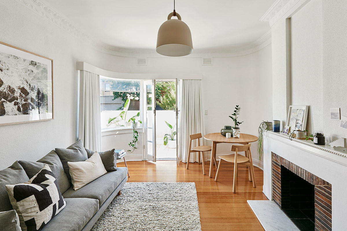
First of all it was important for me to maintain consistency throughout the home, there were 5 different windows I needed to consider, all of which had slightly different requirements. I decided to first start with the show stopper, the unique curved window and doors in the living room.
Selecting Curtains
I will hands up say that I had no idea where to start when it came to selecting fabric for curtains. There were a few things that I needed to keep in mind when choosing fabric:
Sun
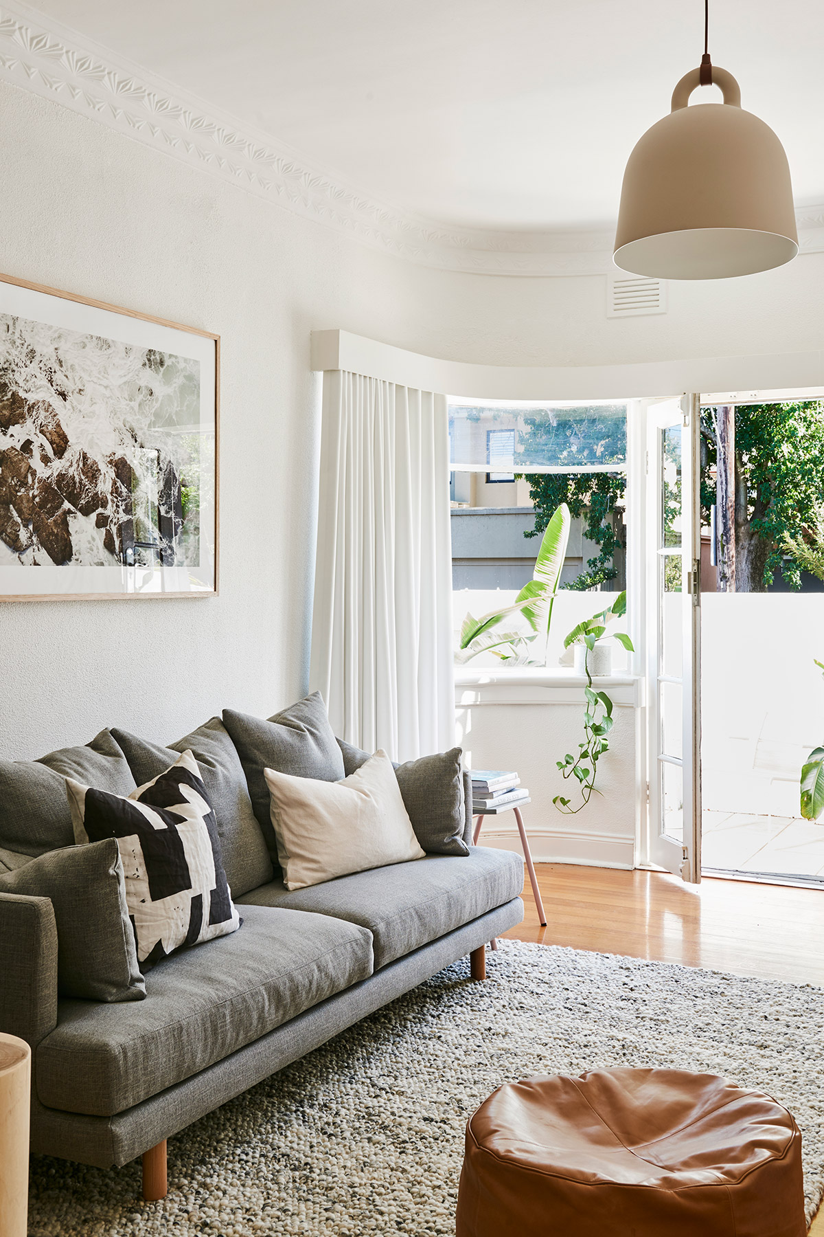
Problem: My apartment is North Facing and the curved window in the living room receives a lot of sunlight. So I needed a fabric that would be able to withstand that level of heat and damage overtime. However in saying that I didn’t want something that appeared too thick or heavy, I wanted the fabric to look light and airy.
Solution: I opted for a slight see through fabric with a linen texture that gave it a ‘light and airy’ aesthetic, but I paired this with a solid block out fabric. This was loosely pinned to the back to allow the feature fabric to drape freely. As it was on the back (window side) the block out can withstand the heat without damaging the feature fabric on the inside.
Colour
Problem: I wanted to make my living room feel larger.
Solution: I opted for a light ivory colour. It was important for me not to choose anything too cold or too warm, I just wanted a neutral tone that would blend with the wall colour. I wanted the curtain to feel like an extension of the home, rather than making a bold statement.
What I chose
I opted for the Fraser Design in Ivory from DIY Blinds. As my curtain track was quite unique given its curve, I arranged to have the guys from DIY Blinds come out to measure up the track. This was when I was also able to see samples of all the different fabrics, but they can also send samples to your address free of charge. I’d definitely recommend doing this as fabrics can look different depending on your environment (for example: how much light, what other colours are in the room etc).
Selecting Plantation Shutters
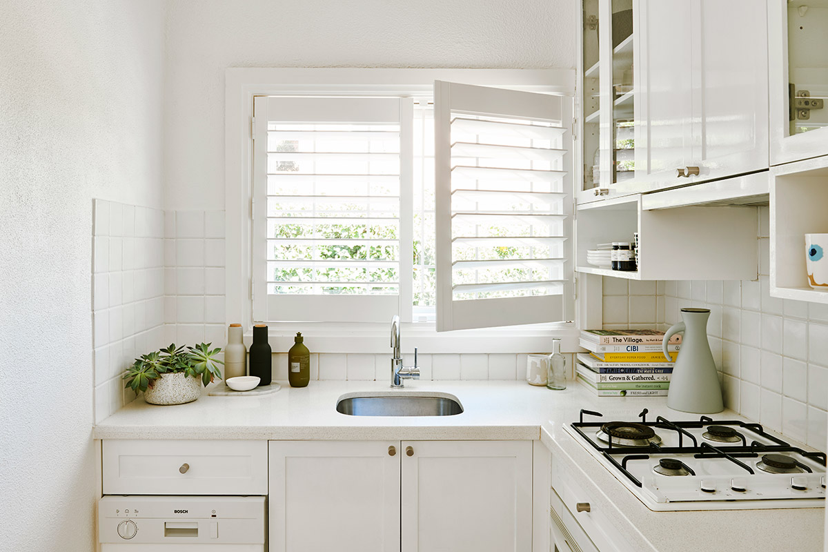
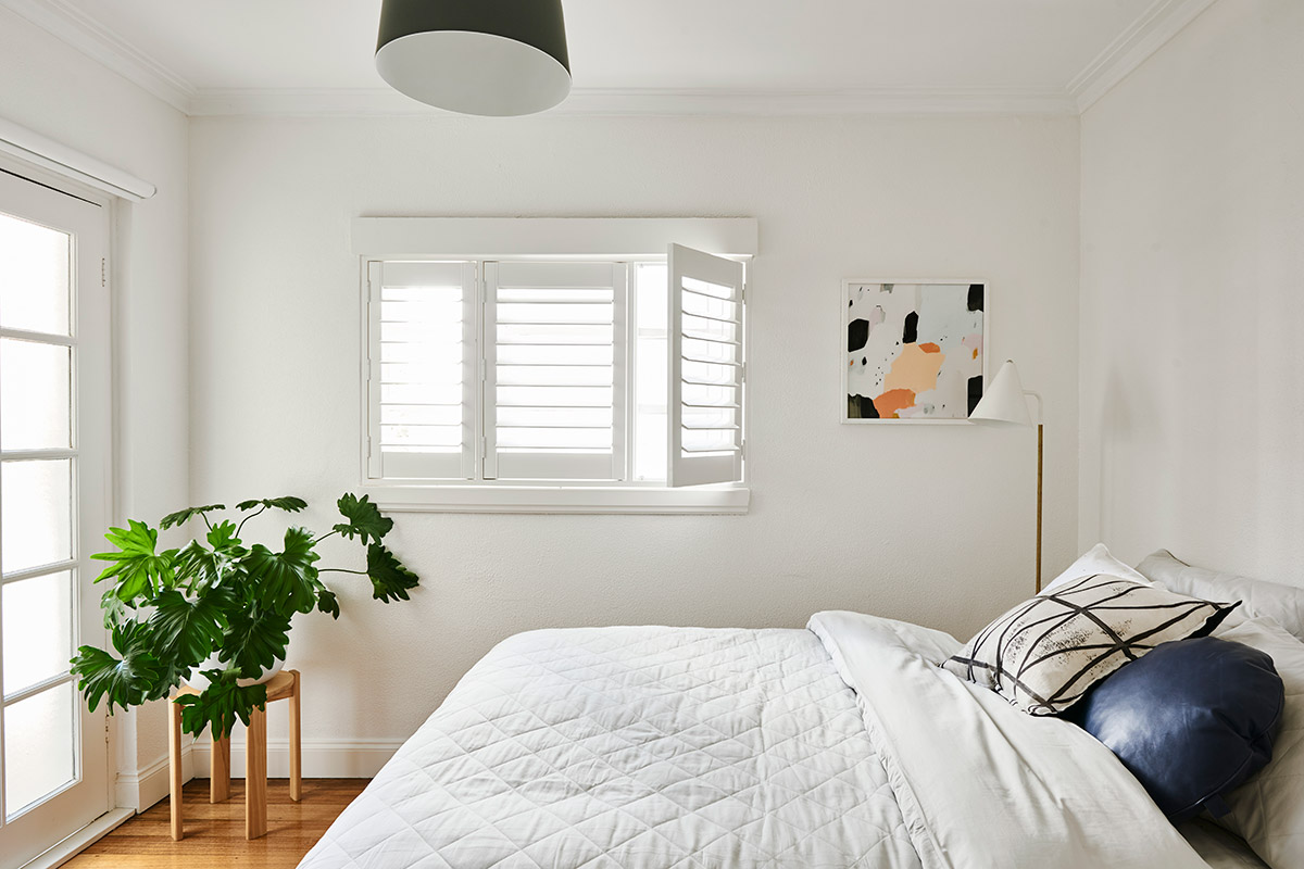
I knew immediately that I wanted Plantation Shutters for my apartment. Why? Oh the romance! I love the breezy, beach house nature of these shutters. I love that they swing open for full light and I love that they close completely for ultimate privacy. But mostly, they remind me of the Notebook when Noah installed them to win back the heart of his sweetheart… (technically she wanted blue shutters, but hey, I overruled that decision!)
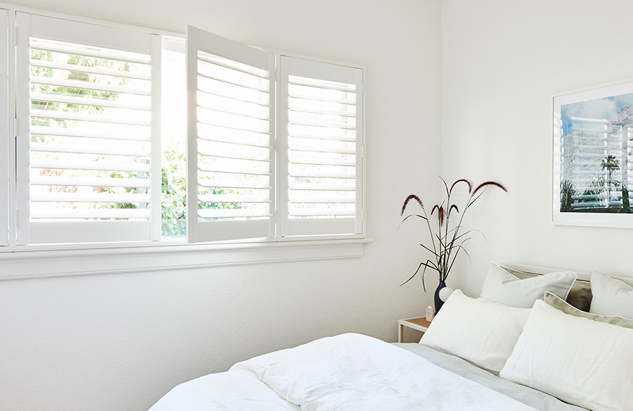
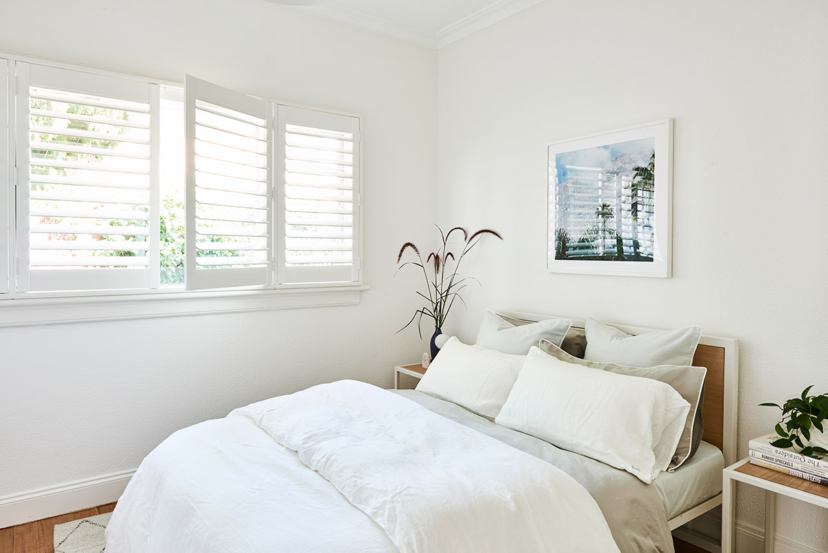
Problem: My bedroom had a large window that is the main source of natural light. I didn’t want to block out too much light, however I also wanted to provide a quick and easy privacy solution when needed.
Solution: Plantation Shutters provided that flexibility. If you need privacy they are much easier to close than winding up and down blinds. However they can also open up completely, allowing more light into the room if you need it.
What I chose
I opted for the PolyLux Shutters from DIY Blinds. I selected the Alpine White colour, this was the best match to my window. DIY Blinds had 3 different white options, that again I’d recommend ordering samples of so you can see how they look in your window.
Selecting Blinds
So I didn’t know if I wanted to have blinds in my home or not, but I did have a door that demanded it.
Problem: I had a frosted door in the second bedroom that provided access to the back of the house and the rooftop. When I was living here I never covered this up, however in order for this room to truly function as a bedroom I needed to be able to completely block out the light.
Solution: I chose a simple 100% block out blind that is barely even noticeable. I didn’t want to make a feature out of this, in fact I didn’t want anyone to see it. So I went for a simple, streamlined solution.
What I chose
I opted for Blockout Roller Blind in One Block White from DIY Blinds. You can see the blind (barely!) in the pic below…
Updating my window furnishings completely transformed my apartment! It really elevated the interiors and increased the amount of light in the home. Here are 5 takeaways to think about when choosing window furnishings for your home:
- Sunlight
What level of sun exposure does each window get? Choose a solution that is practical and can withstand the level of sun exposure. - Privacy
How much privacy does each room need? Do you need total block out or just a sheer cover? - Design
Do you want to make a feature out of your window furnishings or would you rather opt for a subtle ‘barely there’ aesthetic. - Usage
How often will you be opening and closing. Help that to guide your decision making process. - Colour
Always get samples to view in your home. Look online for inspiration to get a feel for what looks you like!
And lastly, don’t forget to ask questions. I loved working with the team at DIY Blinds and they put up with many, many questions from my end! Their website is an awesome place to go for inspiration as you can see all the different options available… making the whole ‘what the hell do I choose?’ process a whole lot easier!


