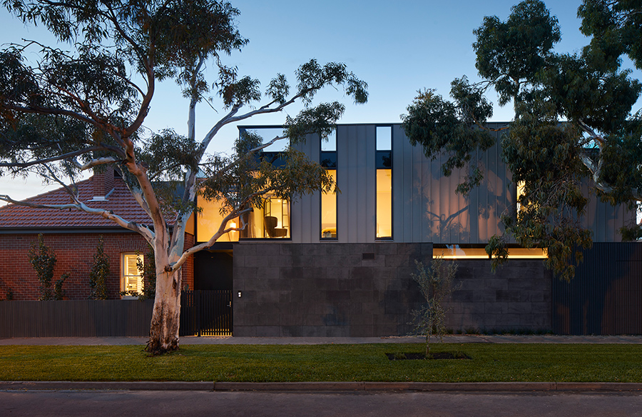
The convergence of two distinct architectural styles paved the way for an old Melbourne home to carry on with its former glory into modernity. The Verge House by Finnis Architects showcases a beautiful moment of transition between old and new with a sensitive approach that saw the new extension not dominating the existing structure. Let’s have a closer look at how an existing Edwardian-style beauty was given a contemporary addition that bridged that gap between its historical context with that of modern living.
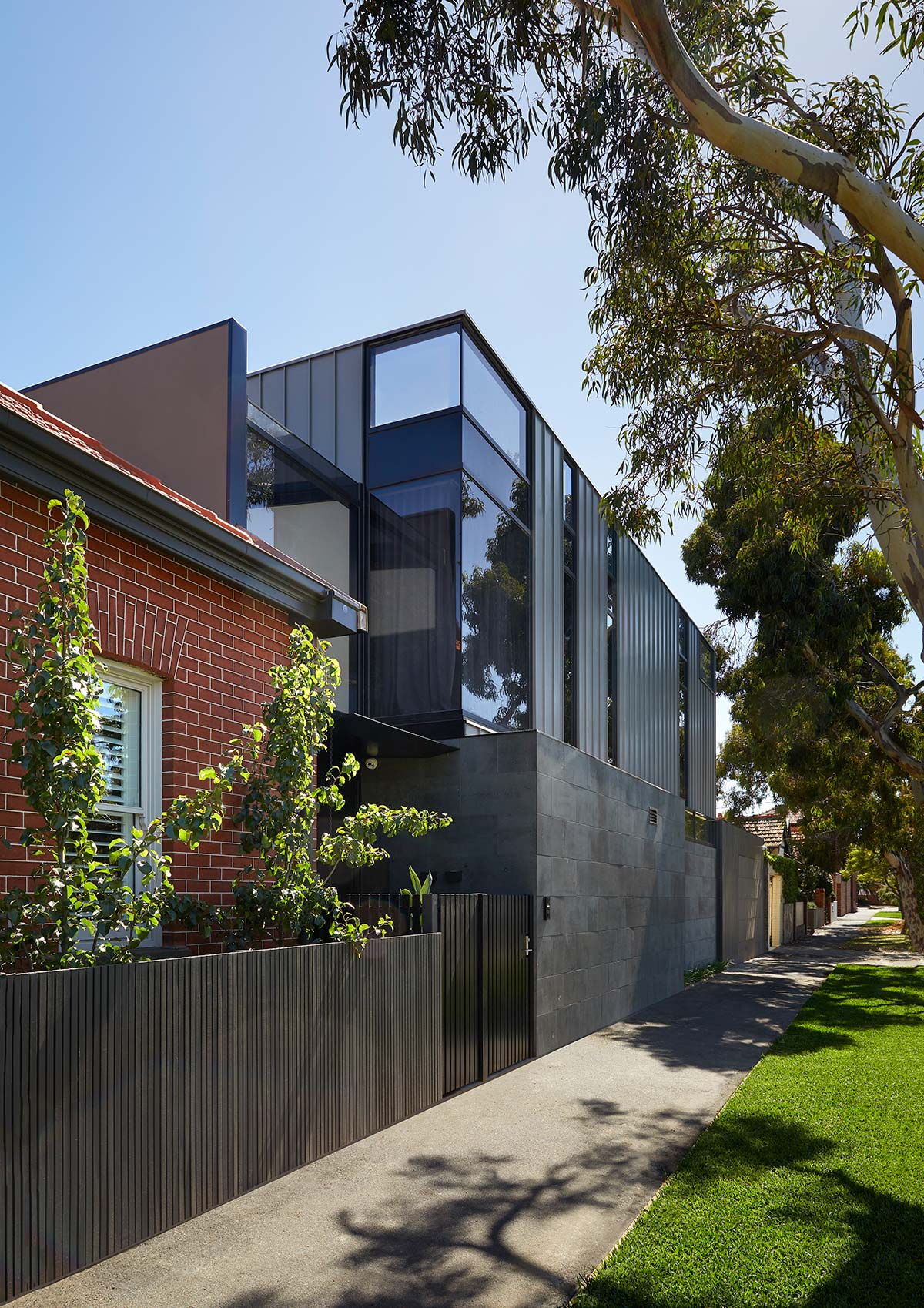
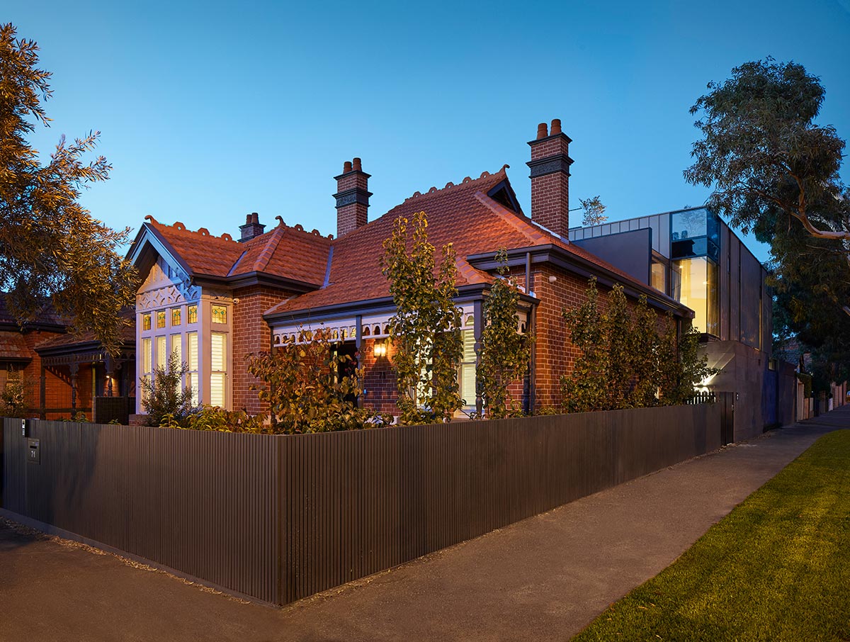
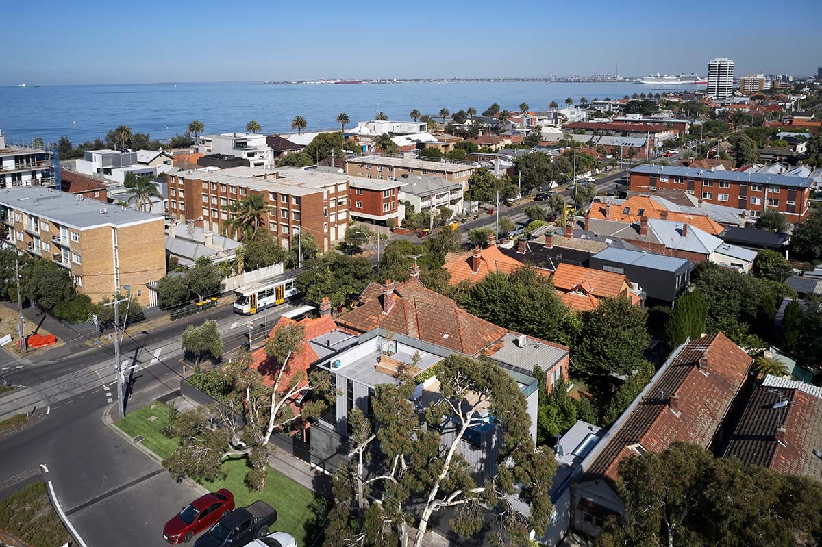
“When proposing that a traditional Edwardian style home would sit next to a metal-clad extension with a flat roof, it was crucial that importance was placed on the threshold of where the styles converged. This was where the project name emerged. The moment of transition between old and new had to be obvious but not overbearing. Therefore, it seemed natural that this transitional space was a double volume glass atrium which aided in adding much-needed light to a now tight corner site.“ – Finnis Architects
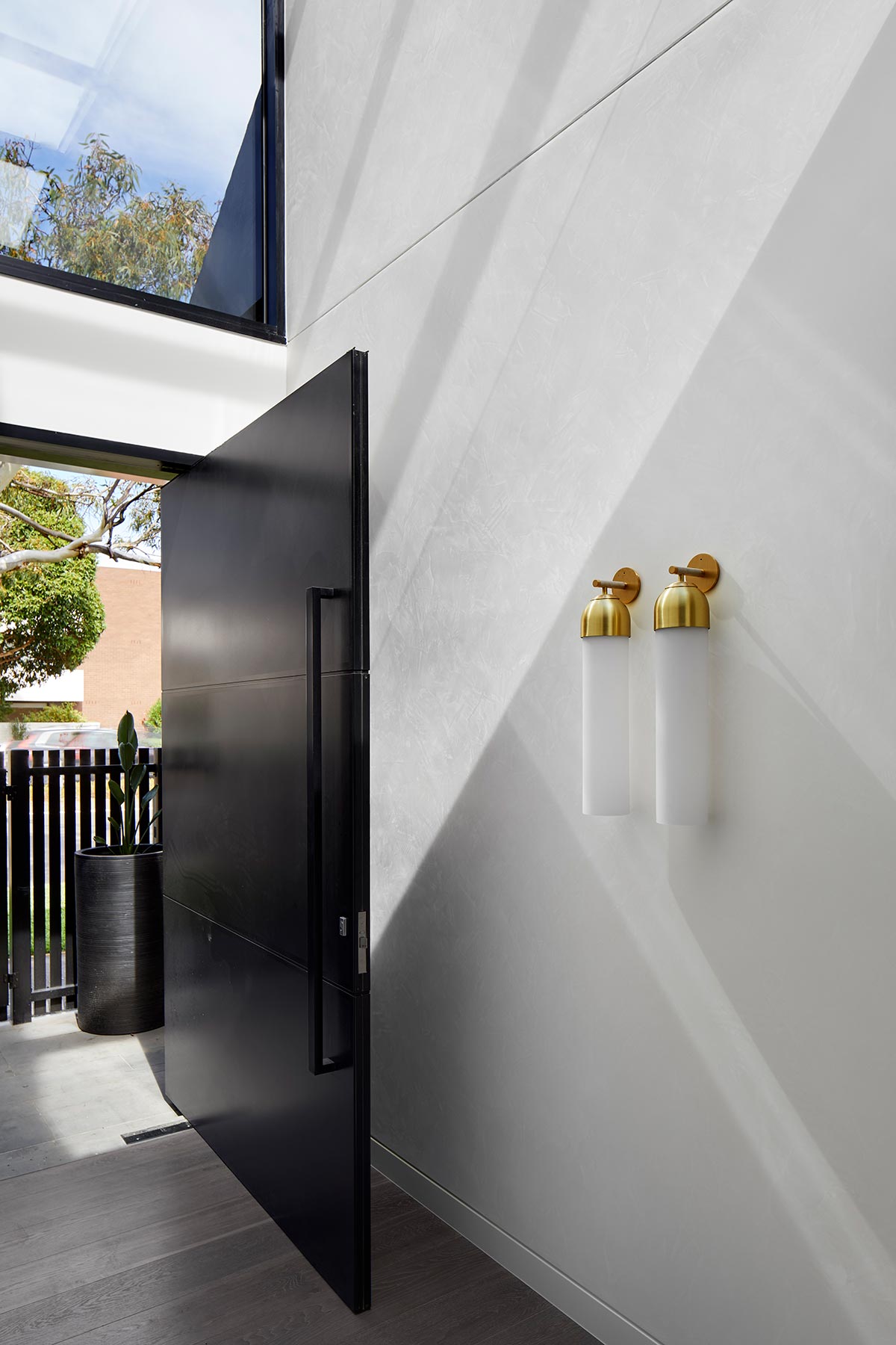
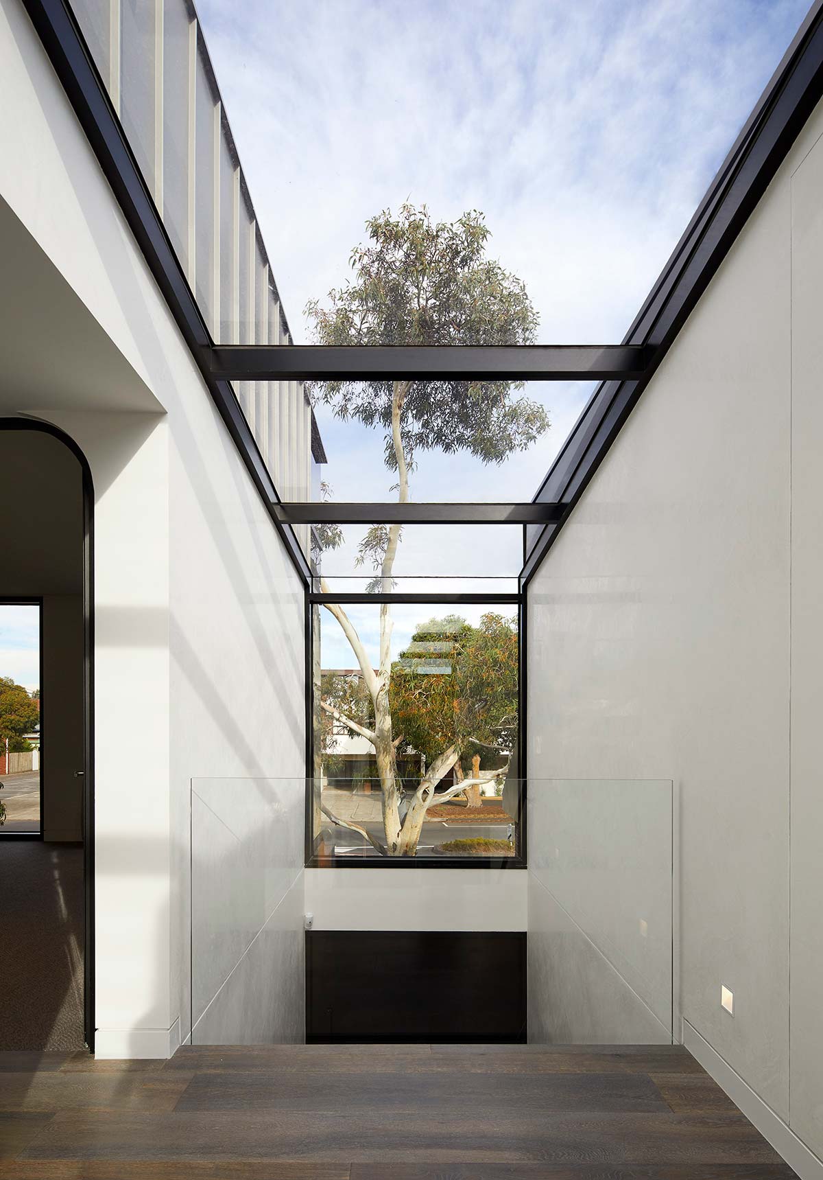
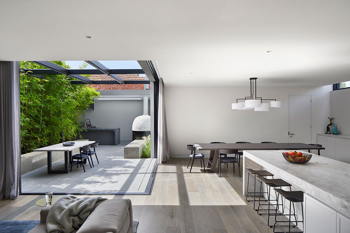
The client’s brief called for an open plan indoor/outdoor living and expanded amenities to all bedrooms without losing on both outdoor and indoor living spaces. The solution to the proposed home scheme revolved around the idea of maximising internal and external spaces, introducing much-needed light to the home, and creating a bold but not dominating contrast between the transition.
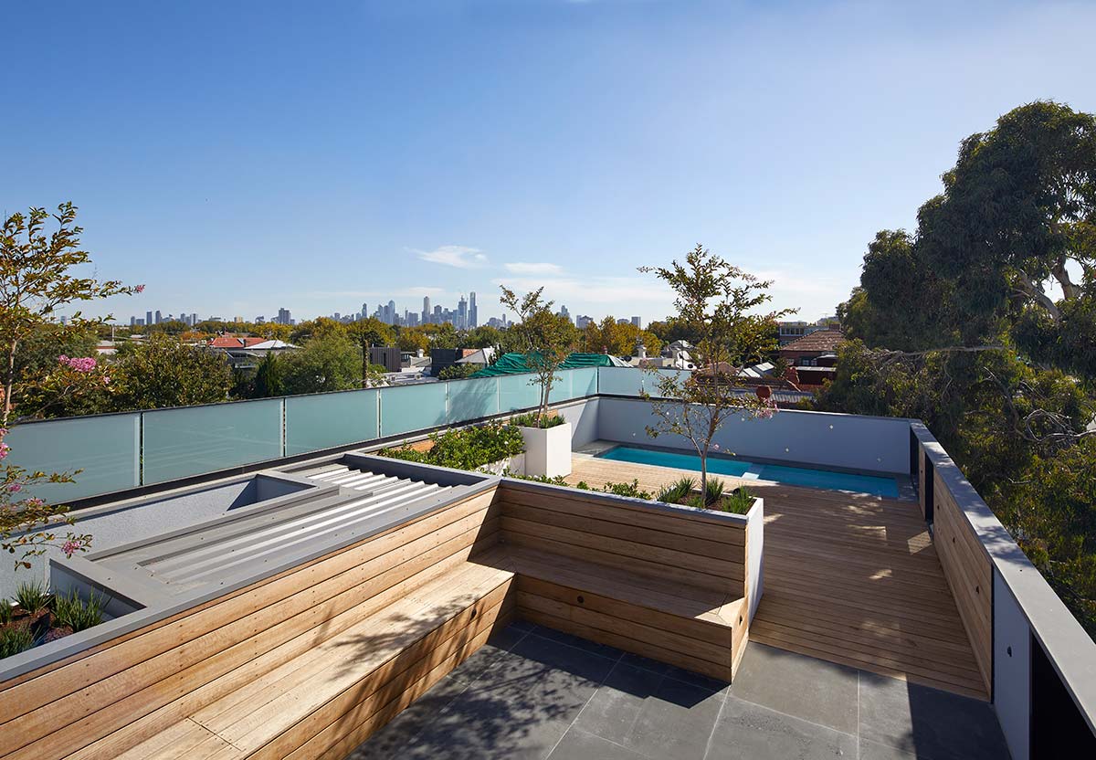
Taking full advantage of its location, the extension has been able to capture the city and bay views which until now was inaccessible to the client, reestablishing the sites’ close connection to both. Another important request made by the client was the inclusion of both an outdoor area for entertainment on the ground level and the addition of a pool. This was a challenge as the increase in amenities on the said area made the request unfeasible, thus resulting in the creation of a rooftop terrace and pool area. This addition provided the client with more than enough outdoor living without having to miss out on added amenities.
“A visual balance and harmony of the differing architectural styles on the two-street elevation and ensuring the new addition didn’t overwhelm the existing street frontage by controlling height and form aiding in contextualizing the home. With a large amount of glazing, light can penetrate deep into the ground plan into the living and kitchen area and adding glimpses of the sky as you move through the home.” – Finnis Architects
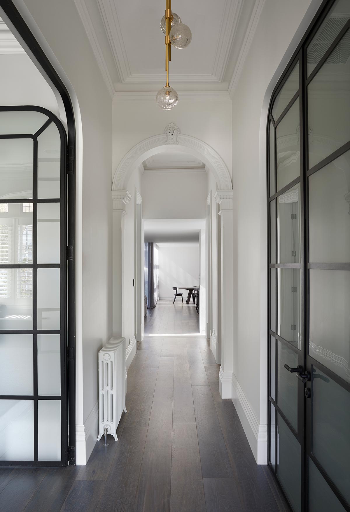
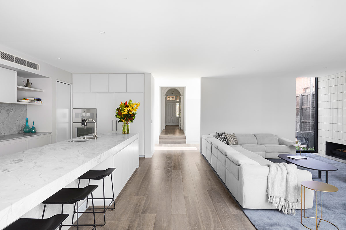
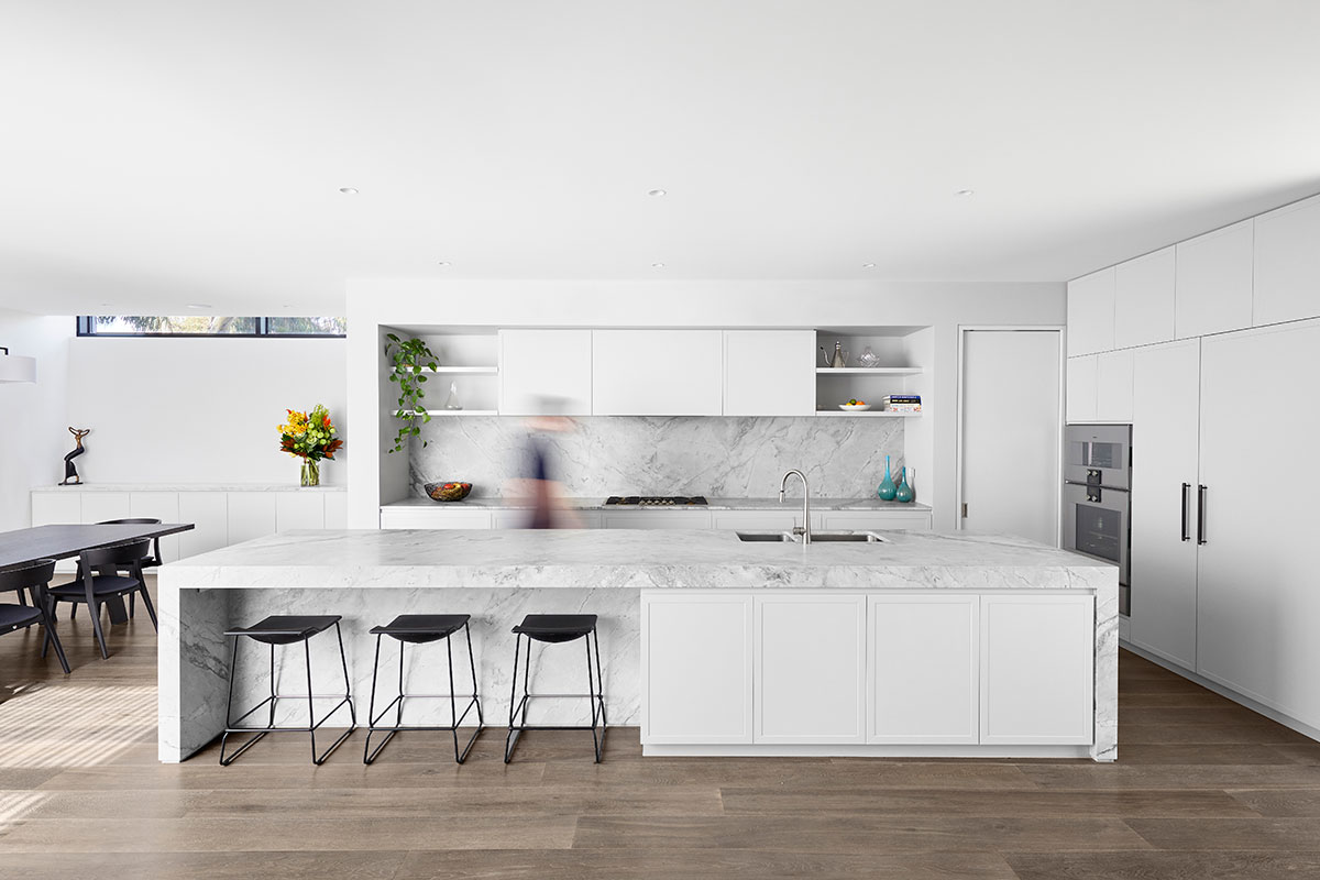
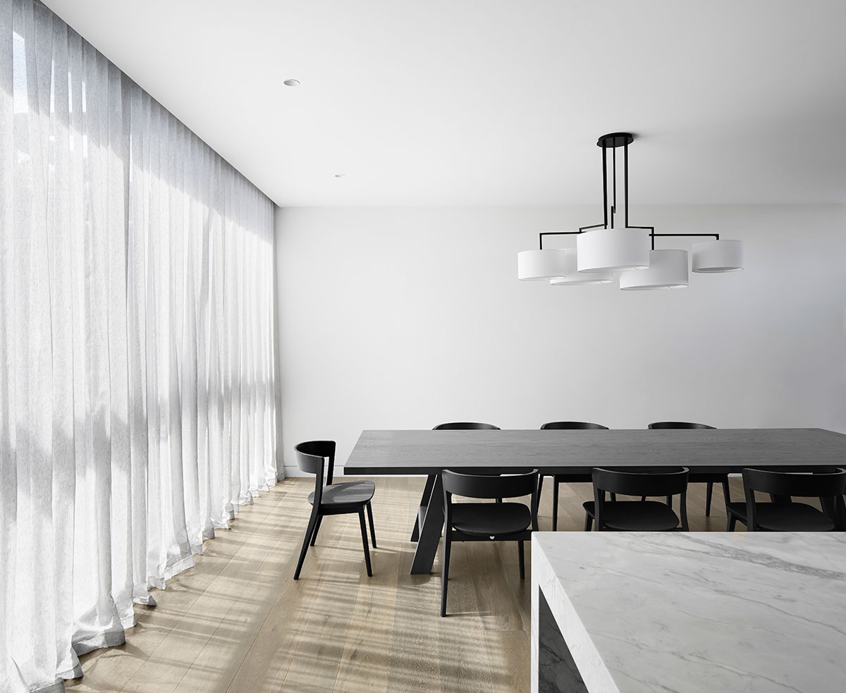
A perfect combination of white walls with blue and grey accents has added to the quintessential yet contemporary personality of the interior spaces. The uniformity in the chosen palette frames and pulls all the interior elements together to create a consistent but unique visual experience that blurs out the difference between the old and new spaces internally. A proof that home additions don’t need to be overwhelming to the point that existing structure loses its personality.
“A successful integration and collaboration of interior design and architecture with Mim Design enabled a high quality of finish which didn’t feel disconnected to the external architecture and the homes underlying principles. A restrained colour palette features several curves throughout the design (notably in steel doors and openings) which gives a subtle nod to forms seen in the original dwelling.” – Finnish Architects
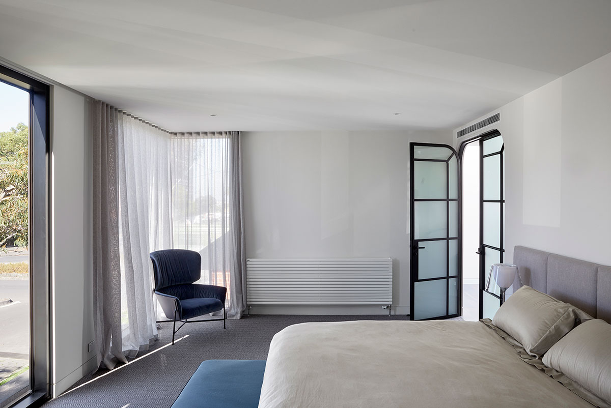
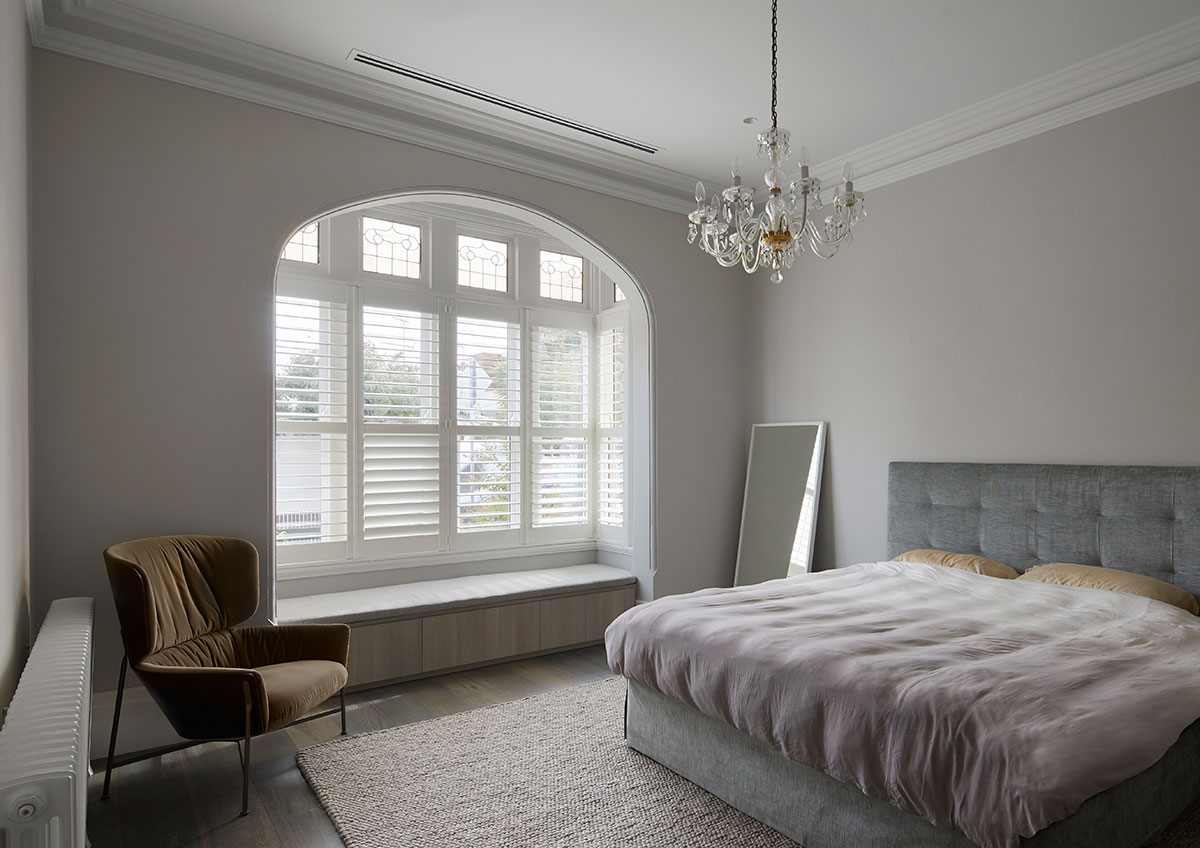
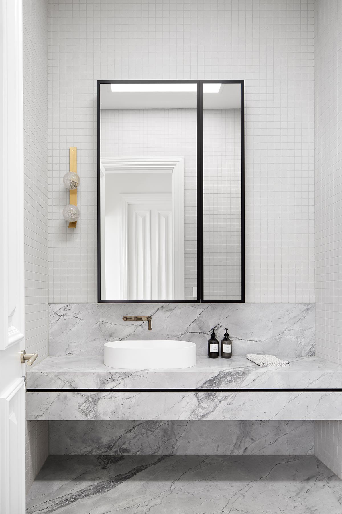
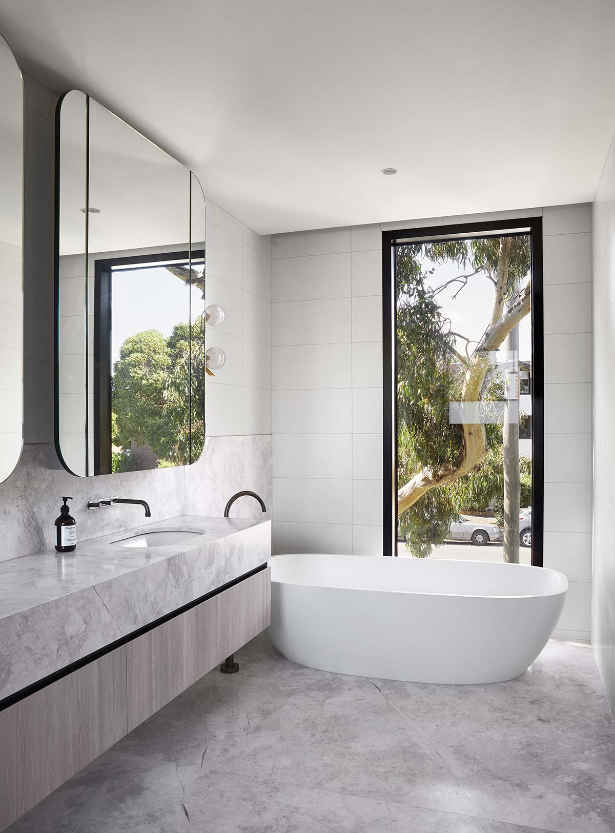
Throughout the process, the team incorporated extensive aesthetic and functional improvements while at the same time retaining much of the original feel of the existing home. The processes didn’t only focus on giving clients a comfortable, spacious, and functional abode but also prioritised the social development of the family it shelters.
House Project: Verge House
Architect: Finnis Architects
Location: Melbourne, Australia
Type: Renovation
Interior Design: Mim Design
Photography: Tom Roe


