Small may get a bad rap, but there’s no need to let your teeny tiny space cramp your style. It’s probably just a few carefully considered steps away from cosy, warm and familiar. Whether you’re living in a cosy studio apartment or want to get more out of a cramped room or awkward nook in your home, here are our top five styling hacks for maximising small spaces.
1. Light it up
Natural light is paramount to humans’ perception of space and comfort. When choosing colours for your space, keep things light and bright. Darker colours have a tendency of making spaces appear smaller, whereas lighter colours open things back up. A predominately neutral colour palette generally makes the room appear bigger and less cluttered.
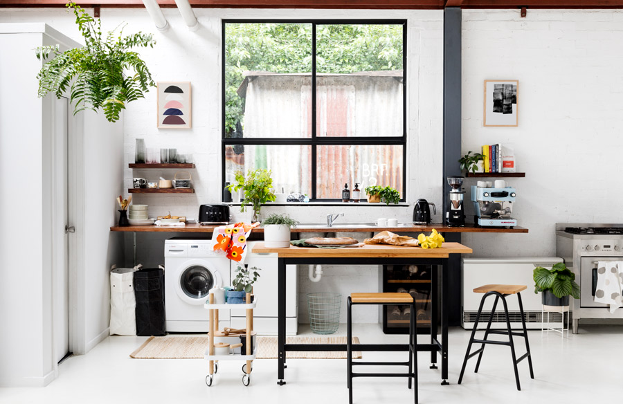
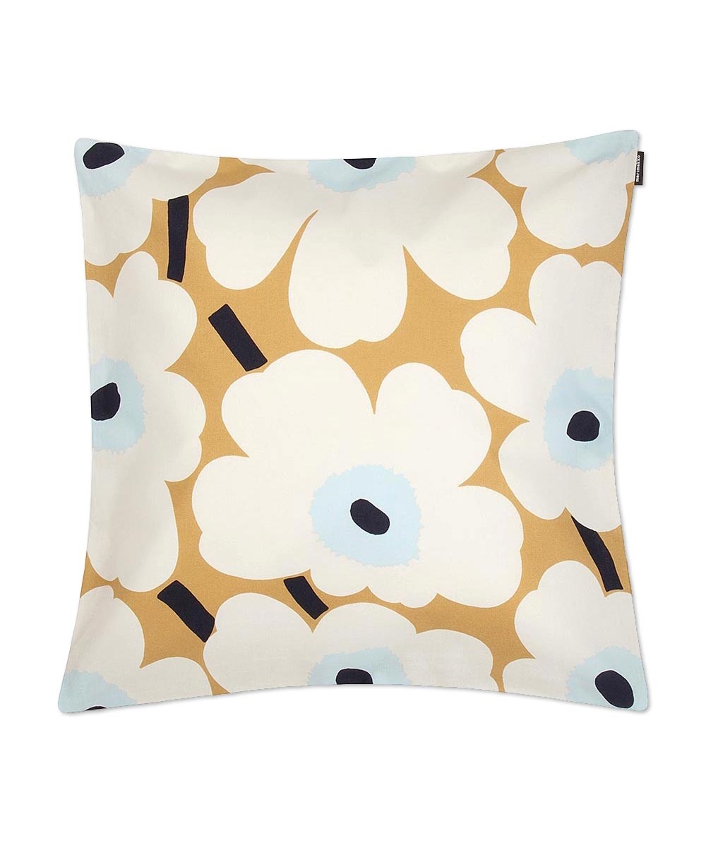
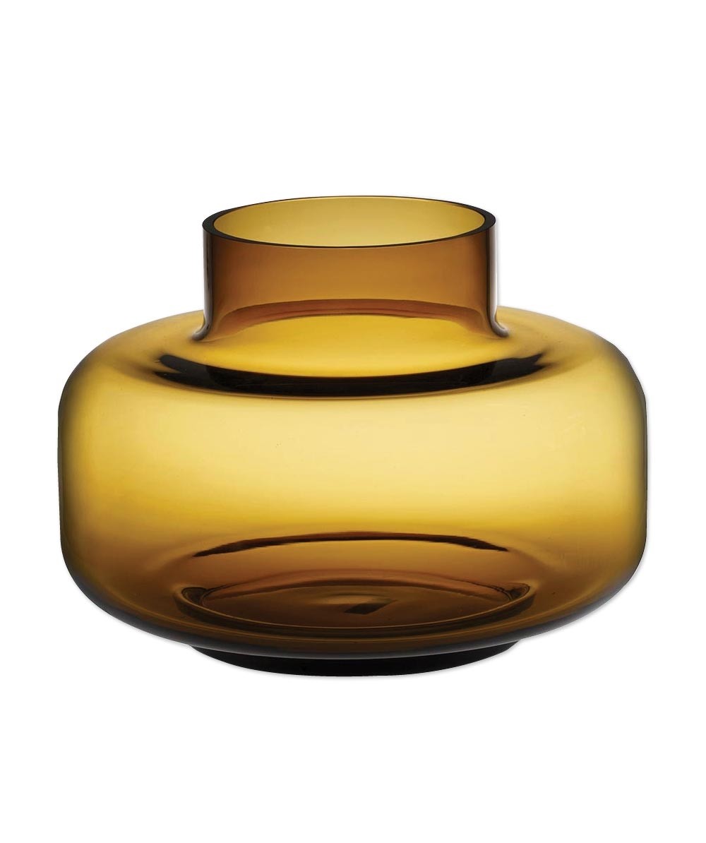
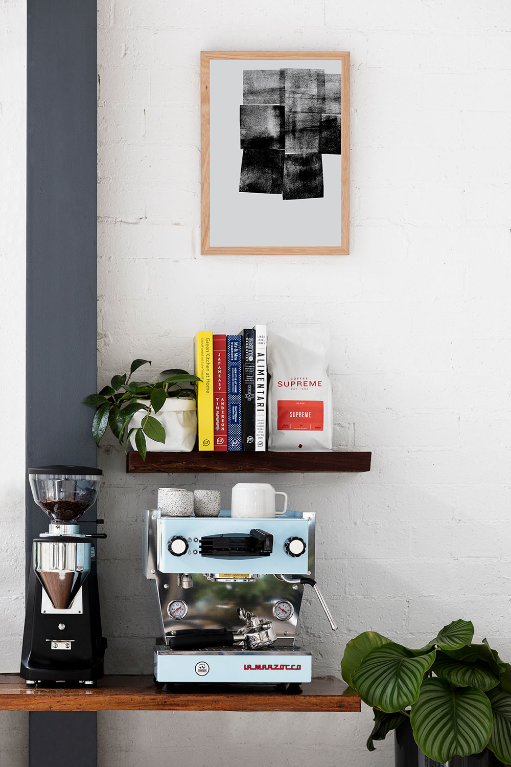
Don’t get me wrong, that doesn’t mean you have to forgo colour altogether. Playing it safe with a minimal colour palette provides you with the perfect backdrop for colour-popping accessories. Get your colour fix with soft furnishings, appliances or house plants. The iconic baby blue La Marzocco coffee machine used in our Home Life campaign adds decorative charm and a welcome pop of colour to the small space. Similarly, a vibrant Marimekko cushion or vase can transform an entire room’s decor and deliver a bold colour statement.
2. Invest in smart furniture
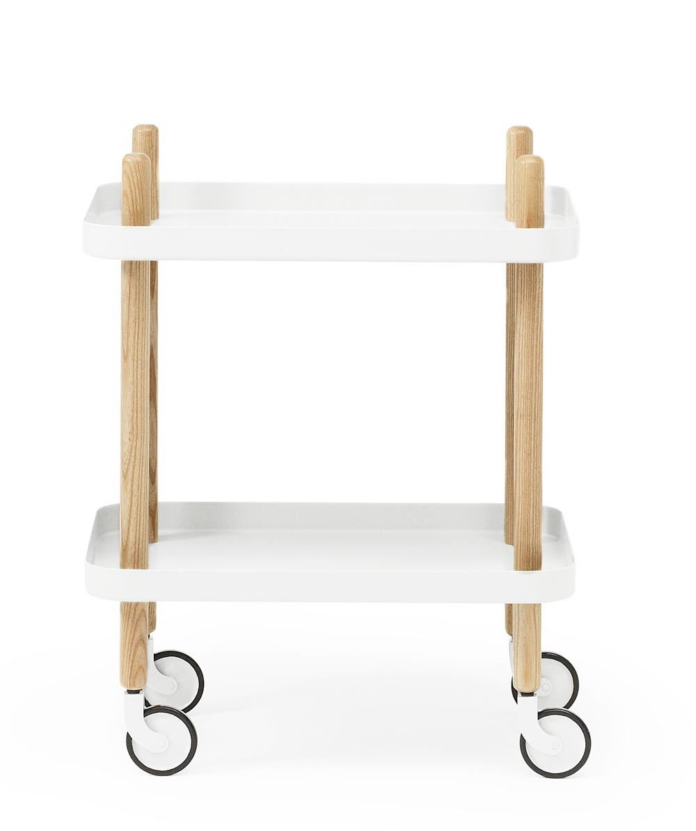
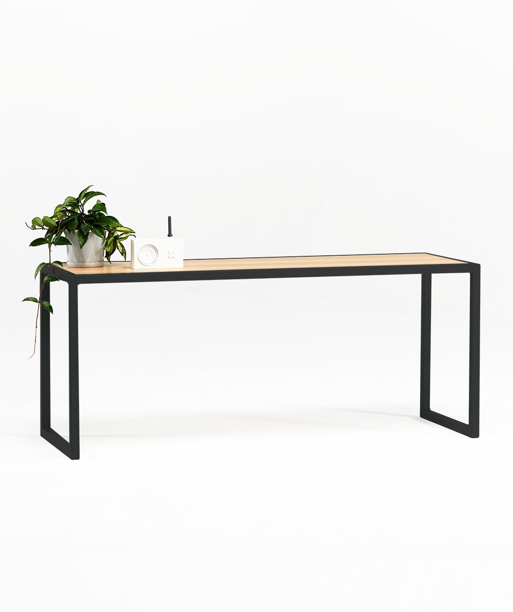
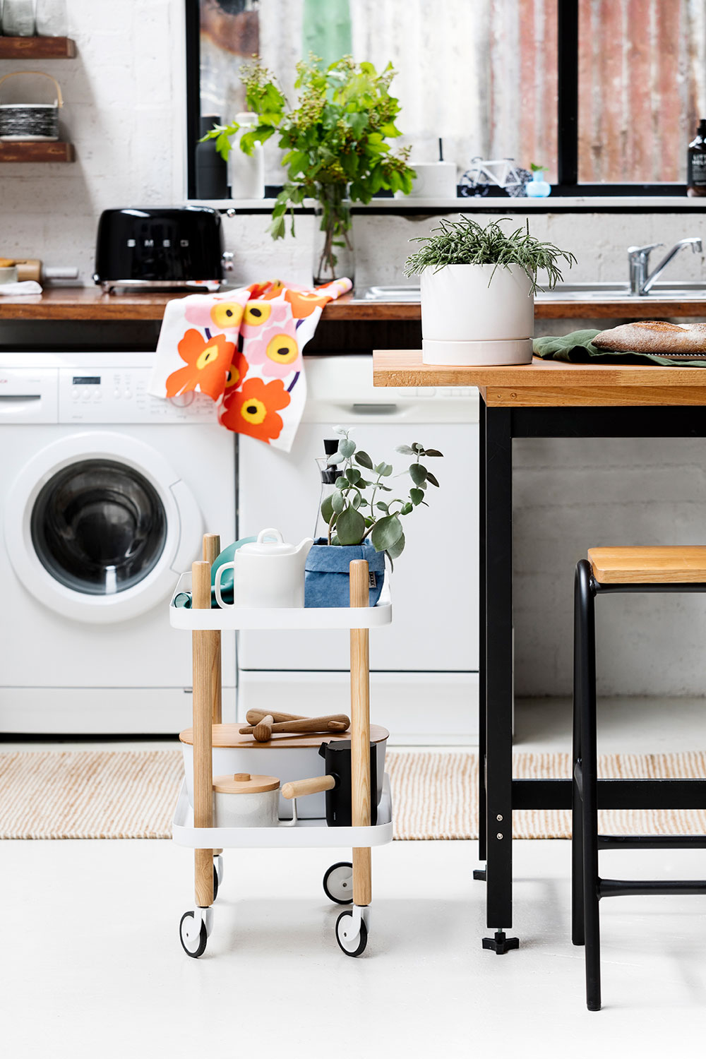
Multi-purpose furniture is a game changer in small room designs. We’re talking a desk that doubles as a dining table; a sideboard that doubles up as a bar; or wheeled storage solutions that can easily be rolled out for use or tucked away if needed. You get the gist.
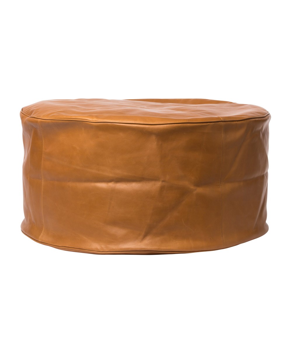
Stools also double as side tables, whilst ottomans and floor cushions can work double-time as footrests or extra seating. Moreover, take advantage of your walls (and save floor space) by adding shelving or hooks. Or, opt for a narrow bookcase that provides you with lots of vertical storage.
3. Zoning
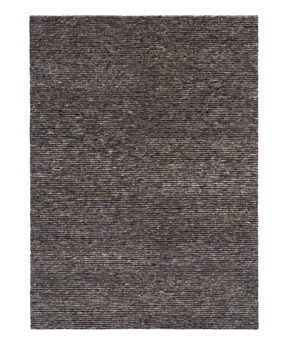
Open plan is synonymous with small spaces but it requires a certain level of definition to avoid things looking a little messy. Think about all the things you do in the space; work, sleep, relax, eat. Once you can get an understanding of how you want the space to be used then you can start to plan zones. Furniture and rugs are both great ways to create zones. Check out our blog post Three Ways To Zone Your Open Plan Interior for more tips and tricks.
4. Look Up
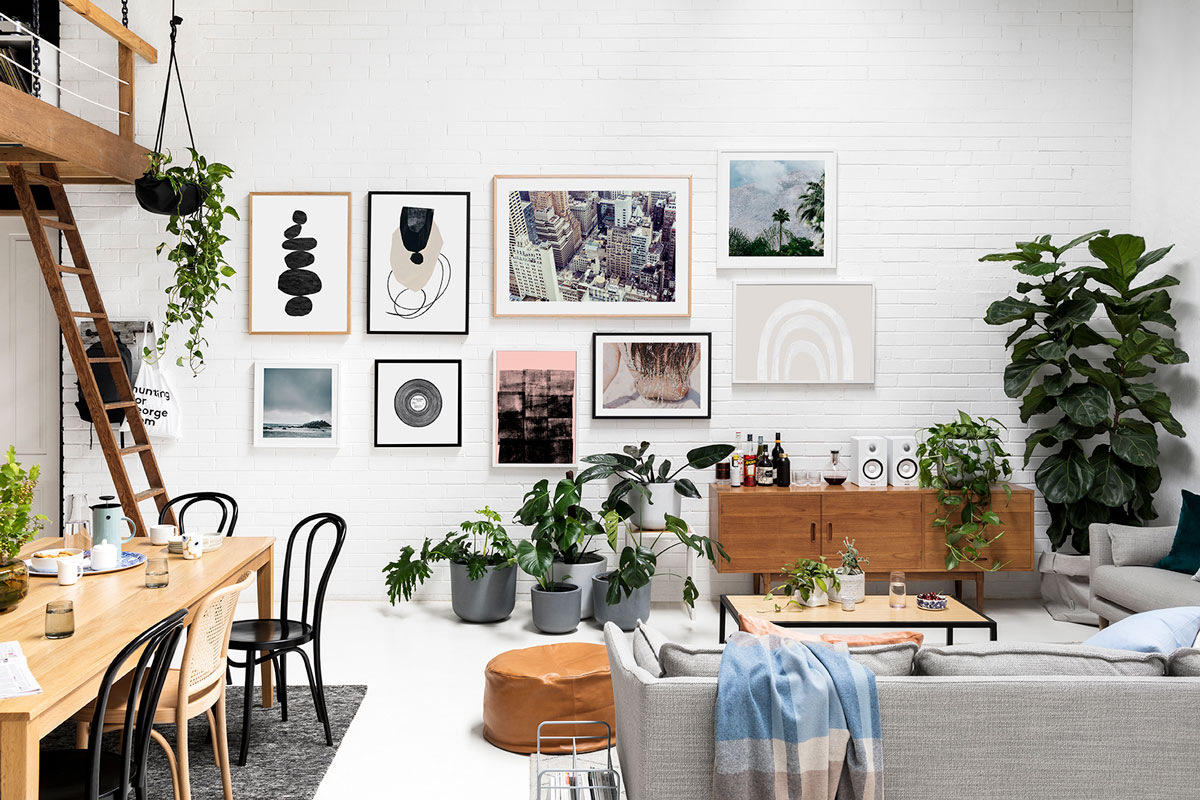
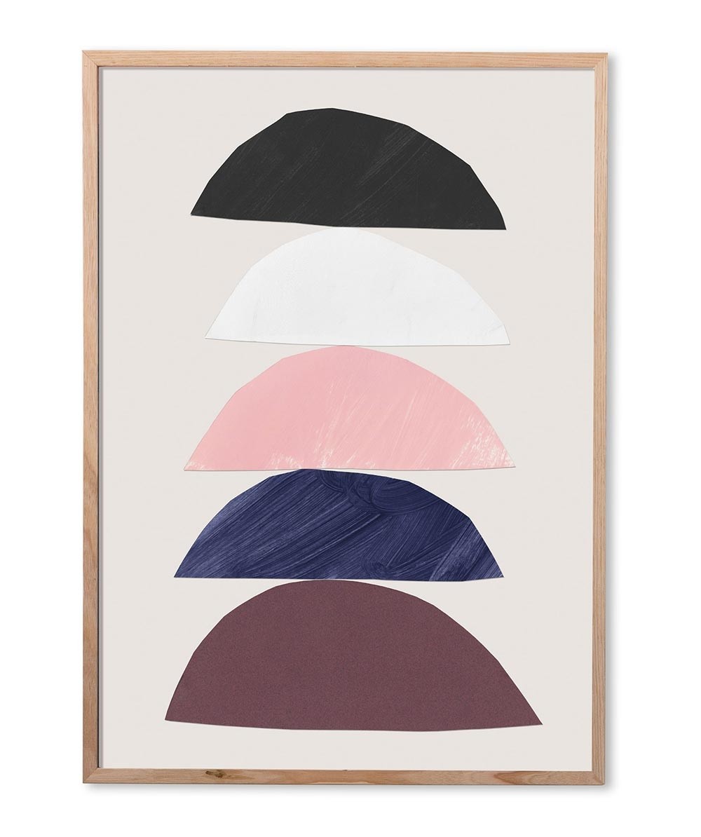
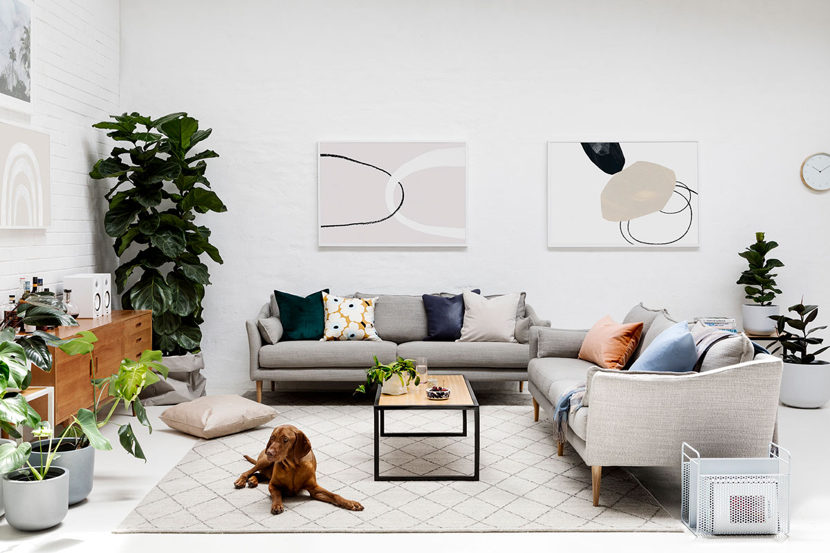
Scaling a small room with a large statement print or a cluster of art prints might seem counterintuitive but adding artwork to your home that stretches from the floor to ceiling will distort the perception of height, making the space feel larger.
It’s also a super effective way to inject character and personality into a space without introducing too much clutter. Whether you print a photograph, purchase an art print or pick up a vintage map from the markets, there are many ways to introduce art to create impact. For example, layered watercolour in whimsical pastels or muted earthy tones can make a space feel tranquil and inviting. Similarly, hanging a bold or unique artwork in spaces injects life into the room while serving as the perfect conversation-starter.
Like the look of an art print wall? It can seem like a pretty daunting task but it doesn’t have to be. Here are our top tips for styling your artwork as a cluster.
5. Less is more
It’s only natural to accumulate clutter after living in the same place for some time. However, when living in a small apartment, the clutter is much more apparent because there are fewer places to hide it! Make time to go through your possessions regularly, you’ll be surprised at what a difference it can make to a space once you clear out the junk. And when you do, be cutthroat about it! Ask yourself the question, “do I really need this?!”. Every piece of furniture should be working overtime to earn its place. But if you do live by the motto “more is more”, try to keep things organised. Clutter can work but it needs to be curated.
Small Space Heroes
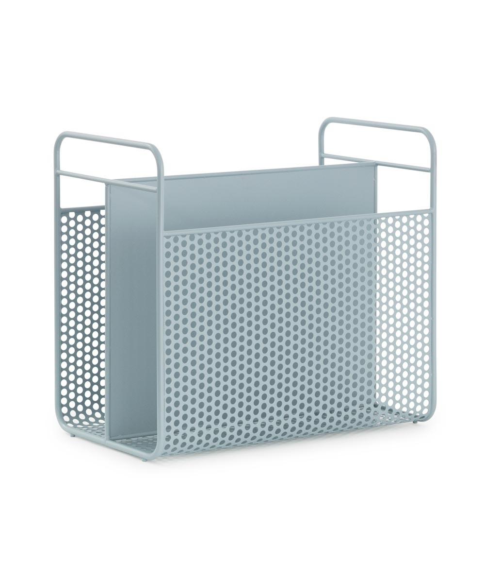
We’ve had our fair share of experience living in shoebox-sized apartments. We’ve picked a few of our favourite products to help make a space feel bigger, better and ultimately more enjoyable to be in. Shop the entire Home Life campaign here.
Home Life campaign photography by Martina Gemmola. Art direction and styling by Lucy Glade-Wright.


