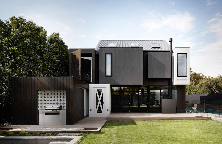
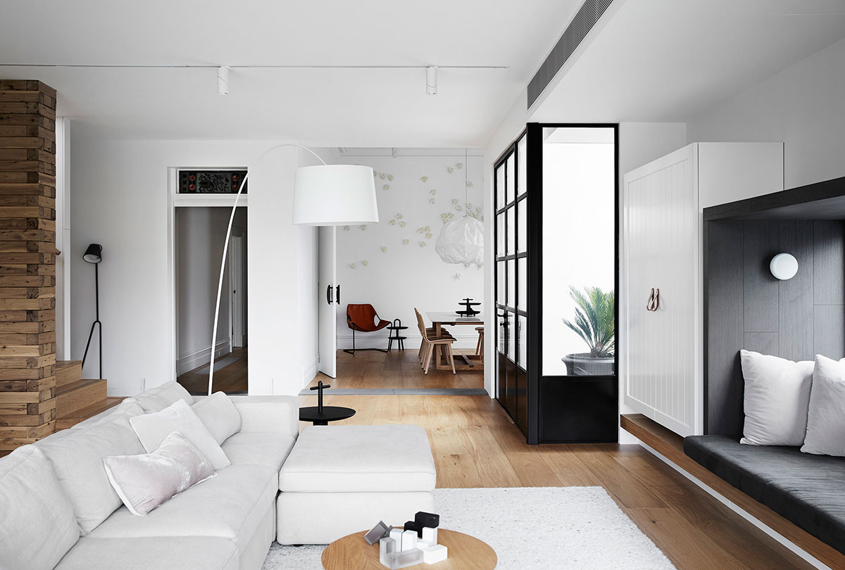
Don’t be fooled by its flawless exterior folks, this here is a house designed to appeal to the kid in all of us. If not for the unexpected splashes of colour throughout, then it’s probably the swarm of honeybees dancing across the dining room wall that has won us over. Full of surprises, this residential extension for a young family of six is the ultimate family pad.
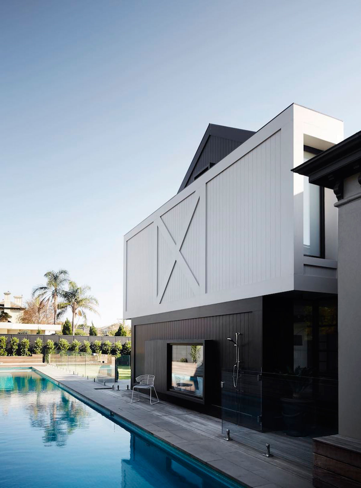
As liveable as it is lovely, Normanby House by Whiting Architects is a home built to impress. Set in the urban coastal environment of Brighton, Victoria, Whiting Architects adopted an ‘architectural’ approach to the interiors – a ‘process of discovery’. With an objective to not reveal everything at once, but rather offer glimpses as you work your way through and around a collection of box forms that have been inserted into the space. The boxes conceal, reveal & wrap load-bearing structure and storage.
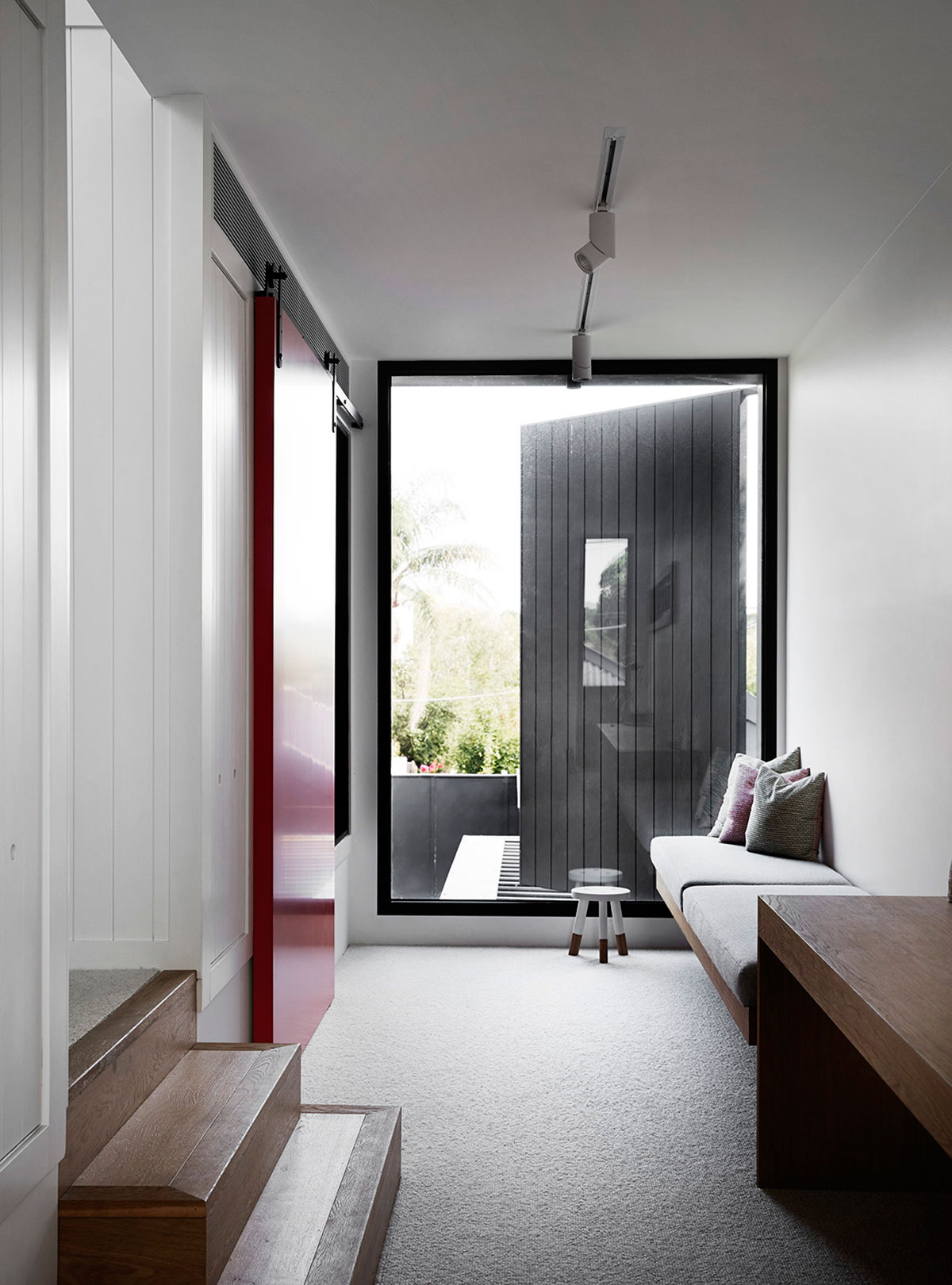
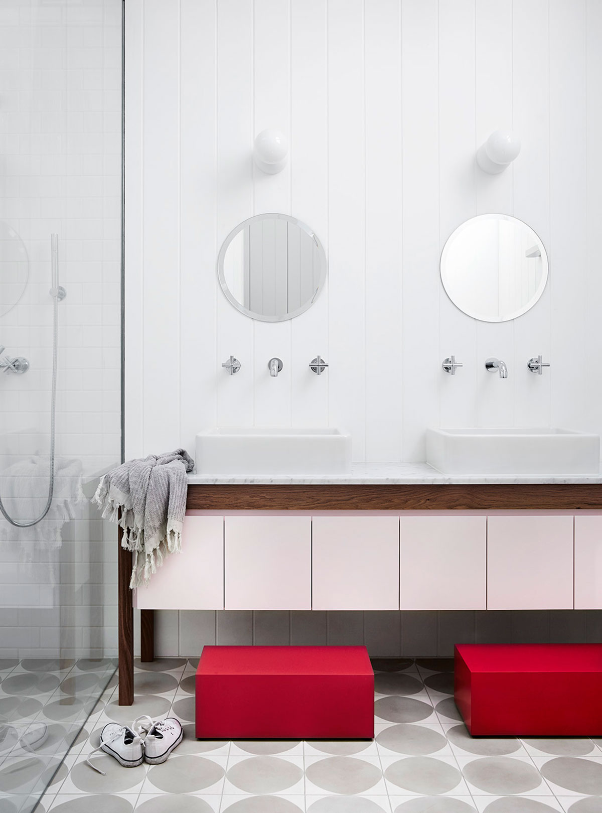
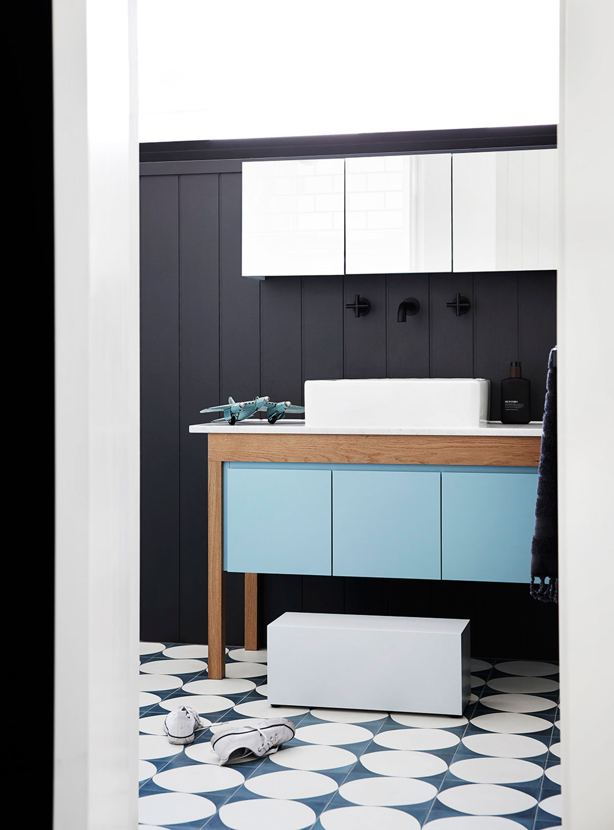
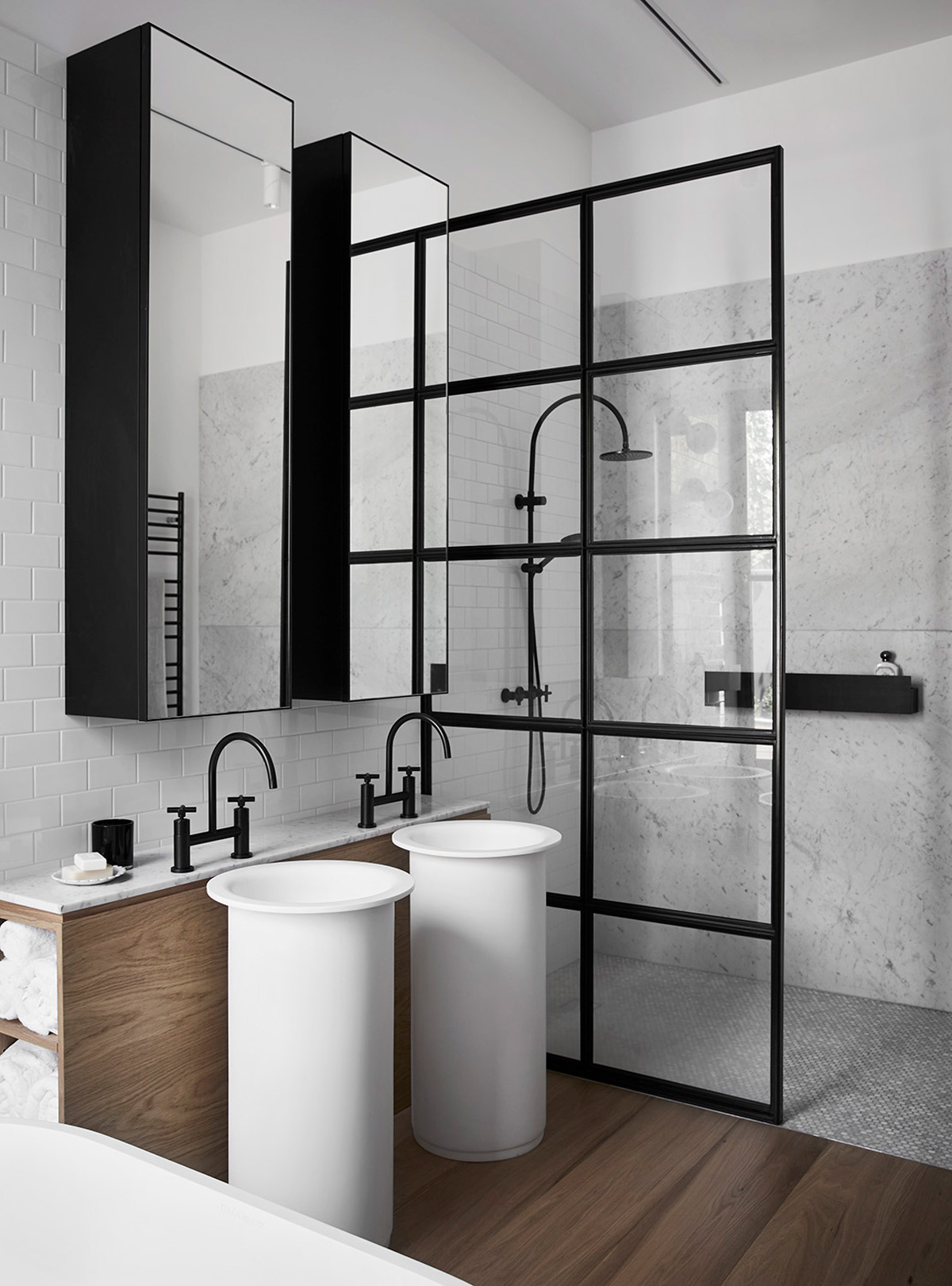
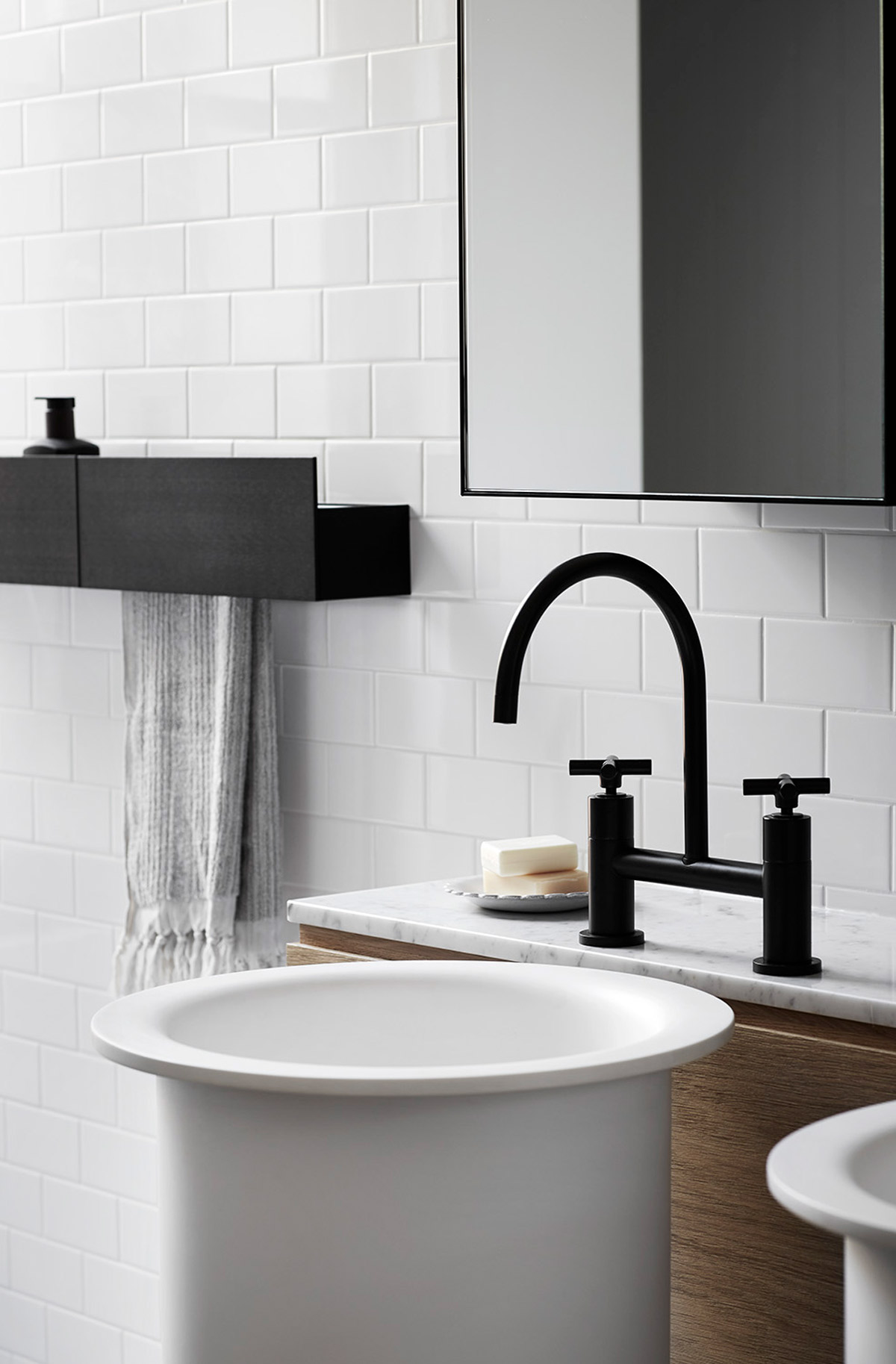
Colour is used cleverly, with unexpected pastel hues popping up to define and create interest. As a matter of fact, Whiting’s courageous use of colours is what made Normanby House take out the “Single Residential Interior” Category during the 2016 Dulux Colour Awards. The judges admired their use of pastel hues with natural materials and bold colours in all the right places. Take the aqua blue cabinet in the bathroom (painted with Dulux’s Ice Pack Quarter) with its wooden frame and marble bench top. The paint does a superb job at enhancing the natural material. “Using what typically could be a jarring combination of hues, this original palette subtly defines spaces within the home,” said the judging panel.
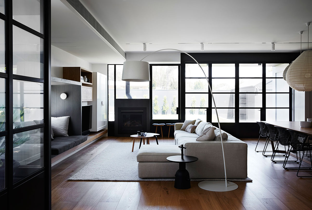
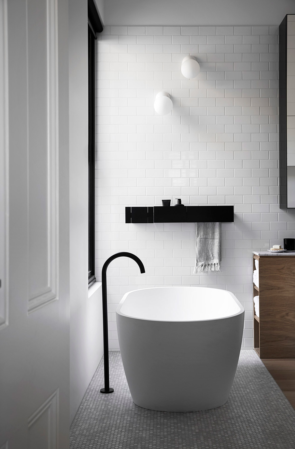
The integrity of the front four principal rooms were to remain whilst accommodating a refurbishment of the master suite to include an extensive walk-in robe and luxurious ensuite. The addition to the rear called for a new precinct to house living, dining and kitchen areas on the ground floor and children’s bedrooms and a playroom on the first floor.
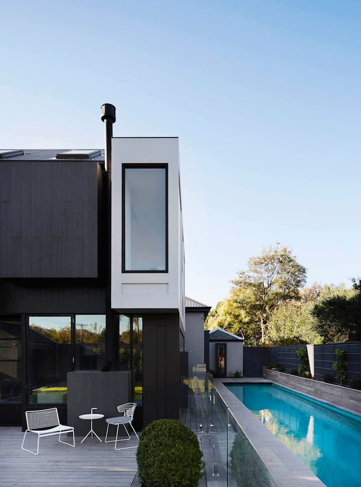
Maintaining the integrity of the existing grand Victorian dwelling was an important design consideration. The brief was given so that the project should not look as if it were being devoured by the new addition, nor should the architects pretend that nothing new has taken place. The architects chose to separate new from old with a clear 1.2m wide gap giving a clear delineation point.
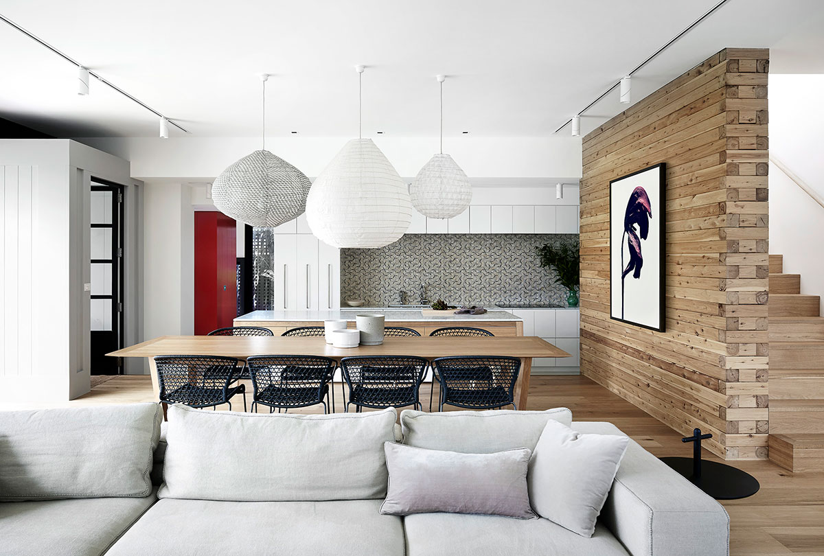
The new addition is a ‘complimentary opposite’, relating to the existing building through height, scale and proportion. It requires a sense of belonging without replicating. Defined precincts for children and adults maintain a uniform style and good vision lines connect the family. Long gestures were created to accentuate a quality of space and create focal points.
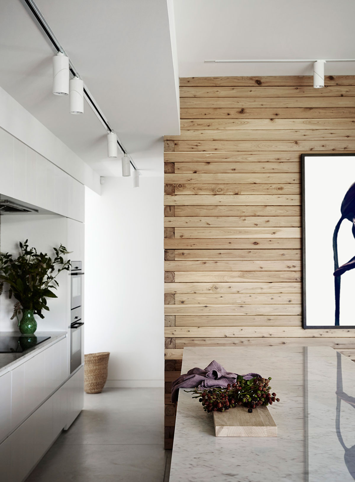
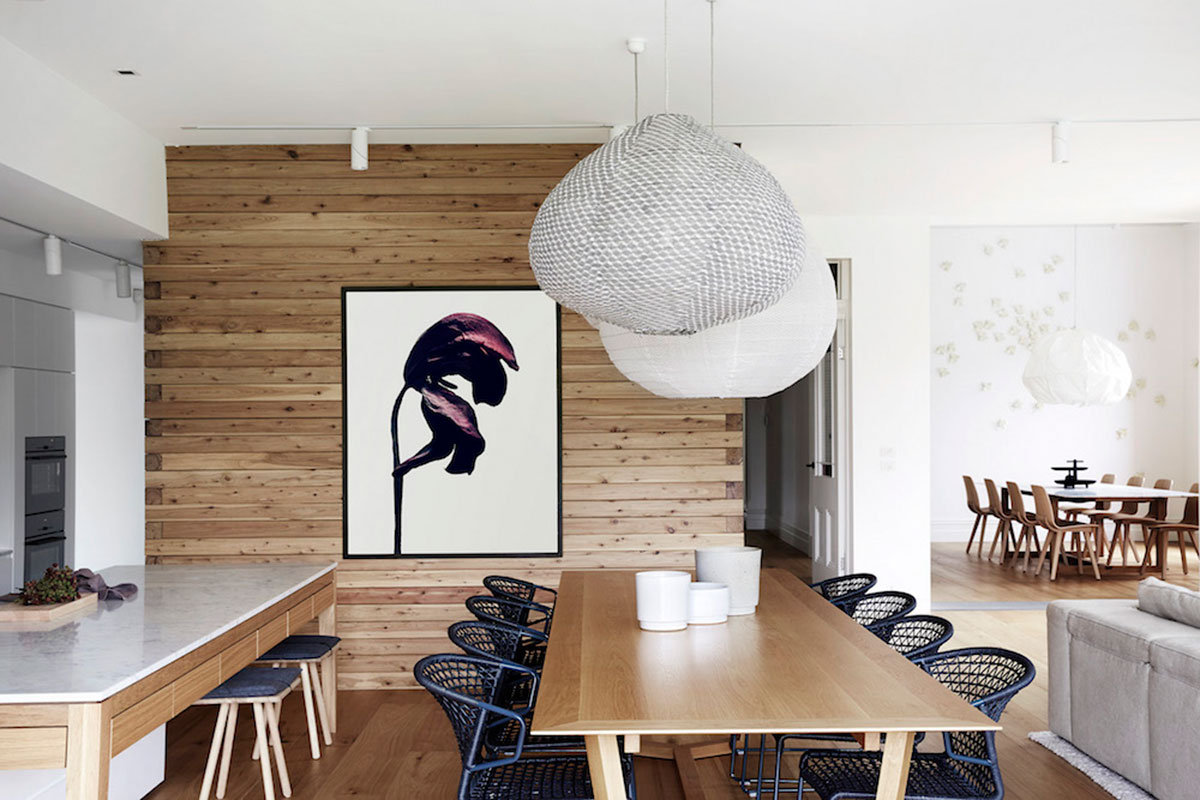
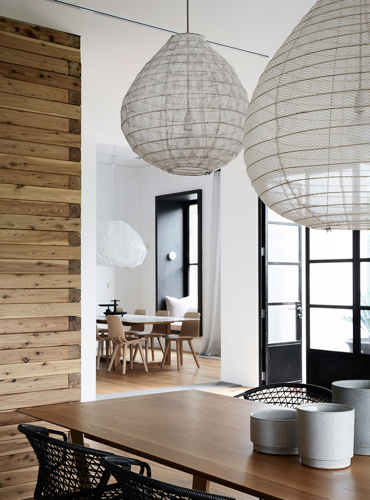
The architects have encouraged differing qualities of space from small and intimate to high, pitched volumes. It is fitted with the right amount of custom made and procured joinery and furniture. Everything is considered and designed.
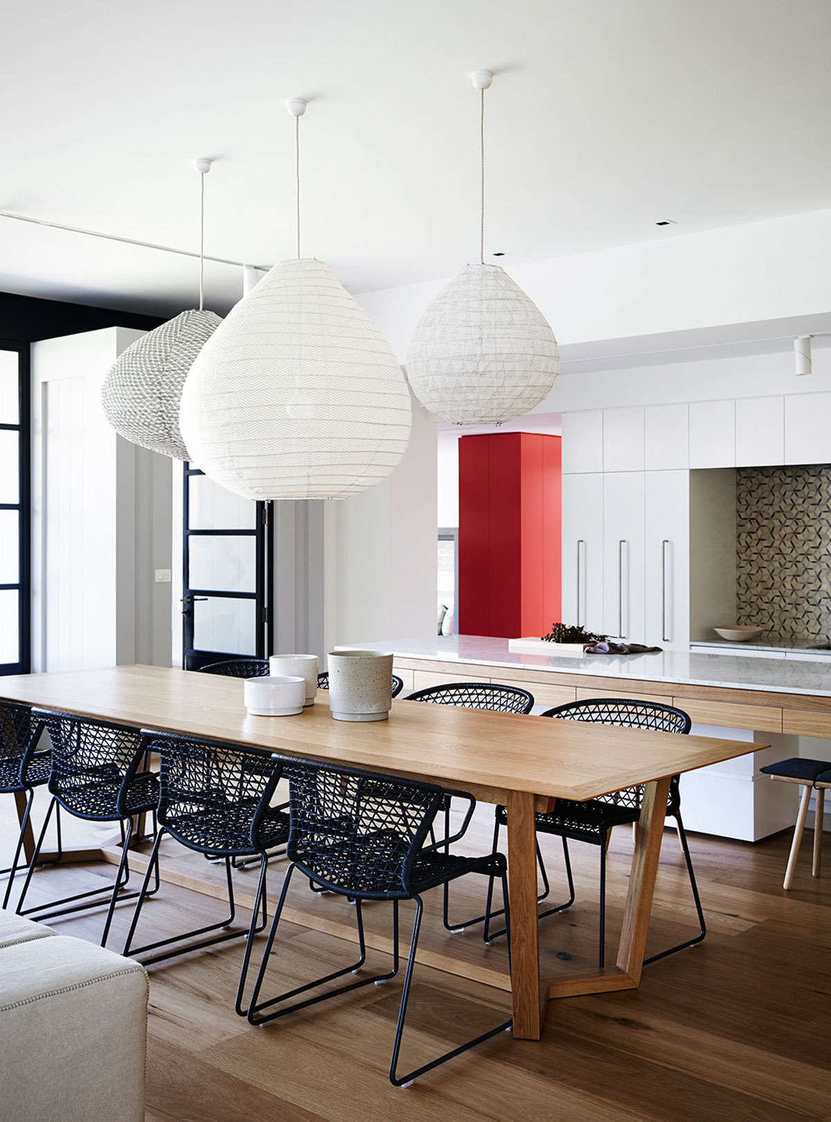
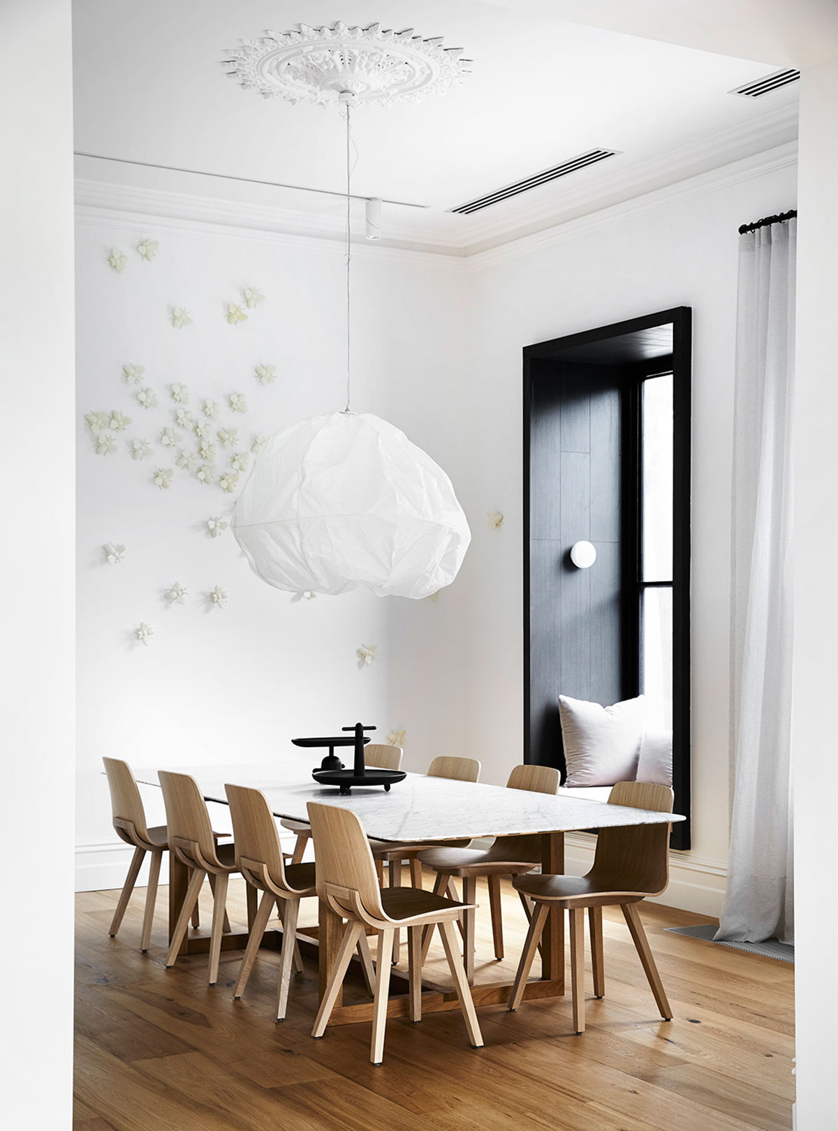
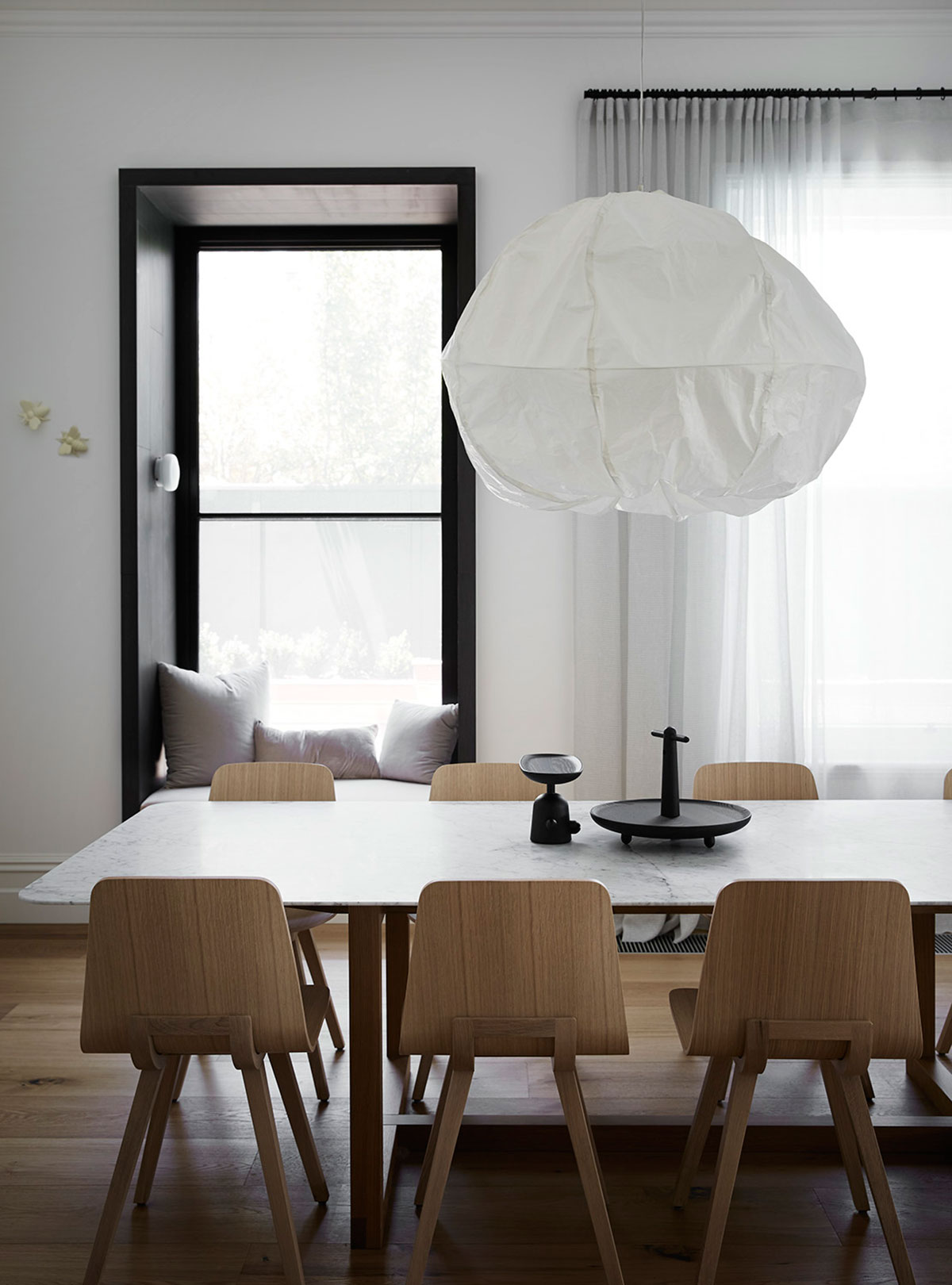
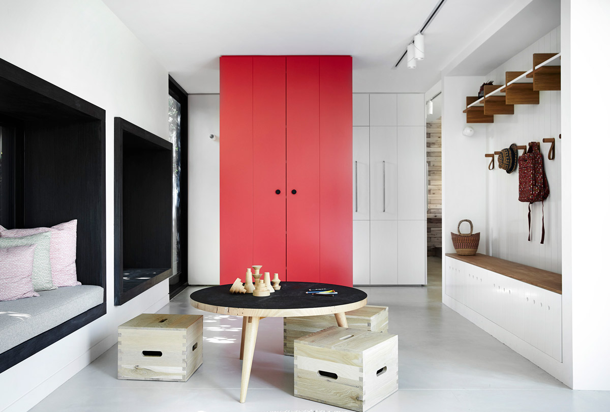
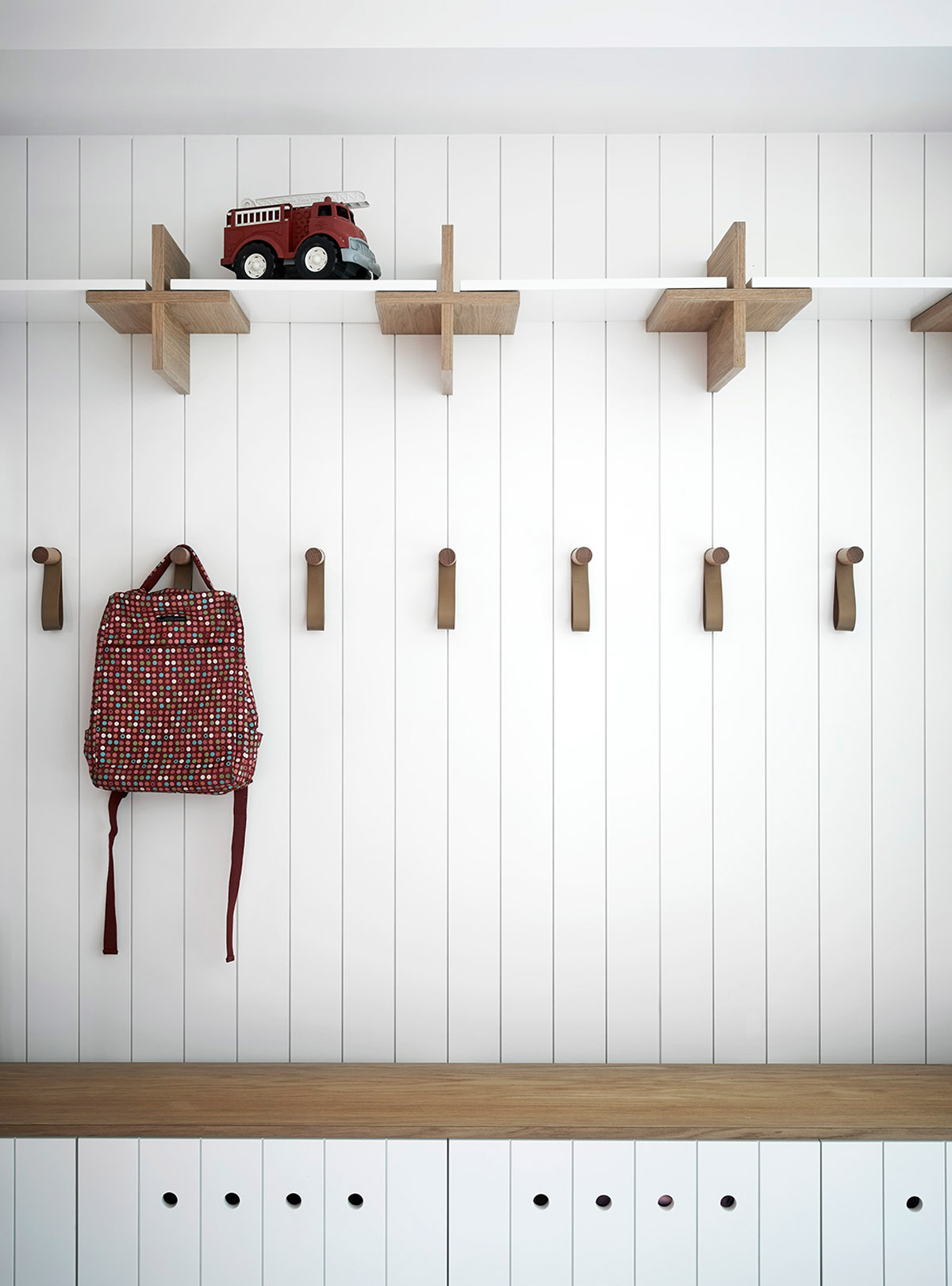
This house never runs out of playful details; from the hard-wearing felt upholstery, red stepping blocks in the bathroom for the kiddiewinks, wooden crates that serve as chairs, eye-catching geometric tiles, kid-sized storage solutions, to the crumpled cloud-like pendant lamp above the dining table… And whilst we’re in the dining room, did you noticed the 3D creatures climbing the wall? It’s actually a swarm of honeybees! Yup, you’d better bee-lieve it (see what I did there? Very punny). This house is the bee’s knees.
Reflecting the youthfulness of the growing family who are lucky enough to call this their home, Normanby House can be likened to a kid-friendly playground that boasts plenty sophistication at the same time. A surprise at every corner awaits, this is a family home that artfully caters to everyone’s needs.
Photography by Sharyn Cairns.


