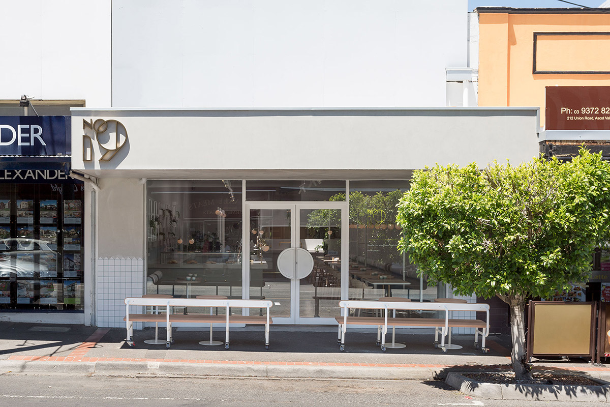
Melbourne’s love affair with lattes is stronger than ever. Part of our city’s energetic vibe is compelled by the presence of cafés of all shapes and sizes that line the busy shopping strips of every neighbourhood. One of these is No. 19, a dainty eatery that sits north of the river in Ascot Vale. Owned by husband and wife duo Domenic and Diana Caruso, this is the second café under their belt, helping to contribute to Melbourne’s much-loved café culture.
After the success of their first café, St. Rose in Essendon, the duo sought the help of Melbourne-based creative studio Biasol to create a second venue that was both welcoming and casual, but sophisticated at the same time. The result is this 1950’s deli-inspired space that serves up healthy food, good old smoothies, and Five Senses coffee.
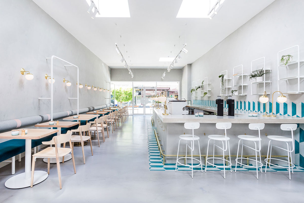
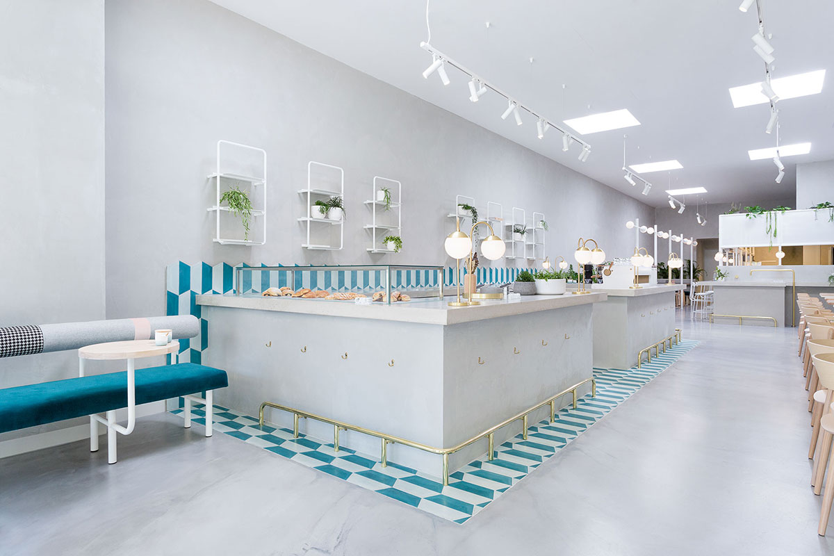
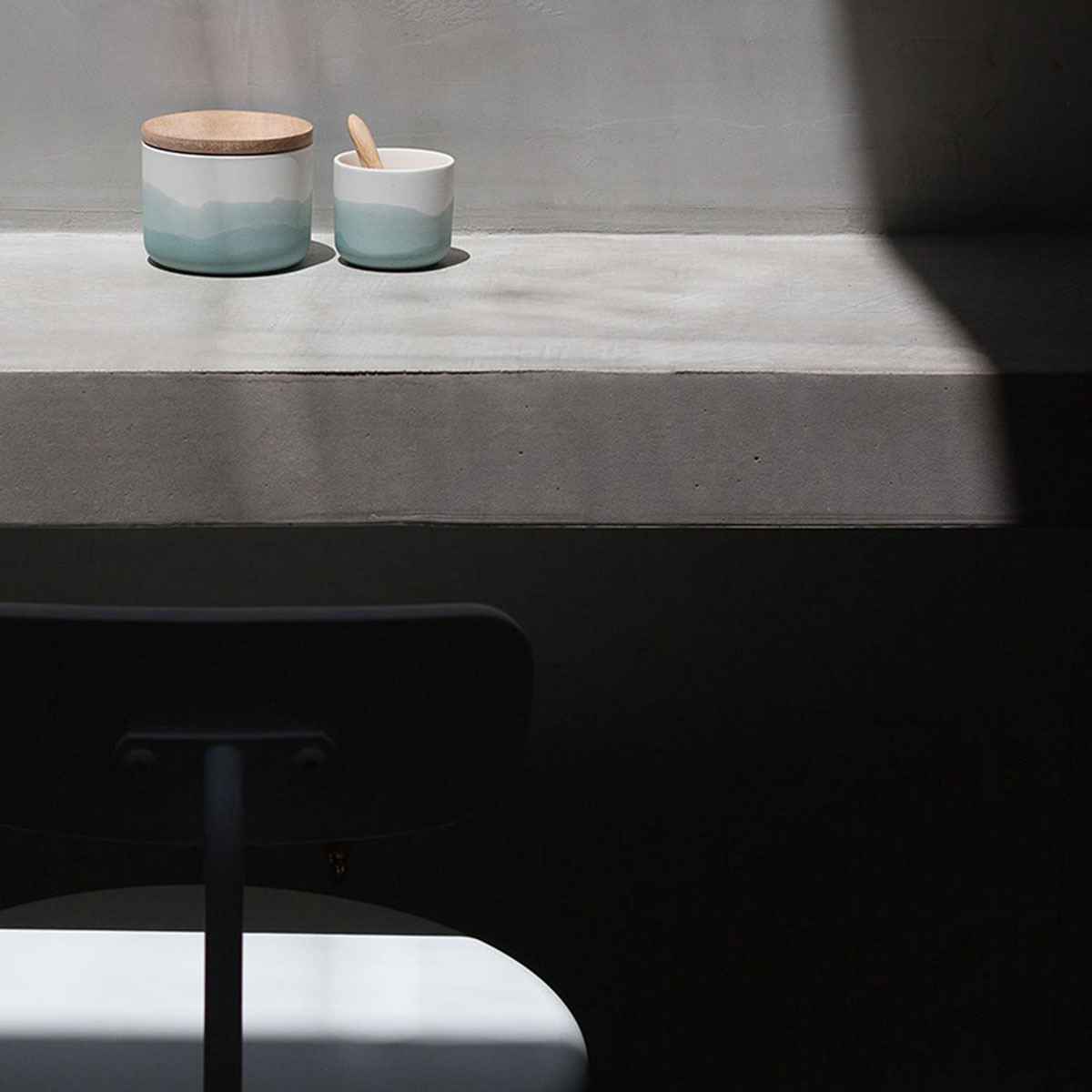
According to Biasol, the design was inspired by the Greek delicatessens that blossomed in Melbourne in the late 1950s. Featuring high ceilings and natural light, the interiors are predominately concrete with accents of brass and elegant furniture detailing.
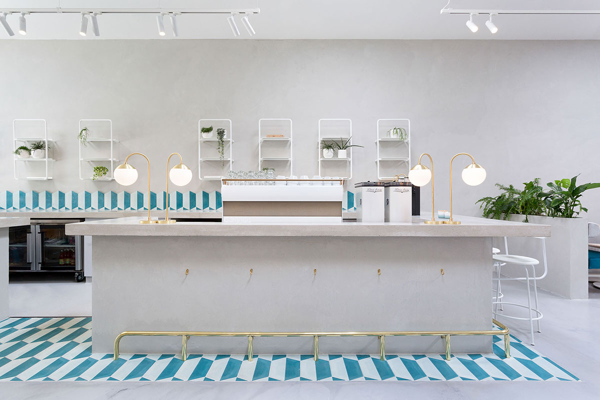
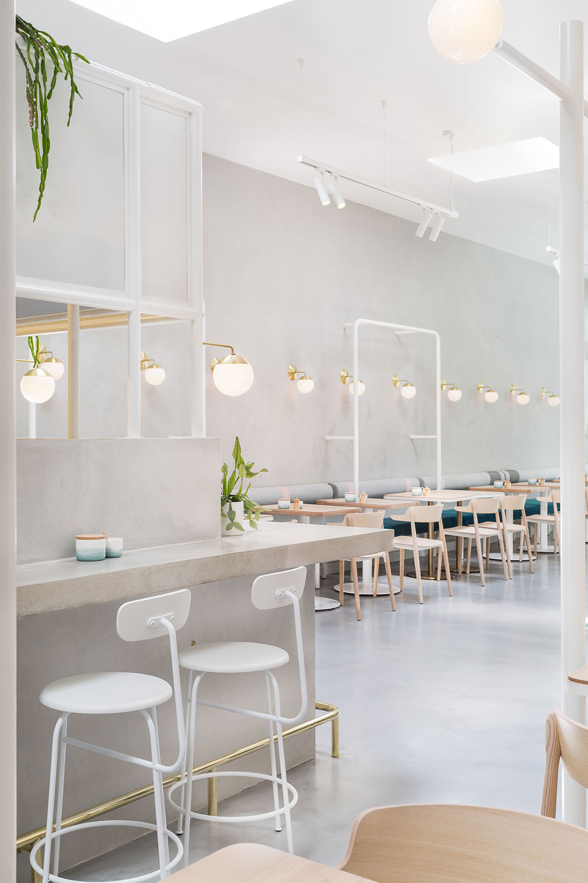
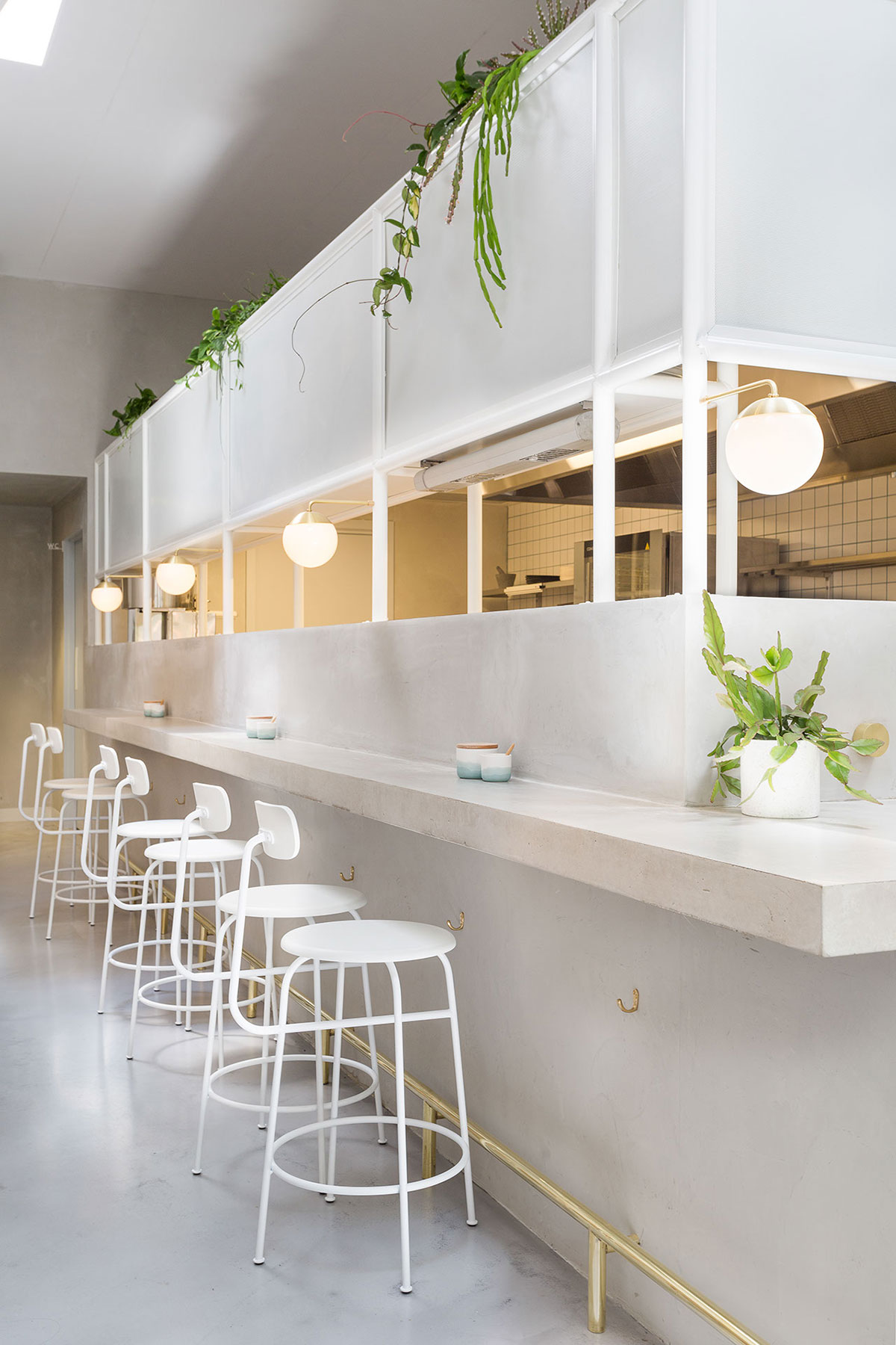
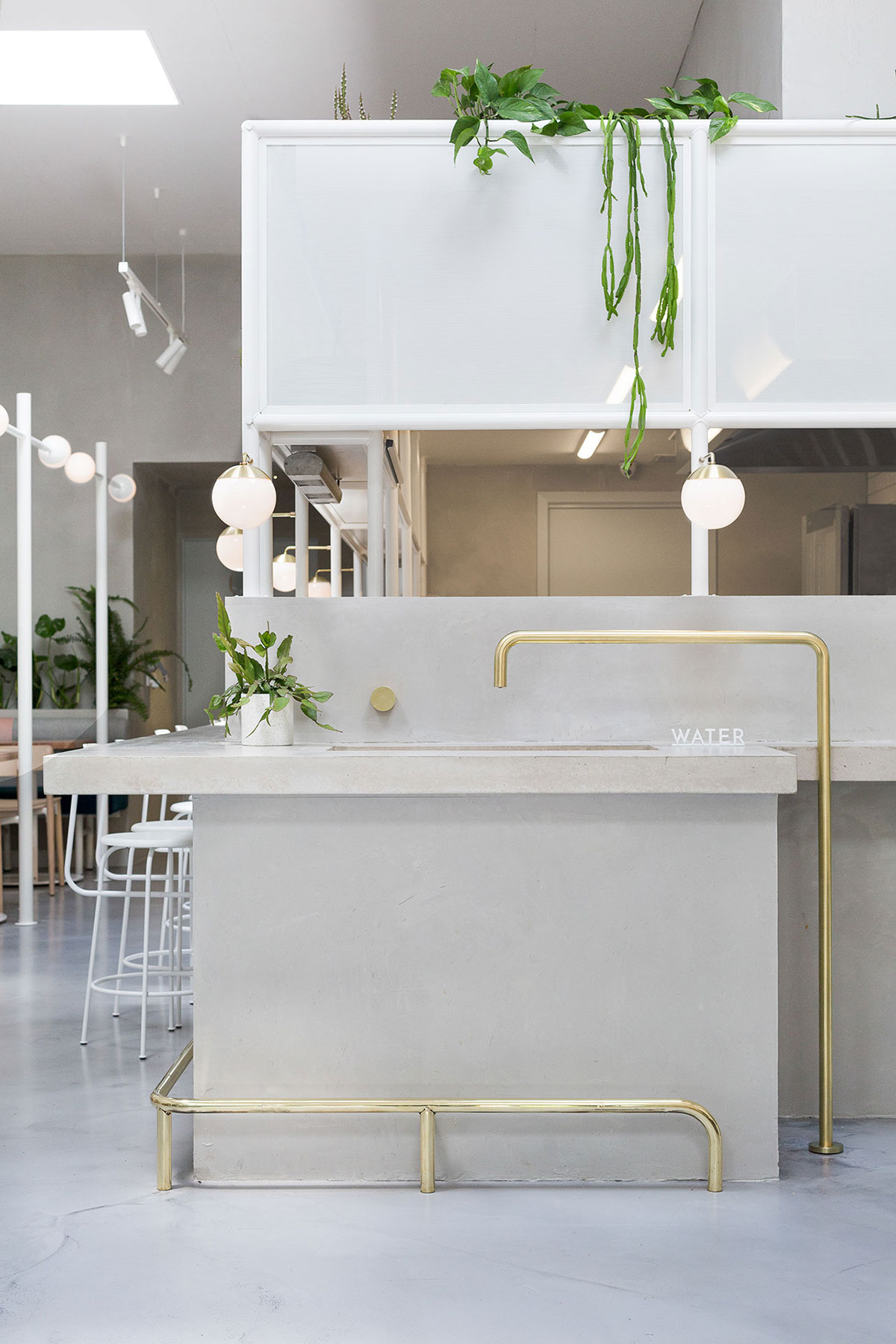
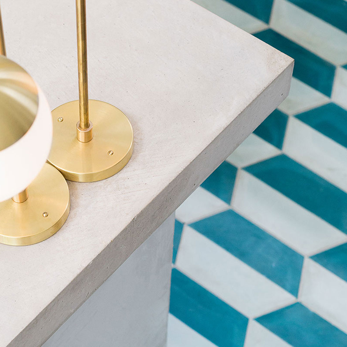
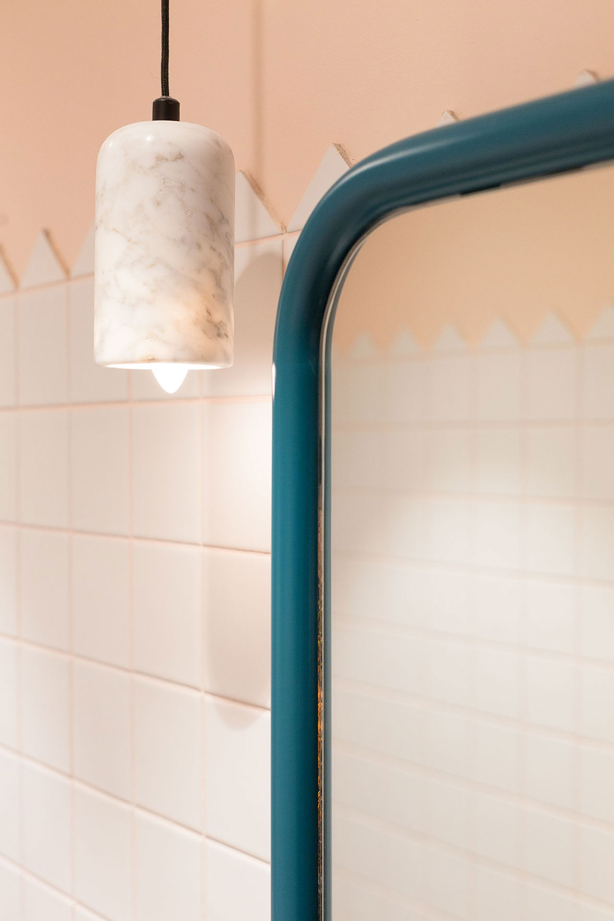
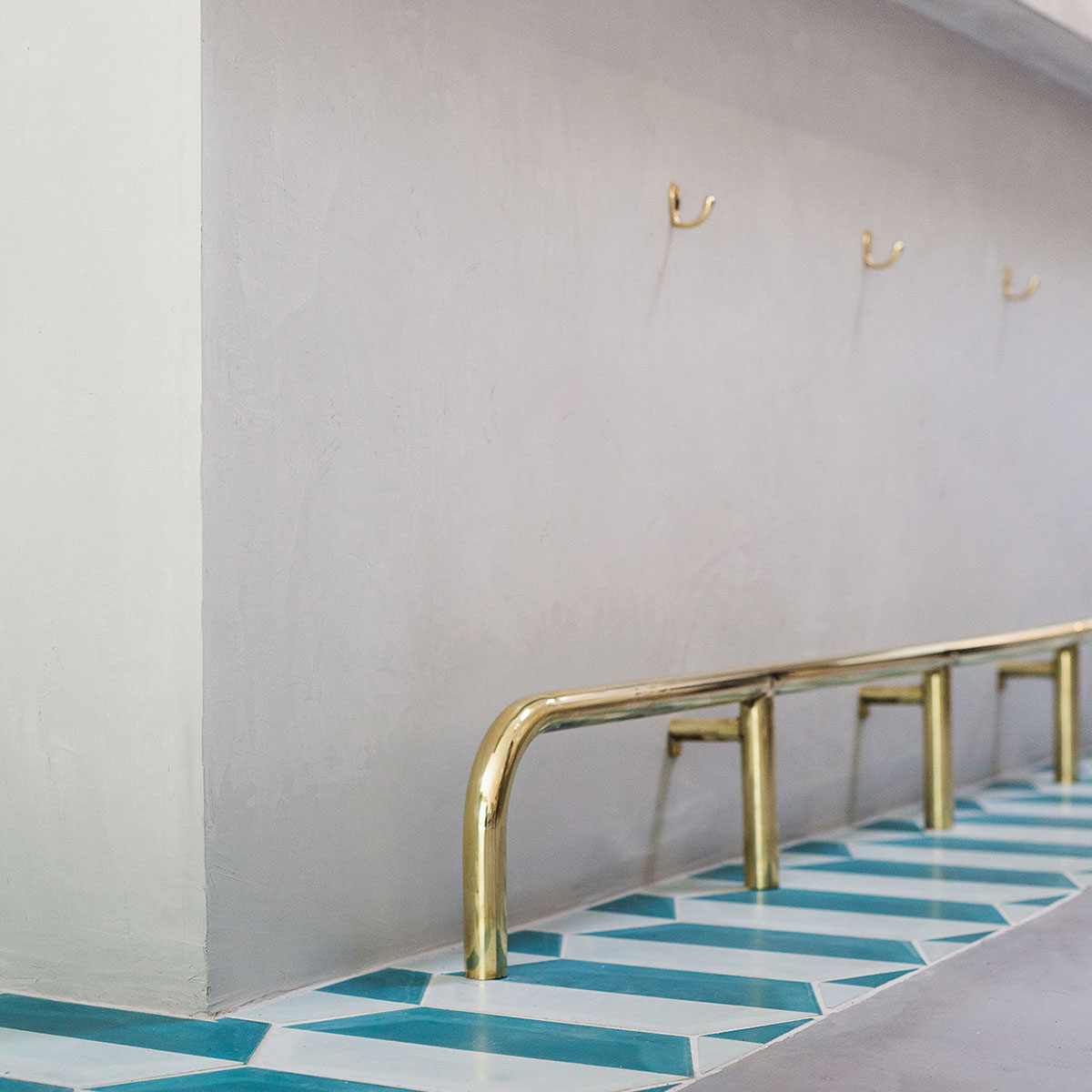
At the heart of the space, a concrete service counter is accented with beautiful hand-painted green and teal tiles from Morocco that trace along the splashback and wrap around the front of the bar. Warm brass elements – arching custom-designed countertop lamps and a slender foot rail – reinforce the venue’s refined aesthetic. Behind the bar, display shelving made from white tubular steel hosts pockets of greenery from Loose Leaf.
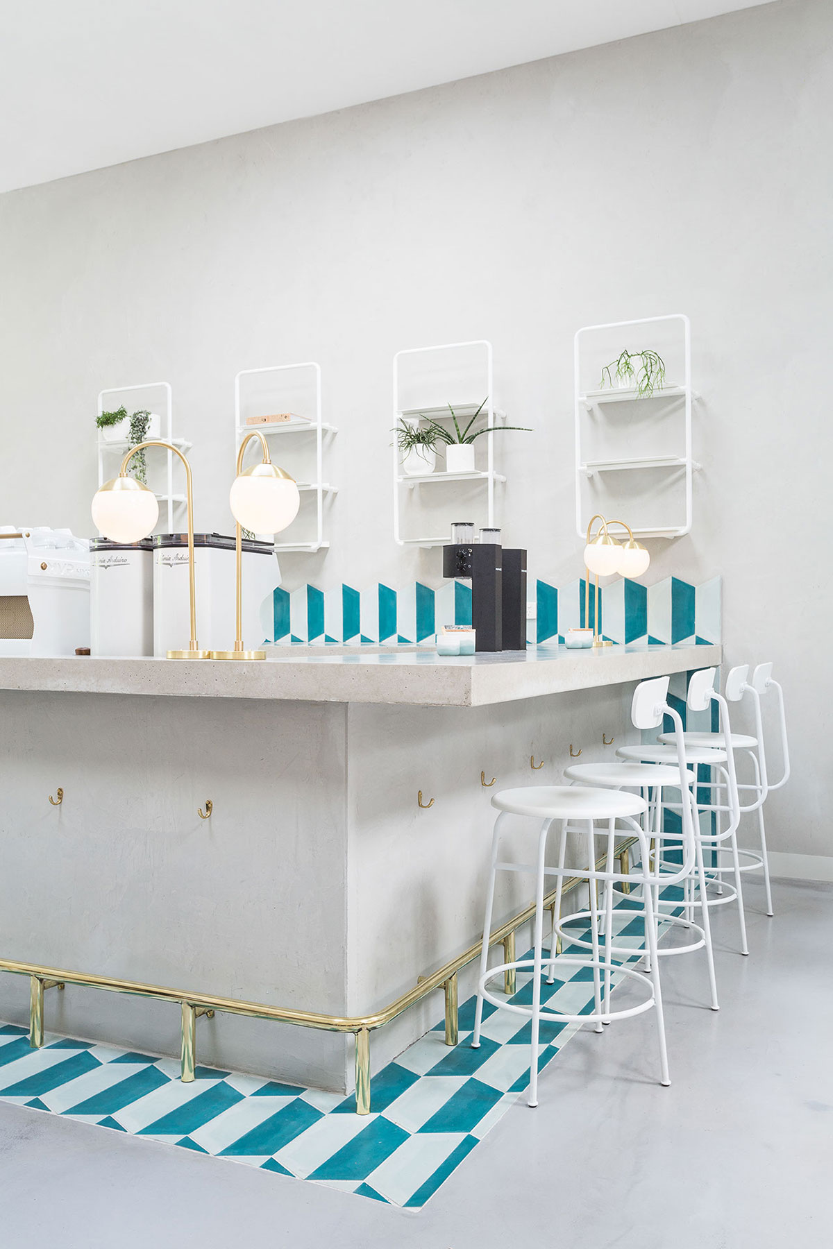
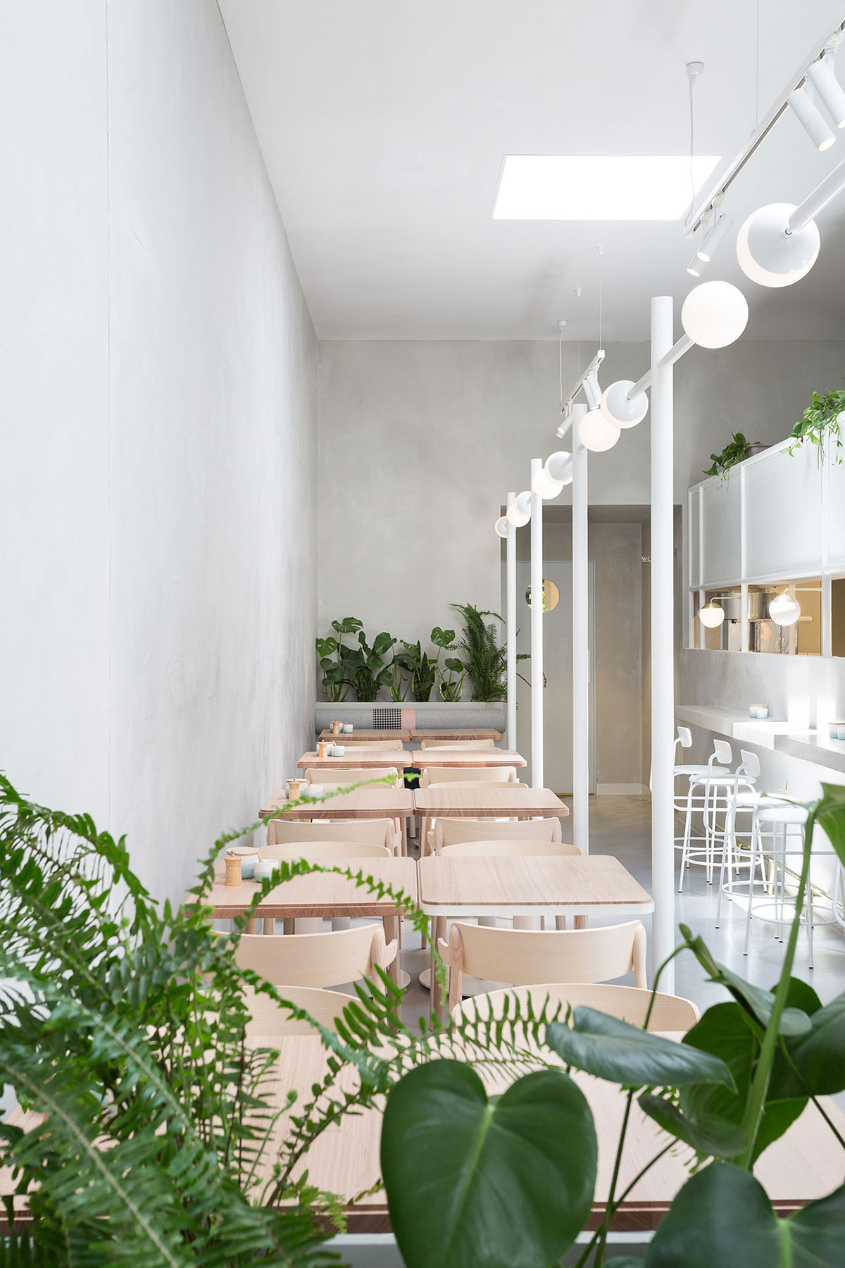
With the 4.5-meter ceilings and skylights that flood the interiors with natural lighting, it’s easy to get started on the architectural scheme. The rectangular footprint also spurred endless layout possibilities that will further enhance the space.
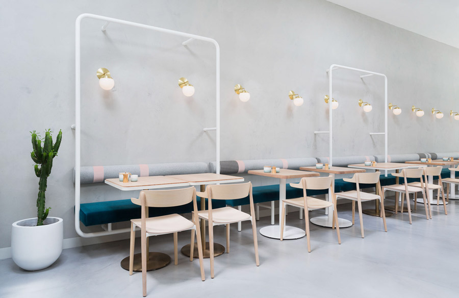
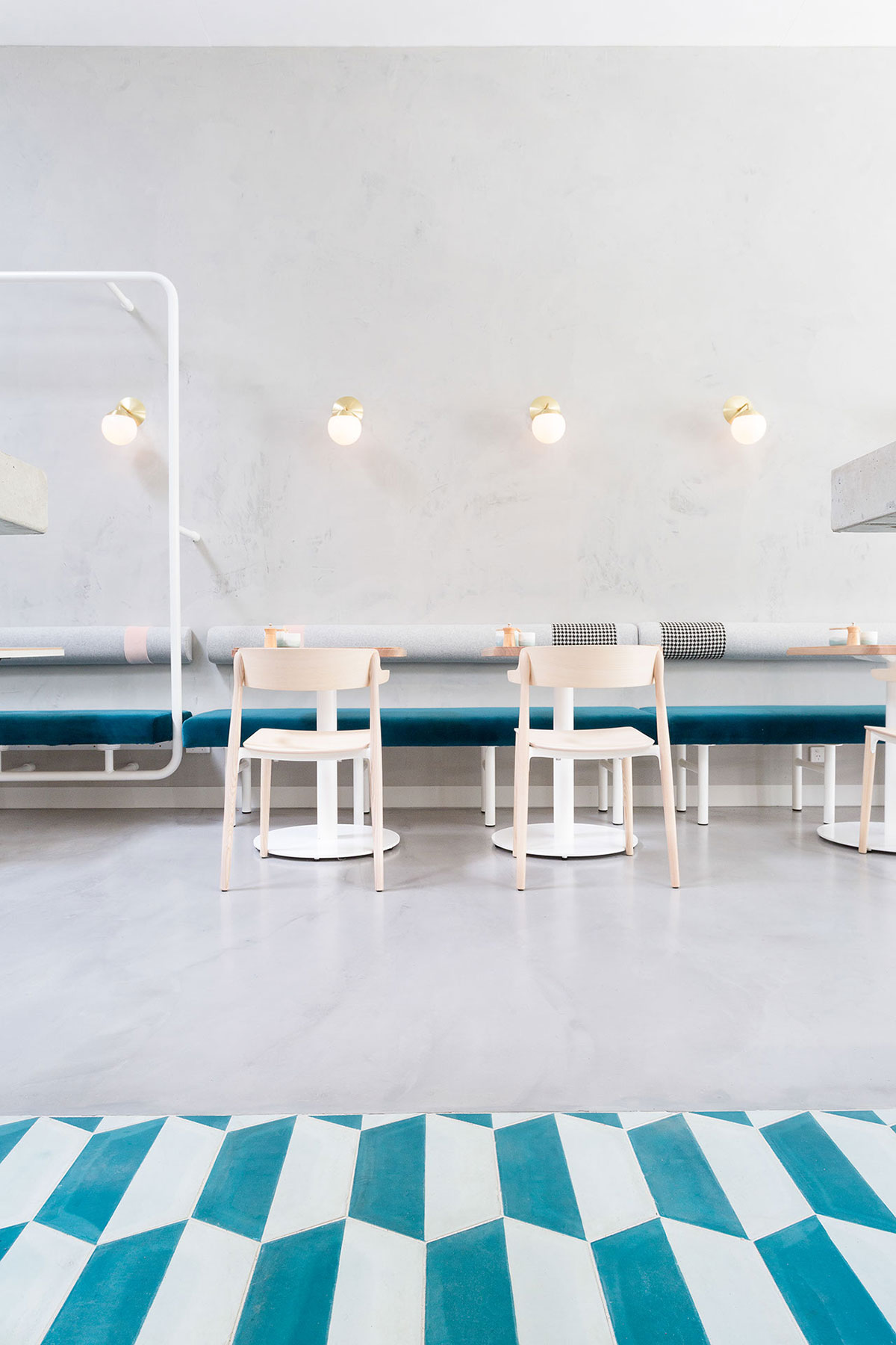
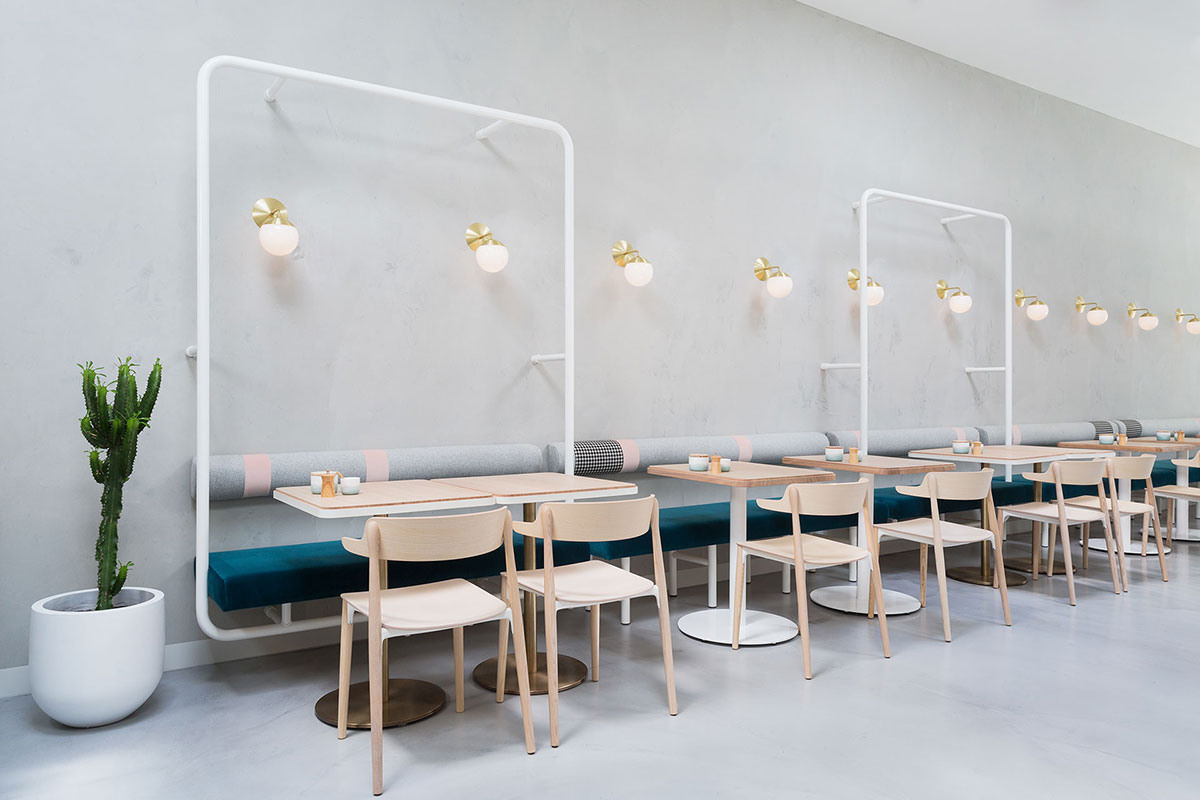
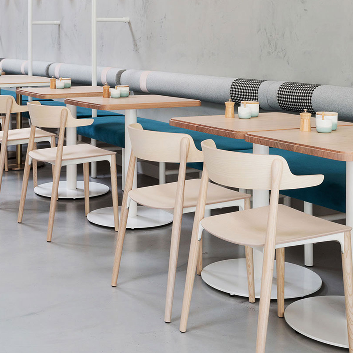
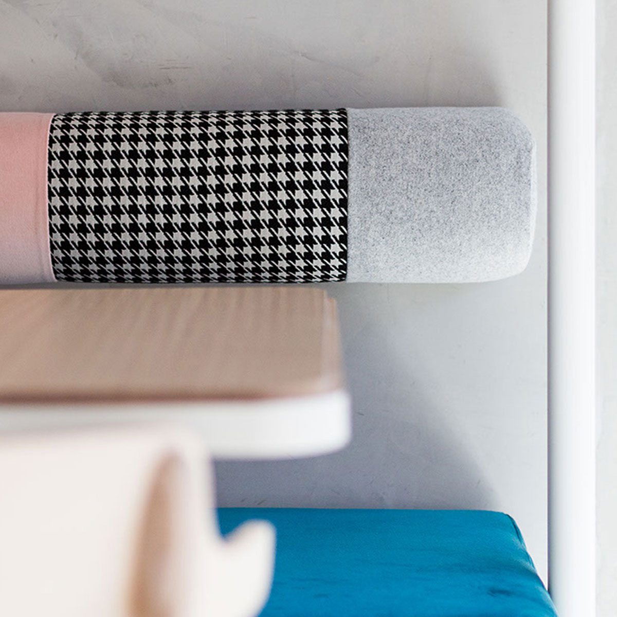
Timber-topped tables with banquette seating and Pedrali chairs run the length of the space. At intervals, lightweight steel framing with in-built lighting becomes a sculptural element, providing a sense of intimacy without breaking up the café’s openness. Upholstery enhances the pared-back mood of the space – a lush teal for the banquette and a composition of grey, pink and classic houndstooth for the wall-mounted bolster.
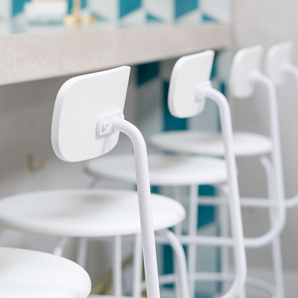
For the best seat in the house, walk towards the rear of the space where the semi-open kitchen is. You’ll find Afternoon high stools from Menu spotting the concrete tabletop, the perfect possie for a spot of people watching if you ask us!
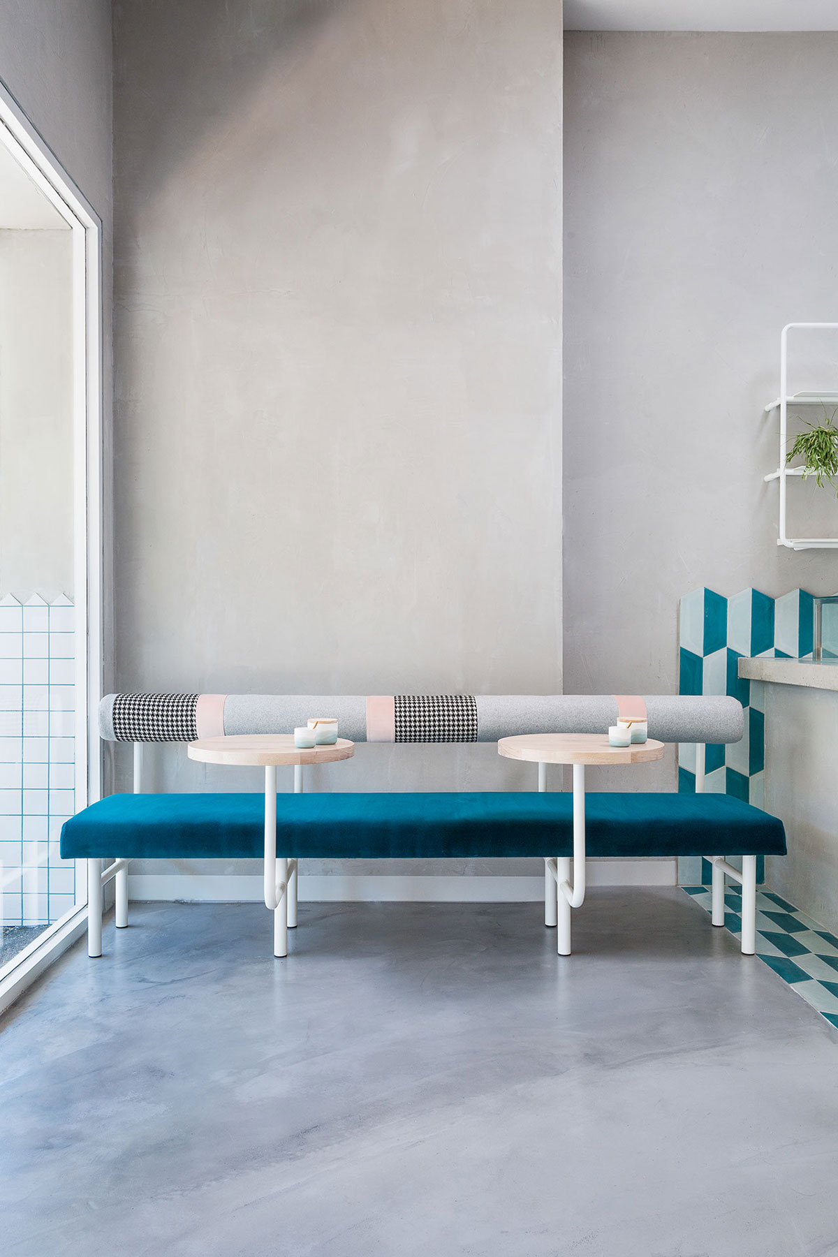
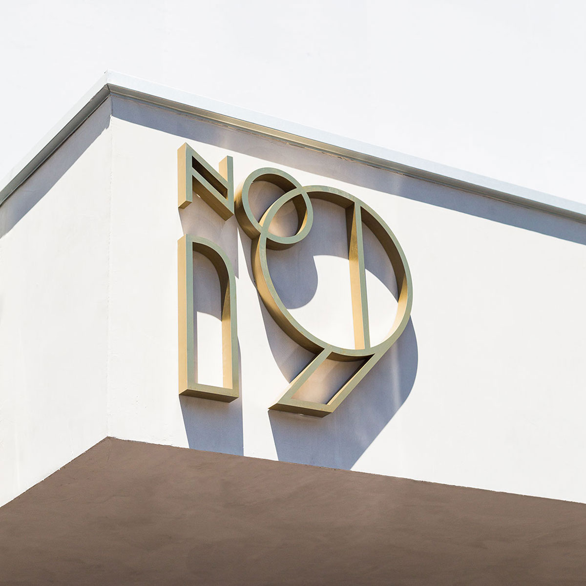
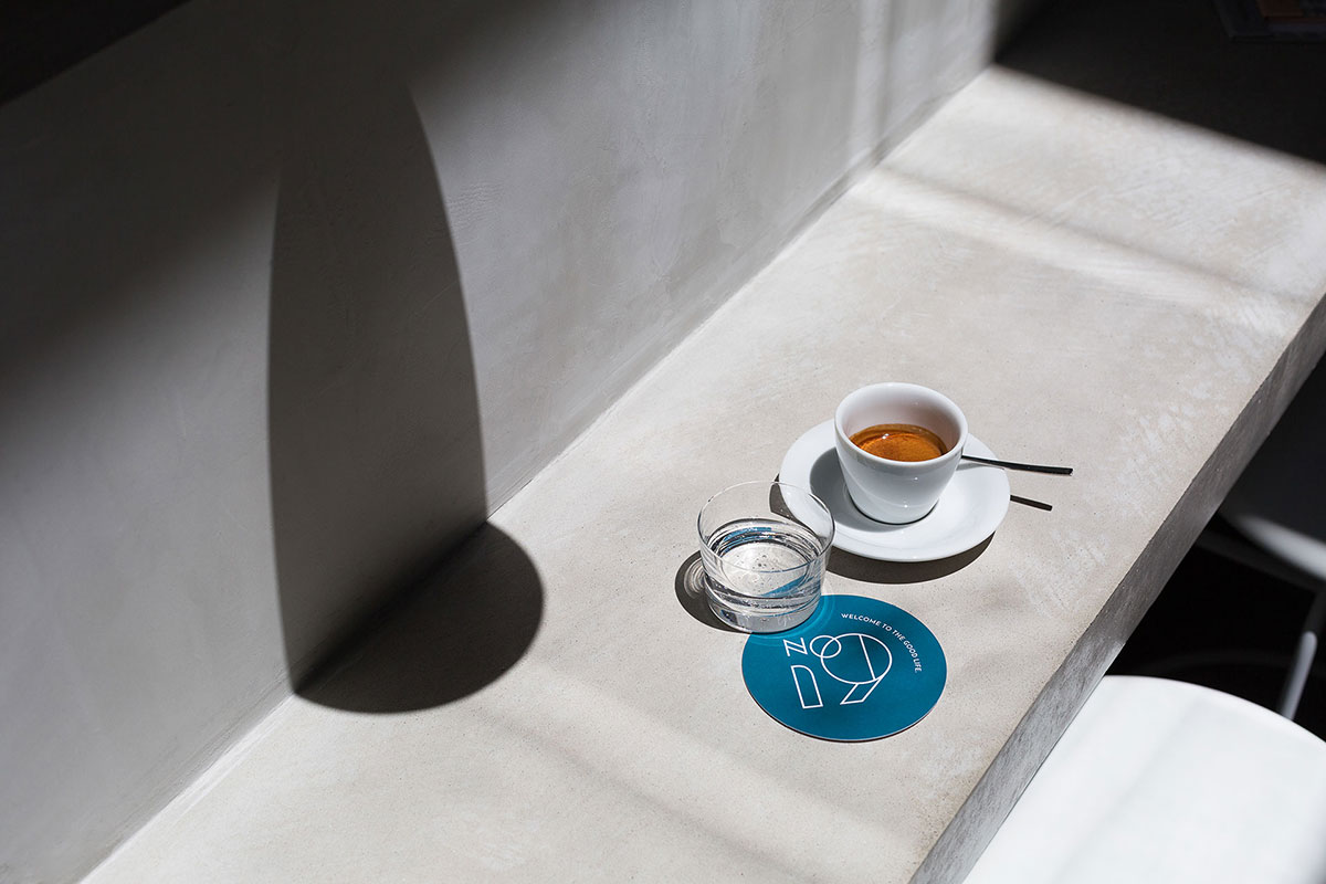
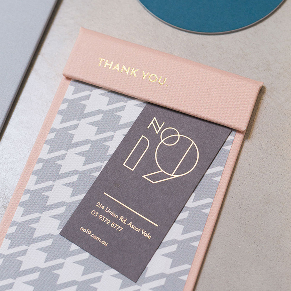
Another important part of the brief was to develop a strong connection between the interior design and the brand itself. Every element has been carefully considered, right down to the minute details – the menu, coasters, crockery, furniture, and even the deli paper.
It’s all about keeping a light and bright palette to maintain the sunny and vibrant mood they want to portray. Concrete benches and marble floors contribute to the overall simplicity of the place, while the golden steelworks, brass lamps, and playful upholstery perk up the place.
The clients believe that keeping a solid connection between all the restuarant components is what will give their customers a pleasant and truly memorable dining experience and Biasol’s careful curation of the elements has truly made this vision a reality.

Photography by Ari Hatzis.


