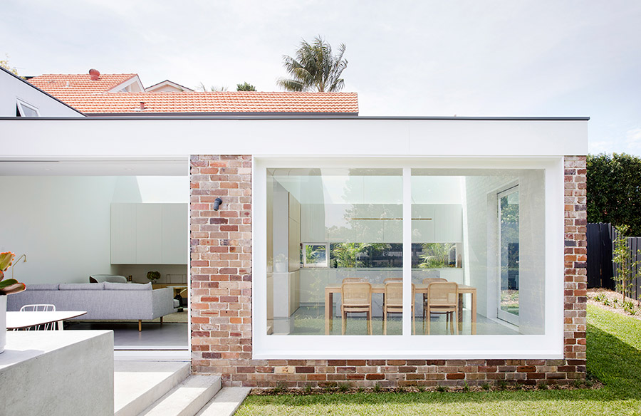
How can a nine square metre renovation possibly make a huge difference in the overall form and function of the entire house? The upgrade done on Nat’s House located in Cammeray, Sydney was to solve the dilemma posed by poorly lit interior, the separation of living spaces and garden, and some outdated cosmetic style from the existing structure. Designed by Studio Prineas, the solution was to capture the sunlight and minimise the overshadowing of a garden, along with some interior aesthetic upgrades.
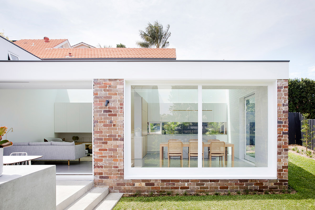
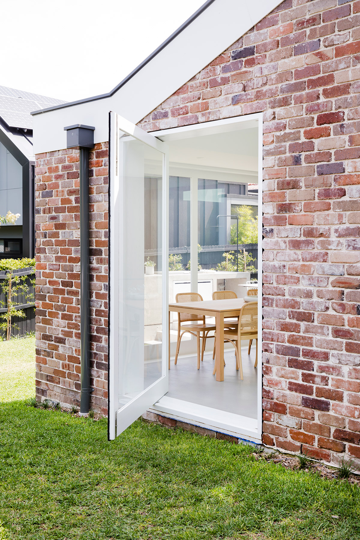
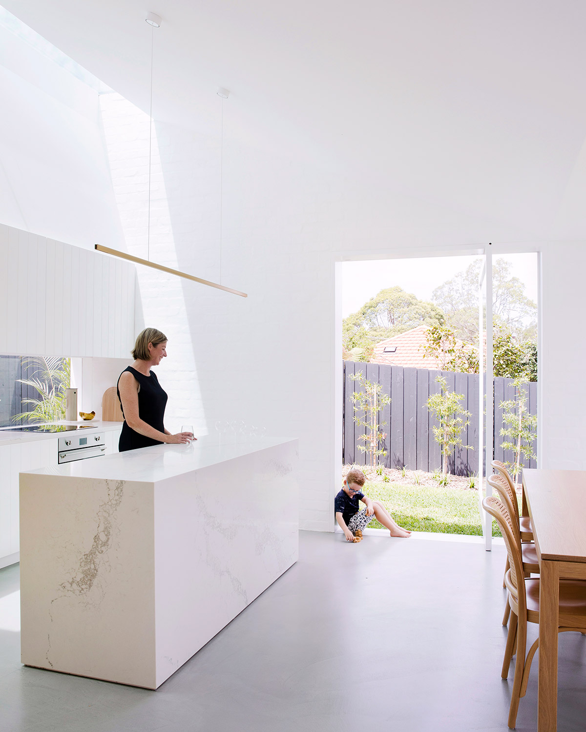
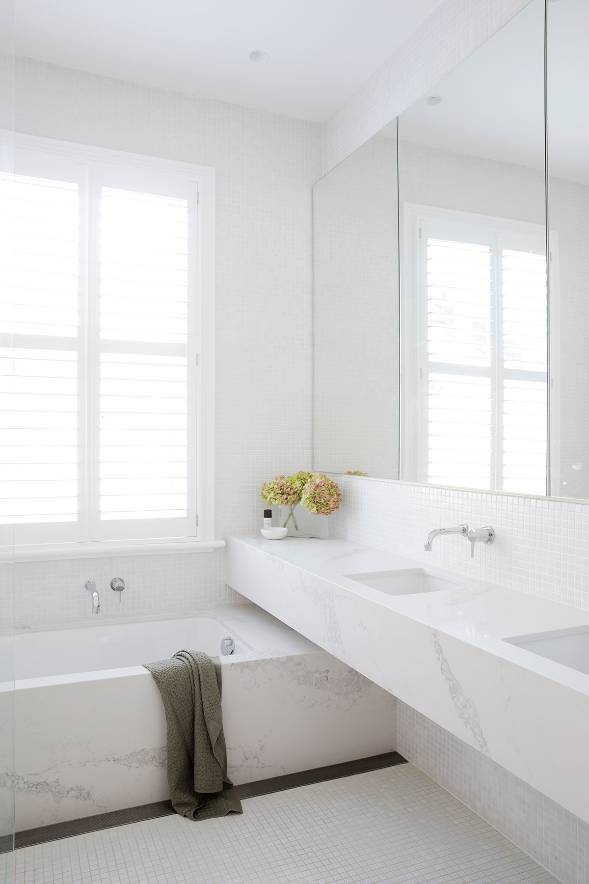
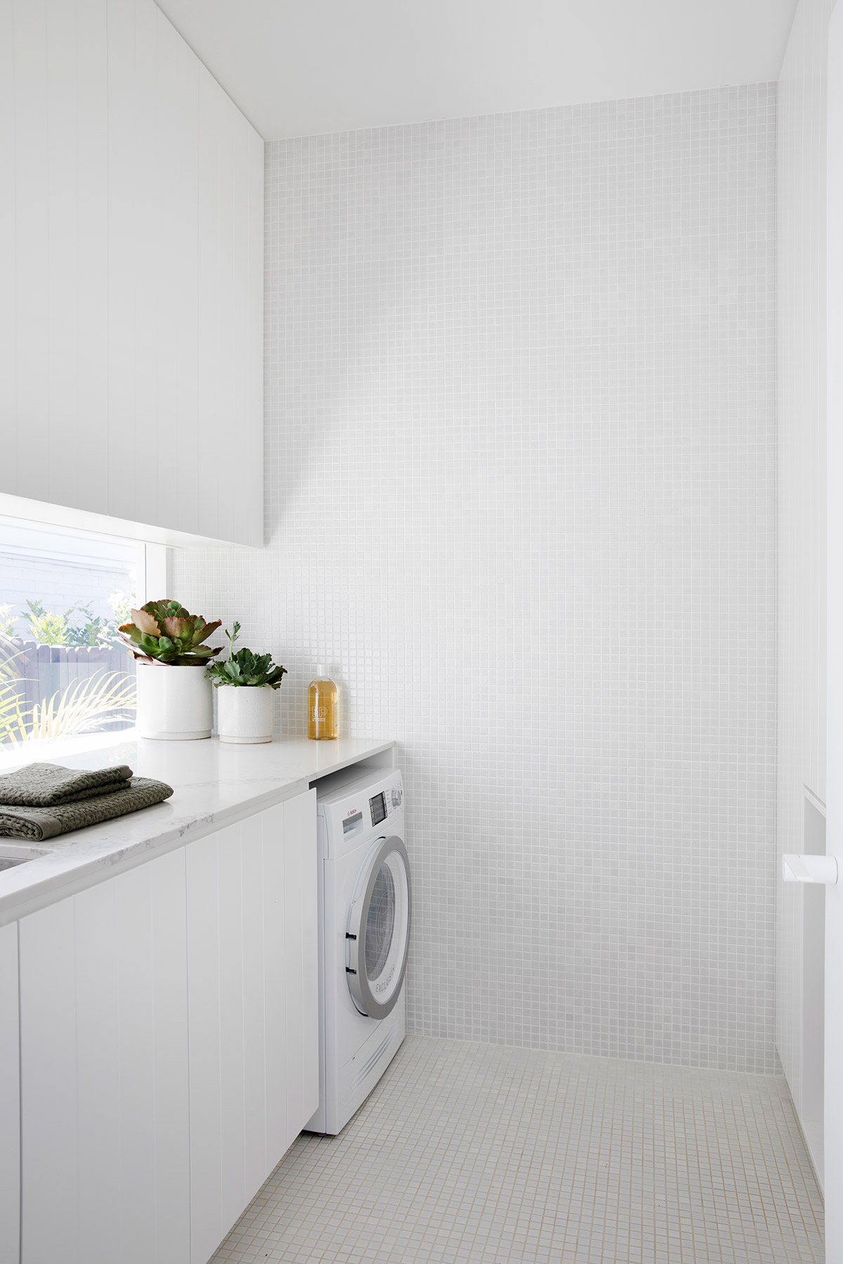
According to principal Eva-Marie Prineas, the clients prioritised high quality over extra space and multiple bathrooms. They also wanted to create a strong indoor-outdoor connection and improve the existing rear extension, which accommodated the kitchen, dining and family rooms, laundry and second bathroom. The space was configured in a way where the rooms could be interconnected while at the same time have their own defined area.
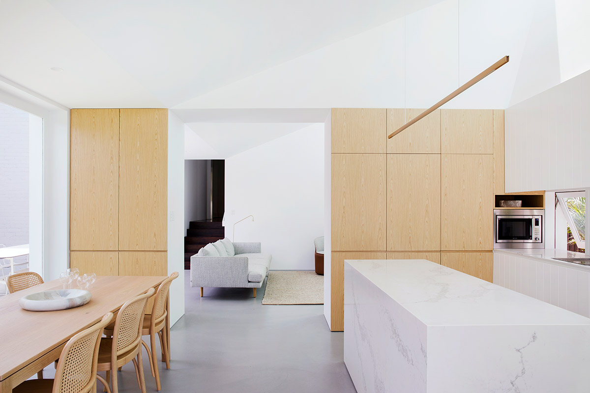
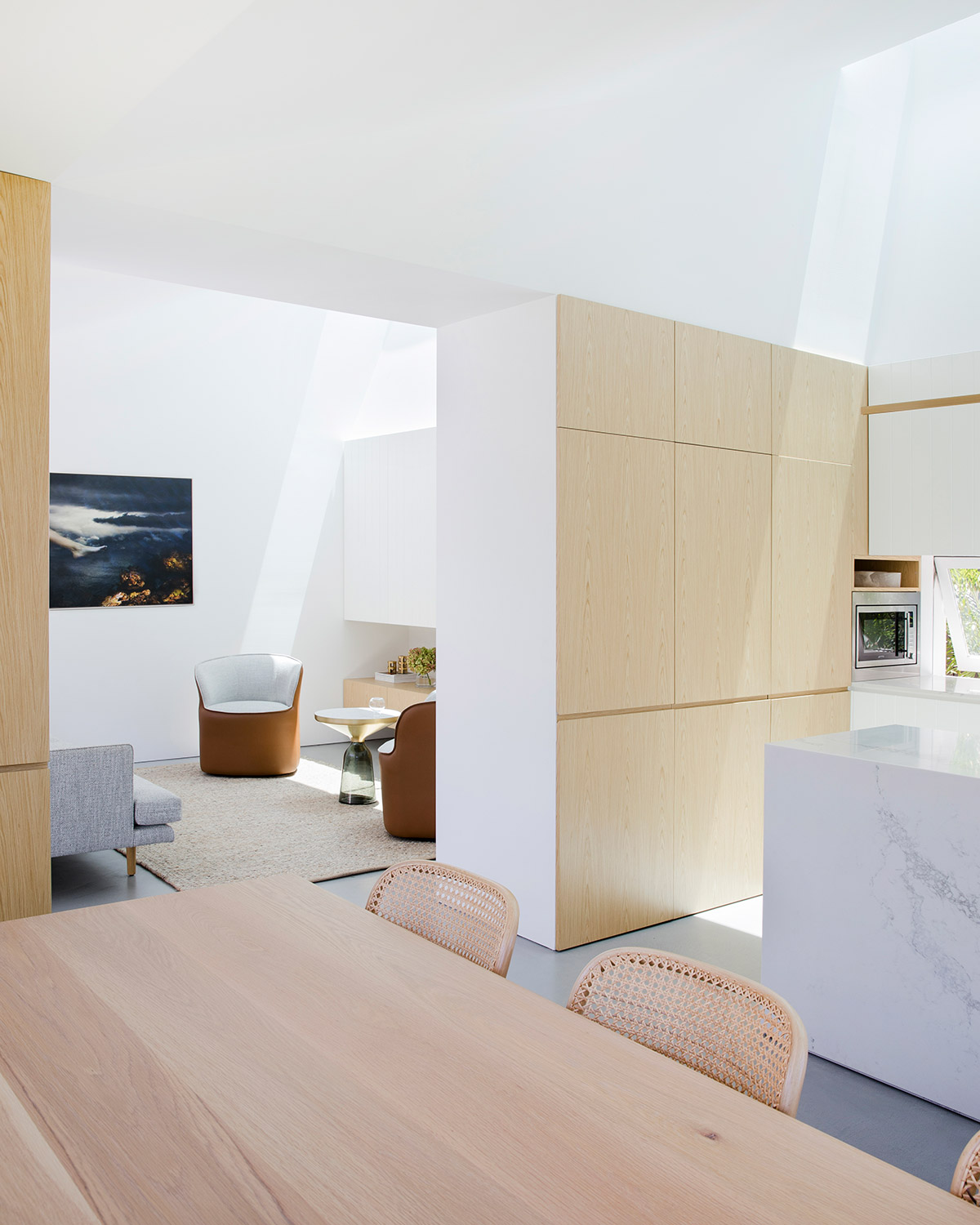
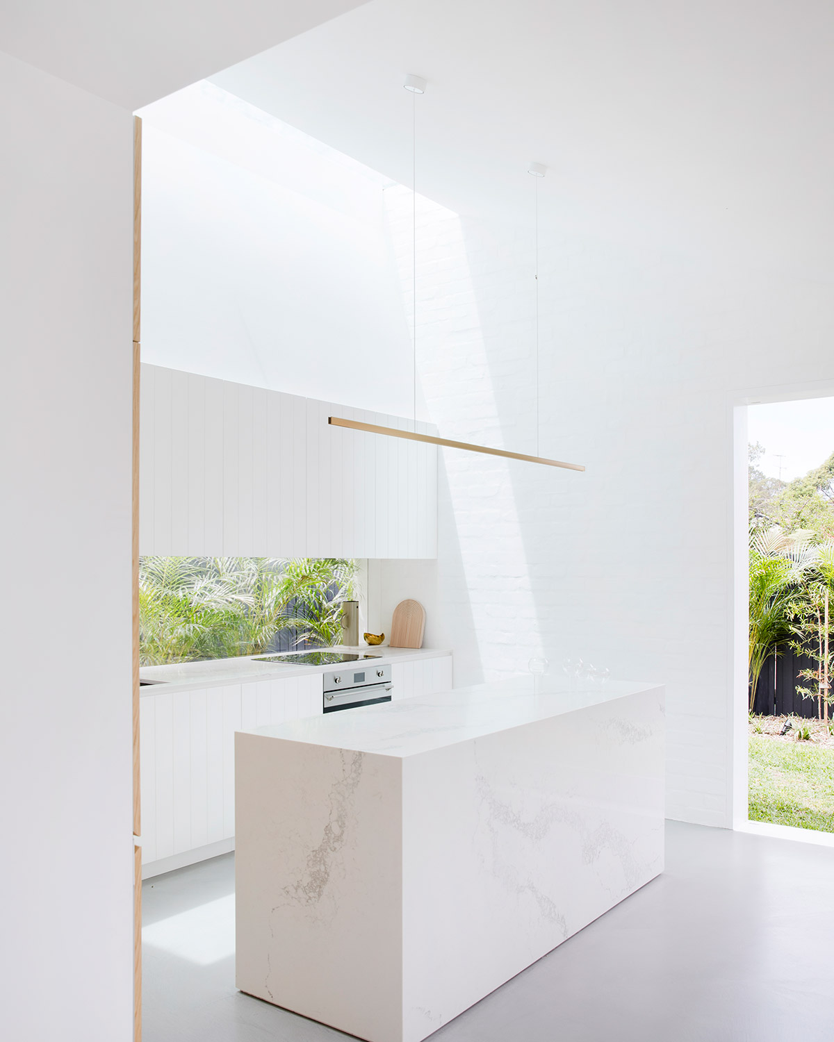
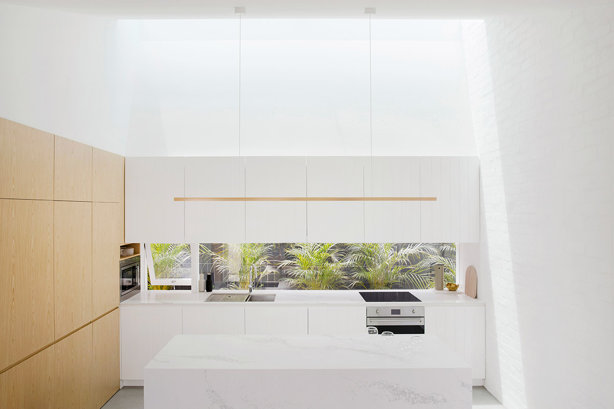
The kitchen and dining was partially separated from the compact lounge through the use of subtle cupboards that appear to be thickened walls. A large window allows sufficient flow of natural light into the room and also provides refreshing views of greenery from the outside garden. Additional storage and appliances are concealed by a classic timber joinery in the kitchen area, and a soft graphic pattern-clad kitchen island runs through the middle.
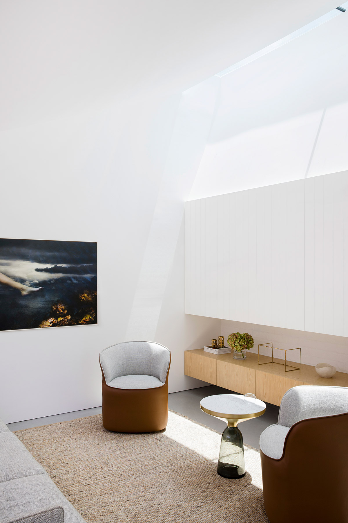
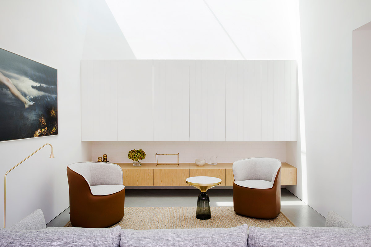
The new compact lounge is surrounded by bright, white-painted interior walls and conveniently sits two armchairs, a small round table, and a sofa. The entry point is a recessed sliding door the connects the lounge to the outdoor dining area with a built-in concrete barbecue.
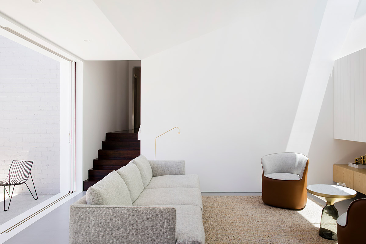
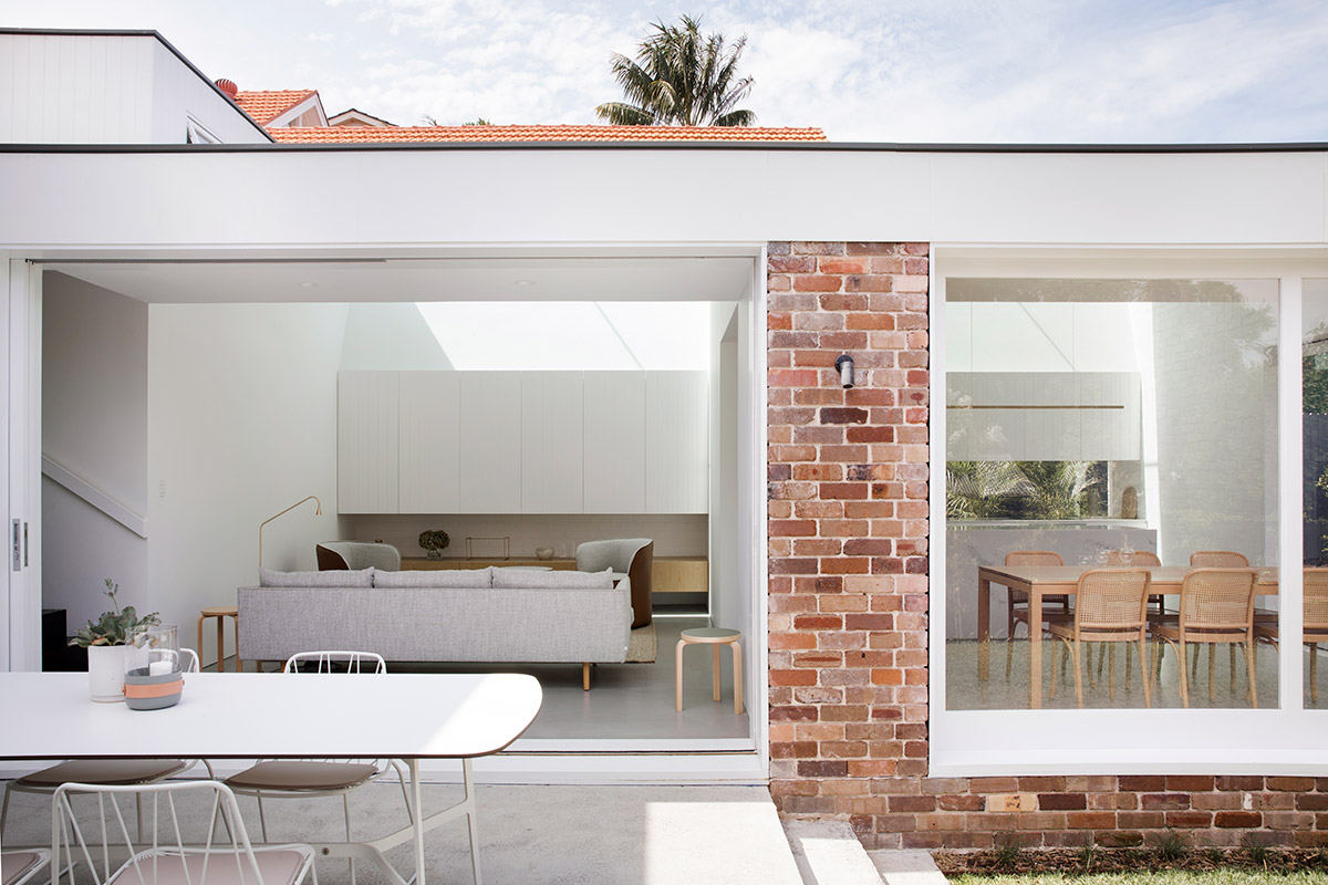
Substantial internal volumes are created by lowering the additions and maintaining the roof line of the existing structure. Extra ceiling height is attained by stepping down the site to ensure that the roof is not visible from the street.
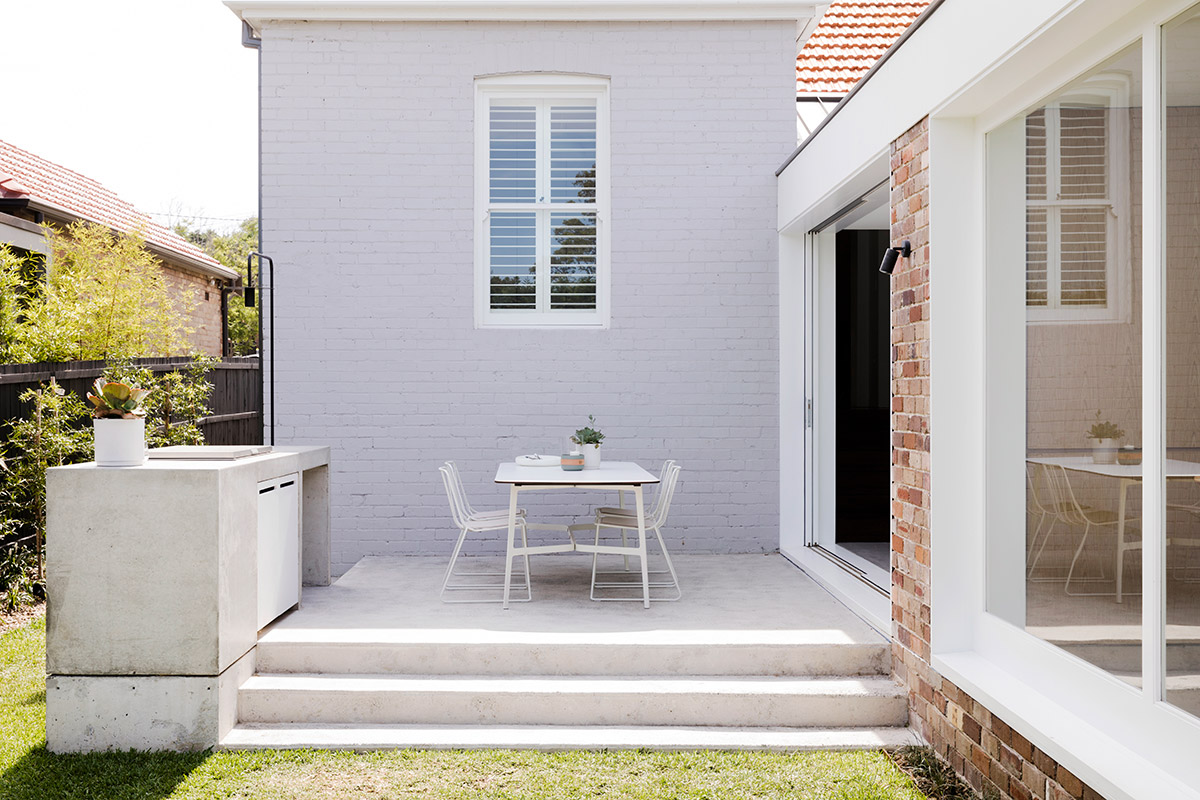
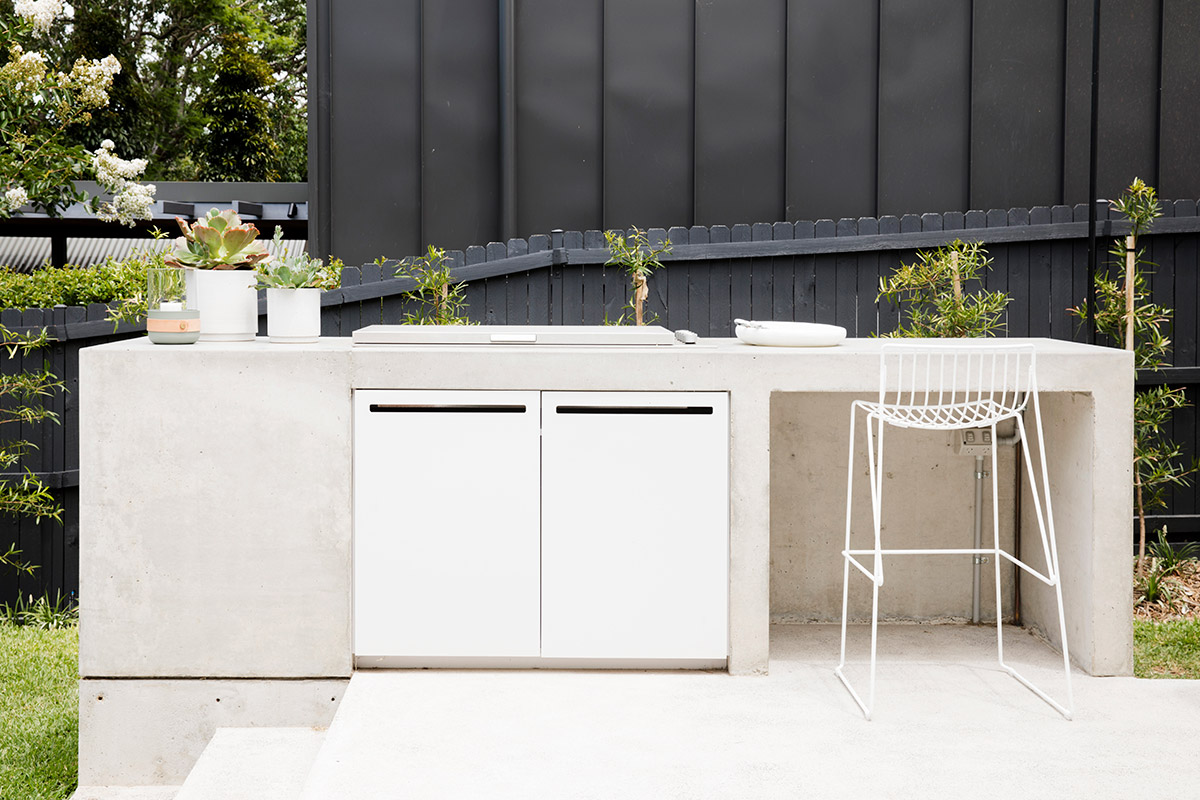
“The result – Pure family joy. New airy living, kitchen and dining spaces, designed a level lower than the original home in order to be open to the garden, capture the changing light of each day via a dramatic, high internal ceiling and a north-facing skylight stretching the full width of the new living space.” – Studio Prineas
We rarely see renovations and upgrades that don’t affect much of the footprint to the original structure. This just goes to show that compact without compromise is very much possible, and the temptation to overdo things and add more details than necessary isn’t always the best choice. The clients were confident and particular about what needed to be done and the team delivered and hit the project right on the nose!
House Project: Nat’s House
Architect: Studio Prineas
Location: Sydney, AU
Project size: 146 m2
Site Size: 396 m2
Type: Renovation
Photography: Chris Warnes


