Maybelline’s catchy slogan “Easy, breezy, beautiful CoverGirl” seems like the most appropriate way to start this blog post. Why you ask? Cause this house is an absolute bombshell where all three elements of the iconic slogan apply. Melbourne-based architecture and interior design practice Architects EAT are responsible for sprinkling their magic on this family household in Kew, creating a breezy, light-filled dwelling with ample privacy.


A striking white aluminium screen forms a singular mass in the outline of a suburban gable roof, subtly referencing the immediate neighbours in both form and colour, while the internal spatial volume is defined by the 3 repetitive in-situ concrete vaults. It’s impossible to miss this unique dwelling as a passer-by, with the stark white colour that contrasts against the landscape greens and the blue sky. The geometric repetition of the façade also seems to pull you in, building intrigue about what lies beyond!
As one passes along the façade towards the entry, it deconstructs to reveal the concrete bodies in a journey of discovery and surprise. The entry sequence finishes in a recess, with raw concrete beams cantilevering out to provide partial shades and refuge, hanging plants from the gutter and grasscrete paving below – all in an Arcadian setting before reaching the Corbusian green door and a finely turned timber handle. The lush green door leaves a lasting impression on every house guest. Little do they know that they’re about to witness some pretty magical interiors beyond that bold door.

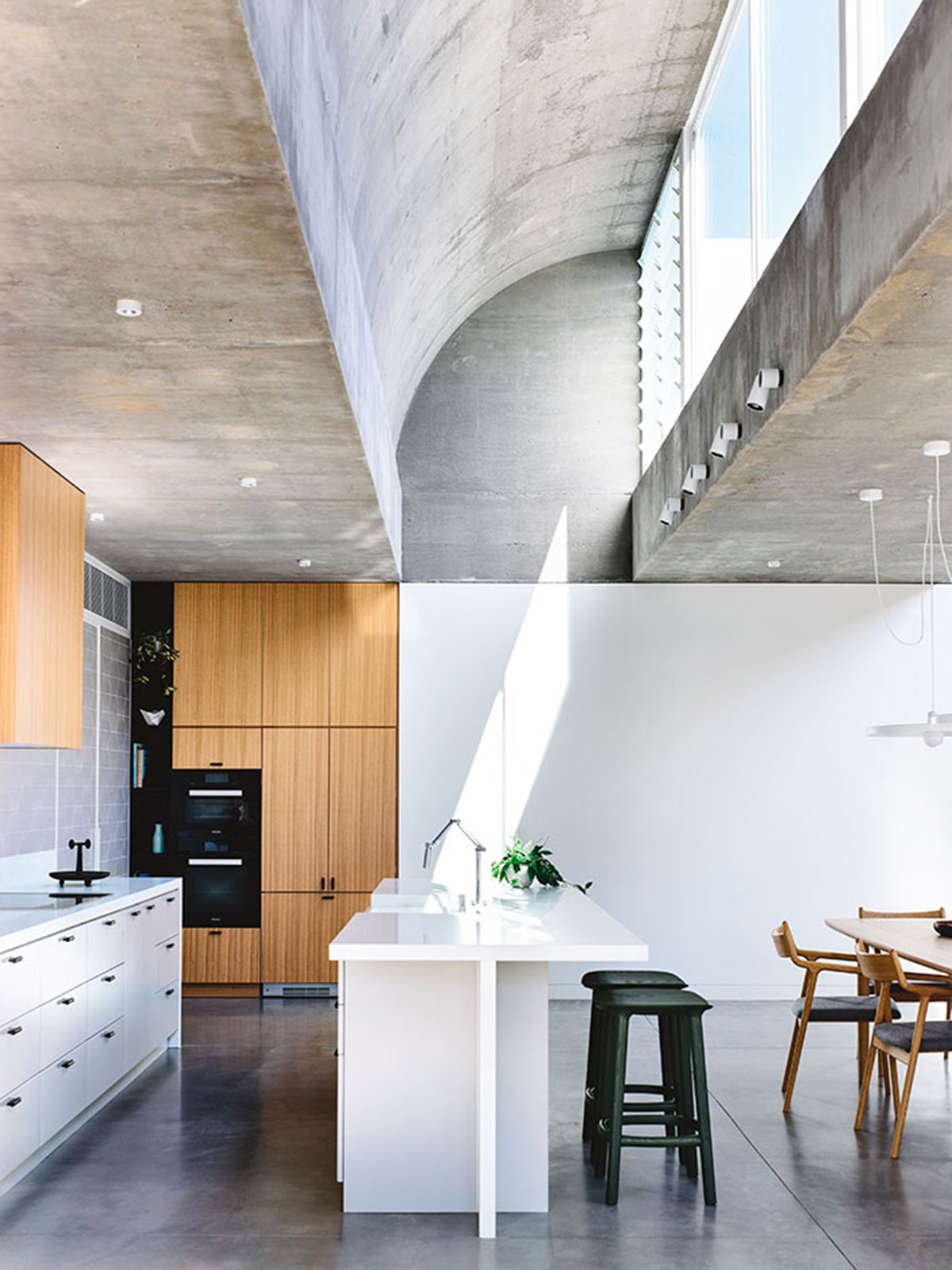
Lighting, as much as privacy, were central to the design process. Finding a balance between the two, Architects EAT has come up with vaulted skylights, soaking up the sunlight from above. The three repetitive in-situ concrete vaults have fulfilled their purposes while giving the interiors of the house its quirky spatial volume.
Inside, the raw concrete is the star. Boasting its natural tone and texture, concrete is a choice not everyone will be bold enough to build upon. If others get the feeling of it being unpolished and unfinished, the architects used this design innocence to guide the eyes to explore the other more furnished elements of the space: the polished floors, the harmonious earthiness pulled together by the furniture, the greens that dot the interiors, and most especially, the three grandiose skylights. This genius move has filled the house with ceremonious lighting that makes every spot Instagrammable—and possibly a perfect pictorial shoot location.

Every hour is distinctive inside—the animated lighting paints the home differently throughout the entire day. In the morning, the rays slowly creep in. As the sun sets, the ceiling vaults project a soft, fading light until artificial lighting takes over and transforms the interiors with glowing lanterns.
Moving House is not only a design monument that gives a feast to the eyes, but it also gives the dwellers an experiential journey with the dynamic lighting spawned by the building’s structure. It’s lovely to see what can be achieved through the careful balancing and orchestration of materials, playful manipulation of the construction, and mindful analysis of the design’s impact on the senses.


Photography by Derek Swallwell.


