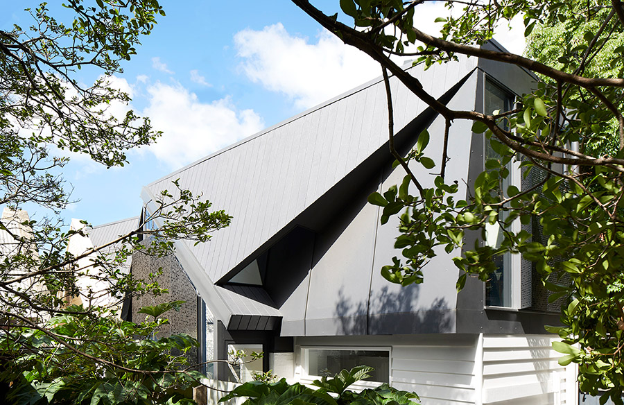
Moor designed by Whiting Architects is the epitome of easy modern living. This uncomplicated home which used to be an outdated single-fronted and single-bedroom terrace in the heritage streetscape of Fitzroy was overdue for a much-needed renovation. The refurbishment of the old dwelling focused mainly on creating a functional two-bedroom home on a limited budget, enabling the structure to take in more natural light, all while maintaining privacy and keeping the home humble as a homage to its origins.
With budget constraints and limited building footprint, how could the team possibly transform this old heritage home from its lowly origins to a completely different and unassertive modern abode? Let’s see what they came up with…
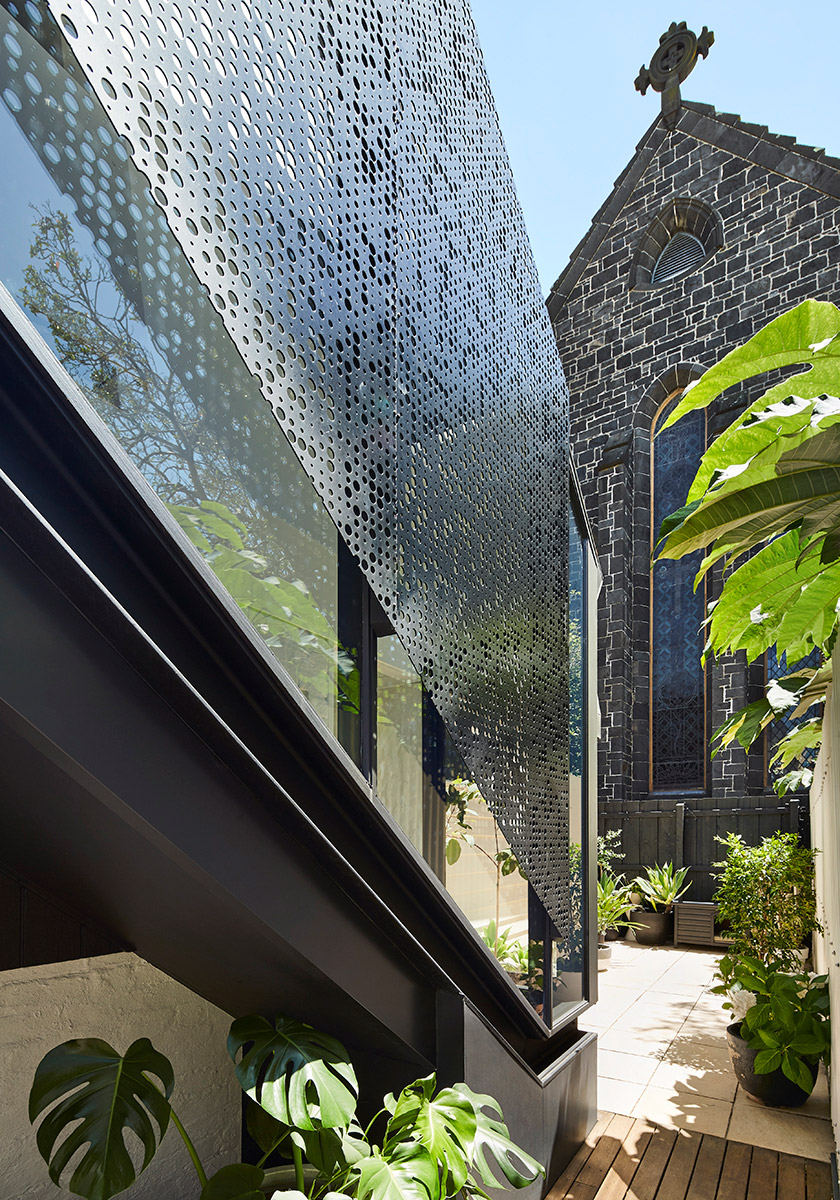
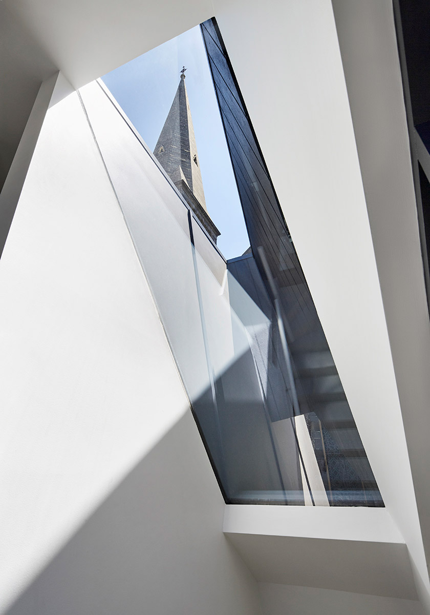
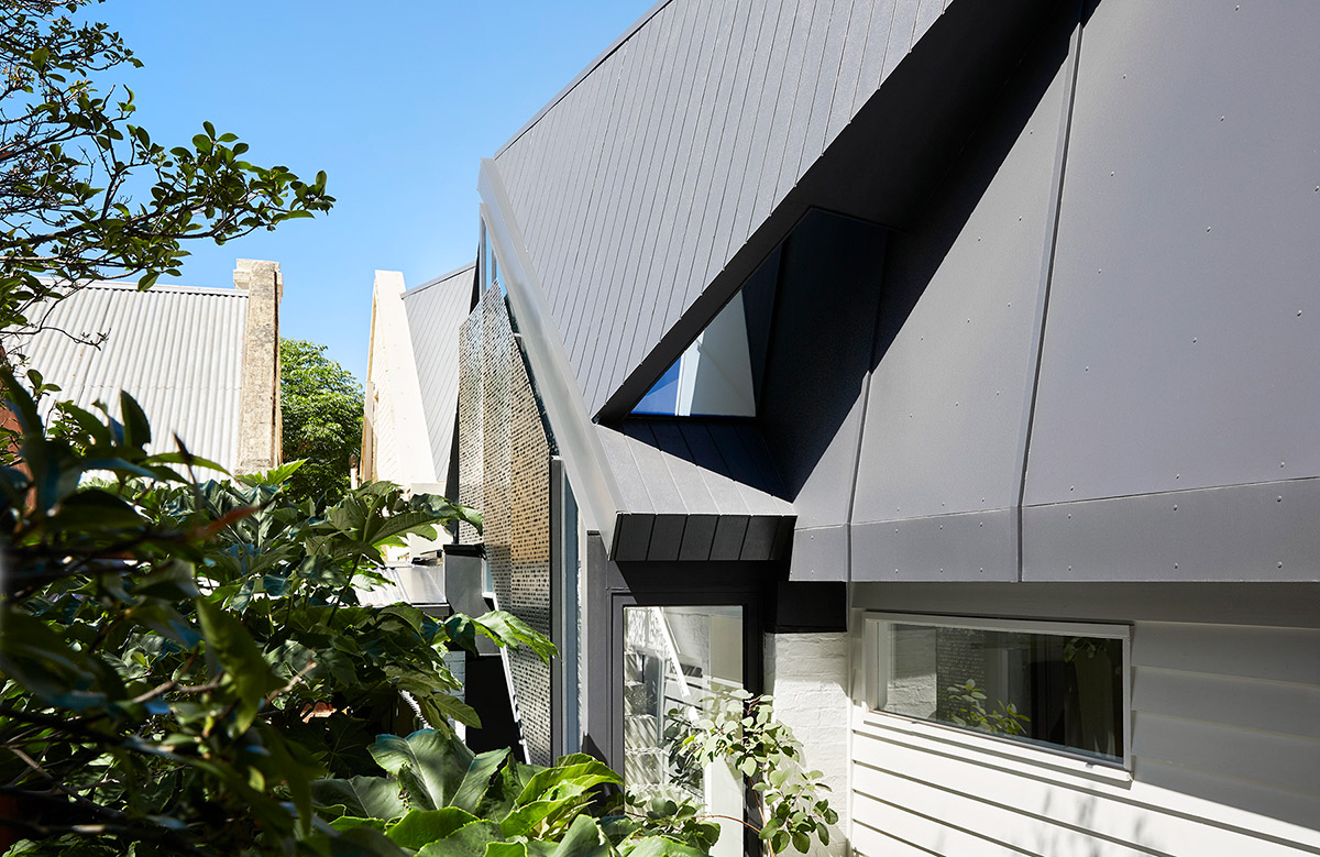
A large bluestone church located at the rear dominates the site. This was not seen as a nuisance but rather a design response was instantly perceived and used the unique views at their advantage. The elevation on the east was ‘folded’ like an angels wing that protects the building below, paying homage to the ecclesiastical inspiration. This design articulated the elevation, breaking down the bulk of the building while maintaining the privacy and natural light.
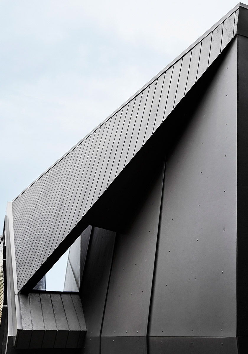
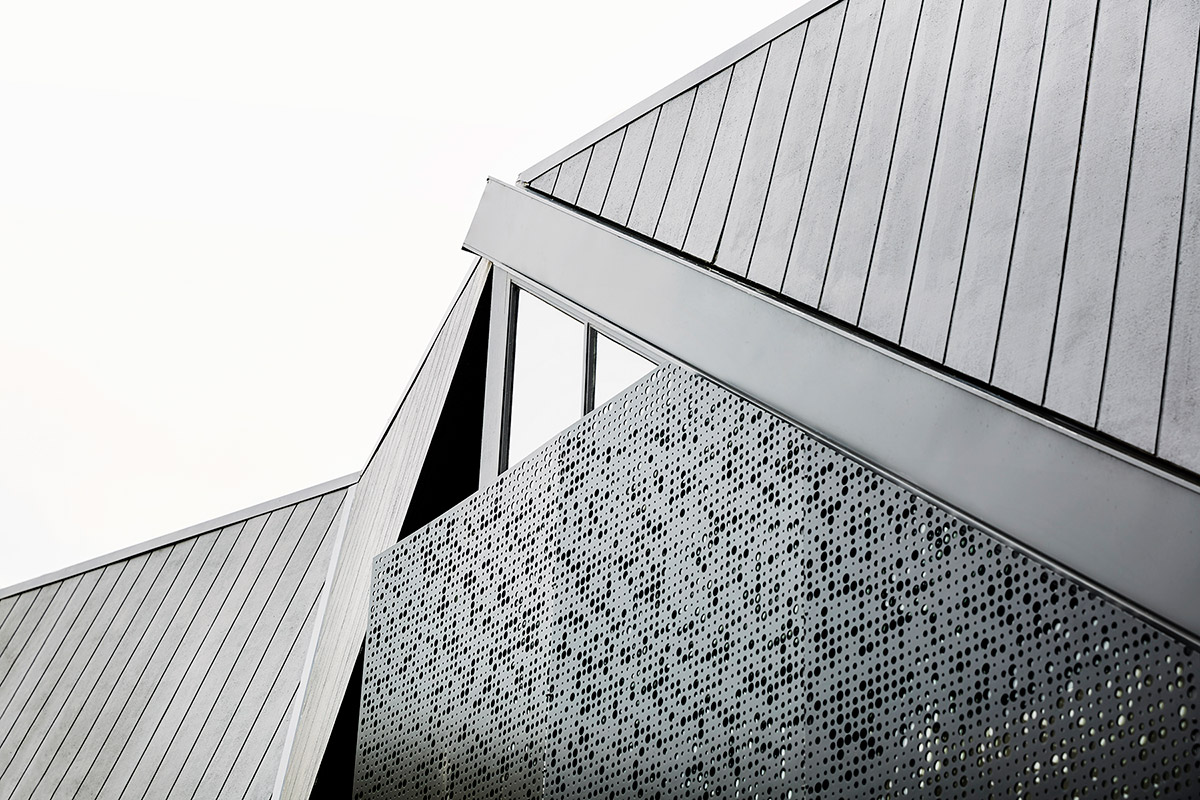
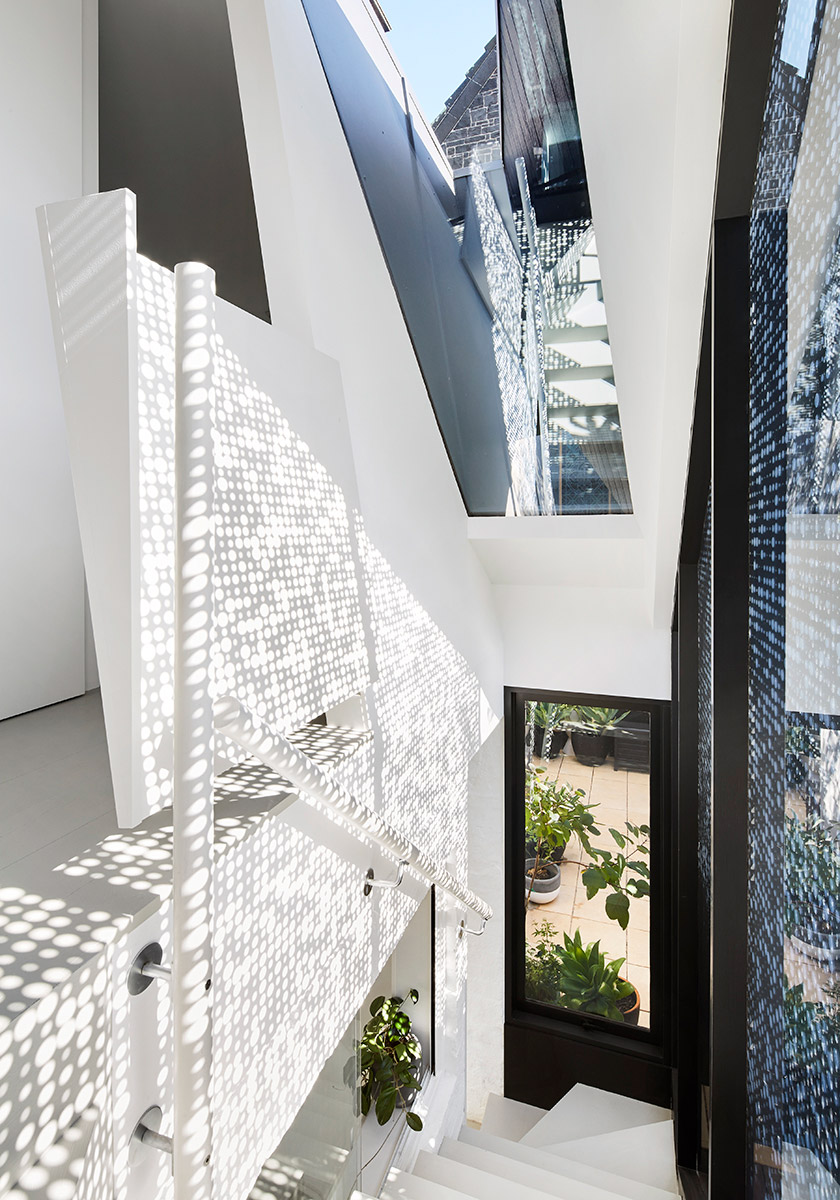
“We identified a key group of elements; stained-glass windows, stonework and the spire and then set about framing them from areas within the new build. Looking out to these focal points through the interior landscape informed the design response. The rear bedroom skylight perfectly frames the steeple and rear windows frame the church’s large stained-glass windows. The stairwell works to channel views to the church and an additional layer of interest is achieved through reflection. The angled structure of the new building is reflected back in the sloping stairwell skylight, creating a remarkable Escher-like stair puzzle.“ – Whiting Architects
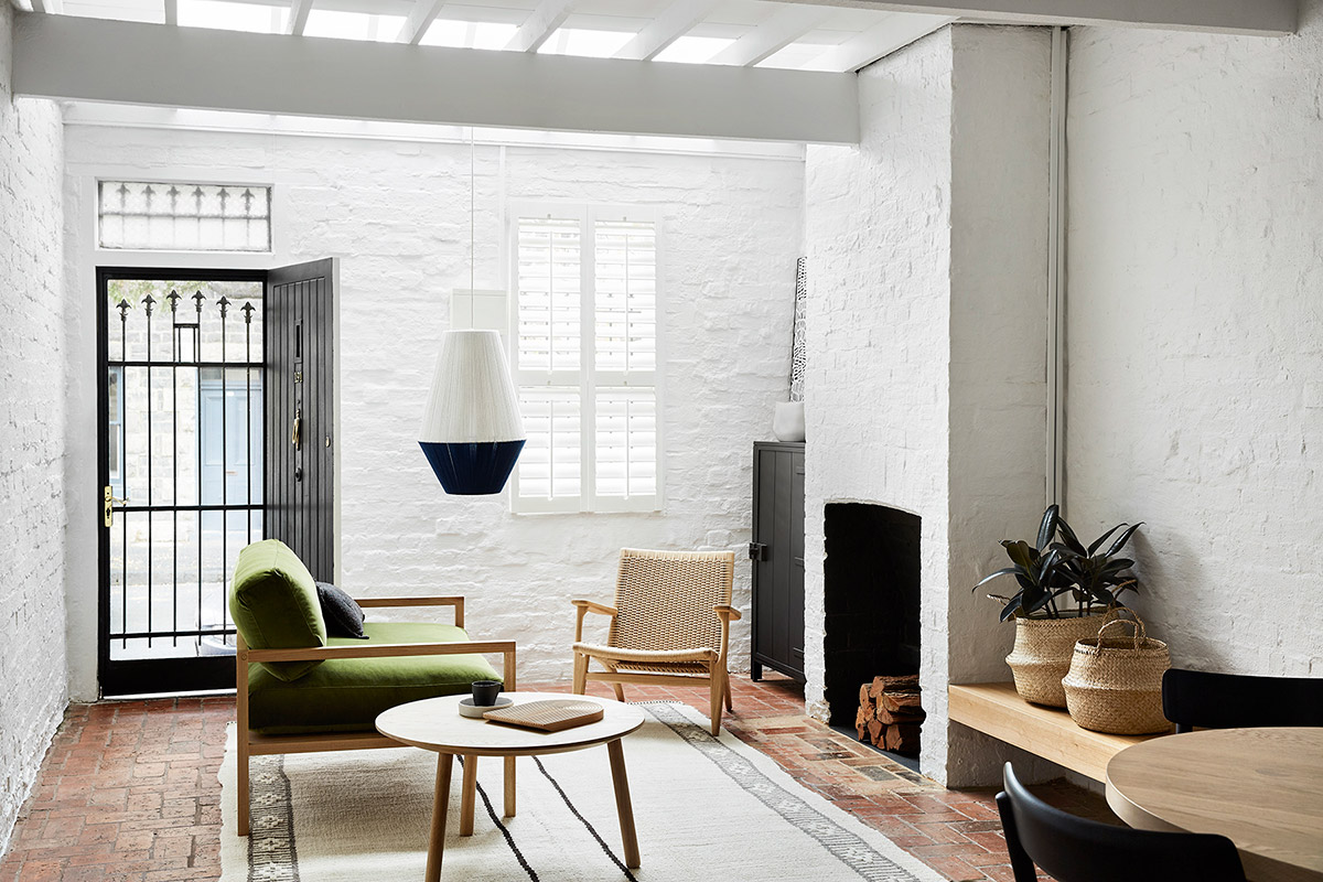
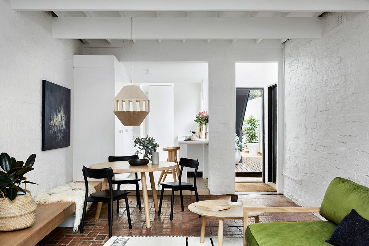
The original dark, cold, and uncomfortable cottage was treated with a seemingly subtle renovation which changed the functionality and aesthetics of the home entirely. The humble origins were kept while at the same time achieving the functional requirements set out in the brief.
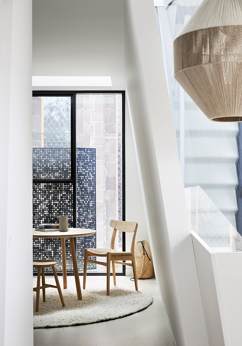
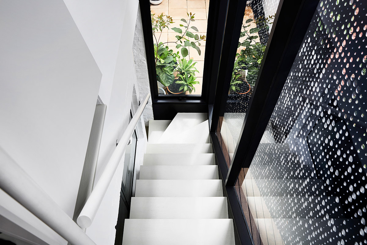
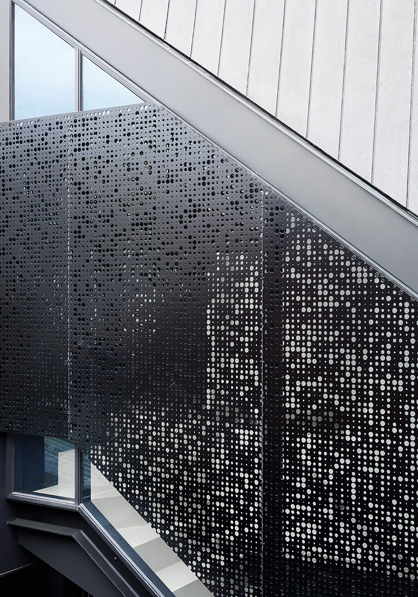
Dappled light formed by the perforated panels creates a unique flow of light over the stairwell and interior which changes with the time of day and season. The shadows and light reflected by these panels appear very similar to that of trees, invoking a natural serene ambiance to the space.
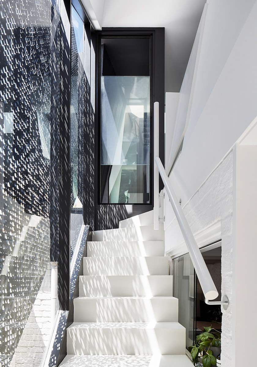
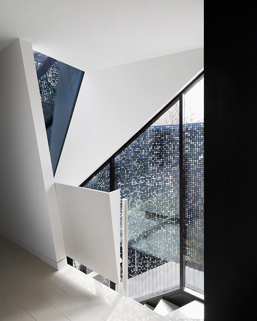
Several extensions were done internally, particularly the space where the mezzanine bedroom had been and connected it to a new rear addition comprising a bathroom, stairwell, and second bedroom/study room.
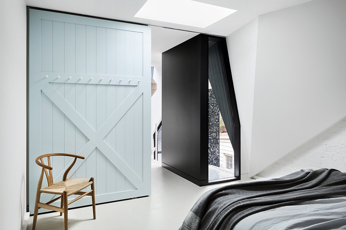
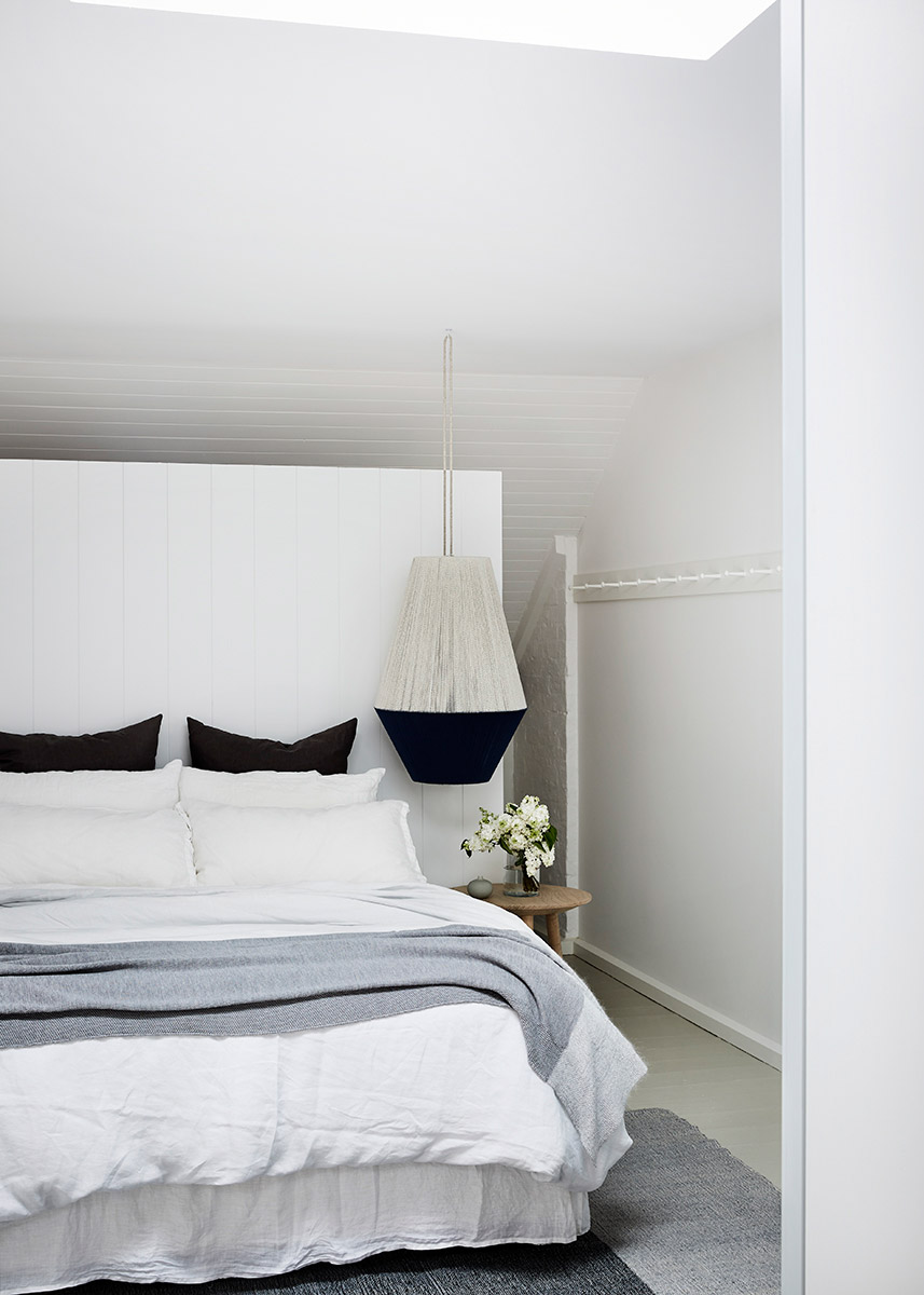
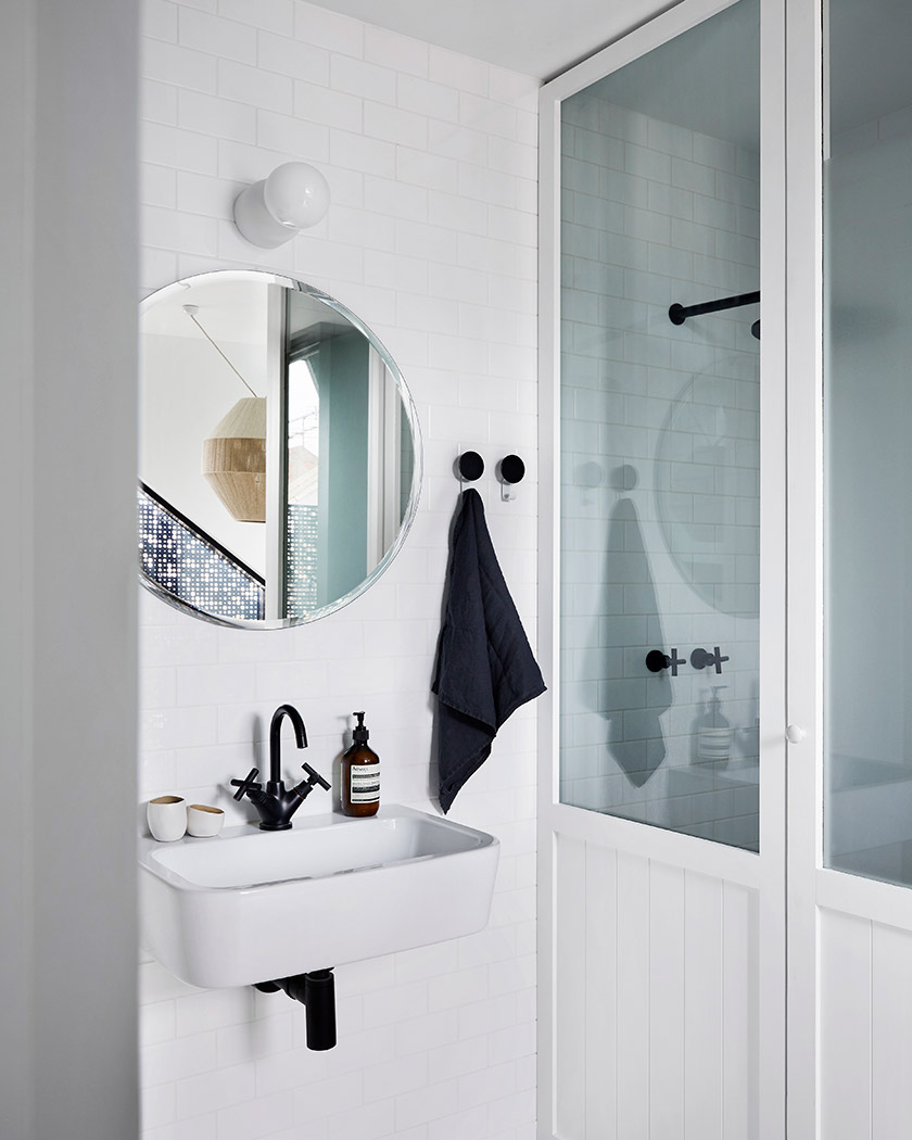
The stairs that were originally positioned in the middle of the living area were also relocated to free up the limited space available. With the tight 79m2 site area, space was a premium and needed to be used wisely. This adjustment resulted in the space being seemingly more open, greatly affecting the functionality of the whole house.
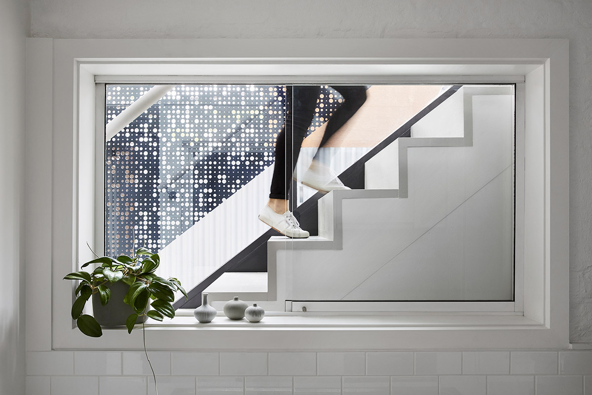
To preserve its heritage, the addition was kept hidden from the streetscape. There was no hint of the second level from the ground floor, and the stairs were flawlessly concealed on what appears to be a kitchen cupboard at first glance. The stair is intended as an external element and acts as a device to filter light through the middle of the home.
“With setbacks and building-bulk to consider, architecturally we found ourselves facing the prospect of creating little more than an anonymous box. We decided to work with the site constraints, taking them on as a positive. We took inspiration where we could.” – Whiting Architects
As a resourceful and creative team as they are, Whiting Architects created a workaround through the various constraints encountered in this project and turned them into innovative aesthetics and stunning design opportunities. The result was a unique reinvention of the seemingly modest house. Kudos to the whole team!
House Project: Moor
Architect: Whiting Architects
Location: Melbourne, Australia
Type: Renovation
Photography: Tess Kelly


