The age-old colour palette battle knows two sides, monochrome and colour. Can you pick a side? Which style language defines your personal look and mood for your home? We’ve all walked into a house that is distinctly one or the other. Did it make a difference to the way you felt? Because, it should have.
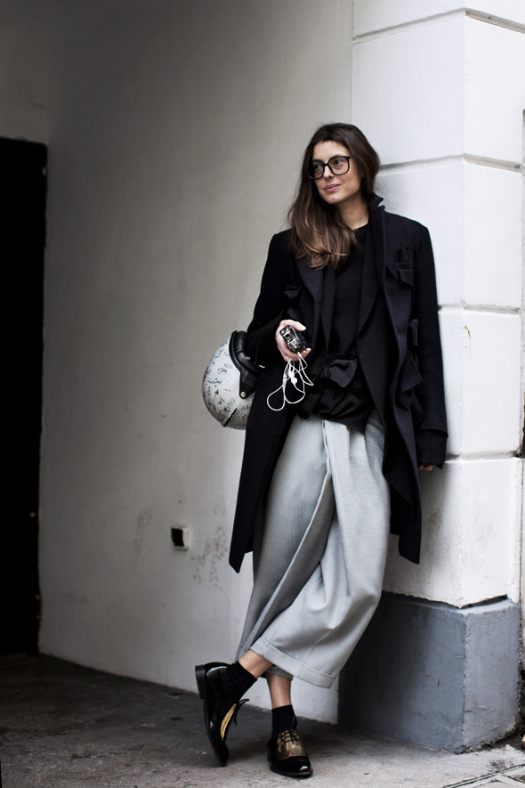
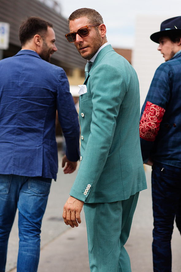
Designers will often begin developing an interior scheme firstly with a colour palette. This foundation becomes the basis for many more design decisions. And an understanding of the mood created by different colour harmonies or tonal contrasts is established very early on. Similarly for dressing up in the classic black and white combo or a bold and bright ensemble.
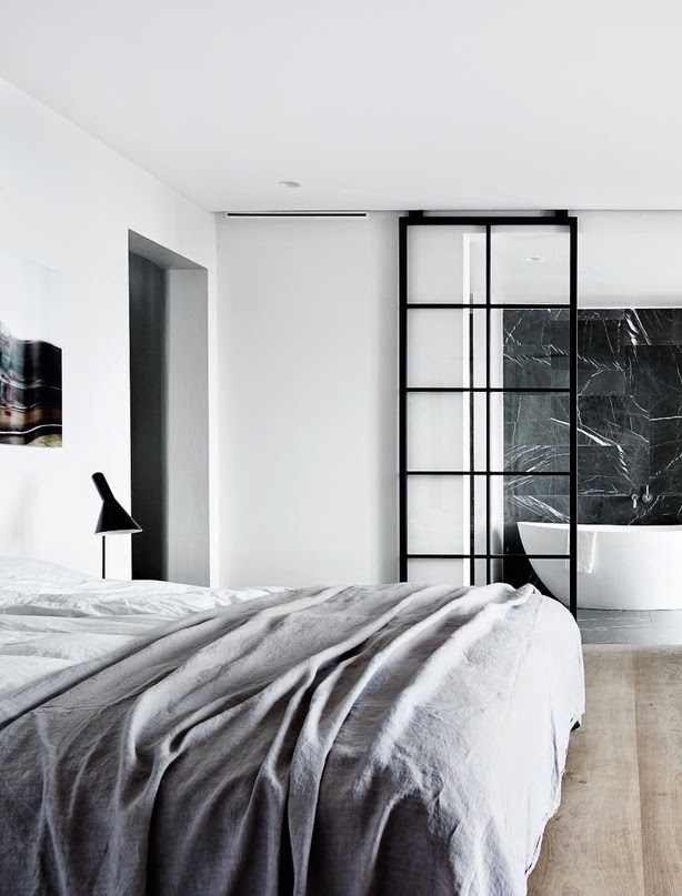
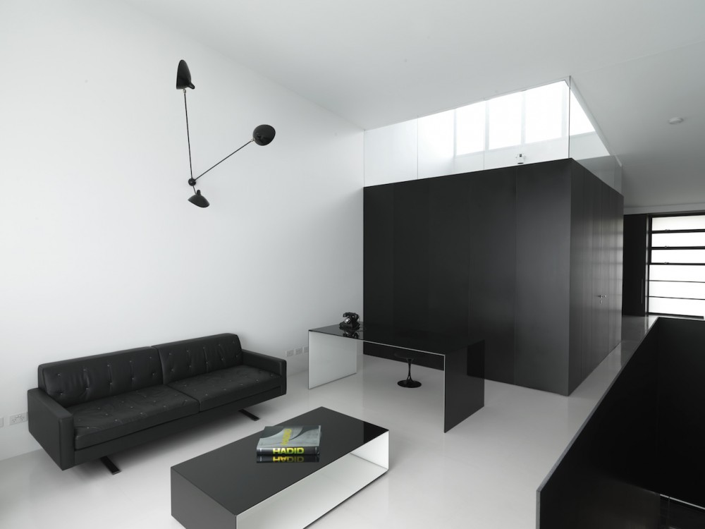
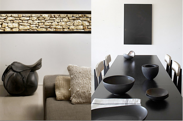
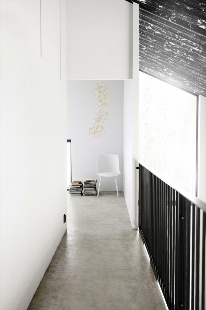
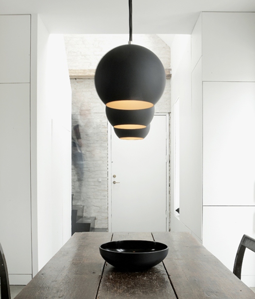
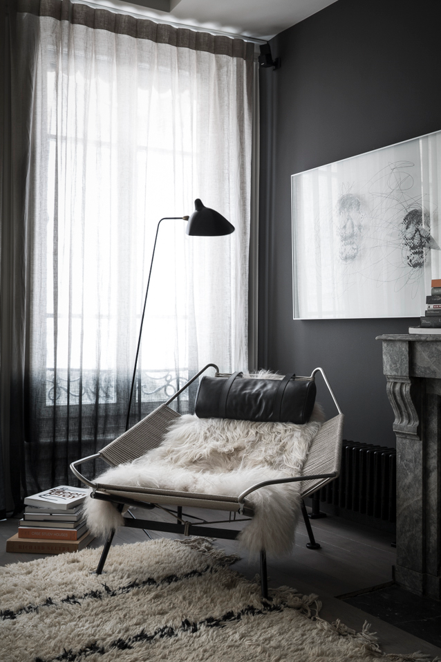
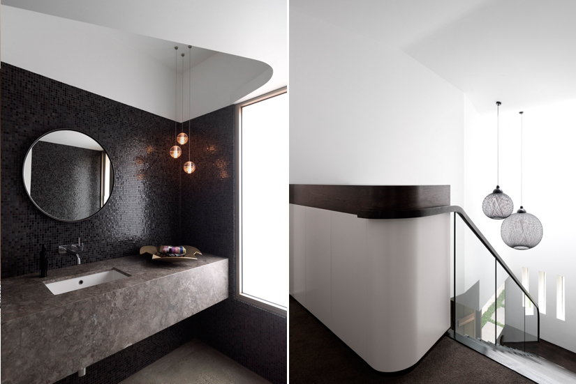
Monochromatic colour schemes are derived from a single base hue and expand using shades, tones and tints (blacks, greys and whites). Monochromatic colour schemes provide opportunities in art and design as they allow for a greater range of contrasting tones. Although monochromatic palettes can feel calm and peaceful if the contrast is low. An illusion created by the use of black and white is of a neat, simplistic and luxurious space. Michael Constable of JAB International Furnishings says, “black and white decorating never goes out of style and can make a big impression at home. Monochromatic geometric patterns create even more interest to the trend.”
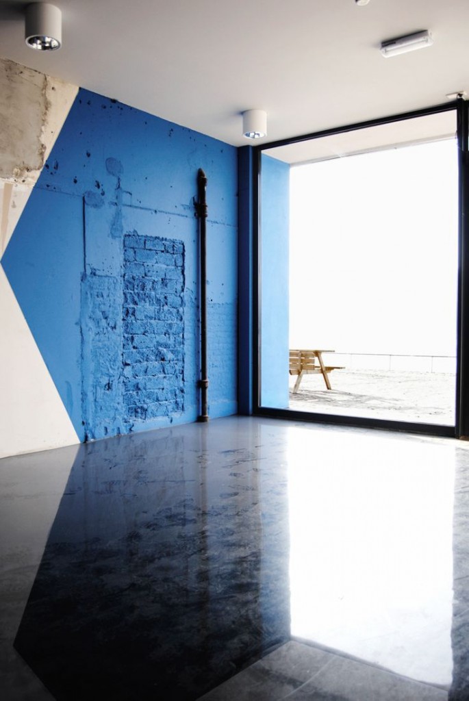
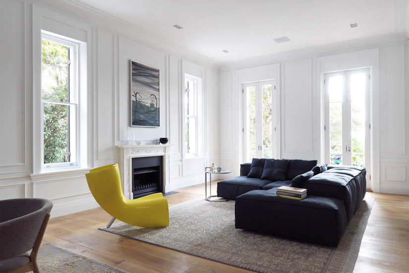
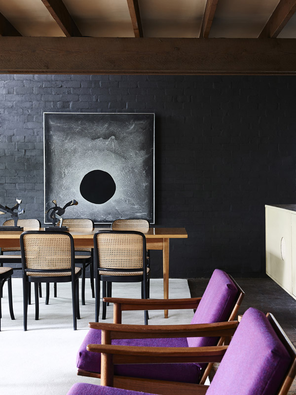
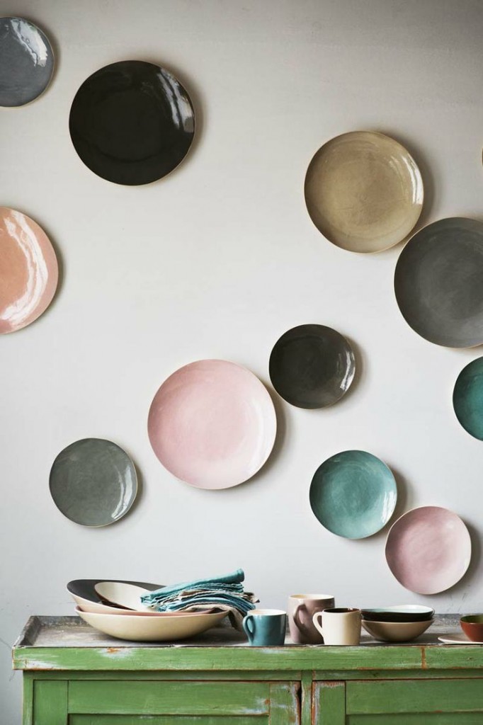
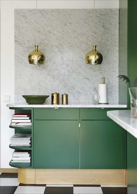
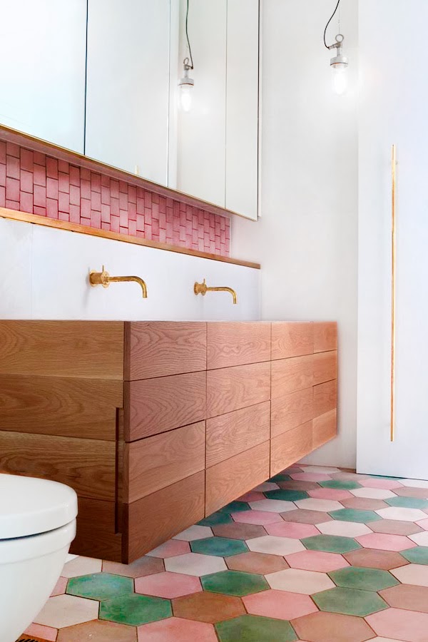
It is suggested that the colours seen together, which produce a pleasing response are ‘in harmony’. Many colour theorists have devised principles and guidelines for combining different hues. Some artists and designers believe a juxtaposition of complimentary colour will produce the strongest contrast and visual effect. While others believe that colours that sit next to each other on the colour wheel provides the richest aesthetic. All agree that warm colours are vivid, playful and energetic, while cool colours give a calm and soothing impression.
If updating your home with this season’s hottest hues, or a timeless monochromatic scheme think about choosing a palette that fits in well with the rest of your space and personal taste. You want to create consistency and a lasting impression, whichever side you choose.






Great article you got here! I learned about the two color schemes, monochrome and bright hues and its effect on designing. Thank you for sharing!