Located in the heritage overlay of the Collier Crescent streetscape and what used to be a run down, seemingly unlivable house, Markham is a remarkable renovation made possible by Preston Lane Architects. The brief for the project as requested by the client was a house with four bedrooms, two living rooms and parking that is off the street along the back end lane.
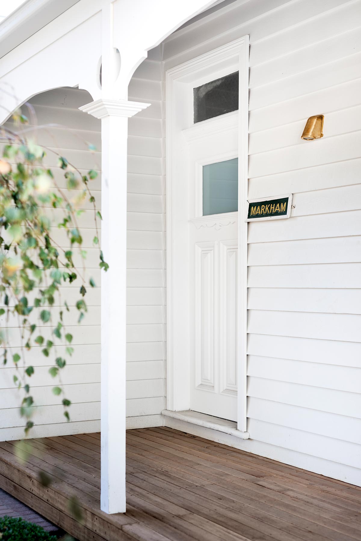
“The main challenge of this project was trying to achieve our client’s brief in terms of a large house on a medium size block in a heritage overlay. The existing house was severely dilapidated and virtually unliveable, however located within a heritage overlay, meant the existing house had to stay and any new proposal had to respect the existing dwelling and heritage streetscape.” – Preston Lane Architects
One of the main concerns in achieving what the client had visualized was the project being in a heritage overlay, which meant that the existing house must remain and whatever changes that would be made must abide to the current housing and heritage streetscape.
“Our design approach retained the front section of the original house and converted the front two rooms and original entry hallway into a master bedroom suite. This maintained the original entry from a visual streetscape point of view, however introduced a new physical entry into the middle of the house from the eastern side through an unusual second gate located within the original front fence.” – Preston Lane Architects
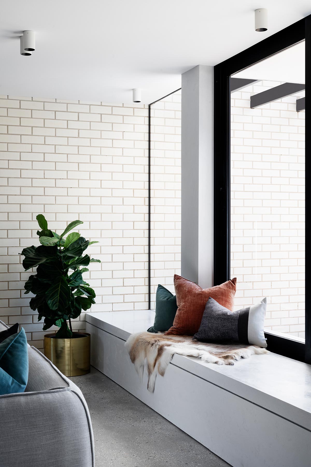
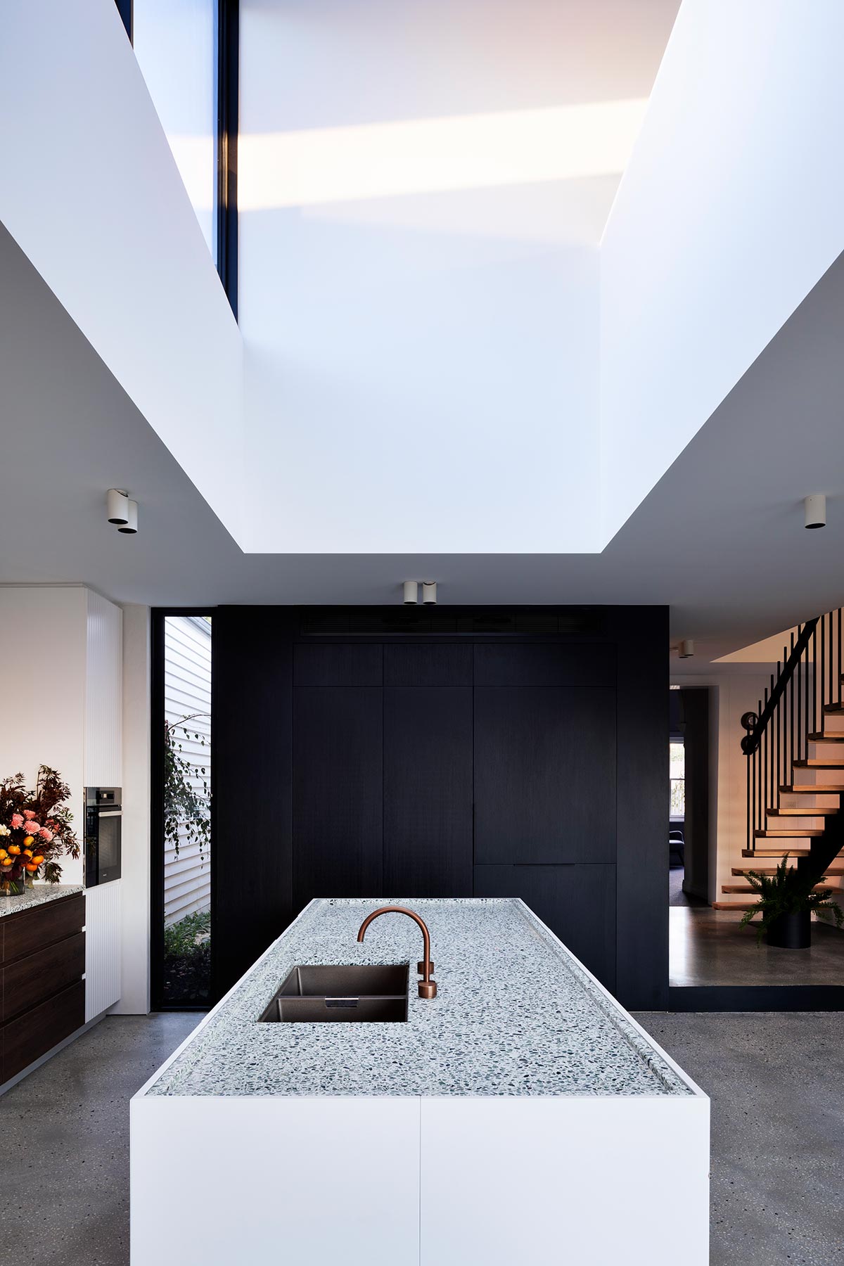
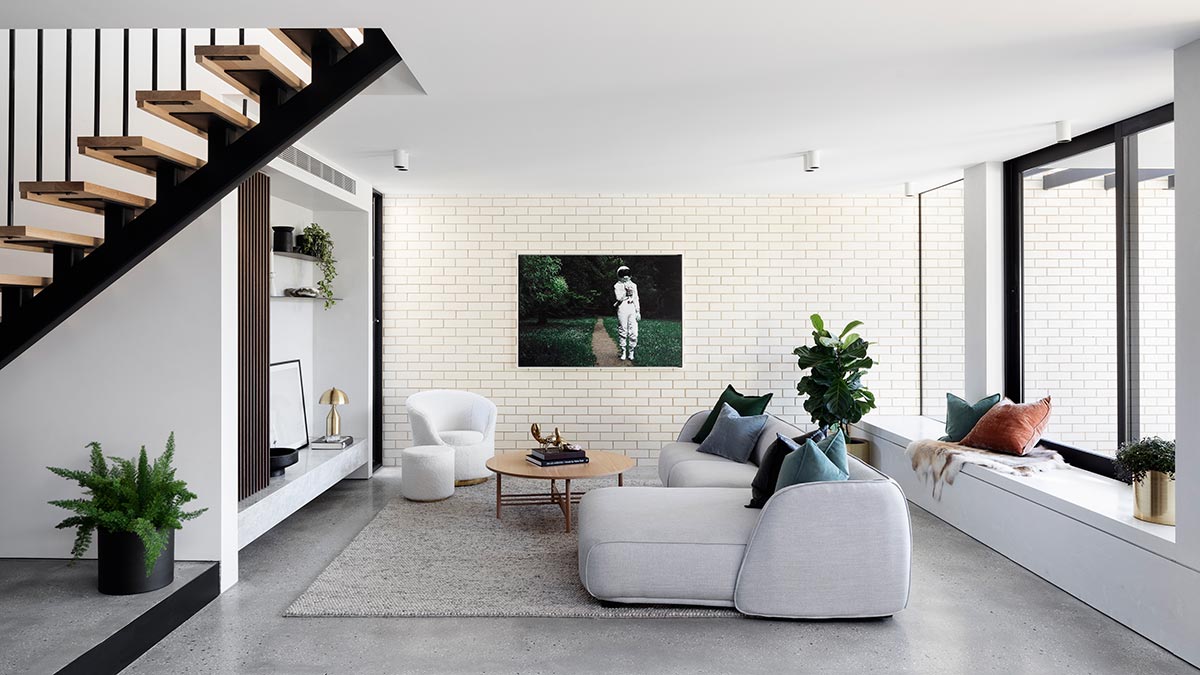
This concept made it possible for the new extension to be unobtrusive to the Collier Crescent’s streetscape, as it was located at the rear end. The new extension was built along the margins, from edge to edge. A large gap was positioned strategically to allow light coming from the eastern side, pouring in above the kitchen, at the same time connecting the downstairs to the kid’s living area.
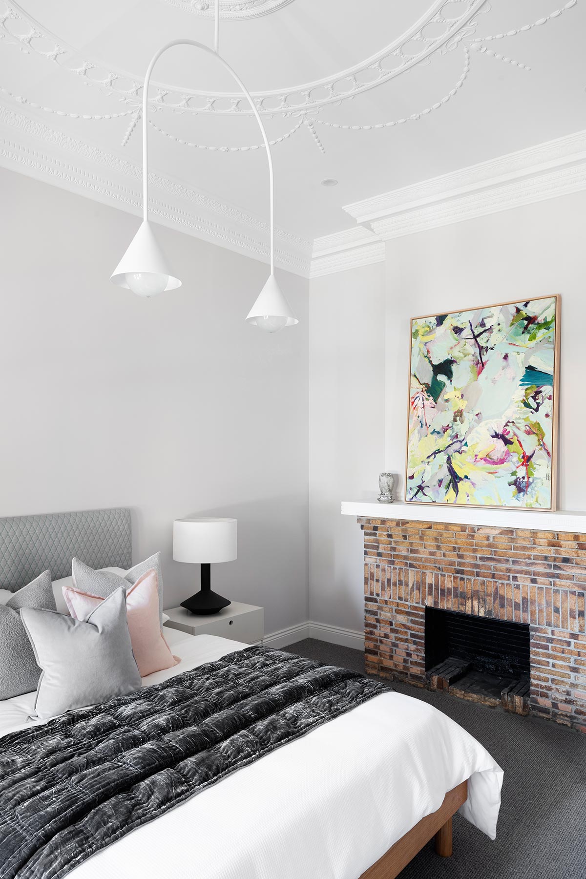
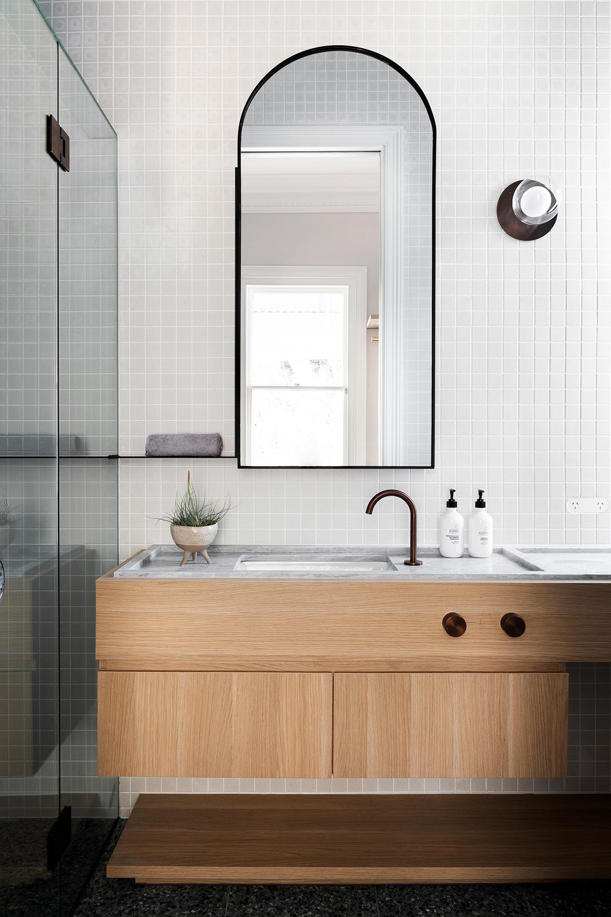
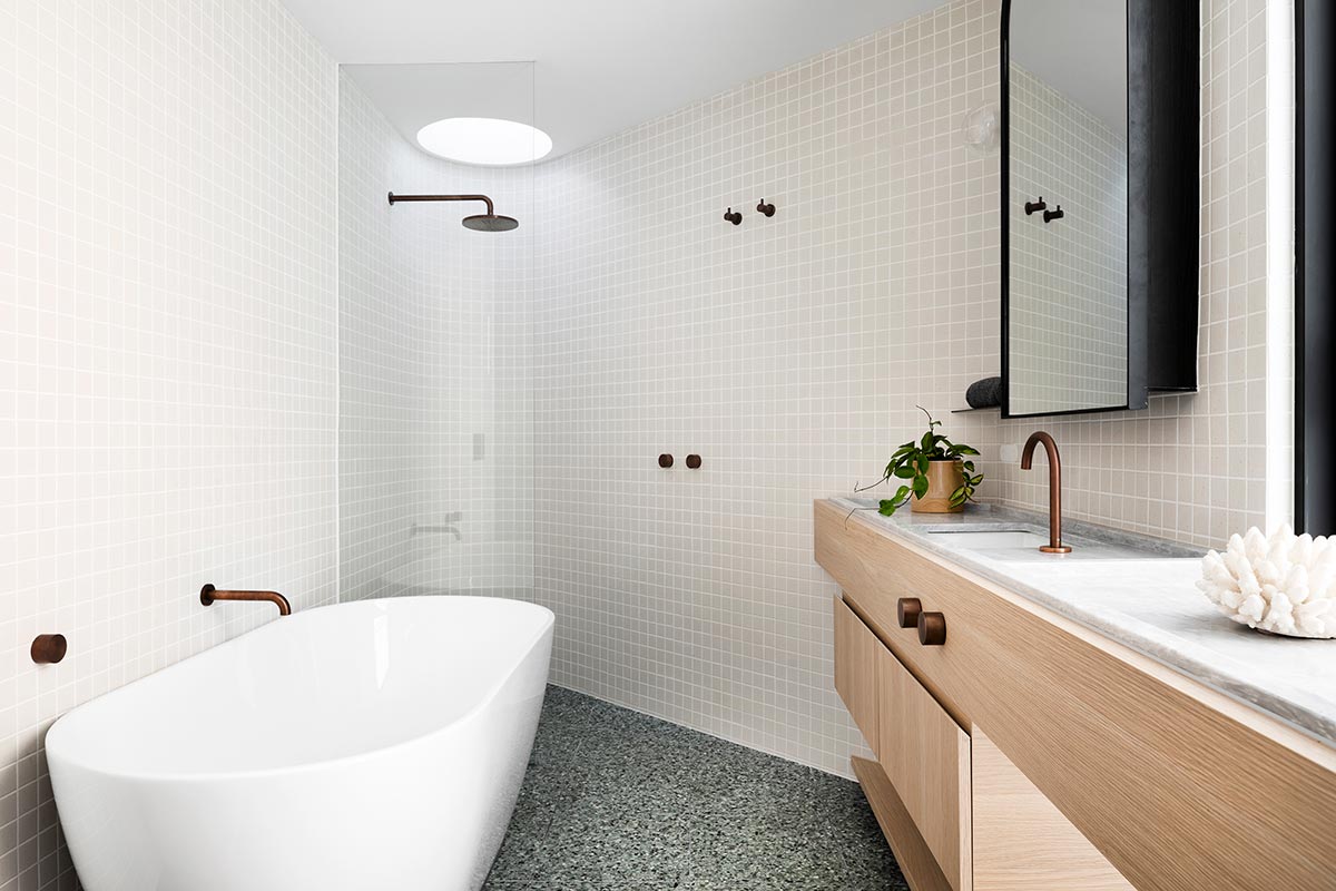
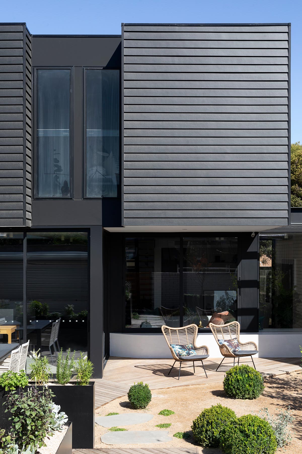
The new entry also created a warm division, from the parent’s bedroom suite, to the living area in the rear end and the kid’s upstairs bedroom, giving everyone their personal space. Dark and bold accents such as window frames add stunning contrast to the light colored wall panels, accentuated by refreshing wood bits and pieces that give the house a contemporary touch. Quite unexpected given the traditional front porch.
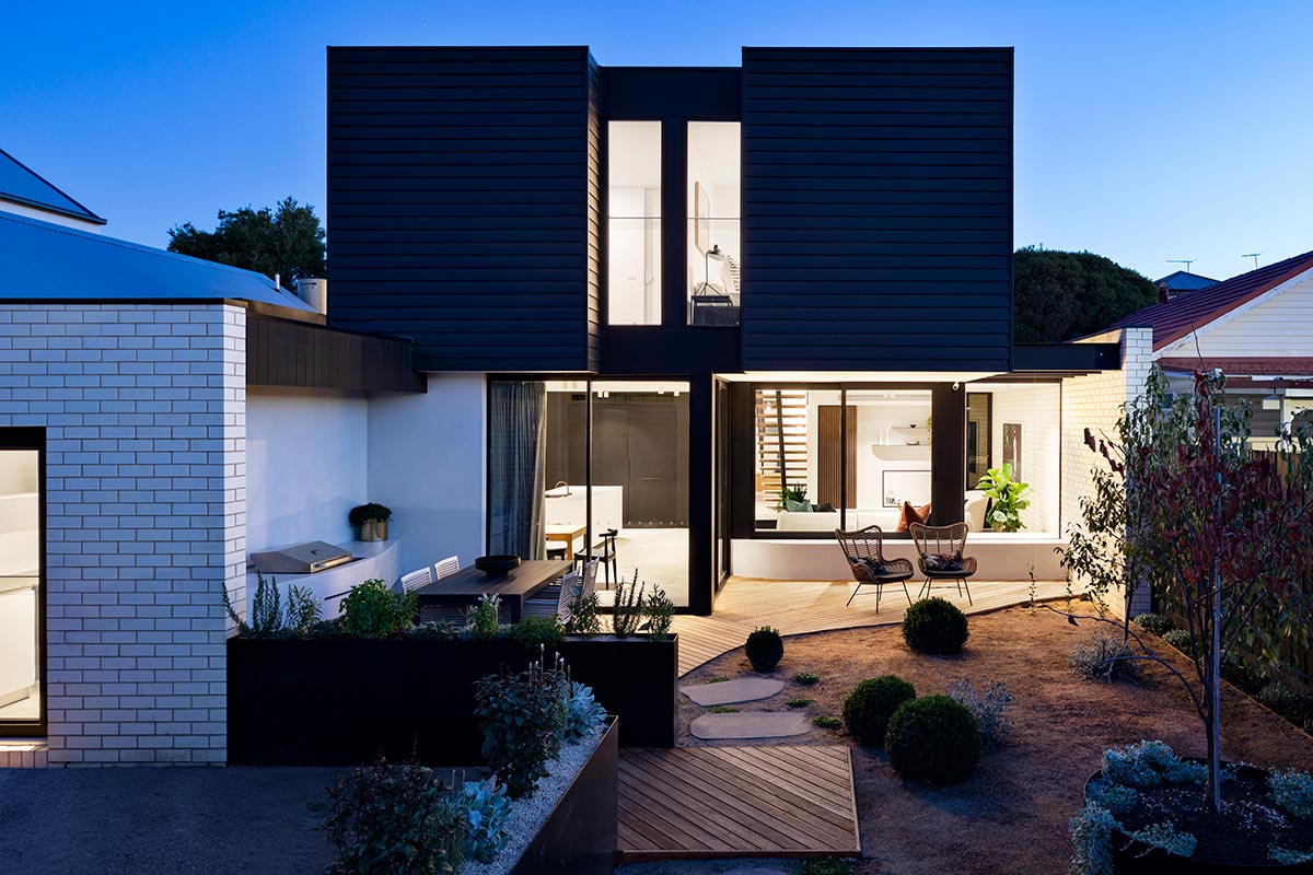
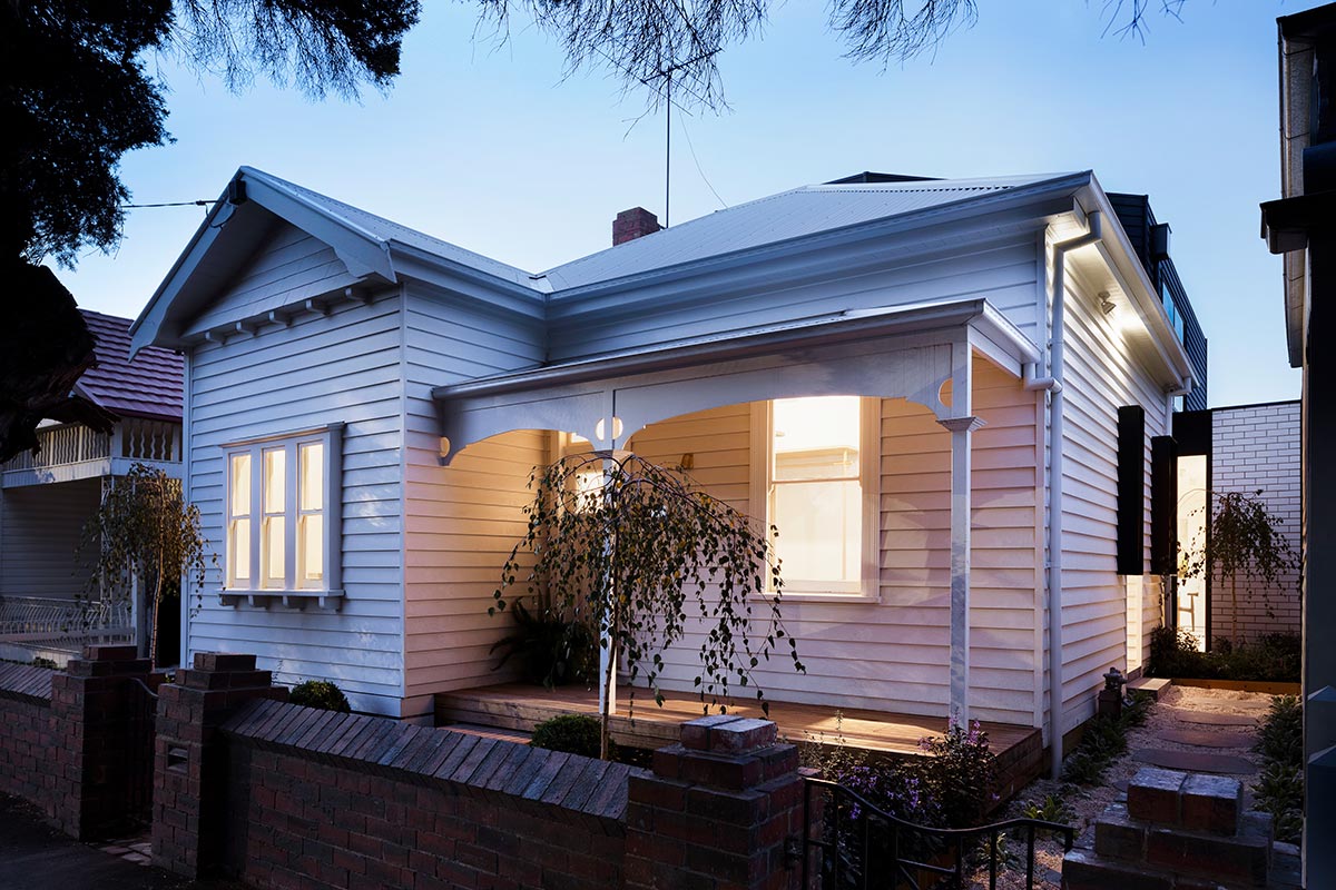
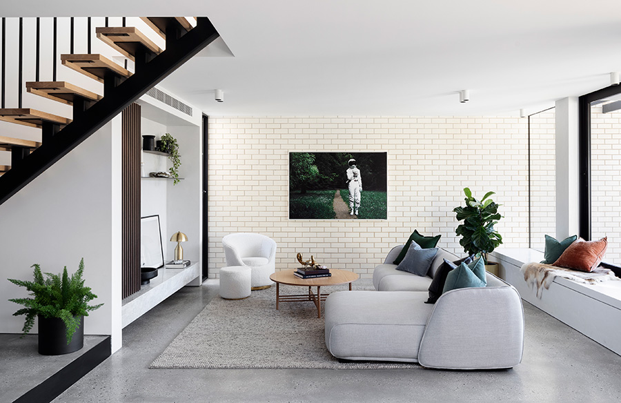
The exterior was designed creating a contextual fit with the original house, weatherboards were placed on the upper level, extending to the north side, for the purpose of giving shade to the areas below. These bold colored upper levels sitting on light colored stone walls similar to the living room, also give a modern touch to what used to be an old, monotonous home.
Project: Markham
Architect: Preston Lane Architects
Location: Brunswick, Victoria
Type: Renovation
Structural Engineer: MTO Engineers
Interior Design: Sarah Decorsey
Builder: De Build Group
Photography: Dylan James





I love this Reno. Is the dark weather boards at the back hardiplank?