Do you know what I like more than candy? Eye candy because it’s got way less calories, and it’s far more satisfying. This renovated weatherboard is full of the good stuff, so let’s go inside and check it out.
If I was to describe this home to you in one word, it would be cool, damn cool. Technically, that’s two words, but still, it’s damn cool. Now, this is a renovated weatherboard cottage, so from the outside, it just looks like any other traditional cottage. But when you get inside, it’s been completely transformed. In fact, the only original part of the building is the actual facade, because that actually has a heritage overlay.
The owner bought this home 10 years ago, and about two or three years ago then it got renovated. And I’ve gotta say, they have completely re-imagined this entire home. They’ve completely opened it up.
The first thing that I noticed when I walked into this home was colour. There is colour everywhere! It is colour overload. There’s pattern, there’s geometric shapes, there’s random sculptures, there’s beautiful artwork. It is everywhere. It is just an overload for the senses and I absolutely love it. With all this going on, you’d think it might be just too much, too crazy, just too chaotic, but it’s kind of not. It’s just beautifully peaceful and calm and beautiful in here. There’s a lovely sense of tranquillity, and it just feels really relaxing.
With the colour, I’ve gotta talk about the artwork. The artwork in this home is just absolutely spectacular. I’m sitting here on the couch right now. I can’t stop looking at that Fred Fowler! That is incredible. That commissioned artwork, which has just got the most insanely beautiful colours in it, and shapes and patterns, and just so much story is going on along that wall, and it is an incredible piece of artwork that greets you as soon as you walk through those doors into this open plan living, kitchen, and dining.
Plus, not only that, there’s artwork literally everywhere, in every single room. It’s not limited to any room. There’s literally artwork wherever you go. And, if the artwork isn’t on the walls, the artwork’s in the material. You know, the material choice in this home is beautiful. It’s incredible terrazzo, there’s beautiful herringbone timber floors. There’s amazing tactile qualities. That amazing OSB in the laundry. There’s just all these incredible colours and choices, and it’s all been put together so incredibly well.
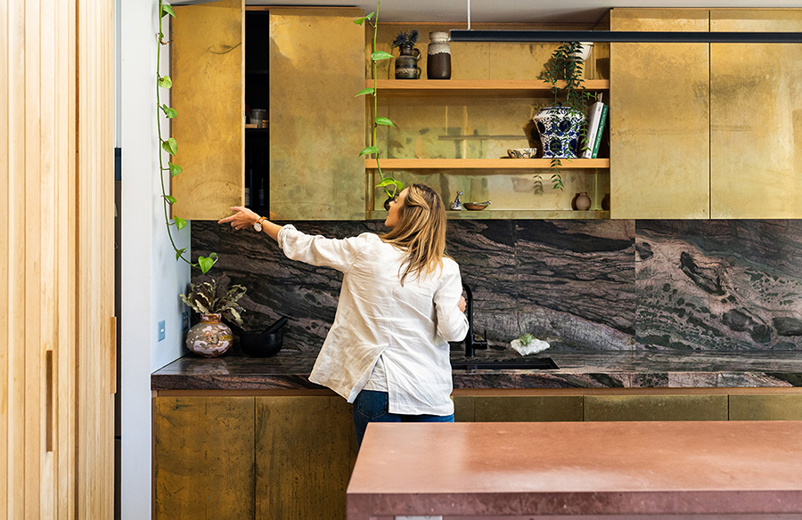
And, speaking of materials, we’ve gotta talk about the materials that are going on in that kitchen. There is a pink concrete island bench that is in the kitchen, and it’s also in the laundry. But, not only that, it’s got a… wait for it… a bamboo crocodile quartz splashback! Not only the splashback, but also on the bench top. Plus those divine aged brass cabinets. They are insanely beautiful! And, fun fact, the owners actually aged that brass themselves with some apple cider vinegar, whilst just having a cheeky couple of glasses of wine, I love that.
I really like the pantry, and I really like that hidden butler’s pantry and laundry area, as well, with that beautiful timber detailing. It just completely doubles that area. First of all, didn’t even know it existed, and I kinda pushed it open and it extends beautifully, it allows a lot more light in. And, of course, there’s more colour, there’s more texture, there’s just more beauty to be found in every single pocket of this home.
This is a small home. It’s a two-bedroom home, but I love the fact that they’ve just made it feel so much bigger than it actually is! And the way that they’ve done that is just by opening it all up. There’s so much light coming in here. There’s a lot of height. And I love those incredible, really heavy strong sliding doors that open all the way up into the garden. So you’re basically doubling your living space and I mean, we’re in St Kilda. It’s the best area. You’re near the beach. It just has a really nice indoor-outdoor vibe, and it’s really a beautiful house to just live in. It’s just got a really lovely feel to it.
The gardens, as well, I love that really high garden behind the kitchen. It’s so divine, I love the fact that it’s draping down. It sort of extends that feeling of that indoor-outdoor, as well. It brings the outside in, and I just love indoor plants. What’s not to love? Also, there was a cute little detail with that fireplace that they obviously aren’t using so they’ve turned that into a bit of a garden area. I think that’s really sweet.
But then, the styling in this home! That shelf is just like the sexiest shelf I’ve ever seen! And it’s not just that shelf but everywhere, every little detail has been really beautifully considered. And I love the fact that this home, it just feels like the owners are very well travelled. It feels like they’ve experienced life, and they’ve just collected things along the way, and you can tell that there’s a lot of story and love, and meaning in this home. And I think that’s what makes it really, really special.
What I really love most about this home is that it just so incredibly bold. And I’m ashamedly sorry, it is just so confident in its choices and its colour, and its pattern, and how it’s pulled everything together. I love its styling. It’s bold, it’s staring, it’s crazy, but it’s also calm. I don’t even know how that works, but I love it. This home is like the type of person you want to have around for dinner, inspiring, friendly, and full of great stories.
Hi guys, thanks for watching! If you liked this video, make it official, give us a like and comment below, because I wanna know what you thought of this delicious pad. And if you have not already, please subscribe to our YouTube channel, because we’ve got way more Let Us In home tours coming your way. Cheers!
Check out our previous Let Us In Episode 20 where we take a tour of The Block 2019 Winners ‘The Oslo’ Tess and Luke’s House.


