Hey everyone. You are here, I am here, because both of us love to sneak inside other people’s homes and just have a good old sticky beak. Some people like to think of that as stalking. Personally, I like to think of it as inquisitive. Without further ado, I’m going to take you through a beautiful renovated Federation home in Windsor. Let’s go take a look.
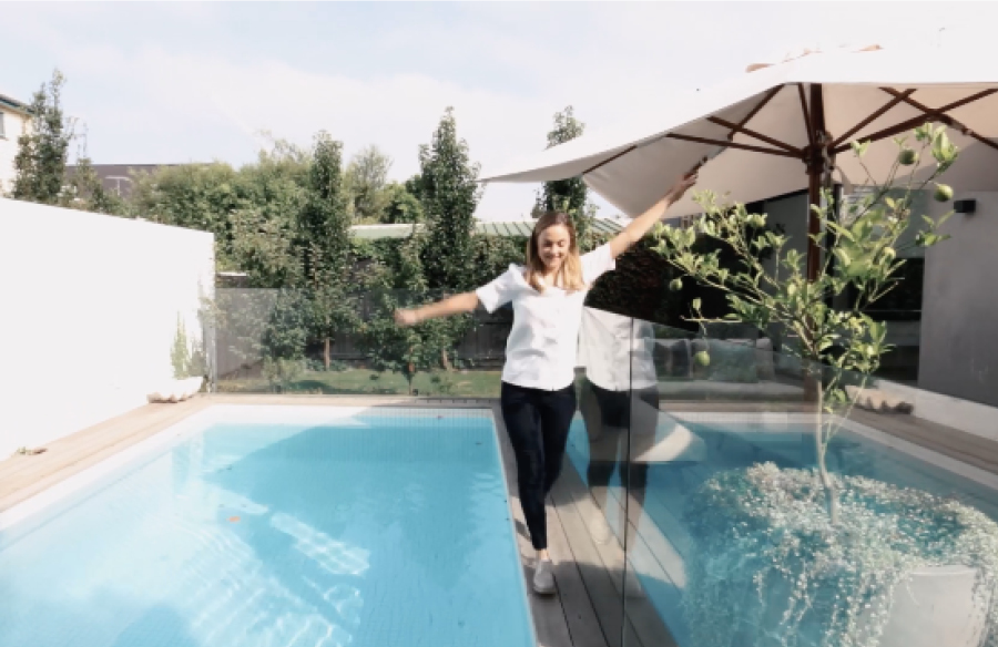
What I love about this home is that it is seriously, seriously luxe but at the same time, it’s also very practical. It’s very clear to me that this is a family home. The owners have created this with their kids in mind. They’ve got beautiful rooms for their kids. They’ve got incredible lawn space, their gardens are fantastic, and plus, the pool. Seriously, they’ve created beautiful spaces for their children but it’s more skewed around the playground for the adults and that’s what I really love. This is a serious entertainer’s space. You can tell that the owners love to party and I mean they’ve got a dining table that sits 12 people. I don’t even know if I could get 12 people around for dinner? The kitchen is massive, that island bench is just phenomenal and this couch, oh, my God. This couch, it is so big. I could Netflix on here so good, it’s just ridiculous, but it’s really centralised. It creates a really warm hub and it just feels friendly, it feels cosy. To be honest, it’s hard to do sometimes. When you’re going a luxury look, it’s hard to get that under earth cozy feel, but they’ve managed to do it as well.
“There is very much a monochromatic vibe going on here. There’s a lot of black, there’s a lot of white, but there’s also a lot of marble so that’s beautiful for the textural element, it brings in a little bit of natural tone. The other thing I’ve noticed is the greenery. There’s a really nice feel of, I think, this sort of soft green eucalyptus, a touch of blue, so it’s calming as well. So, it softens it a little bit. If you go too heavy on the monochrome, sometimes it can be just a little too much and intense, but this feels really warm and really welcoming as well.”
When I was speaking to the owners about this home, when they had their first child, Charlie, that was when they started to think about, ‘Well, we need to create a space now. It needs to be bigger and we want to create a family home.’ Great bones, obviously, from all the original features that we’ve seen throughout the tour. This home was originally a little bit closed in as most of those older homes were. There wasn’t a lot of light, there was lots of poky spaces and different odd sized rooms tacked on here, there and everywhere, and so, they basically wanted to really focus on space and they really wanted to focus on light and they just wanted to open it all up and make sure that it was a really functional space. That’s pretty much what they’ve done. The size of it is kind of what hits you. You walk through that hallway and it’s so, so wide. That hallway is huge. I think the way that they’ve done it is through those skylights as well. It’s really pulled in a lot of light. So, if you’re wanting to make a space look bigger, the more light you have, the better. What they’ve done out here, because the home is south facing is they’ve really opened it up by putting windows at the top. Basically because they’re not north facing, they’re not going to have that luxury of the sun streaming into that big open scale from the poolside. So, they’ve done a bit of a trick. They’ve lifted the roof and they’ve created a big panel of windows and that really pulls in and draws a lot of light into that living space.
Speaking of size, the other thing that I noticed is scale. So, the scale of things is really interesting to me because there’s so many big things and it just really helps to elevate everything and just enhance the feeling of scale. Again, the artwork is out of this world big, I can’t even begin to explain. It’s some of the biggest artwork I’ve ever seen and also, what I love about the artwork, is that it has very much been mixed. It’s not all the same. There’s photography, there’s beautiful original artwork, there’s kids hand paintings on the wall. There is no formula and I like that and the owner really loved to actually mix that around as well and I love mixed artwork so I love that this owner loves that.
The other cool thing about this house is that rear access. That used to be an old lane way access for septic collection, eww. But back in the day, a horse and cart used to have to go down there sorting out the waste. It’s locked into this title over time and so now they have this incredible access to the back. So, the owners are thinking about putting in a double car park, maybe putting in a granny flat studio. So, there’s kind of more to this story to come, which is also really cool.
“I really love the way that the owners have actually celebrated the heritage of this home but they’ve also given it an incredible modern makeover. It’s very much tradition at the front, party at the back, and I really do like that. It’s about entertaining, it’s about family, and ultimately, it’s a really crazy, happy home.”
That’s it from me, guys. I hope you enjoyed the A House for Charlie home tour. Let us know what you thought, and if you liked it, make it official, hit the like button and subscribe to our channel if you want to see more home tours. If you have a house that you want us to come visit let’s us know and we’ll catch you next time.
Check out our previous Let Us In Episode 03 where we take a tour of the High House by Dan Gayfer Design.


