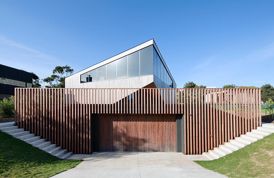
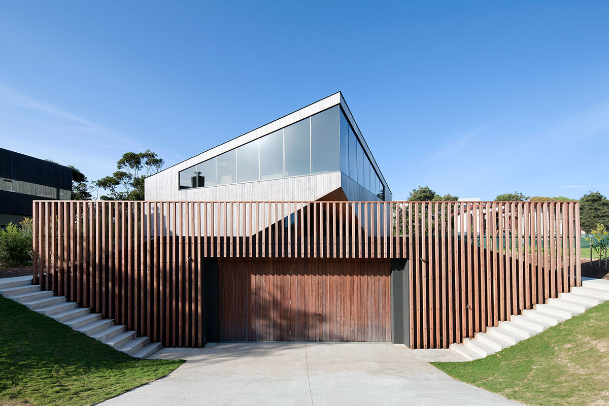
You can’t always judge a book by its cover and it’s safe to say that you can’t always judge a home’s character from its exterior. To describe the Airey’s House that I’m about to take you through is similar to when you’re at a party and you see a really cool but intimidating person that you really want to meet but also you’re kinda scared… but then you do, they’re super friendly and all of a sudden they become your BFF. That’s what this home feels like: from the outside it’s a bold, intimidating fortress but once inside it wraps you in a warm and friendly group hug. But hey, that’s just what I think. See for yourself…
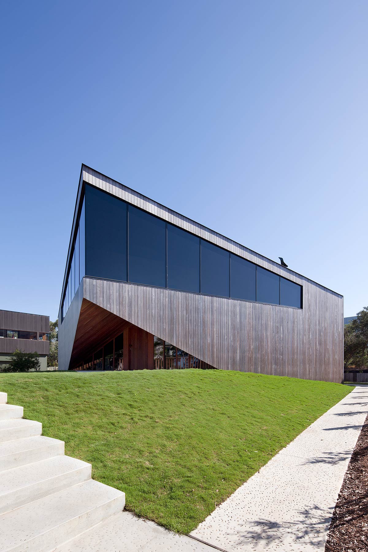
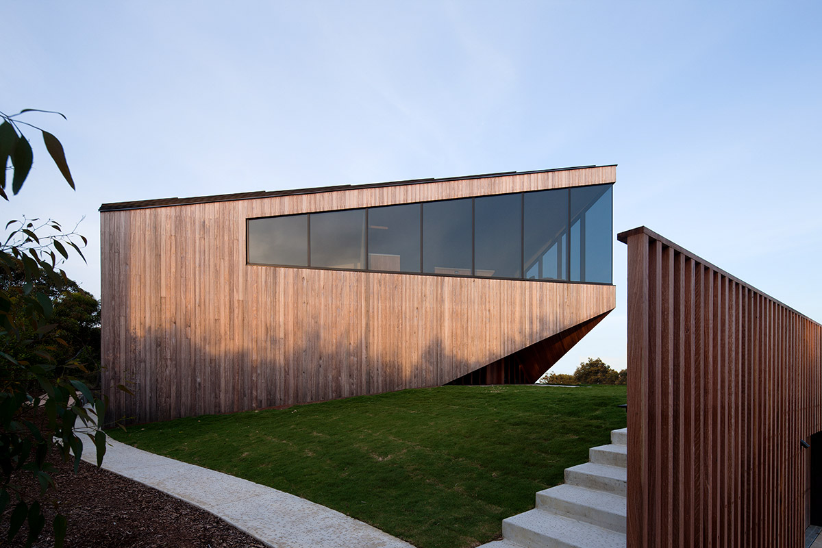
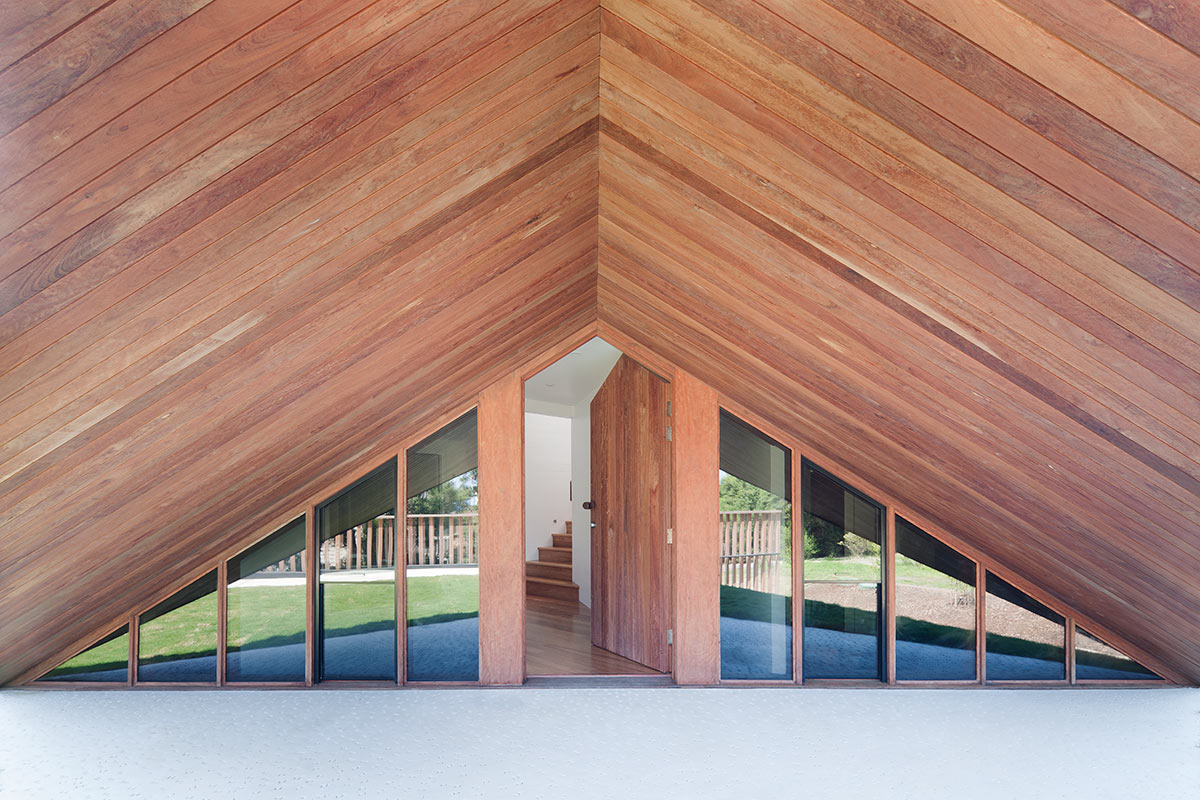
There are a lot of sharp lines and angles in this home and the layout is very unique. Essentially the home is three levels, however the ground and first floor are split to allow views and connection to the landscape. This creates a sense of fluidity and you don’t feel as if you are in a three level home, instead this home takes you on a journey. This was the architect’s intention, wanting to experiment with the landscape of the site to reflect that of its natural surrounds. The site itself has rolling hills and high cliff edges, as you walk throughout you rise and fall, sometimes revealing hidden corners and spaces. Disorientating in a way, but insanely energetic! I loved this concept, the idea that this home itself had its own natural landscape makes more than a home, but an experience.
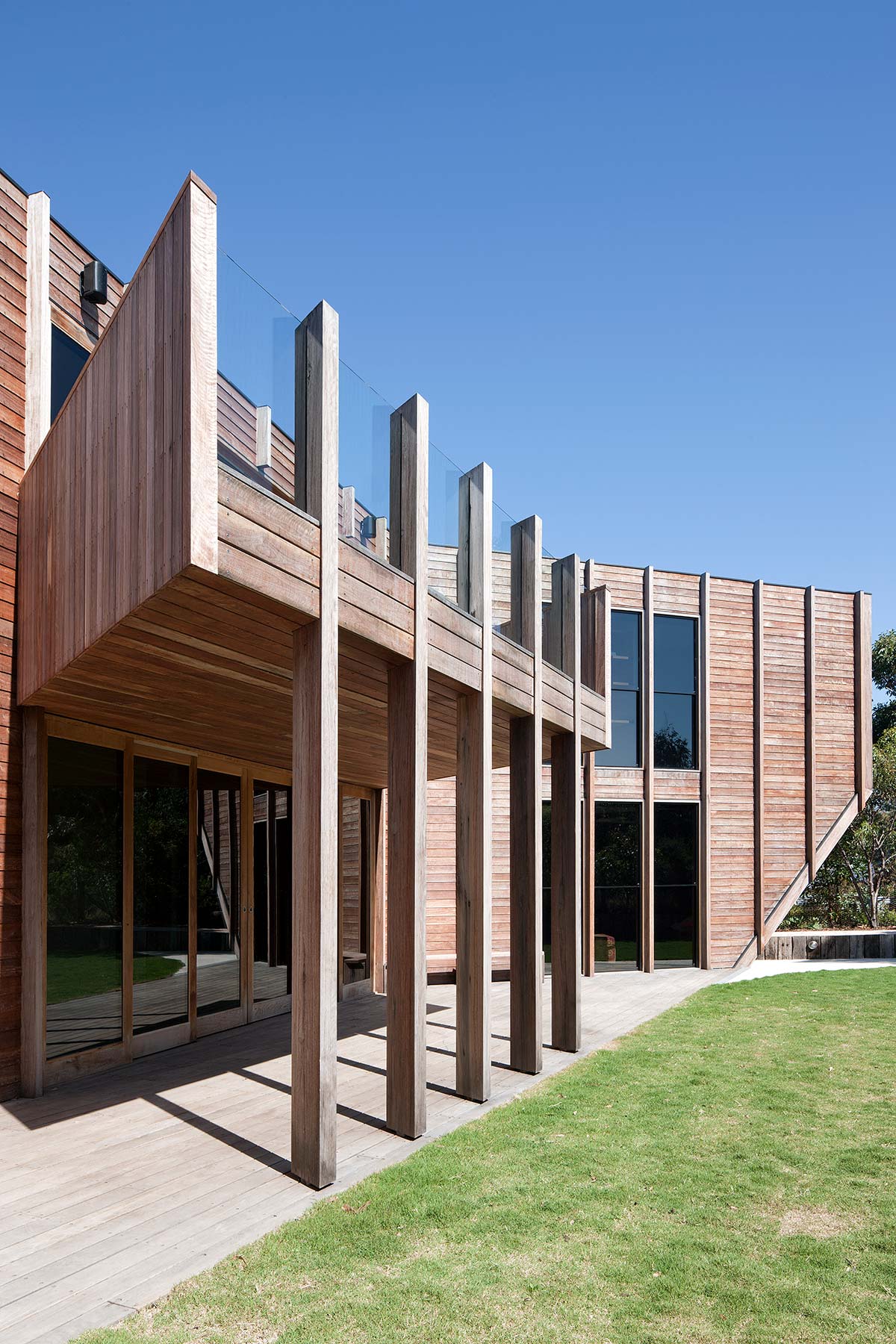
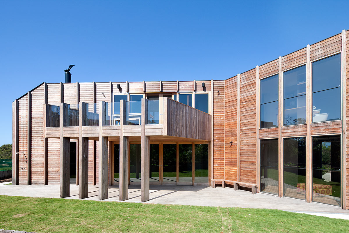
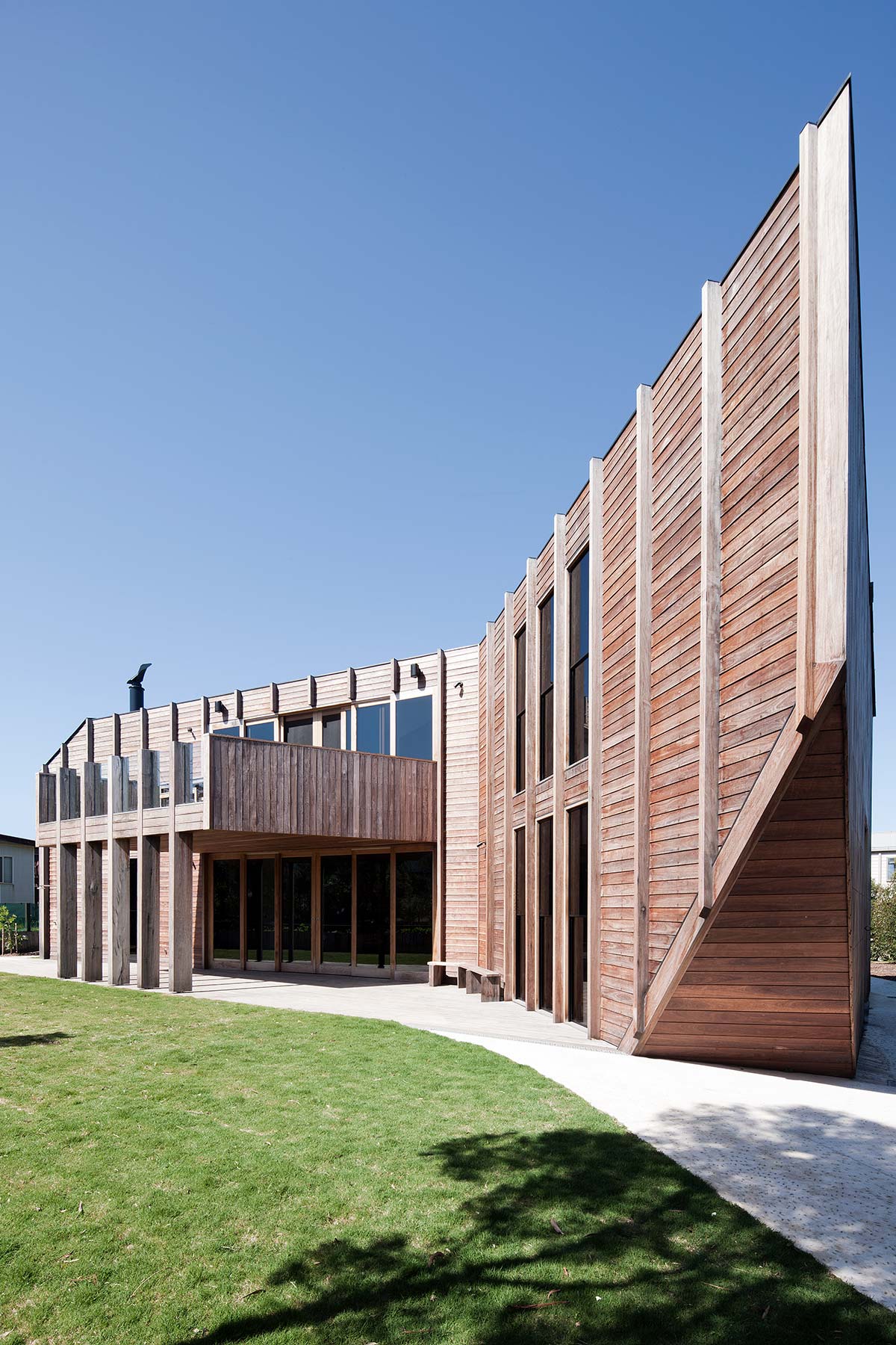
“Our aim in this house was to emulate this fluid and permeable environment. There is no front or back, and the house is entered from various levels. The landscape undulates and continues around the house. Every turn leads to new and often surprising spaces within and around the house.” Nick Byrne, Byrne Architects
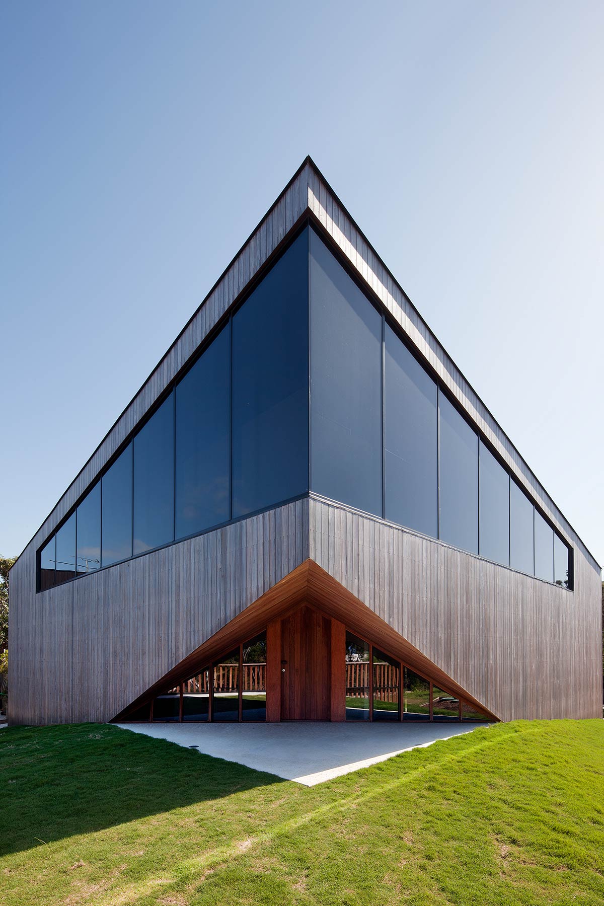
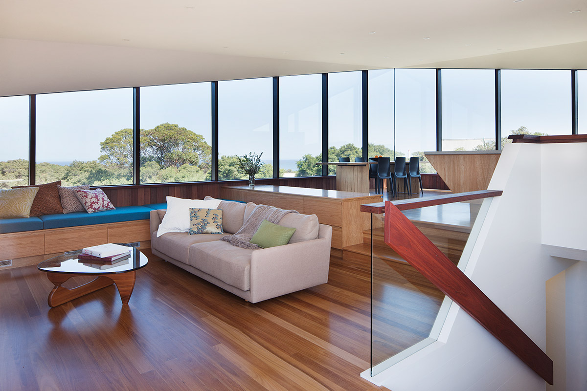
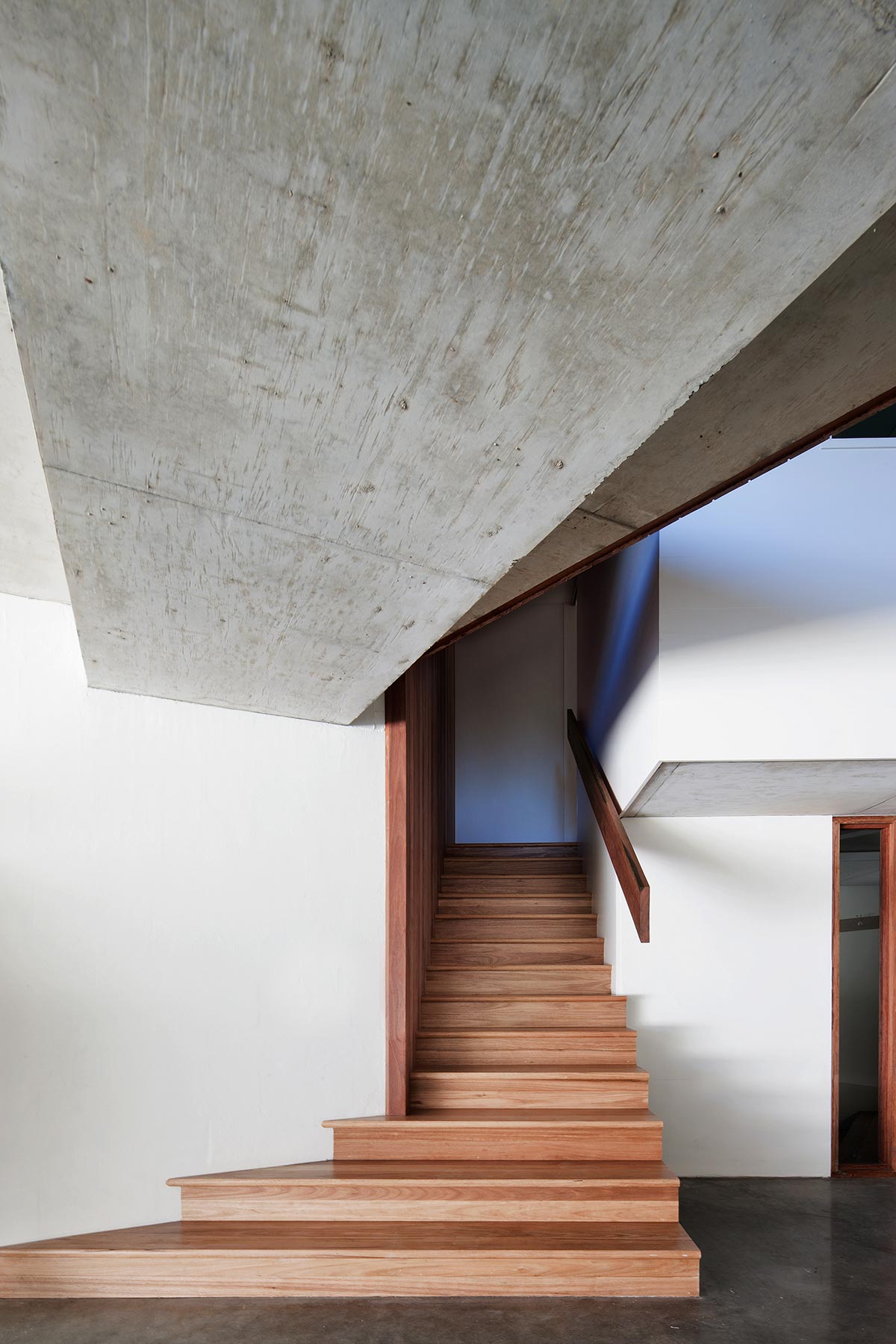
The true show stopper is that piercing glass window apex that points straight out to the Airey’s Inlet lighthouse. That view from the living room, dining and kitchen takes your eye across all of Airey’s Inlet right down towards Lorne. The interiors of the home are incredibly welcoming and a true reflection of the home owner’s personality. I love visiting well lived in homes, spaces that are truly enjoyed by the owners. This particular home, whilst a beach house is slowing becoming a primary residence. Given the complexity of the different levels and stairs throughout, the architect future proofed the design with the inclusion of a lift that allows you to access all areas of the home.
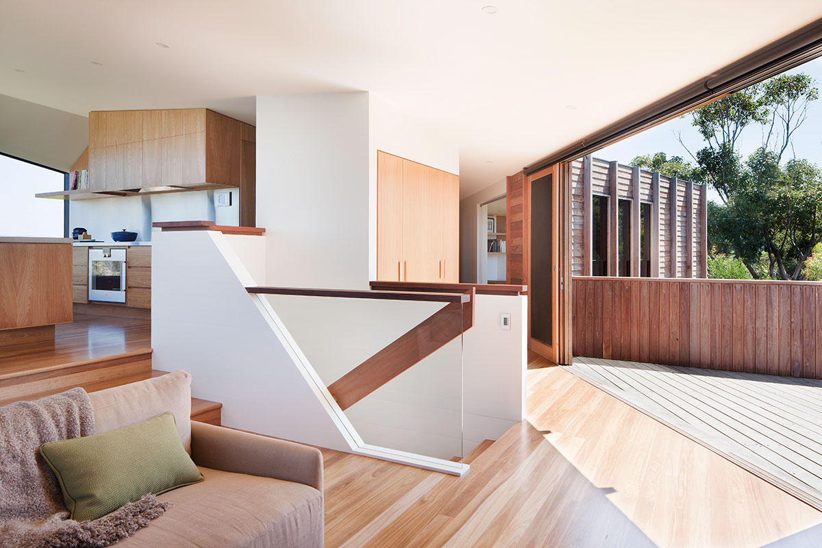
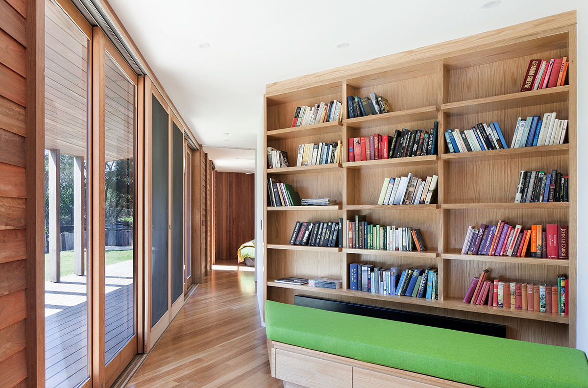
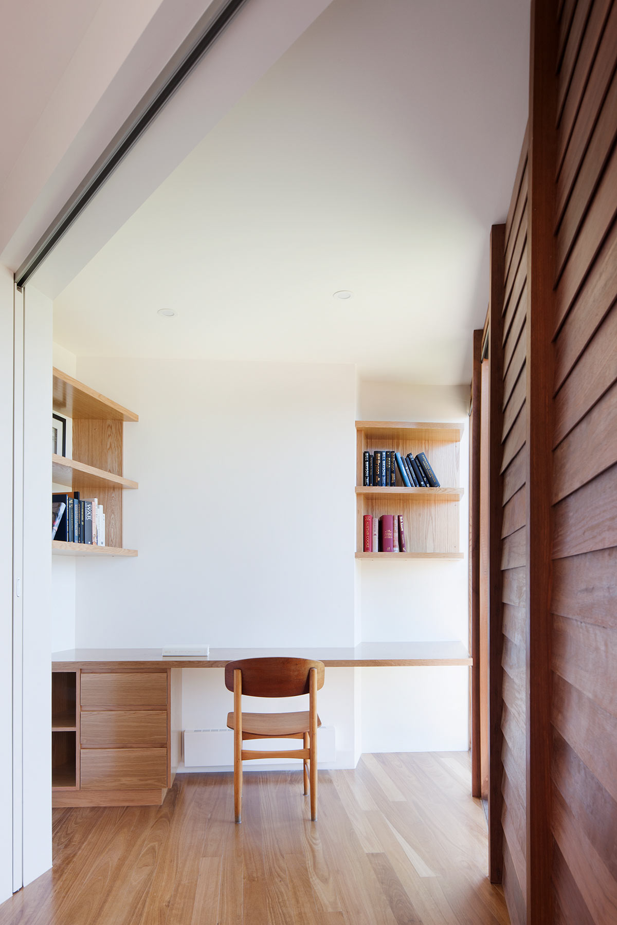
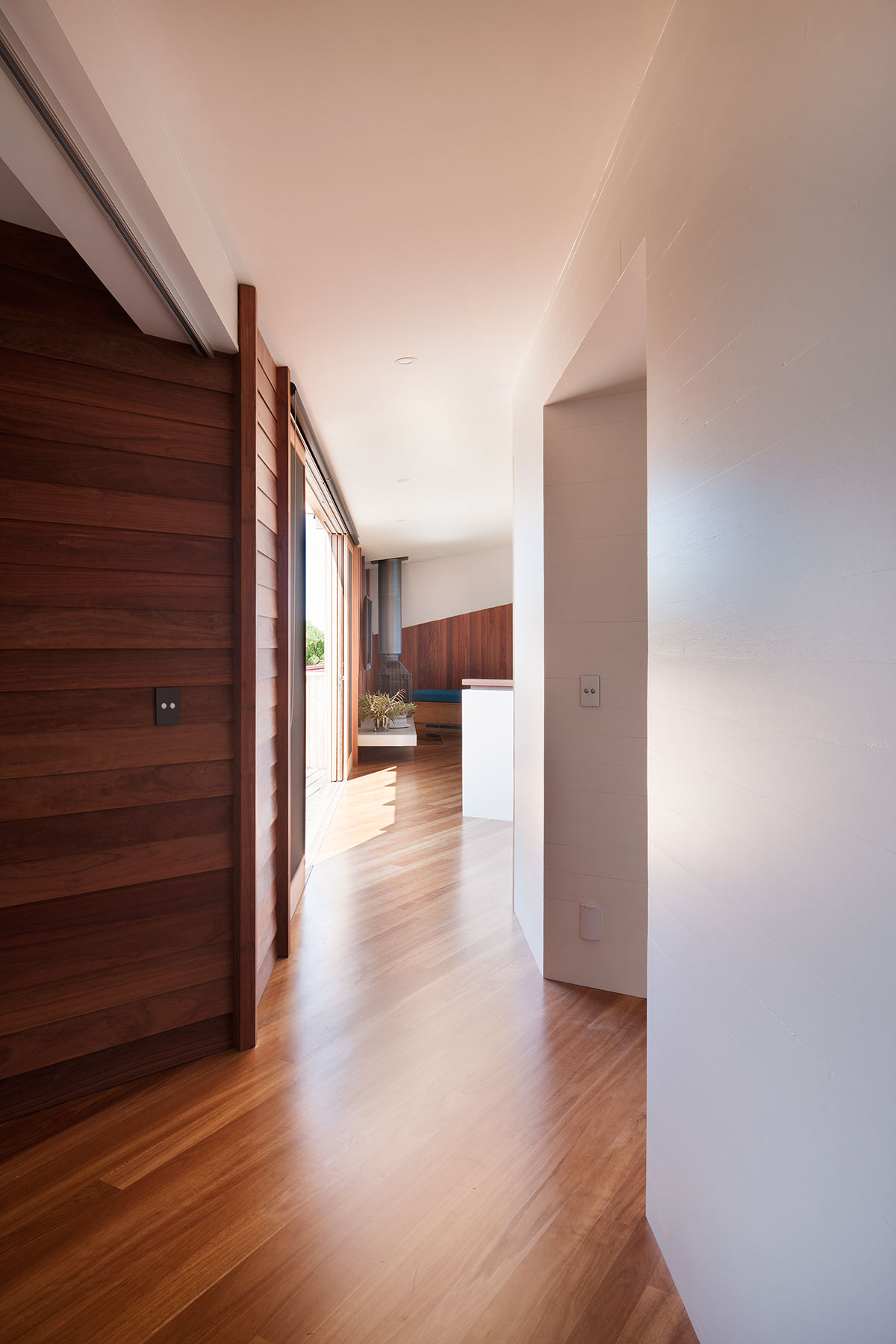
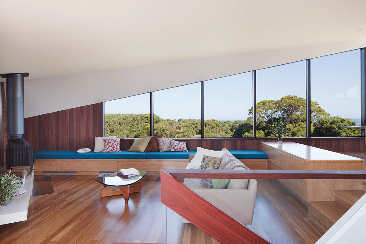
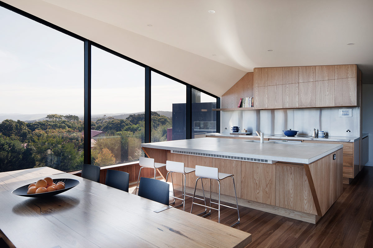
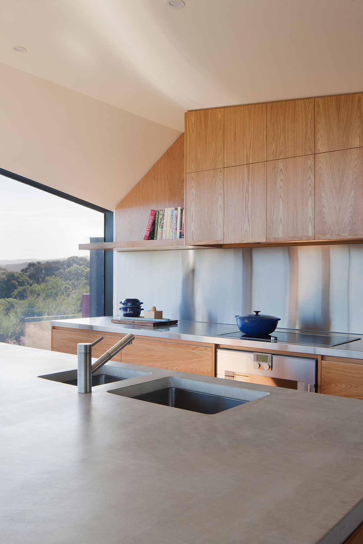
There are three bedrooms at ground level, with the master bedroom, living and kitchen on the first floor and a basement with a-three car garage, workshop and wine cellar. Inside the rooms are filled with natural light. The warm, natural red Ironbark cladding is continued over internal walls. Material finishes are robust and allowed to weather naturally.
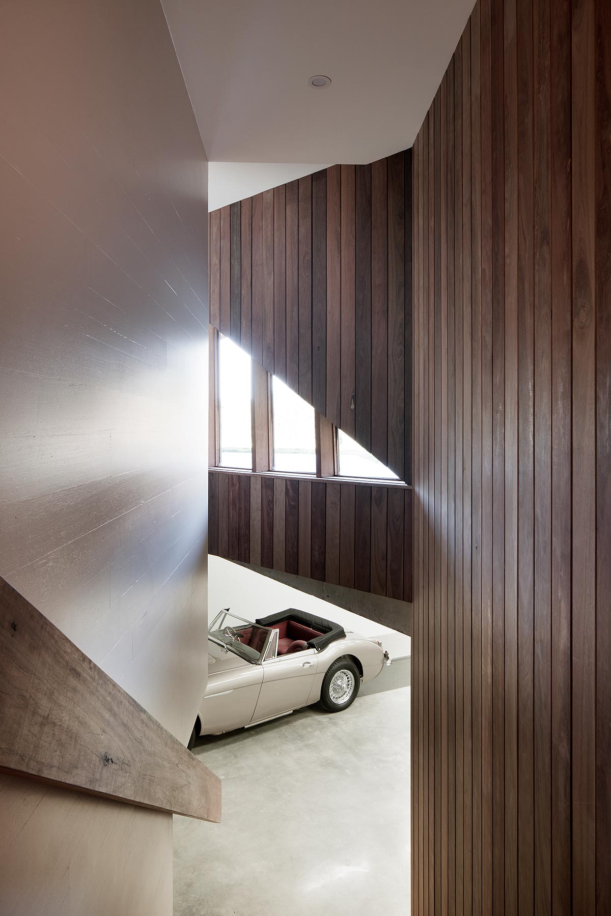
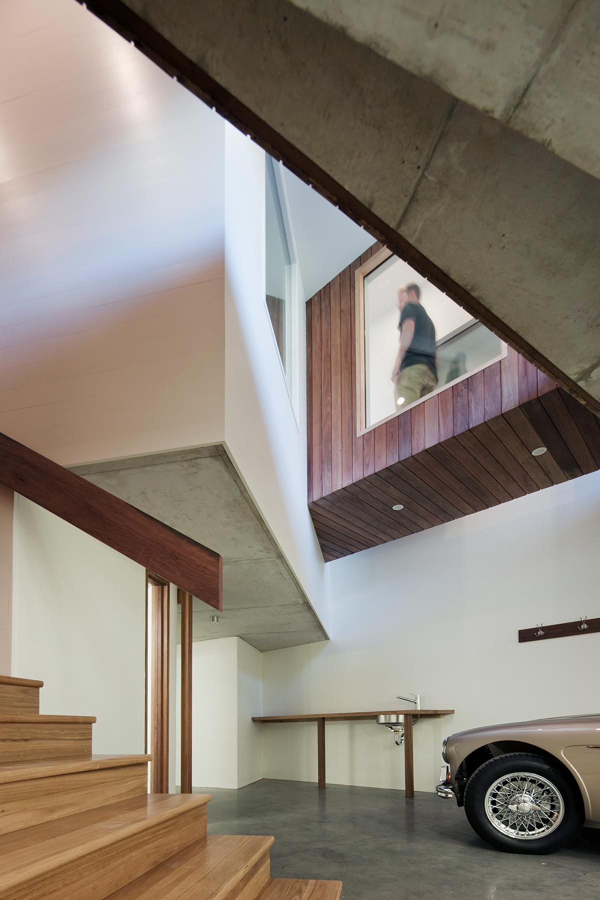
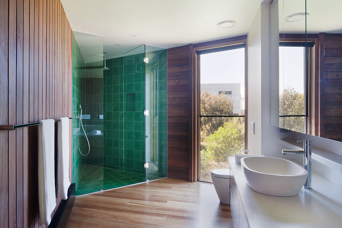
It’s hard to put my finger on what my favourite part of this home was… the classic cars in the garage were a surprise, the green triangle shower in the main bathroom made my heart skip a beat, but simply hanging out in the kitchen watching the weather change… I think that was my favourite. Chatting, eating and drinking in warm and cosy comfort whilst surrounded by that phenomenal view and ever changing sky.
Project: Aireys House
Location: Aireys Inlet, Victoria
Architect: Byrne Architects
Video: Hunting for George
Photography: Shannon McGrath


