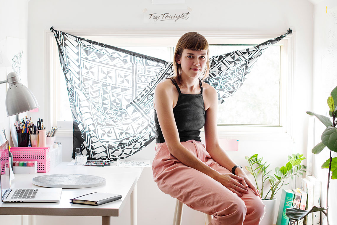
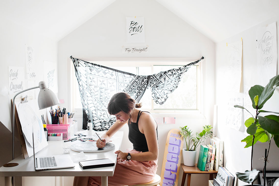
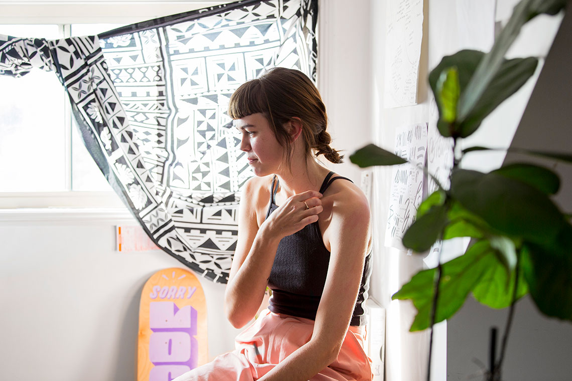
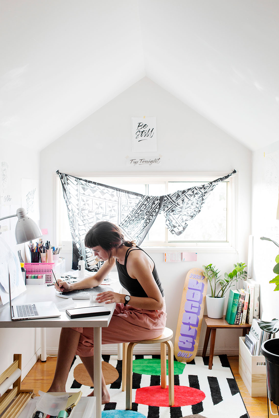
Leona Fietz is the youngest artist in this years Hunting Collective. I visited Leona in her Highhate Hill studio home in Brisbane. Leona told me to watch my step as I descended into her tiny attic space. There was just enough space for everything a home studio needs but the prime light position next to the window was reserved solely for her work. A typographer, Leona specialises in hand lettering. Inspired by popular culture, music, communication with friends and the success of her peers, Leona is at the start of what I have no doubt will be an exceptional career.
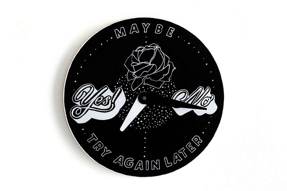
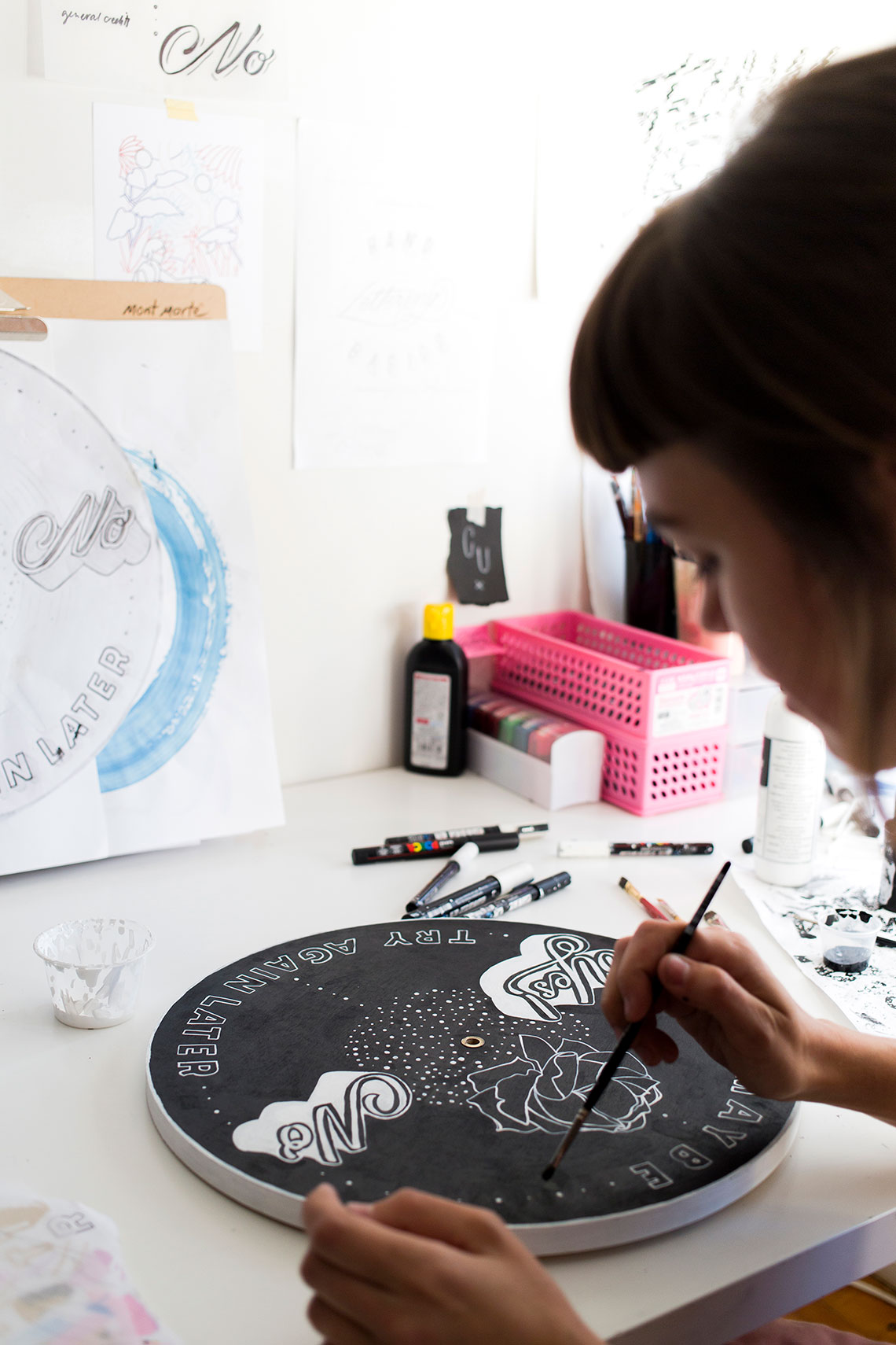
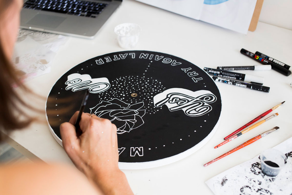
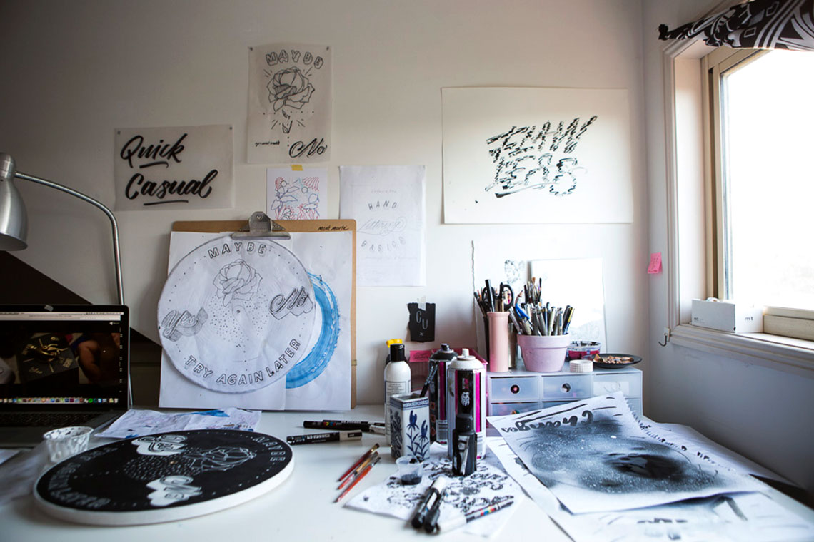
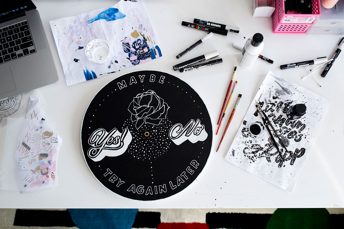
Leona is serene and familiar, at ease with the onslaught of camera’s pointing in her direction. She talks openly about her short career and I can tell that this is just the beginning of many interviews for the young creative. Leona’s playful typographic clock acts as an eternal fortune teller and indicates four distinct choices as time goes by.
Leona’s clock is available via online auction. To bid, click here.
When did you realise you were creative?
It wasn’t just one point where I realised I was all of a sudden creative. I haven’t really stopped wanting to do something creative. Originally, I wanted to be a vet and then I wanted to be an interior designer. I think interior design and graphic design came up in year 7 when you have those career quizzes. You do those multiple-choice things and it decides on a career for you. Mine were Interior Design and Graphic Design. I didn’t do fine art in year 11 and 12, because I thought I was not very good at making pots and painting people. My favourite classes were actually Information Technology and Graphics.
My sister is a graphic designer. I always looked up to her and played in Illustrator on her computer. She’d catch me playing with her computer in her room and I would run out. I thought about what I could do that was creative, but that I could also make money from. So I enrolled in Graphic Design at Sunshine Coast.
Can you describe the feeling you get when you’re creating?
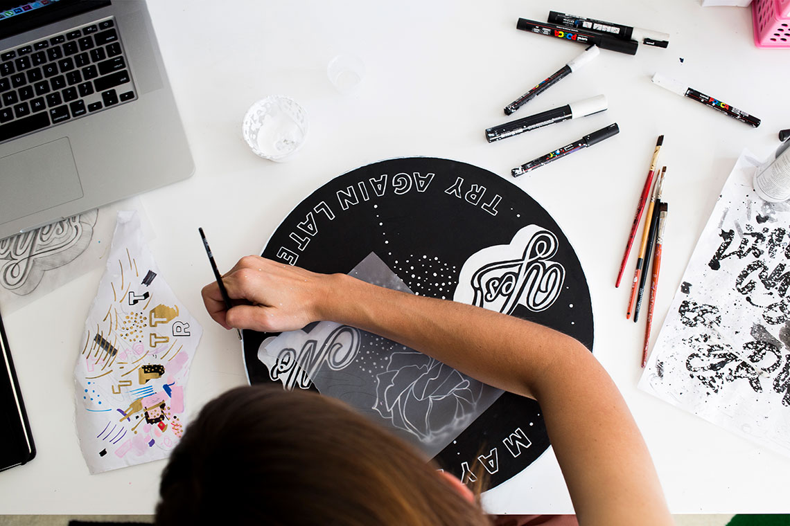
There’s always that rush when you’re coming up with the idea and sketching. When I’m actually creating and I’ve done the design, I’ve done the hard part, it’s like you zone out, which is great. You can put some music on. It’s like you’re set in time, down time, when you’re actually painting or drawing the final piece. There’s always reverting back to not knowing what I’m doing, that fear. But then I figure it out again and feel excited. It’s just constantly going back and forth between those two. It’s not just one thing.
Where do you draw inspiration from?
For the content, all my words and things, it can be from anywhere. Lyrics and music is a big thing, snapshots of conversations with friends, just whatever’s going on around me really. Visually I have lots of books that I reference all the time from people like Louise Fili and Jessica Hische. That’s what got me interested in typography, Jessica Hische and her creative path, she’s made a career solely from drawing letters. Erik Marinovich, Gemma O’Brien, people like that are big names that got me interested in lettering. There are also other places that I draw inspiration from, such as retro packaging, Japanese packaging, vintage. I always go to vintage shops. I look for the records, old 80s ‘really bad it’s good design’ kind of undesign stuff.
What first drew you to typography?
The first thing that got me into typography or hand-lettering was Jessica Hische. I followed Jessica in university and typography was my favourite class. There was one class that we did and when I finished uni, I started working at Letterpress Studio. We would do print runs and have to check everything by hand and roll all the colour on the press and clean it by hand. That’s where I started thinking I should do something more by hand. I’d always loved design that incorporated illustration or hand-drawing type. I tried to do that during uni, but wasn’t very good at it.
What’s your favourite letter?
I used to hate lowercase ‘e’s, but I really like doing lowercase ‘e’ and lowercase ‘r’ now, because they’re really hard to get correct when you’re doing brush lettering or even drawing them. I also really like the uppercase of the ‘Y’ because it’s got so many points that you can flourish. Probably not an ‘L’ though.
What’s the hardest letter to draw?
Probably an ‘S’. Drawing a capital ‘S’ is mind-boggling to draw sometimes. You have to draw by sides.
Are you a perfectionist?
Yeah, I would say I’m definitely a perfectionist. I over-analyse everything and even if I’ve finished something, I want to go back and redo it, even if it’s really painful. It’s hard to know when to stop.
I think every typographer to a certain degree has to be a perfectionist.
Yeah, especially type designers.
How do you start your artwork? How do the words come to you?
If I don’t have set words someone has already given me, words to use for a project, the way that content or words come to me is mainly music. I like lyrics, so it’s something that I hear. It’s hard to come up with something completely fresh that no one has already said to me. Sometimes two different words will go together and I’ll write them down. I have massive notes in my phone that I keep adding to, and I just go back and pick out things that I like. Sometimes it’s just something that someone says that’s hilarious and I’ll write it down, or something that me and my friends are saying all the time, things like that.
Do you see words everywhere?
Yeah, definitely. They are everywhere. I’m definitely looking up and looking at signs and things that people probably aren’t looking at or looking for. All my friends send me pictures of really bad signs or type or handwriting. I’m always looking for designs and letters.
How would you describe your style?
Bold, punchy and a little bit nostalgic.
Is there something that not many people know about you?
I couldn’t touch my toes until last year.
Why did you say yes to this collaboration?
I’ve only painted on wood one other time and that was really fun. I’ve been thinking about time a lot and how it relates to my work. I usually pick out phrases that have something to do with time. I’m really interested in that. It kind of just fit at the time, so I had lots of ideas that would suit this. That’s why I said yes.
What was the inspiration behind your clock?
I’m always watching really bad rom-coms. I was watching Coyote Ugly and there’s a scene in Coyote Ugly where she’s just moved to New York. She’s got this little hand dial and it’s got “No,” “Yes,” “Maybe,” and “Try Again” on it. I was looking for something I could break up the clock with and make it fit, something that I could use around the edge.
Did you like the idea of the hands pointing to certain destinies?
You often look at a clock to decide on a question. Is it lunch time yet? I want to go home, what’s the time. It could be fun if people let the clock decide.
What type of person do you think is going to be drawn to this clock?
Perhaps someone who really likes Coyote Ugly or someone that’s really into fortune-telling, or those really tacky toys you get when you’re young, like Magic 8 balls or magic wands.
What do you love most about creating?
What I love most is actually doing it and probably the initial concepts phase, where you think you’re going to nail it and before you don’t really know what you’re doing. You have to go through ten different concepts, but I also like nearing the end. I like the whole part. The actual doing, the making, I think it’s quite therapeutic.
Leona Fietz’s Clock for the Hunting Collective 2016.
Leona’s clock is made with acrylic paint and water based marker. Leona’s clock is available via online auction. To bid, click here. Leona Fietz is a designer and typographer based in Brisbane, Queensland. Leona specialises in hand lettering. Inspired by popular culture, music, communication with friends and the success of her peers.
All photography by Martina Gemmola for Hunting for George


