This is the room we’ve all been waiting for, our Kitchen Makeover is finally here! It’s cleaned, it’s styled, it’s fully stocked and we’re ready to take you on a tour. But first, we’ve got to take you back to where it all began… old, random and just plain scary, these are all very accurate descriptions for the kitchen and pantry situation that we needed to transform. We turn a nightmare panty into a shop fit for an OCD queen and give the entire kitchen a completely new monochromatic style. How did we do? Take a look and judge for yourself!
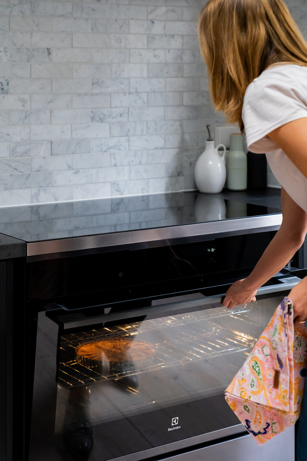
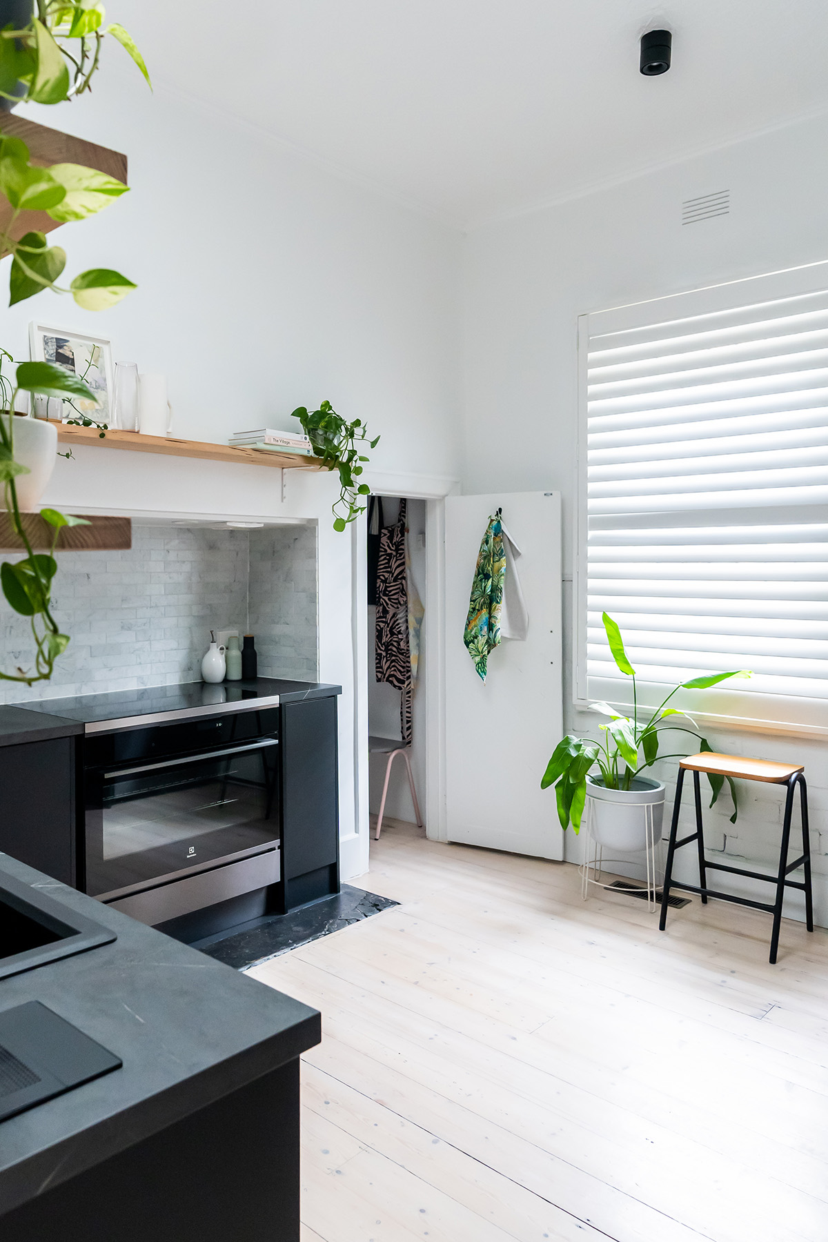
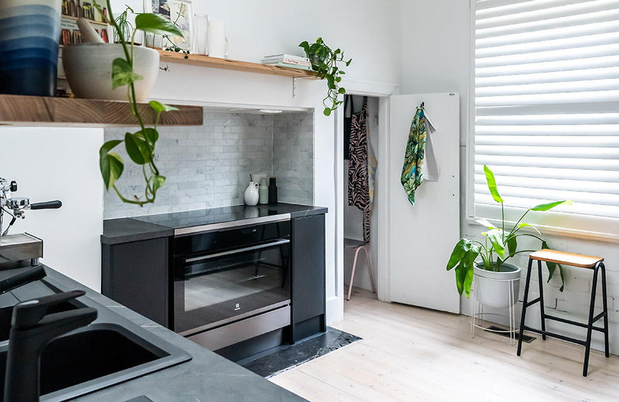
Holy moly this was a big one! Easily our biggest room makeover to date. We had to start from scratch in the kitchen so the first thing we did was work out what appliances we wanted, that way we could base all our other decisions around them. We selected Electrolux appliances for our Kitchen Makeover and they made a huge difference – not just to the overall aesthetics of the room but to our entire lifestyle. The hero for me would definitely be the Freestanding Cooker with Induction Cooktop in Dark Real Stainless Steel. We knew we really wanted a large freestanding oven to be the hero of the room and this one surpassed our expectations. The induction glass cooktop aside from being great to use, looks amazing! And it helped create a fluid, seamless benchtop effect in that nook area. The other appliances we selected were the Built Under Dishwasher with Comfortlift in Dark Real Stainless Steel. This is a streamlined design that matched our cabinetry perfectly. We also upgraded our fridge, big time… to the 524L Dark Real Stainless Steel French Door Fridge which I find to be the perfect size. Not too big and not too small, it fits everything I need and has a lot of smart internal storage solutions that are just plain clever.
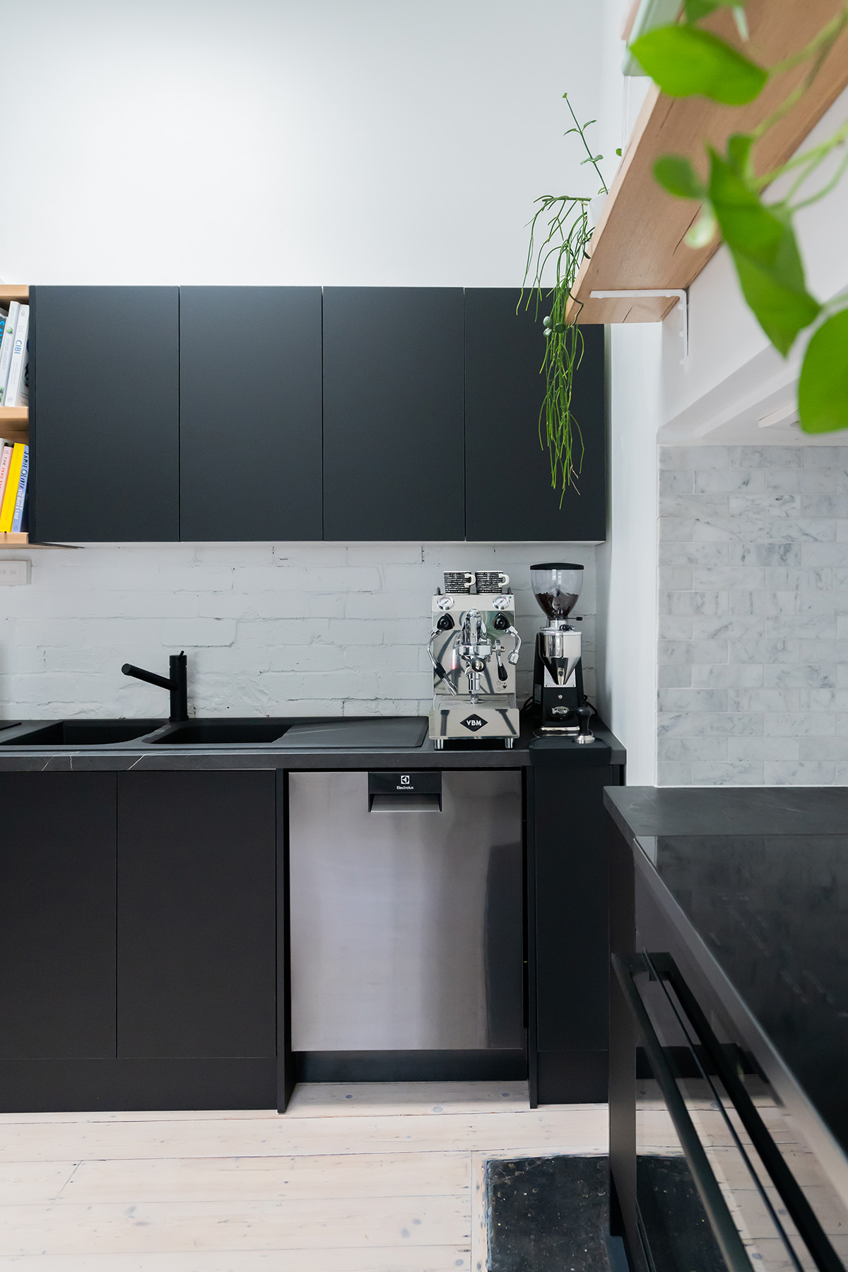
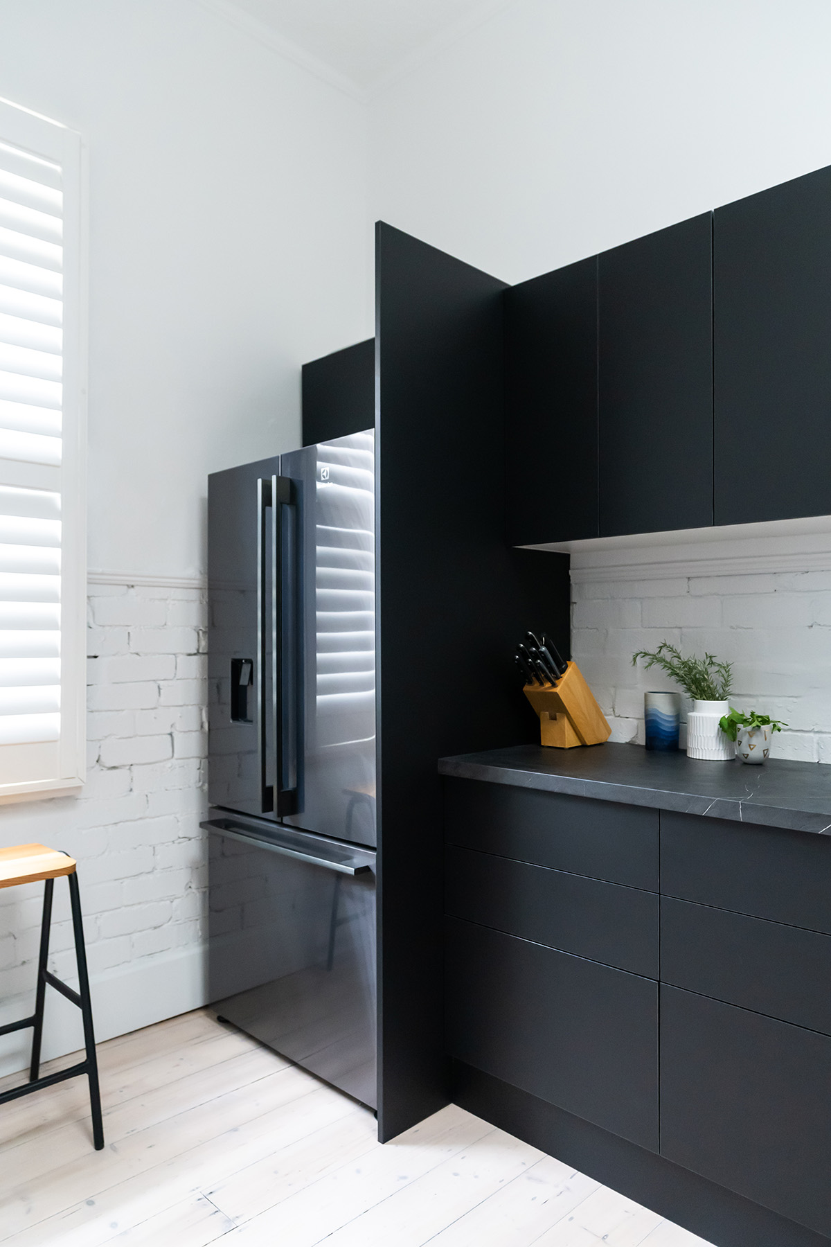
The reason we selected our appliances first was because we needed to then decide on our cabinetry and having our appliance dimensions was a crucial step. We went to Bunnings for our cabinetry to suss out their collection and in the end we opted for the range from Kaboodle. Our kitchen is a good size but it has a few odd corners and nooks, so I used the Bunnings in store service. Whilst I had a pretty good idea of what I wanted, I just wanted the reassurance that I was choosing the most effective solution and to be honest, I wanted someone else to be responsible for the measuring!! I would 100% recommend using this service, the cost of which is redeemable when you place an order.
Lovely Erin (my own personal Bunnings assistant) had all of the Kaboodle swatches for me see. I selected Molasses V for the doors and panels and Black Pudding for the benchtops. These two worked really well together as the subtle texture and graphite nature of Black Pudding complemented the flat, matte black finish of the Molasses V. I was slightly concerned that it was very ‘dark’ so we also ordered a piece of Vic Ash from the Kaboodle range so that we could add in some open shelving solutions. The timber being a natural material really helped to bring warmth to the design and the open shelving allowed me to bring some personality to the space by styling plants, cookbooks and vases.
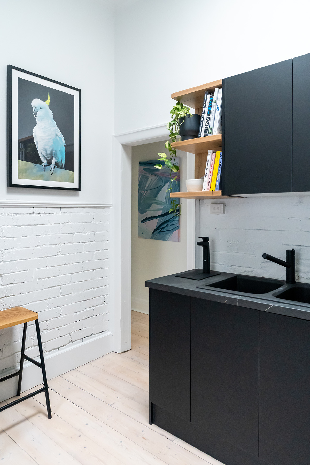
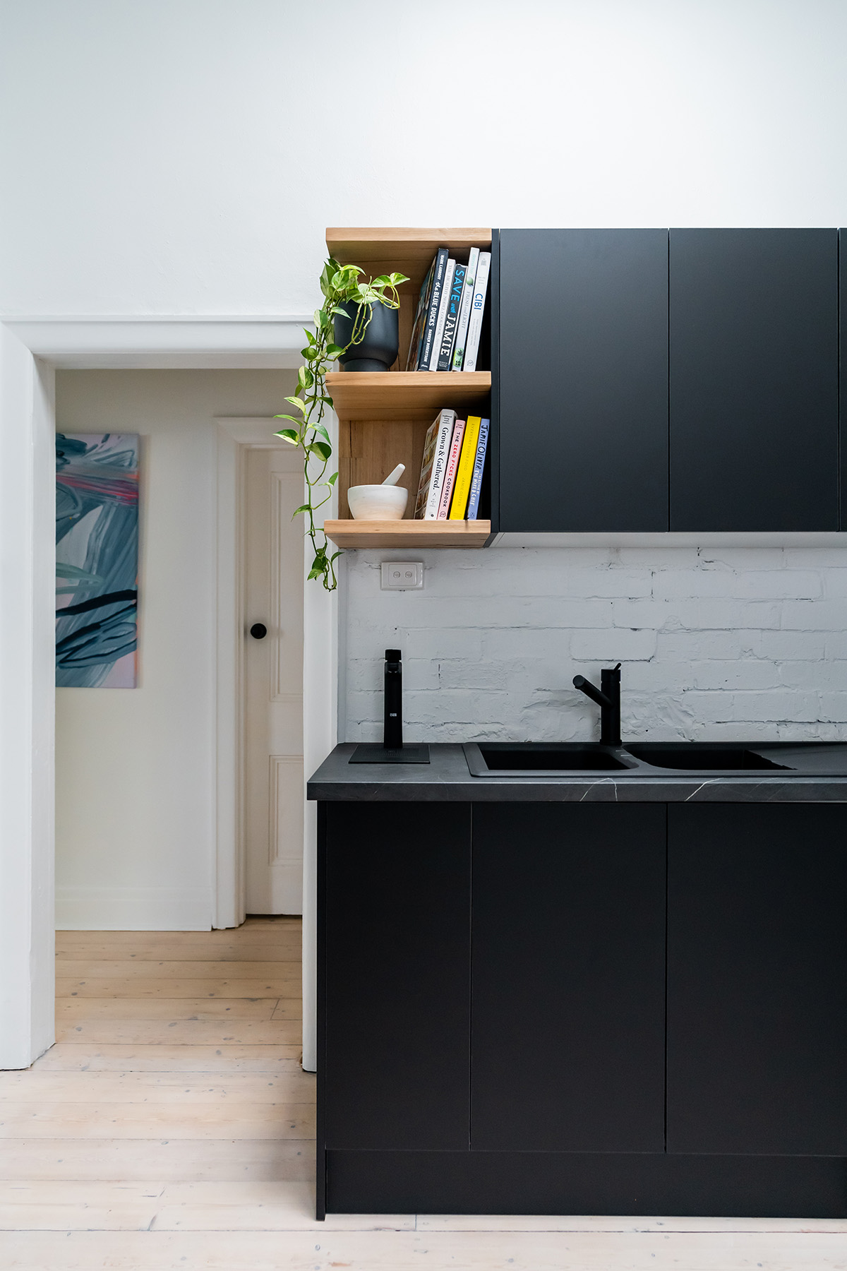
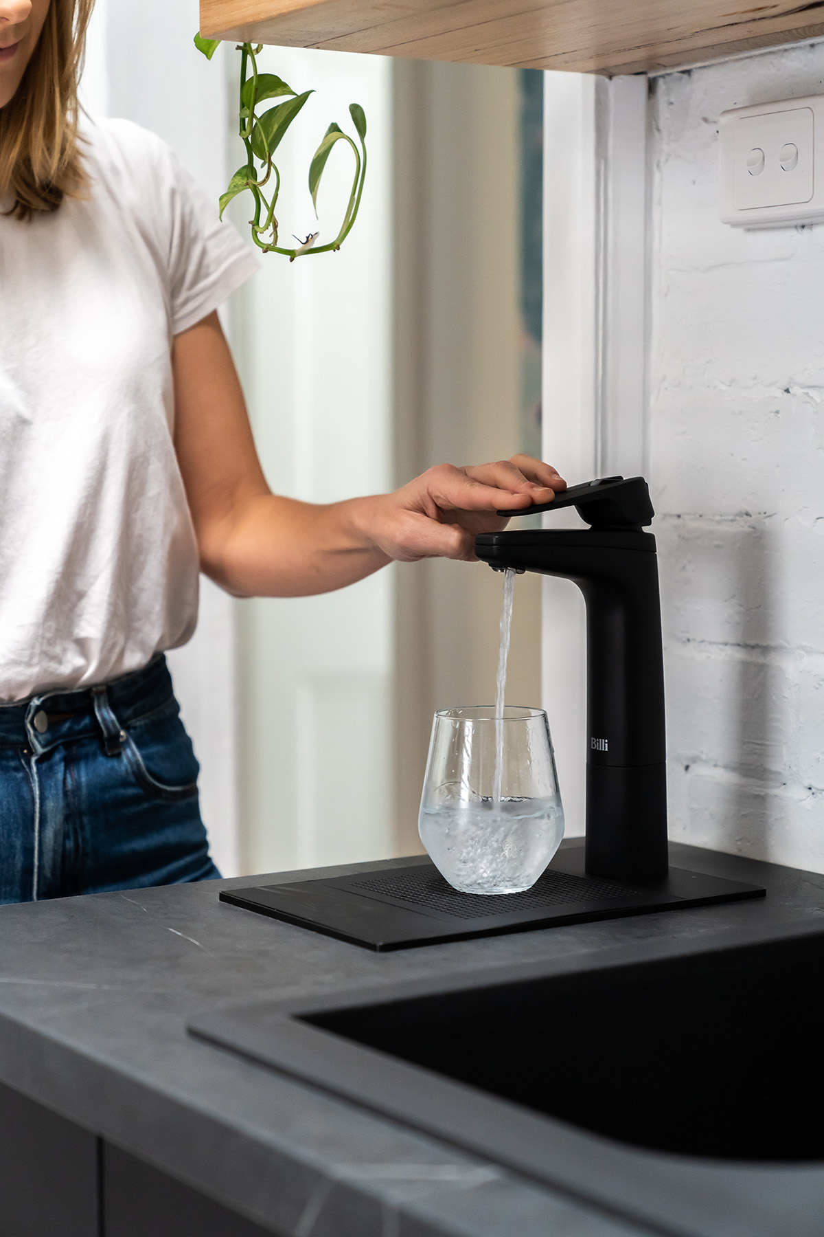
When we installed our Kaboodle cabinets and benchtops, we had some space available to fit in one of our most desired appliances, a Billi! I’ve been seeing the Billi tap in so many beautiful homes and I absolutely love them. Why? Boiling water, chilled filtered water or sparkling water instantly… whenever you want!! Plus its design is super clean and minimal, so it doesn’t draw attention… but trust me, it knows you’re staring at it 😉 They come in a range of different design options, colours and combinations. We went with the B-5000 Sparkling with XL Levered Dispenser in Matte Black and honestly, this little guy has changed the game.
It’s clear from the transformation that we made a massive change to the overall colour theme in our kitchen. We originally had beautiful exposed red brick that I was adamant on keeping, but we removed tiles and cabinets in order to reveal more brick and unfortunately it wasn’t in the best condition. So we decided to paint over it in order to keep as much exposed brick in the kitchen as possible. I decided on Dulux Lexicon Quarter Wash & Wear Low Sheen for the walls and Aquanamel Semi Gloss for trims. The floors also got the white wash effect, as we did in our Living Room Makeover.
To match our new white walls we needed an epic window furnishing and I was dying to get myself some DIY Blinds Plantation Shutters. If you’ve been following us for a while you might remember that we installed these in the kitchen and bedrooms of my Art Deco apartment. They looked incredible and I knew they were going to have the same effect here. What I love most about Plantation Shutters is that they allow for incredible privacy (our kitchen faces onto an apartment block so privacy was my number one priority!) without blocking the natural light. Having privacy, natural light and a beautiful window to look at (rather than your neighbours!) has impacted not only the overall aesthetic of the room but also my happiness levels!
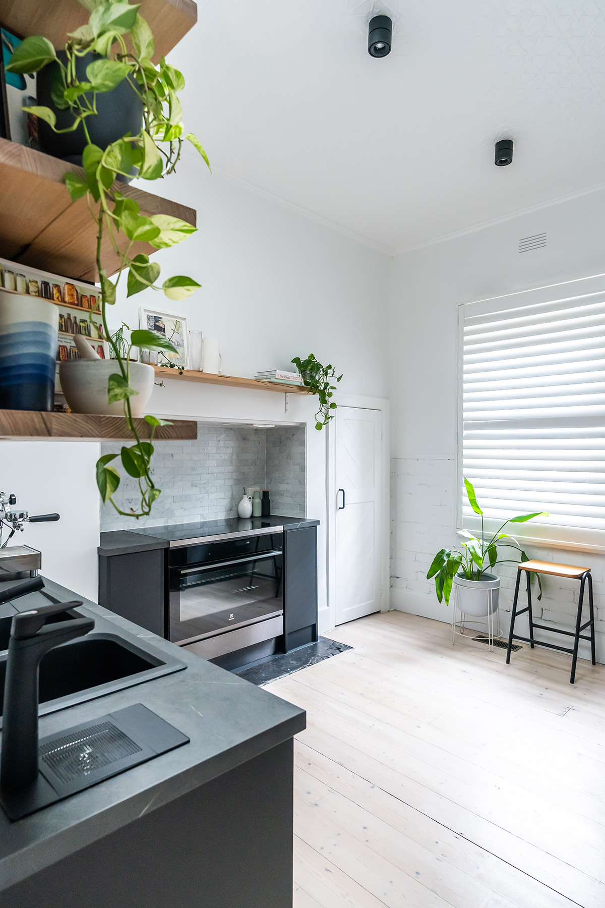
Previously our kitchen had two very dramatic (and not in a good way) red pendant lights. Whilst I think pendant lights can be really effective in a kitchen, this was just not the right space for them! Instead I wanted to install down lights in order to bring your eye upwards, however I still wanted to make a bit of a statement. I chose the Kinetic Down Lights from Lights Lights Lights. These have the availability to pivot 360 degrees so you can angle them for directional light, however for the position of ours we decided to direct them straight down. They come in two direct colours and sizes, we chose the 15W (large) in Black.
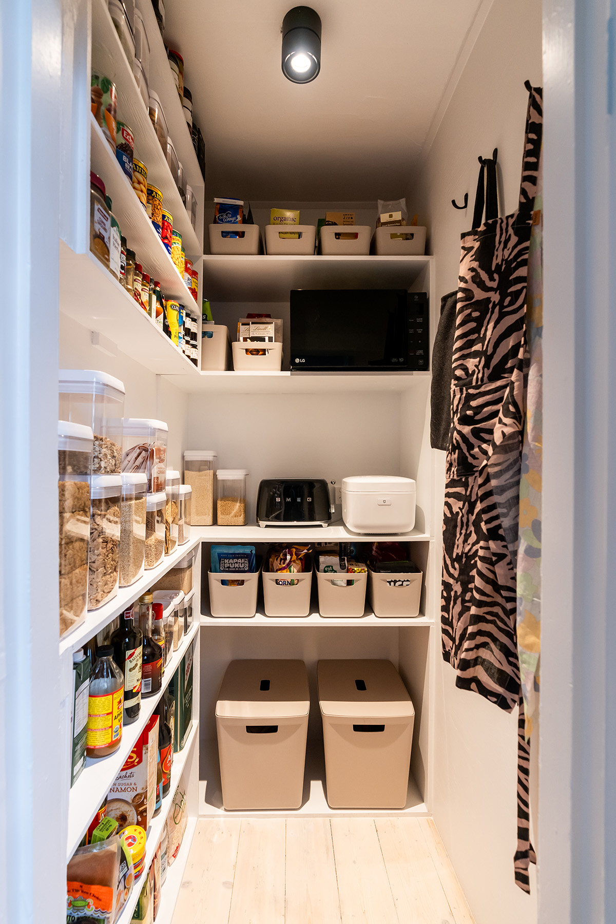
Our previous pantry was nightmarish! Seriously! I was so embarrassed to even show you. We gave this a complete overhaul. After gutting the space and coming across a few issues (watch the video to see what I mean) we built custom shelving to create a butler’s pantry to store our food and appliances. I picked up some storage solutions at Bunnings and they soothed the OCD in me! I must admit clearing out the pantry has had an insane impact on my daily life. Not only am I more organised but because I can actually SEE everything that we have it means that I only buy and use what I need to.
I would absolutely love to know what you think of our kitchen makeover! It was a huge challenge but it feels so good to be finished. This Thursday we will be sharing our costs with you and how we opted to save money in the kitchen. We will also be sharing a Complete Style Guide to the our Kitchen so you can shop the look.
What’s next? We’re busy working on our laundry makeover. Make sure you subscribe to our Youtube channel to be notified when it’s live!




Enjoyed watching the transformation and very envious of the pantry. Just a couple of questions, What is the wall/ panel to the right of the ‘frig? And do you think you have enough bench space? Id be tempted to add something like a butchers block in the centre for extra prep space?
Stunning makeover! Ilove it!
May you tell me, from where the beautiful grey flowerpot with the white plantstand is?
Thank you so much for the great content!
No table in this Kitchen. So strange, a part that i love what you coosed.
This is a great look, but the old kitchen had lots of charm. Can’t help feeling that this is a great apartment look but for that beautiful grand house, maybe taller custom made cabinetry with a bit of old charm?