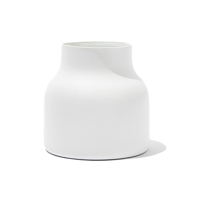
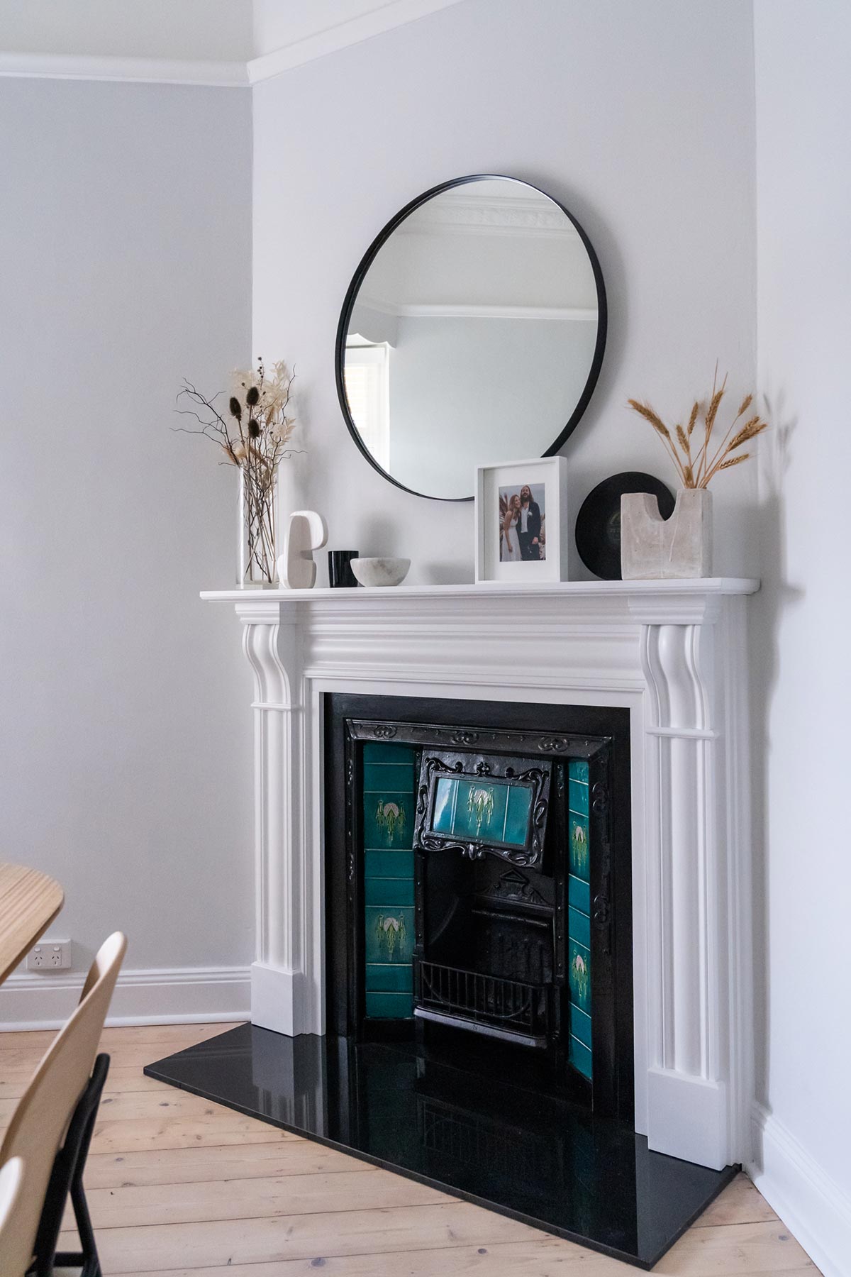
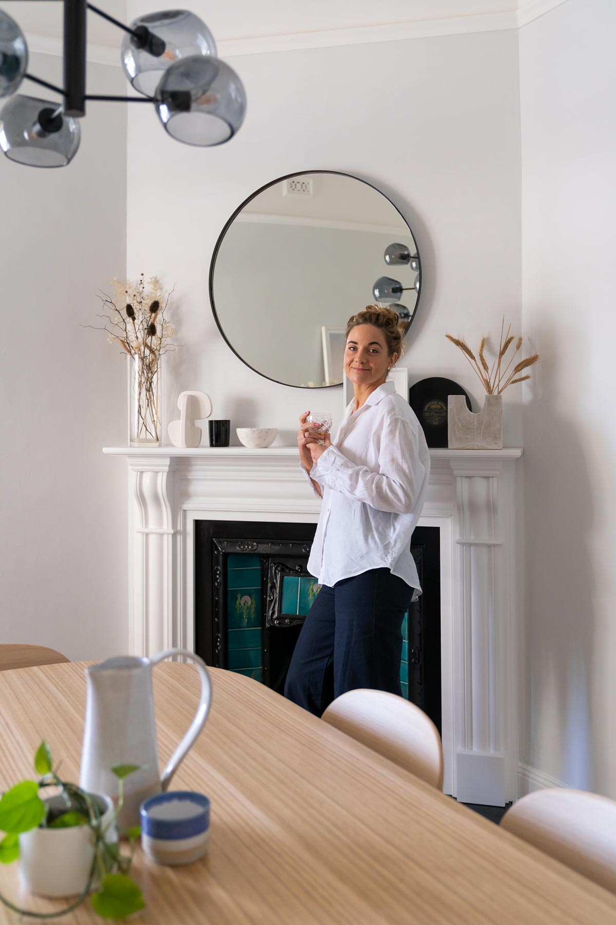
Sometimes the hardest part about a room makeover is knowing how to piece everything together. When it comes to styling, there are a few simple tips that you can follow to create a perfectly balanced room. I share with you 7 (very easy) style tips to help you style your mantelpiece or shelf. For more information on all the products that I styled be sure to check out our ultimate Dining Room cheat sheet so you can get the look at your place.
1. Create an Anchor
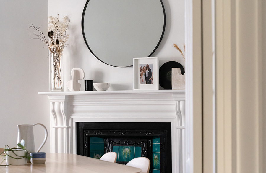
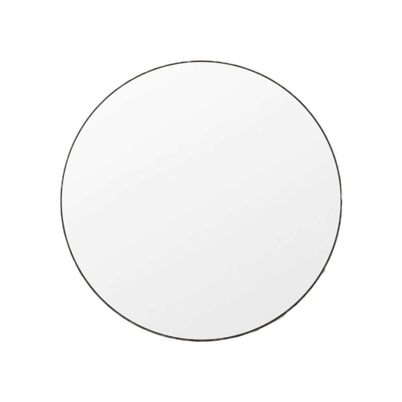
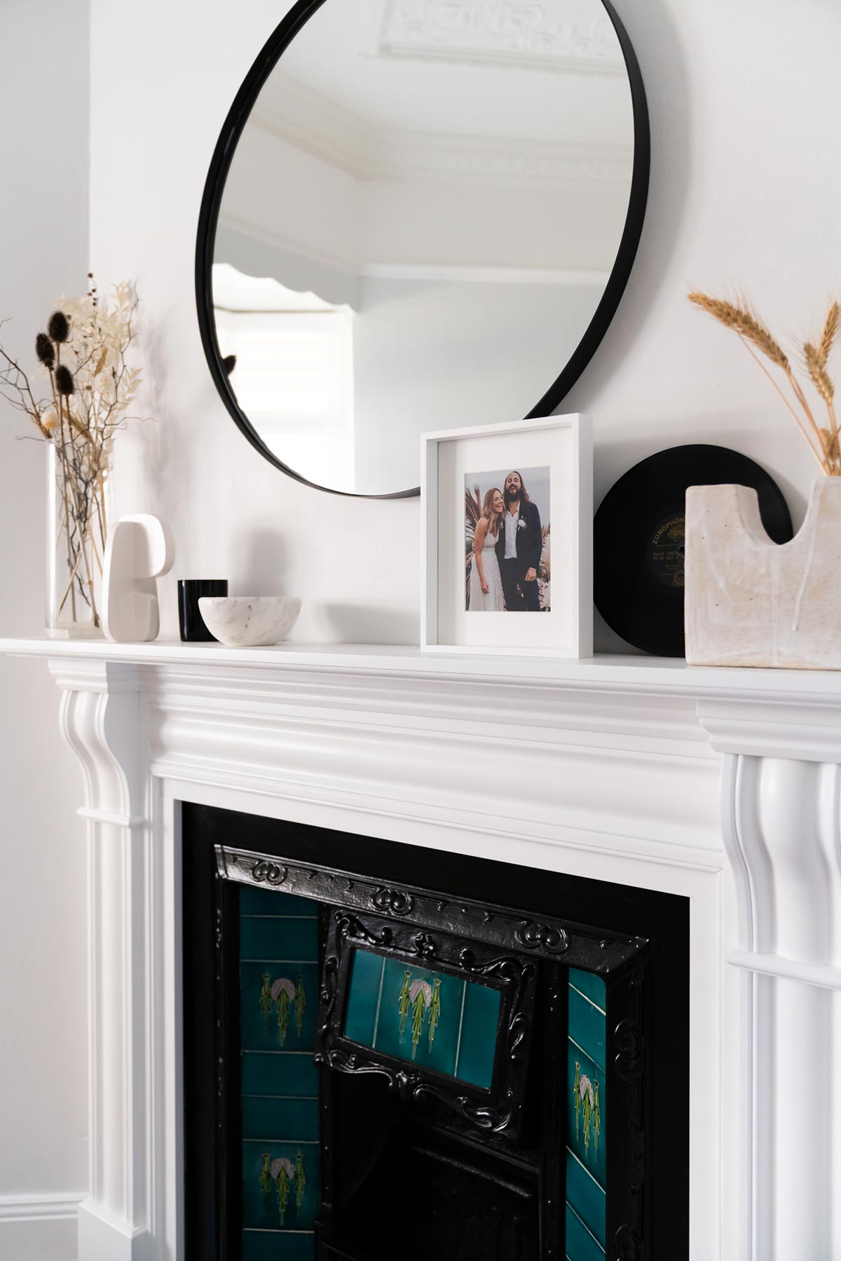
An anchor is helpful to act as a focal point to draw your attention. A good rule of thumb with the anchor is to make sure it’s a decent size, generally aim for half or ⅔ of the width of your mantel. I chose to style with a mirror, but another option is to style an artwork. You can either hang or do a simple lean-to on top of the mantel.
2. Bring in Height
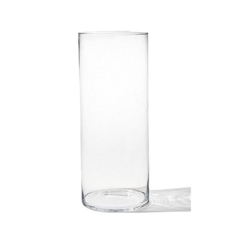
The next thing you want to do is to add height. Tall vases are a great way to add height. To create an asymmetrical composition, mix up with different heights and objects. For a symmetrical composition simply mirror objects either side, matching candlesticks are often a good way to achieve this look.
3. Add Texture
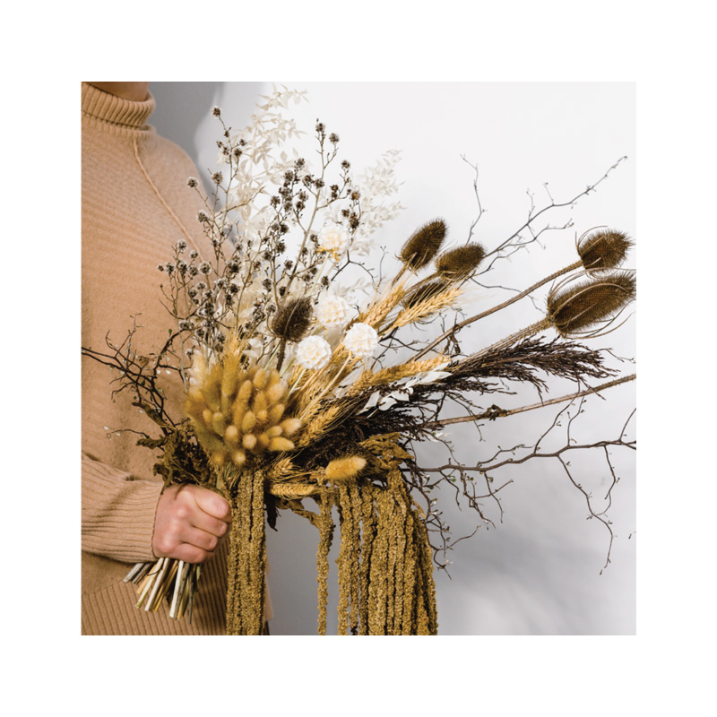
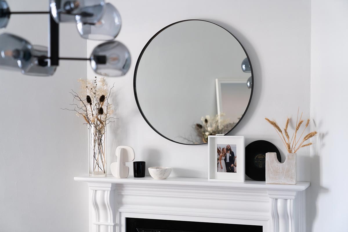
I love to bring in natural texture into my styling to add soft, organic shapes. In this instance I styled dried flowers as these are low maintenance and will always look good. Branches, wheat and grasses are also a great idea.
4. Layer Decor
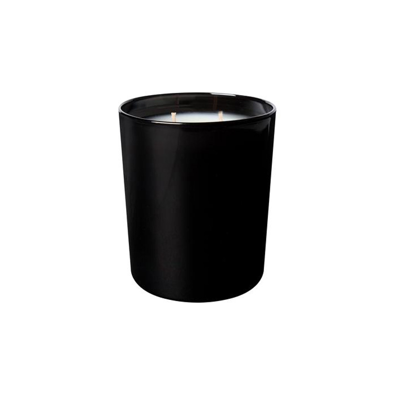
Next step is to add some decor. Bring in different objects, overlap and layer the pieces in order to connect with the anchor and each other. You want to begin to form an invisible triangle, so that you eye moves harmoniously around all the elements.
6. Different Shapes
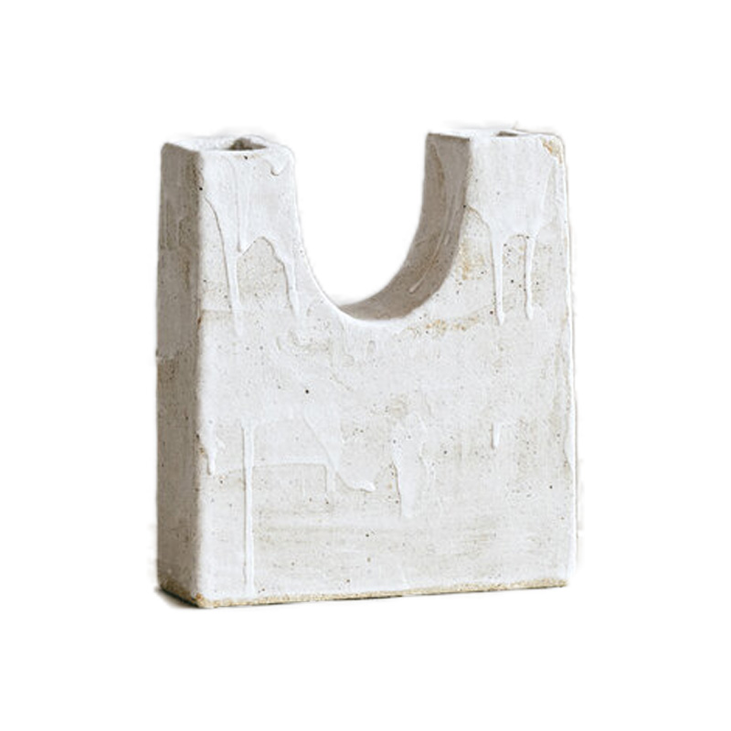
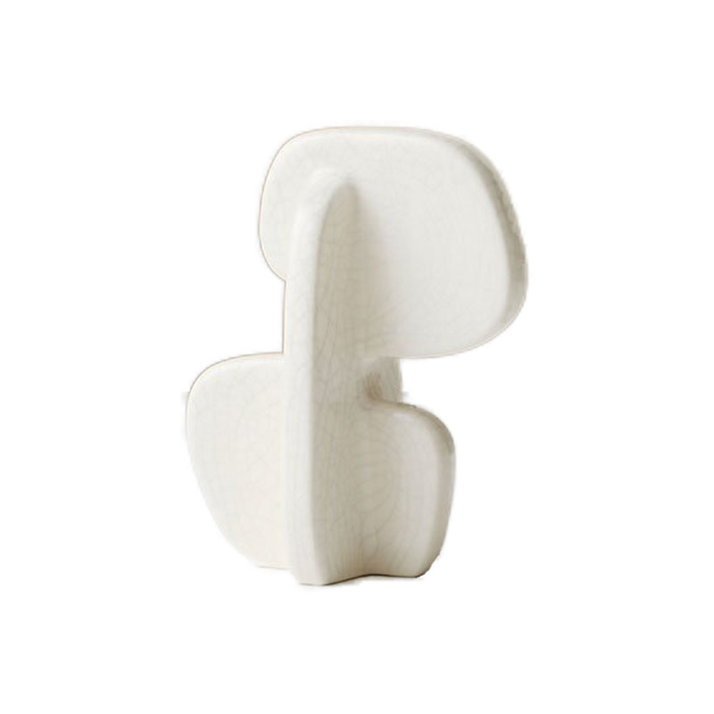
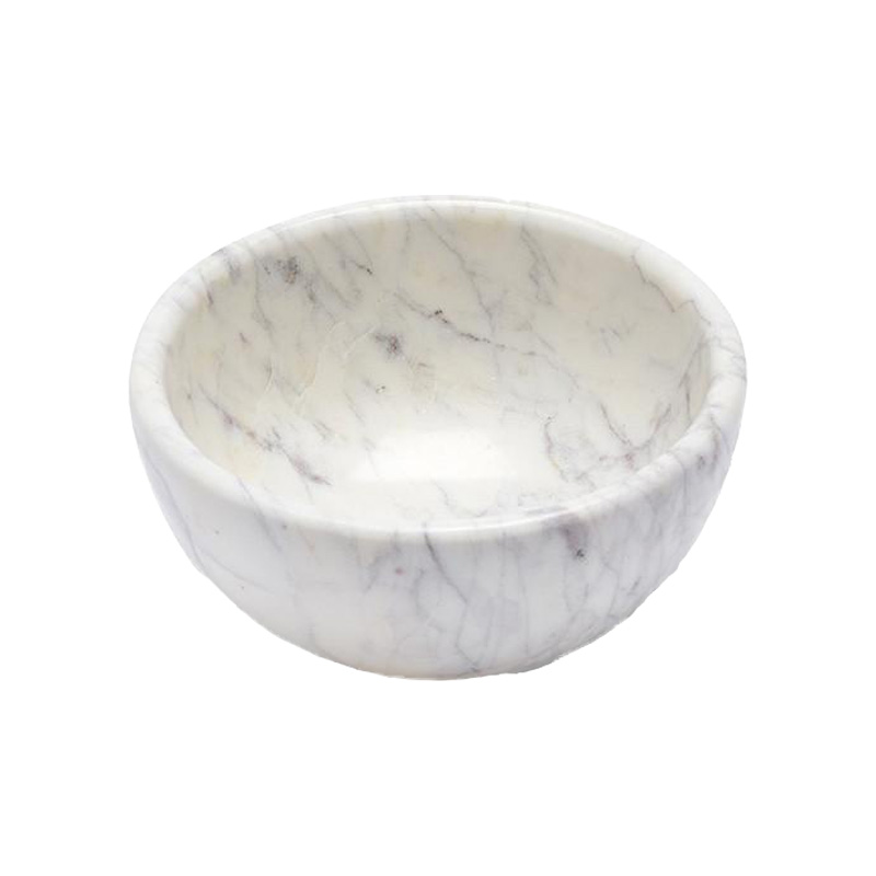
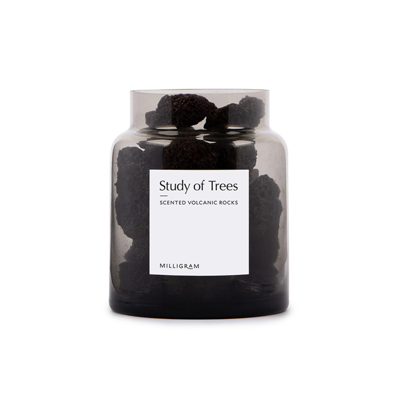
Keeping a variation of shapes for the decor helps create a captivating and eclectic look. Mix curves with sharp lines and keep within your desired colour palette.
7. Scale
Scale is important when it comes to your decor. You don’t want lots of little pieces because it will make your mantel look cluttered. Go bigger and remember, less is more.
8. Balance
The final element to any successful composition is balance! Visually each side needs to feel ‘even’. This can sometimes be a challenge if you’ve opted for an asymmetrical composition such as I have. Try to match heavy and light tones so that each side looks complete. This comes down to practice, just move elements around until you’ve found the right balance for you!
Get the look
No need to become too overwhelmed about his undertaking, styling the perfect mantel is tons of fun! So if you’re looking to spruce up your fireplace, transforming the mantel is the way to go. Hope you guys enjoyed it! To see more, please consider subscribing to our YouTube channel as we have plenty more coming your way.


