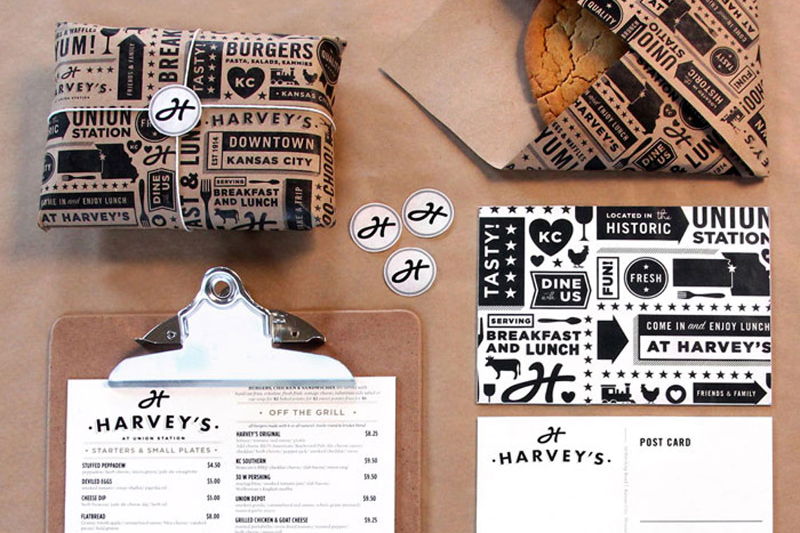
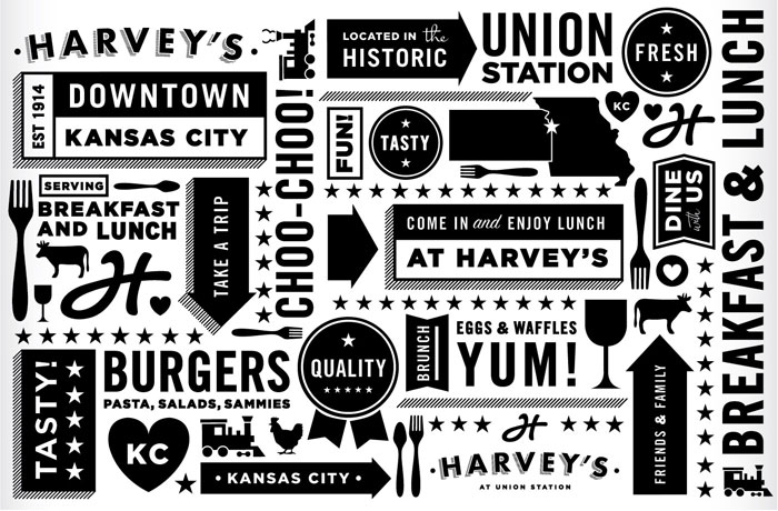
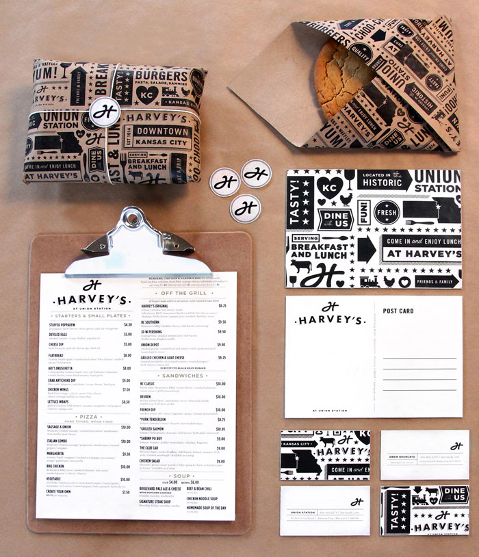
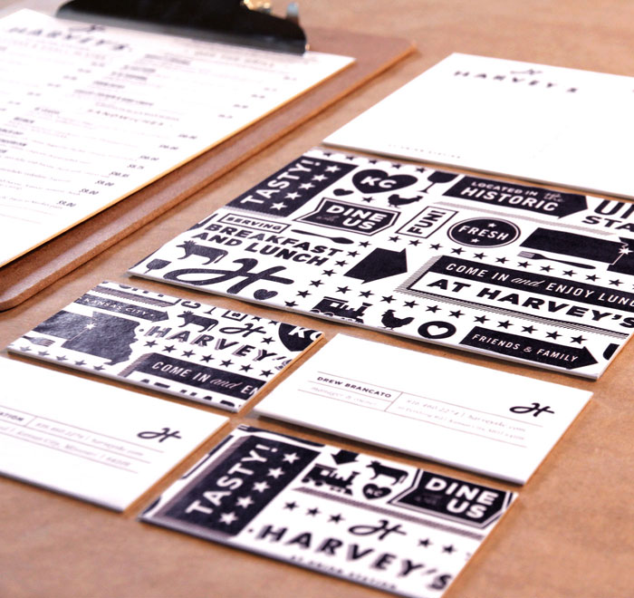
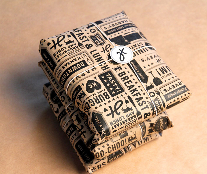
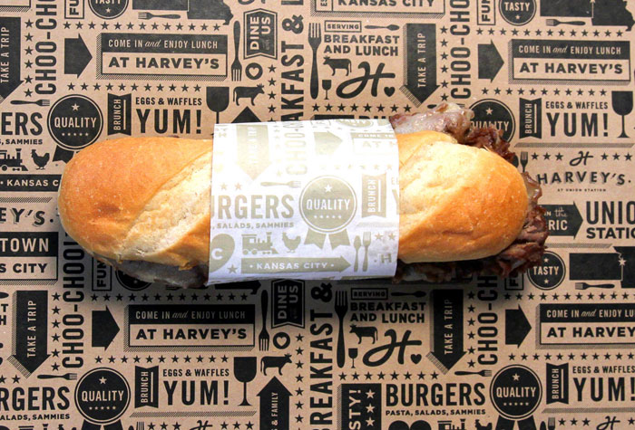
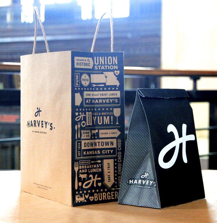
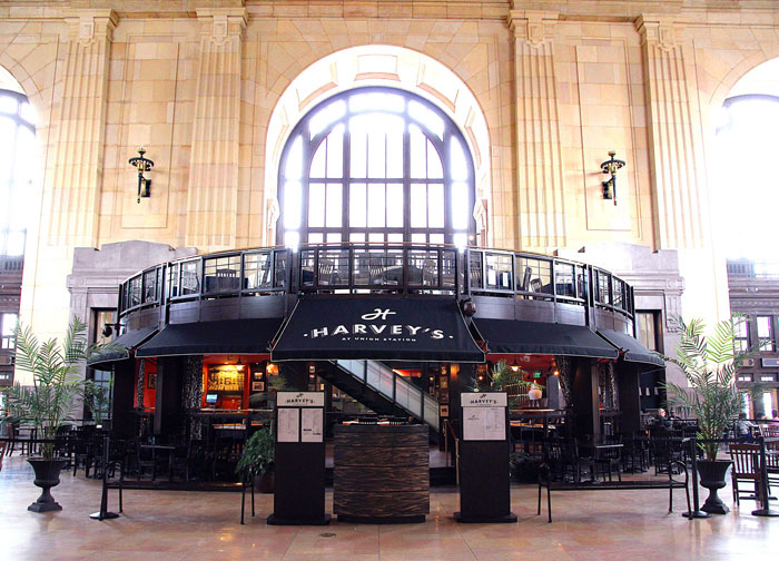
Our latest brand identity crush is served up at Harvey’s diner in Kansas City. Designed by Ted Carpenter Creative it is a modern yet crafty identity rolled out across the board including menus, paper, signage and apparel. With a great use of illustration and a monochrome colour palette this identity is both old and new world, with the tradition of the diner still present in this super sleek design.
Source via The Die Line


