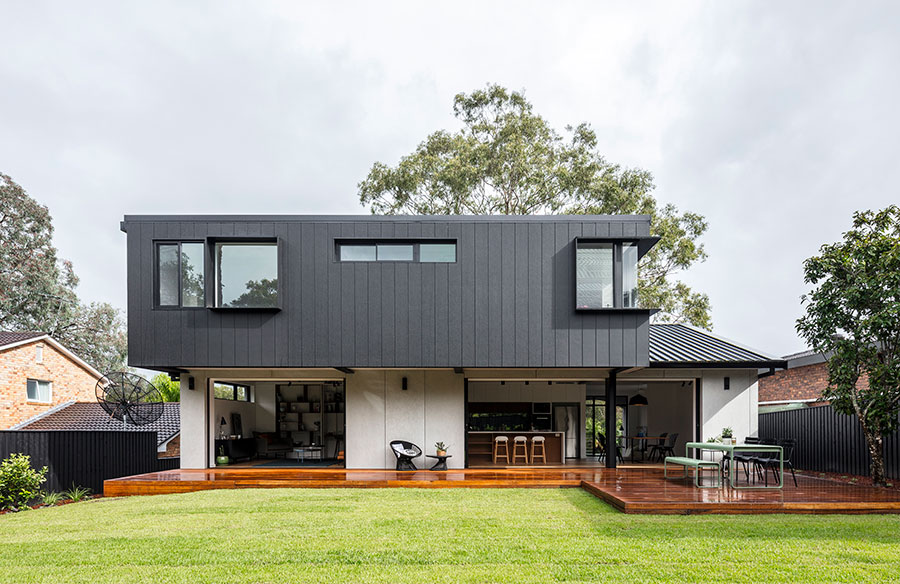
This beautiful contemporary home in Sydney nestled between a golf course and a busy residential street gets a much-needed transformation. The Gordon Residence designed by Studio P Architecture and Interiors features a lighter and more spacious rendition of its former self. The once misplaced and out of sync suburban house was converted into a fresh, open plan and light-filled home that merges into its landscape. Come on in and you’ll see what we mean…
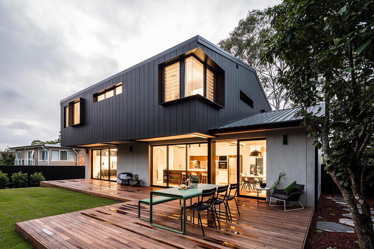
“Our approach was to open the Northern side and expand the kitchen, creating a seamless relationship to the outdoors. Large slide away glazing panels transforms a family home to a large venue for family and friends. Their growing family required more space and versatile space. The enclosure of the top balcony allowed for the bedrooms and bathrooms to expand, making room for a playroom, study and rumpus area. Also a grander master with ensuite and walk-in.”
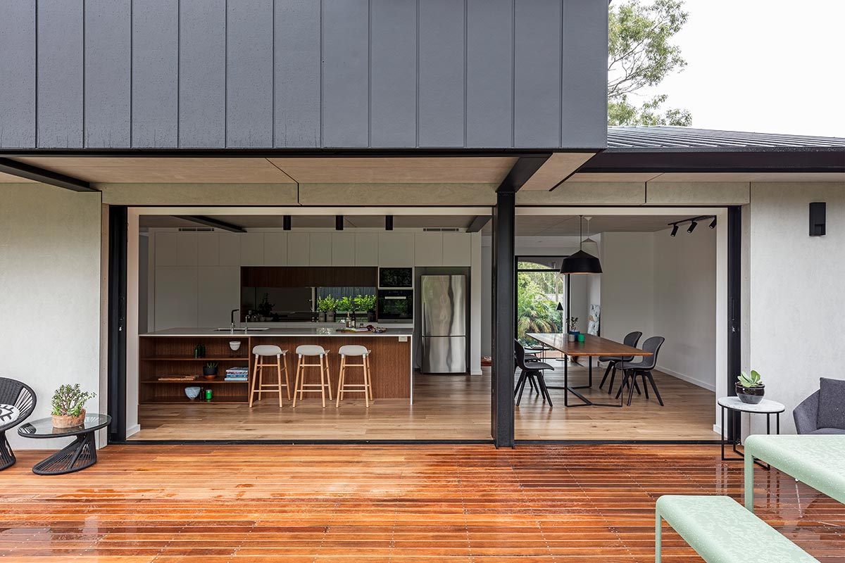
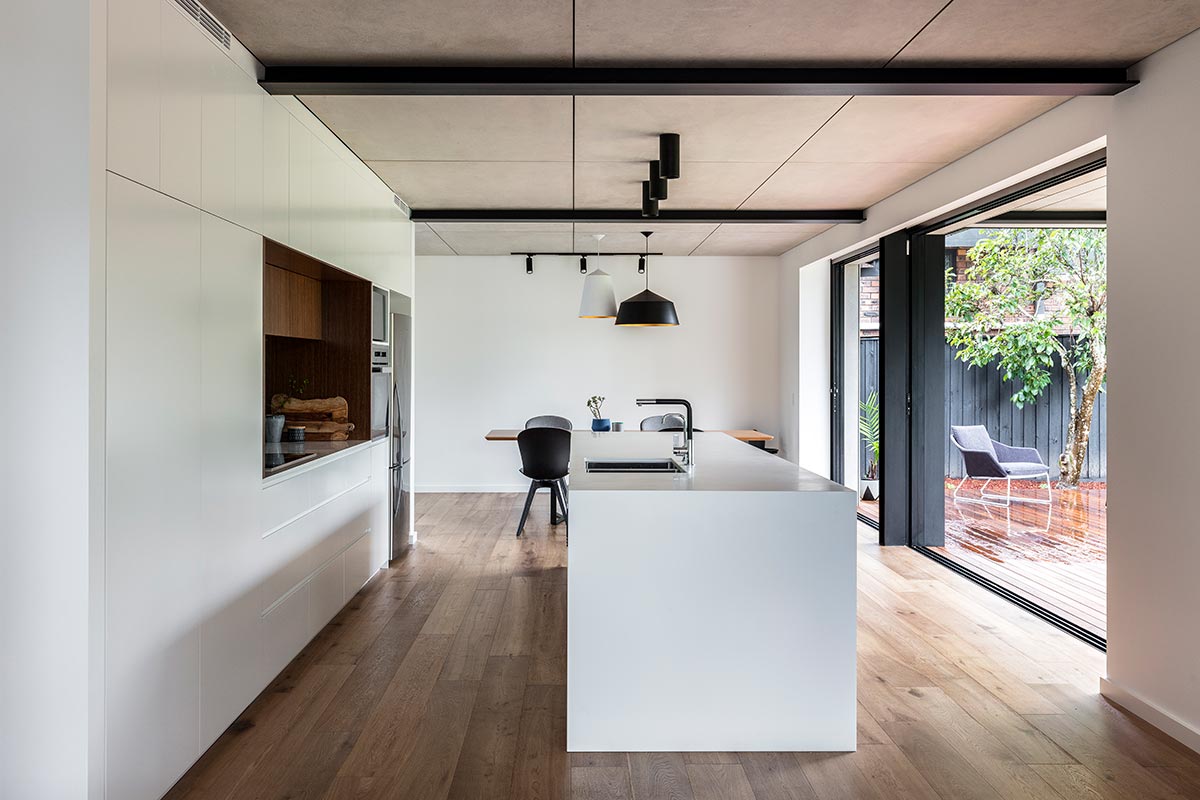
Also relevant to the brief was the large extended family, entertaining space and the accessibility to the kitchen as the core of the home. This project is a perfect example of a house that gained maximum spatial efficiency with a very minimal structural change. The new design resulted in the family home being extended into its surrounding.
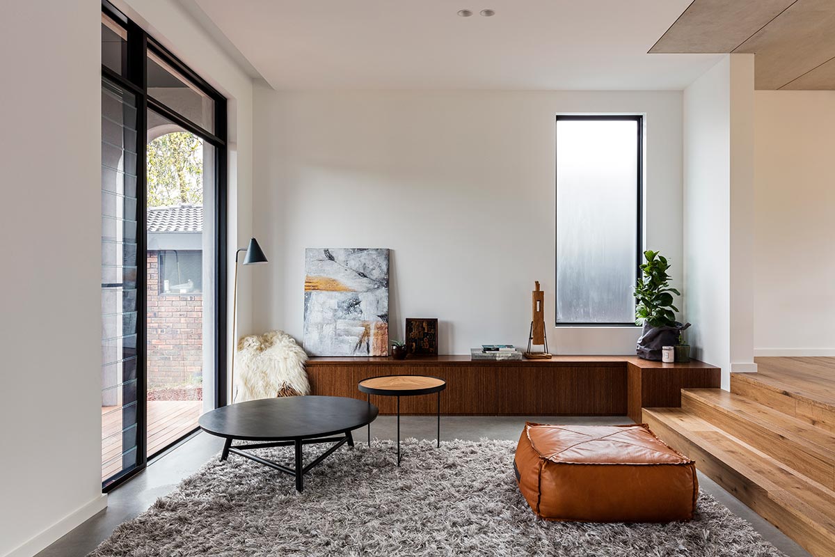
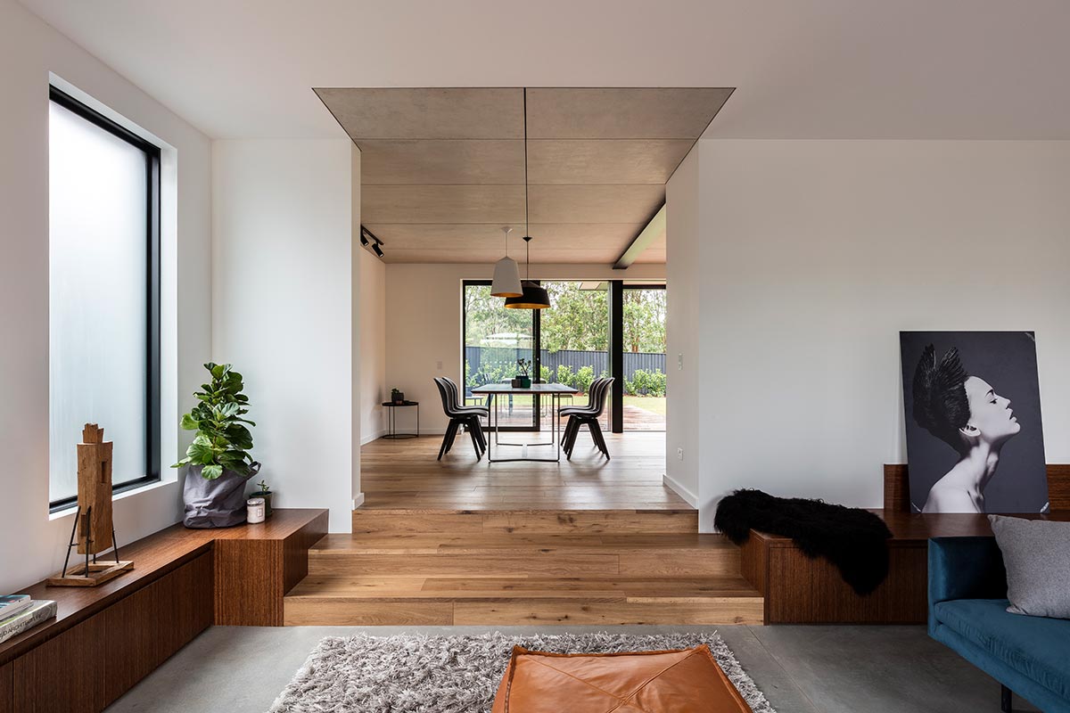
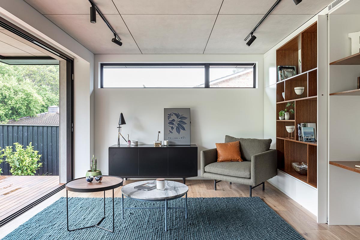
Approaching the project with a consistent material and colour palette provides continuity throughout the home. Sliding doors are used to separate the contrasting vicinity while keeping a connection between the outdoor and the indoor areas. The Gordon Residence was created with a concept to fuse a living space amongst its environment that, needless to say, is never not abundant of trees and other greens. By making minor tweaks, the team were able to improve the functionality of the spaces within their existing general layouts as a homage to the original design.
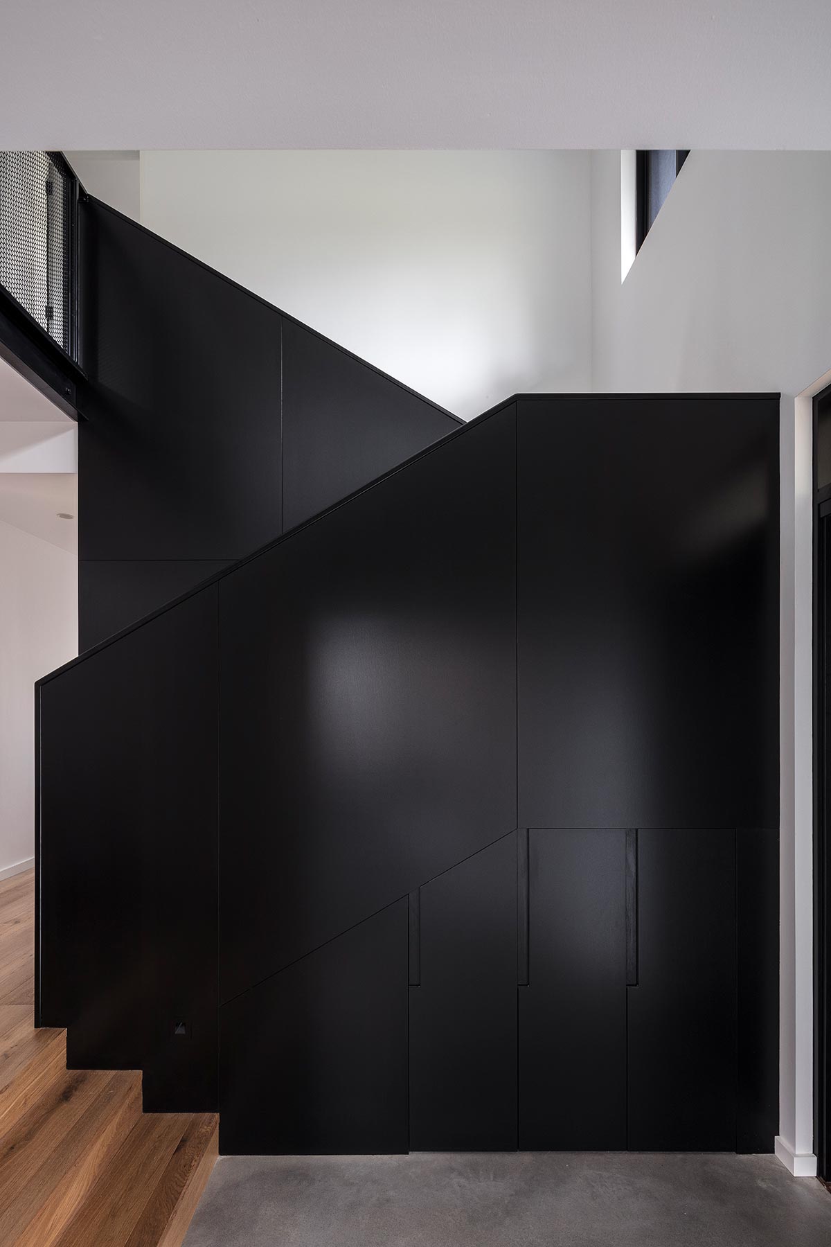
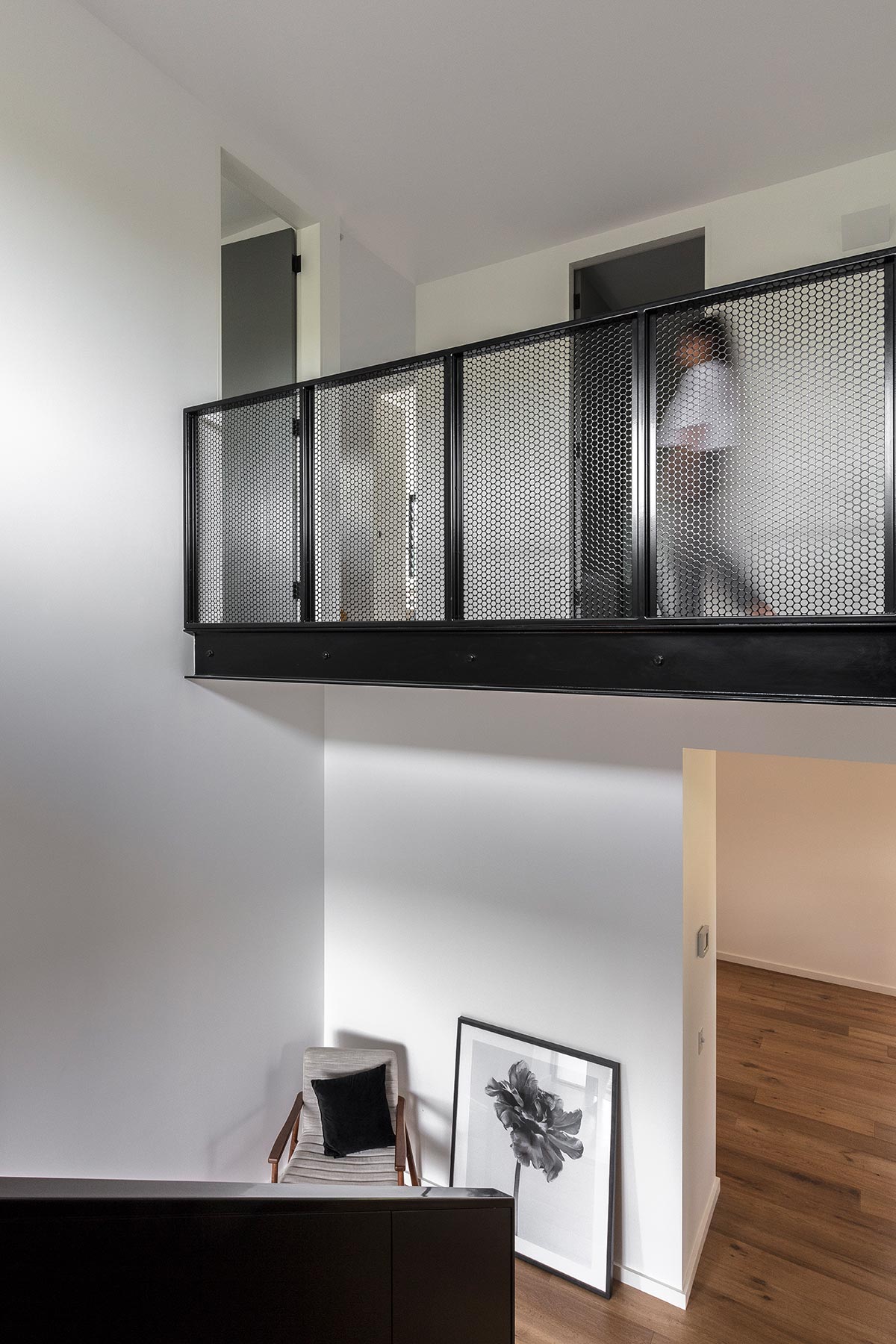
“Although the original builder’s estimation was below the final finish cost, the resultant project was finished at a level that exceeded the original brief. With malleability of certain less pertinent design factors or more thoughtful selection of material, the home was finished in a way that would be more sustainable, requiring less energy to run, easier to maintain with no need for future renovation anytime soon. Thus, the extra spend resulted in meeting a much-expanded brief.”
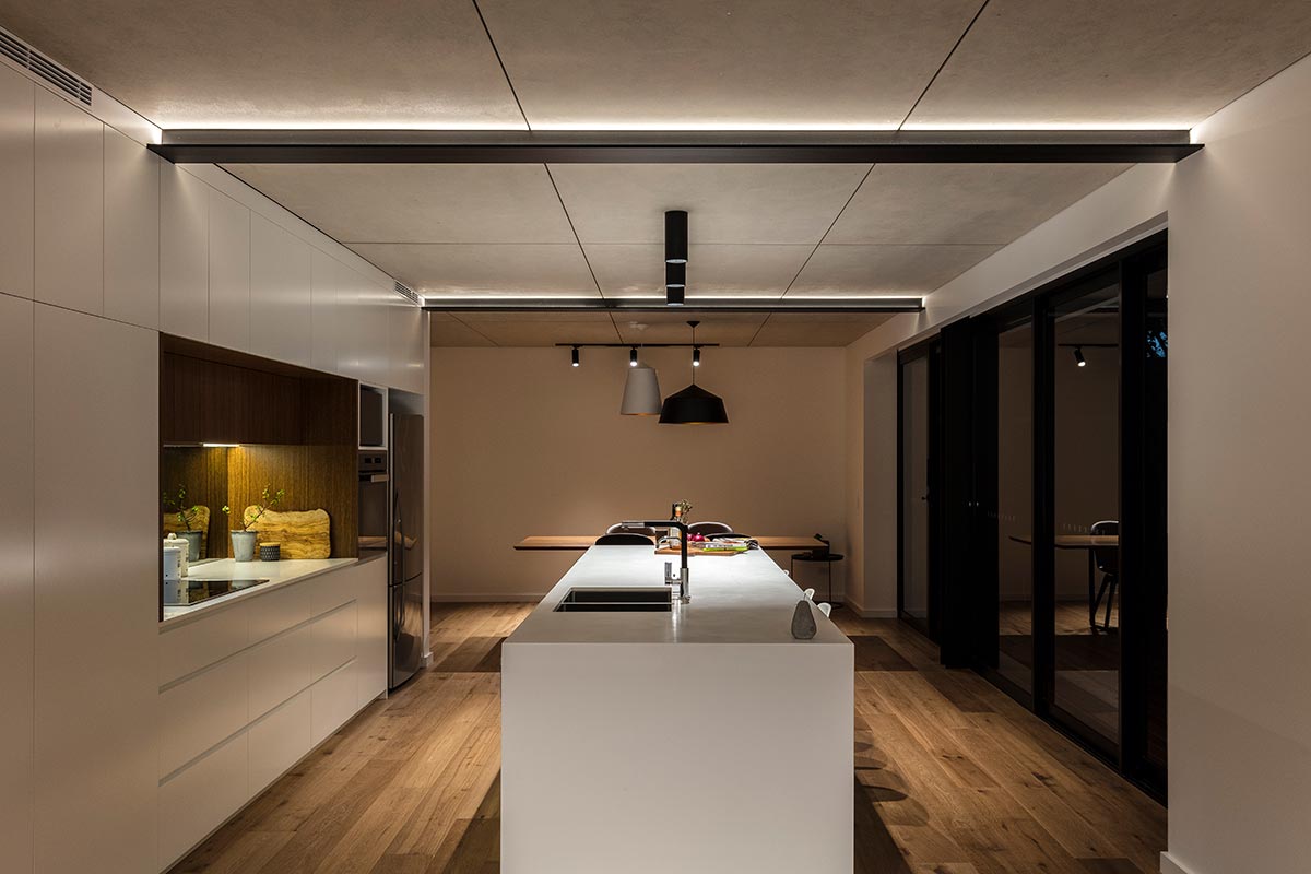
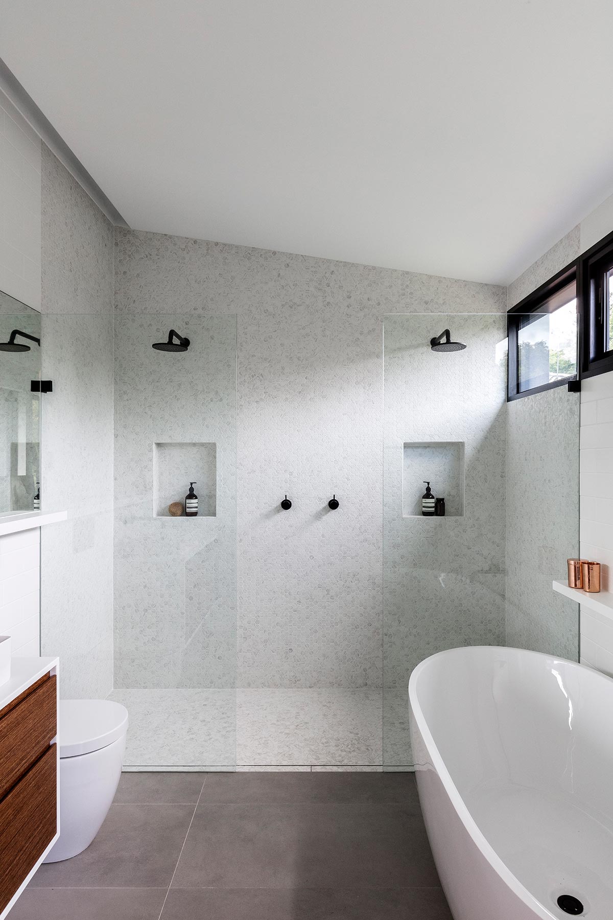
The concept gives a glimpse into the entire living space’s distinct preference for materials that resemble luxury in its simplest means. This home is definitely a haven for anyone who’s been looking to have the best of both worlds, the free-spirited outdoor life amongst the environment and the light and mellow ways of the indoors.
House Project: Gordon Residence
Architect: Studio P Architecture and Interiors
Location: Sydney, Australia
Type: Renovation
Photographer: Tom Ferguson


