We did it! The last room left untounched in our home has now been given a Hunting for George makeover and we saved the best til last. This space needed to be gutted, so we started from scratch to build the ultimate ensuite for our Master Retreat. Get comfy and let us do all the heavy lifting… the ensuite makeover starts now…
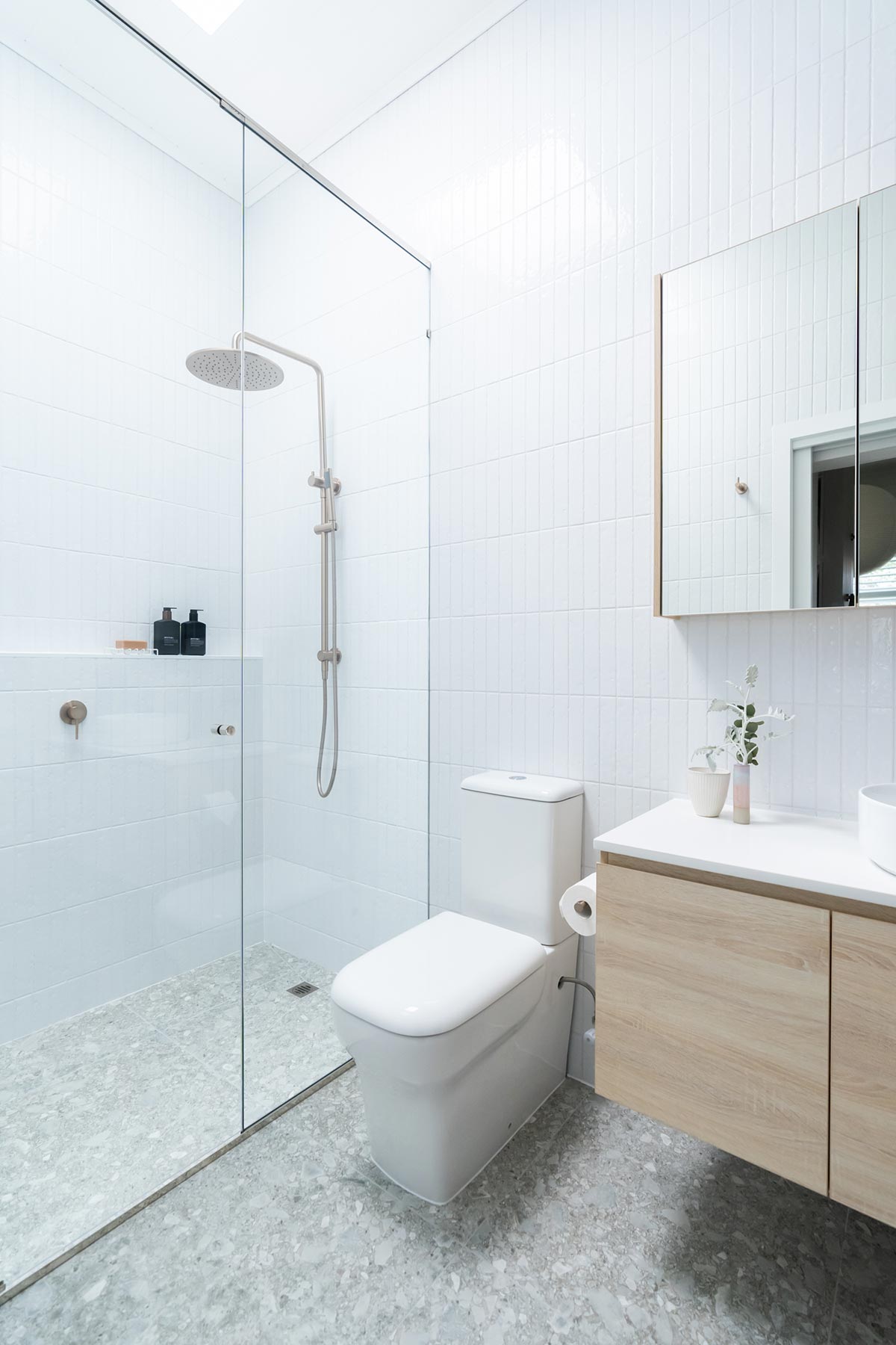
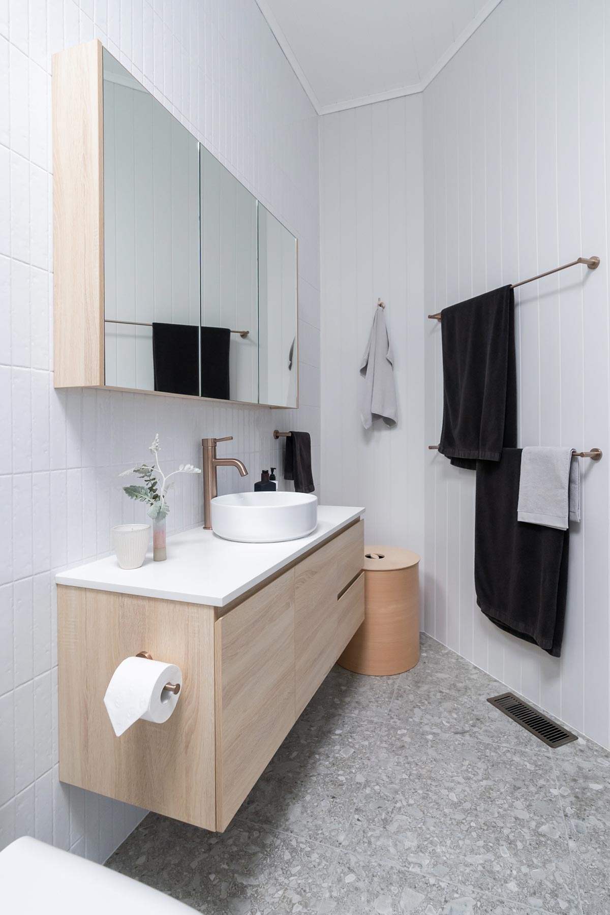
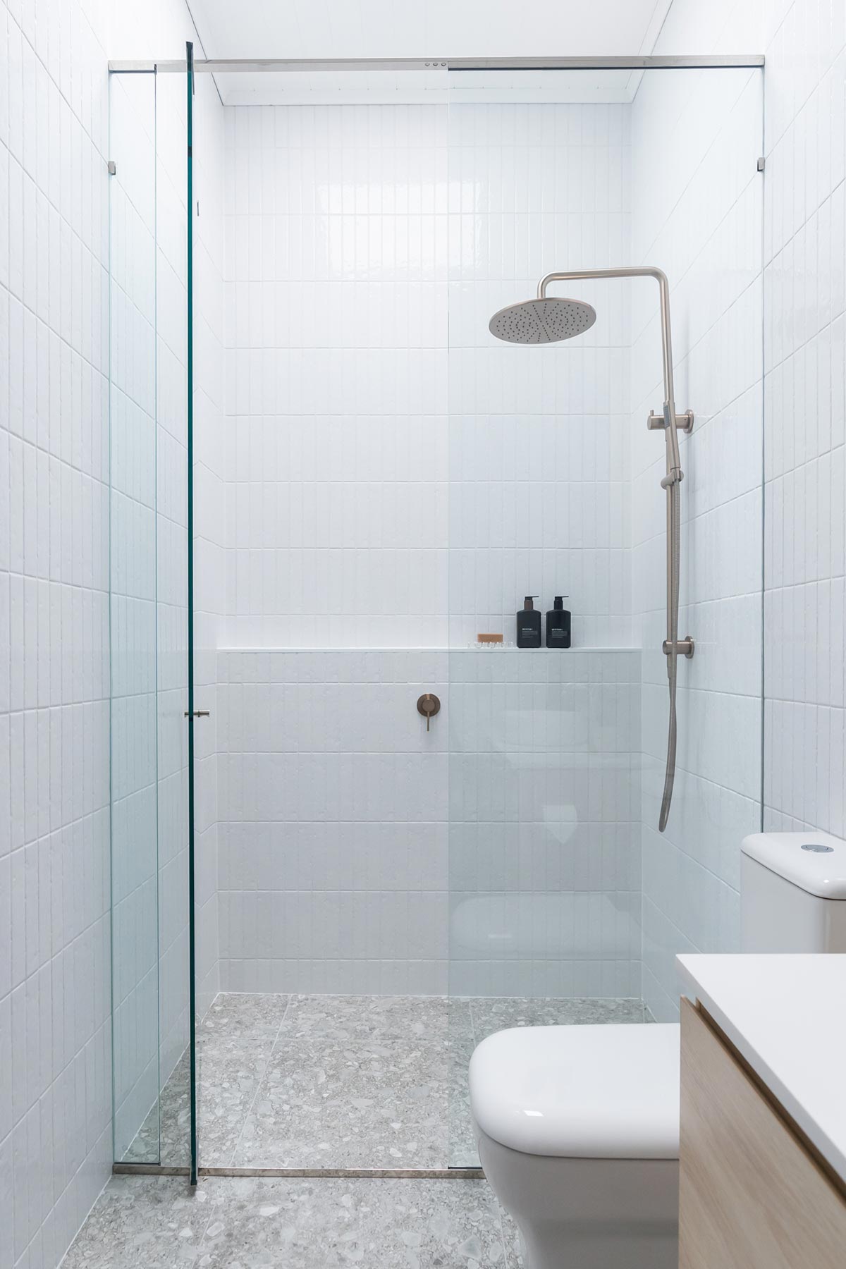
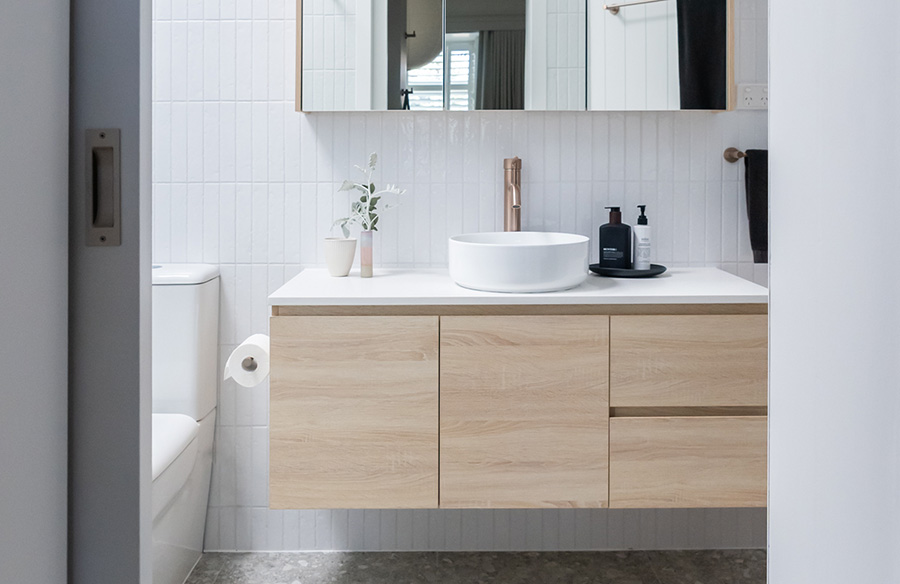
Once we’ve pulled everything out including the internal wall and door, we were surprised to see just how much room we had for the brand new layout of the ensuite. To decide on layout I hunted around Pinterest to find a few ideas and then set about ordering samples and swatches in order to choose finishes. Tilecloud are able to send samples for you to choose from so I put together an edit from their range to play around with. In the end I chose the Albert Park Full White Subway Tile with matching grout colour for the wall. We installed the tiles floor to ceiling for a dramatic look and chose to position them vertically to enhance the feeling of height in the room. To balance the multiple subway tiles I opted for a larger 60cm square tile for the floor. I chose the Stirling Terrazzo Look Grey Matte Tile for its textured grey finish. I wanted a floor tile that would be low maintenance with a natural, irregular texture to it. We hired a tiler as this was not a task that we had the skills for! However we prepared the surface ourselves first by applying two coats of Wet Area Waterproofing that we picked up from Bunnings.
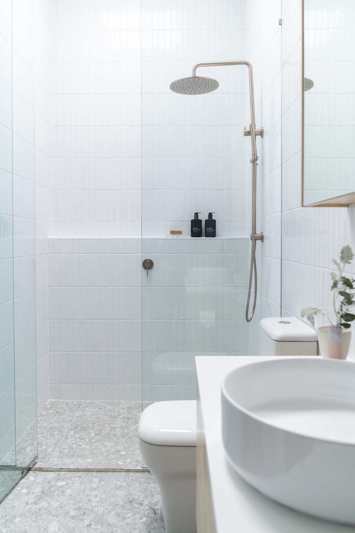
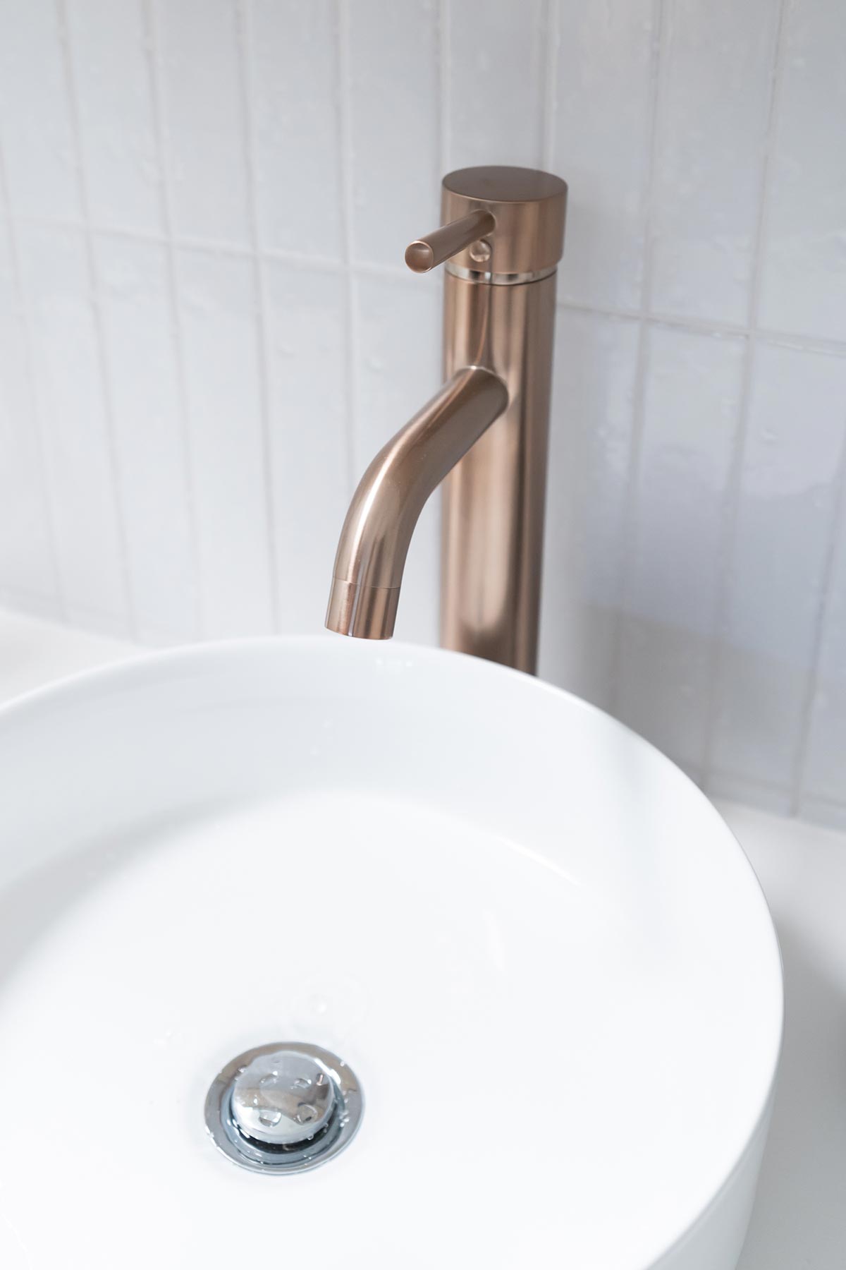
I was very excited about choosing brand new fixtures and fittings. I wanted to bring in a different colour palette to what we applied in the main bathroom in our home, moving away from a monochromatic look into a warmer, softer tone. In the end I found my ultimate colour ‘champagne’ from Meir, best described as Rose Gold which is a material I’m very drawn to. The warmth of this champagne tone helped to bring out the warmth in the floor tiles and added a feminine touch to this room. We decked out our entire ensuite with the Wall Mixer, Tall Basin Mixer, Combination Shower, Robe Hook, Single & Guest Towel Rail, Toilet Roll Holder, and Floor Shower Drain all from Meir.
For the shower area, we were initially planning on installing a single panel however in the end we thought it would be more functional to completely enclose the shower to create a dedicated wet area. I chose the Hawthorn Pivot Shower Screen from Hawthorn Shower Screens that was custom made for this space. The pivot door was a great solution as it actually created a wider entry to the shower compared to what a single panel would have allowed and being able to customise the size meant that I could increase the height of the shower screen, further enhancing the height of the ensuite.
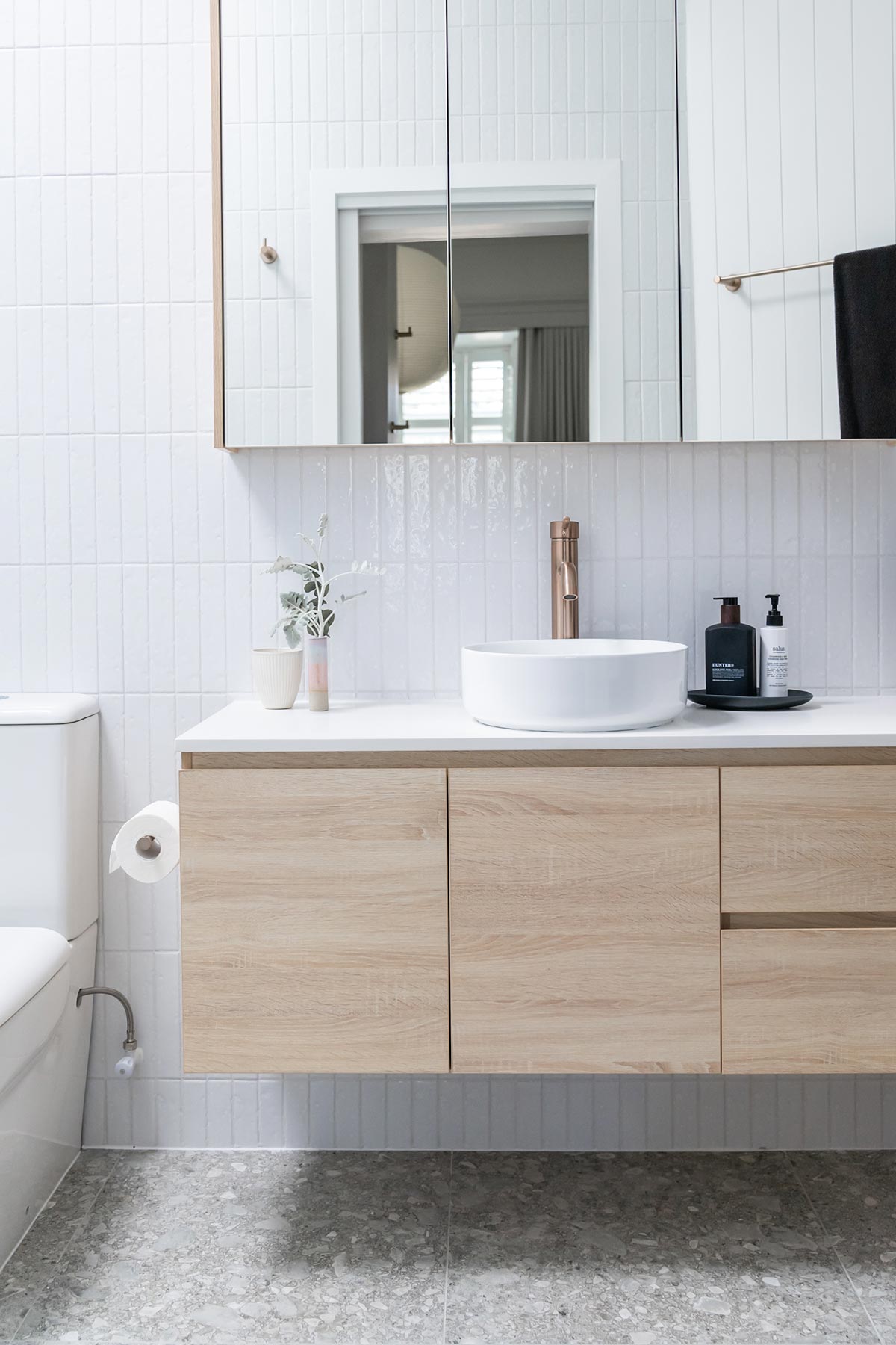
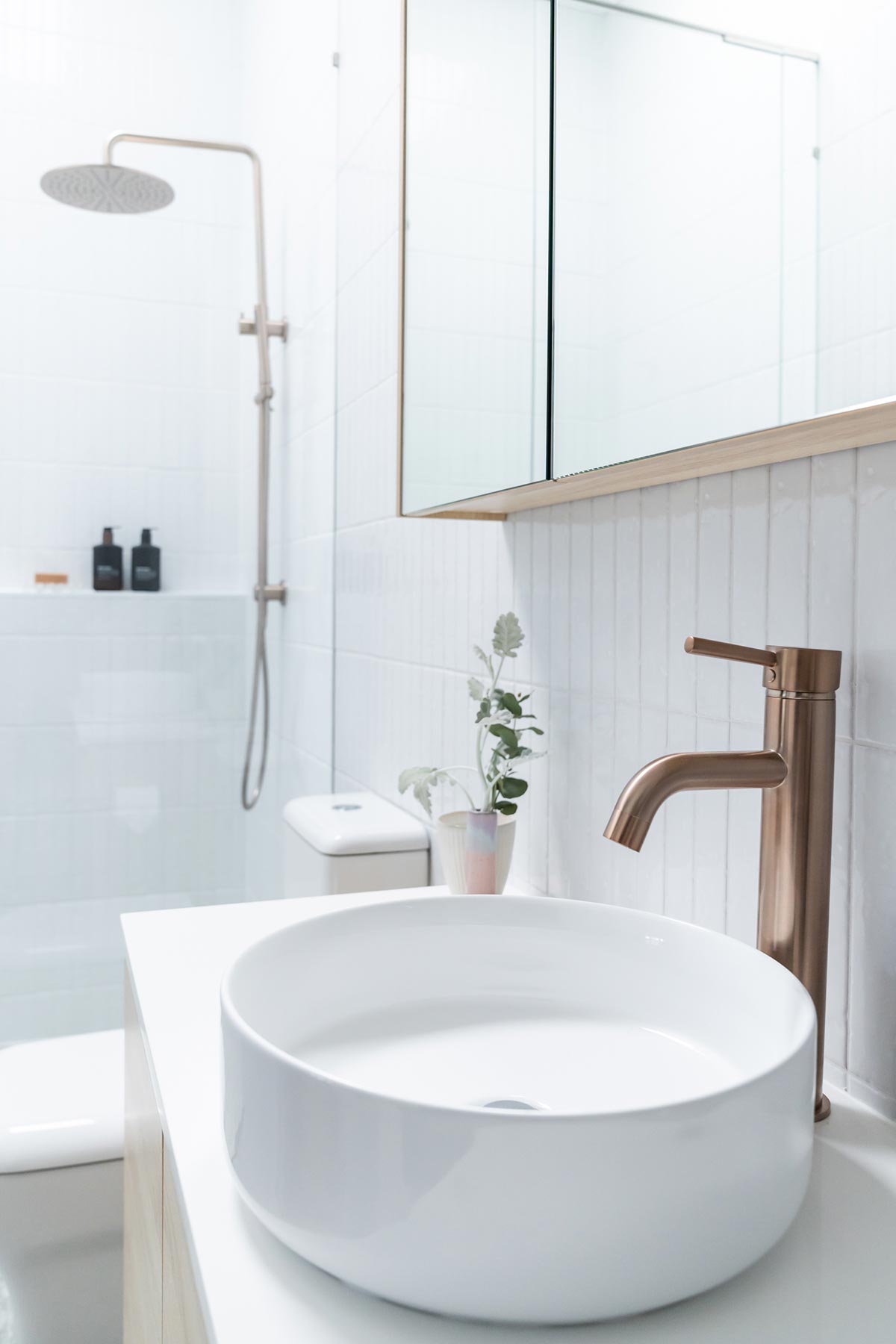
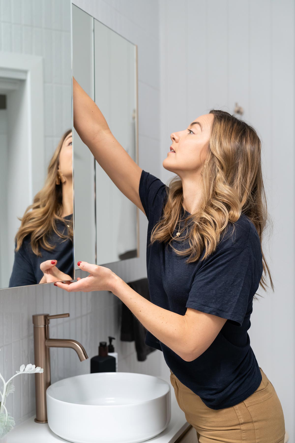
When it came designing the layout, ensuring we had space for a wide vanity was very important. In the end we dedicated 1.2m of width for our vanity, this was based off the standard sizes available from Cibo Design. I was deliberating about going even bigger, as they have a 1.5m wide vanity option, however the tapered angle of our room made that difficult and I wanted to make sure there was ample room for a laundry basket. I selected the Coast Veneer Tonic Mirrored Cabinet and Coast Veneer With Stone Top And White Counter Top Basin. I loved the simplicity of this design and the raised basin on the vanity. It helped to create a central focal point in the room.
We repositioned our toilet and chose a minimal Mondella toilet suite from Bunnings. To fill the angled corner in a way that was practical, I chose the Sweden Tub from Plyroom to use as a laundry basket.
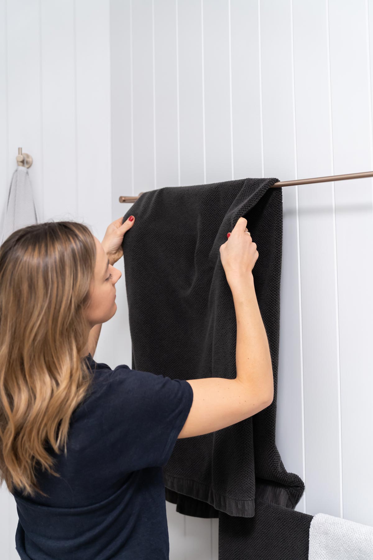
To mix up the texture of the space I brought in Easycraft EasyVJ Wet Area panels from Bunnings for the angled walls. I painted these Dieskau Quarter Strength Dulux Wash & Wear to match the colour in our Master Bedroom. We also installed the Easycraft EazyVJ panels on the ceiling. This was the only ceiling section of our home that we decided to update as the original was not in great condition. The EasyVJ was a great solution for the ceiling and the freshness of the Ceiling white contrasts beautifully with the soft grey on the walls.
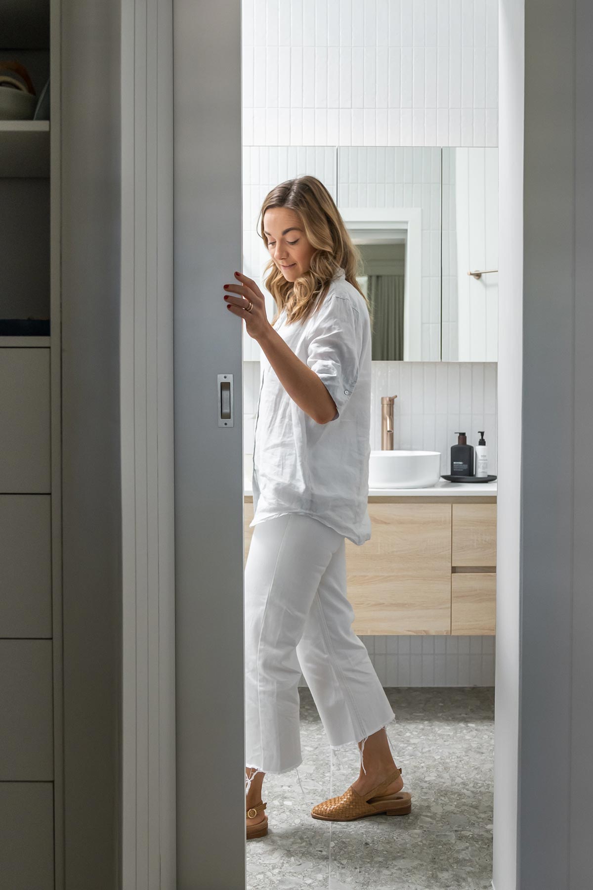
Given the change of layout we needed to consider the entry. We decided to reduce the overall depth of the room by 100mm in order to allow for a recessed cavity door. This is a great space saver for an ensuite and creates a seamless connection with the bedroom. We installed the Corinthian Doors Flush Pull Slimline Door Cavity Unit and Hume Flush Door from Bunnings. All installed with our ever reliable Ryobi tools.
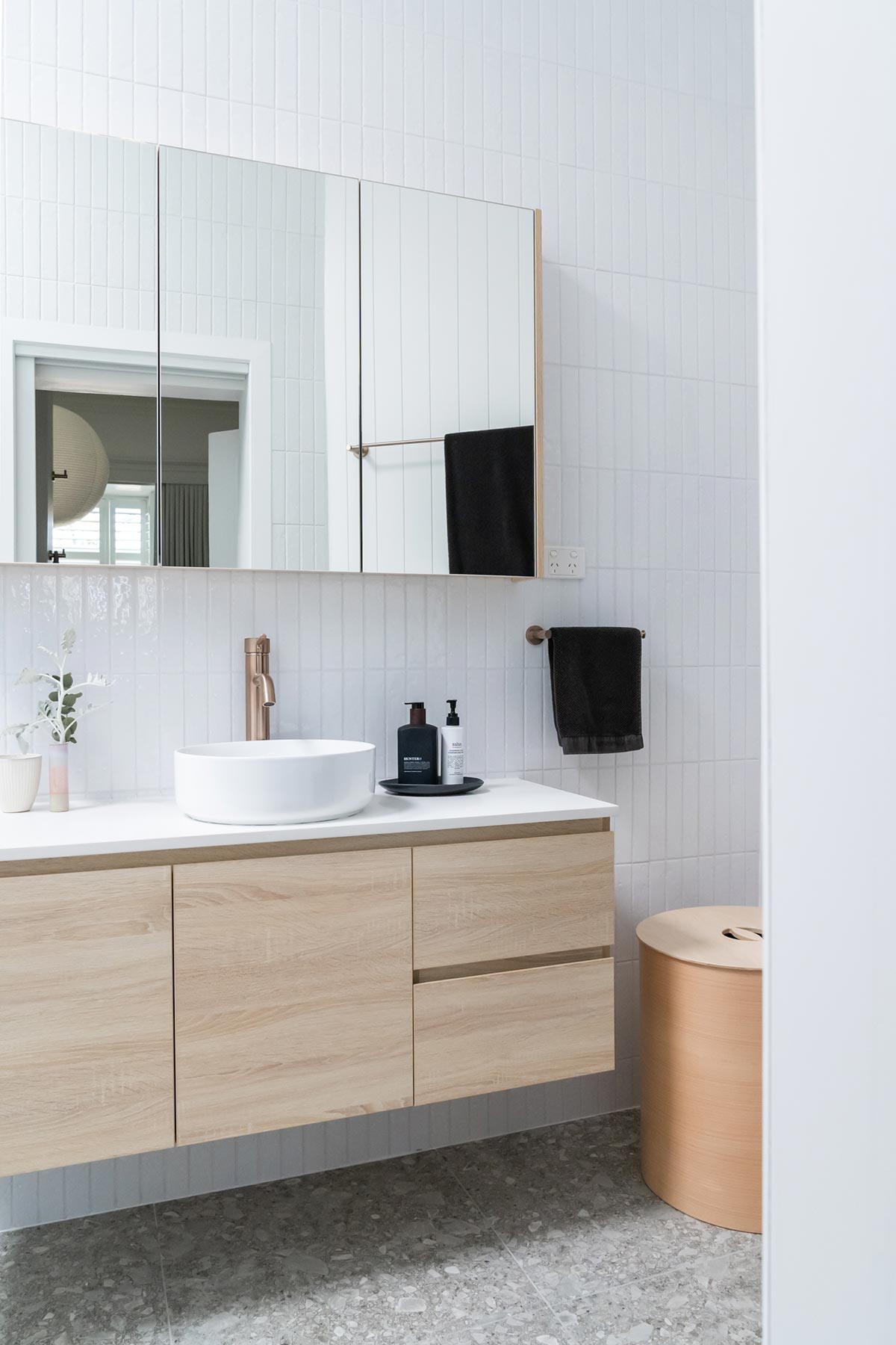
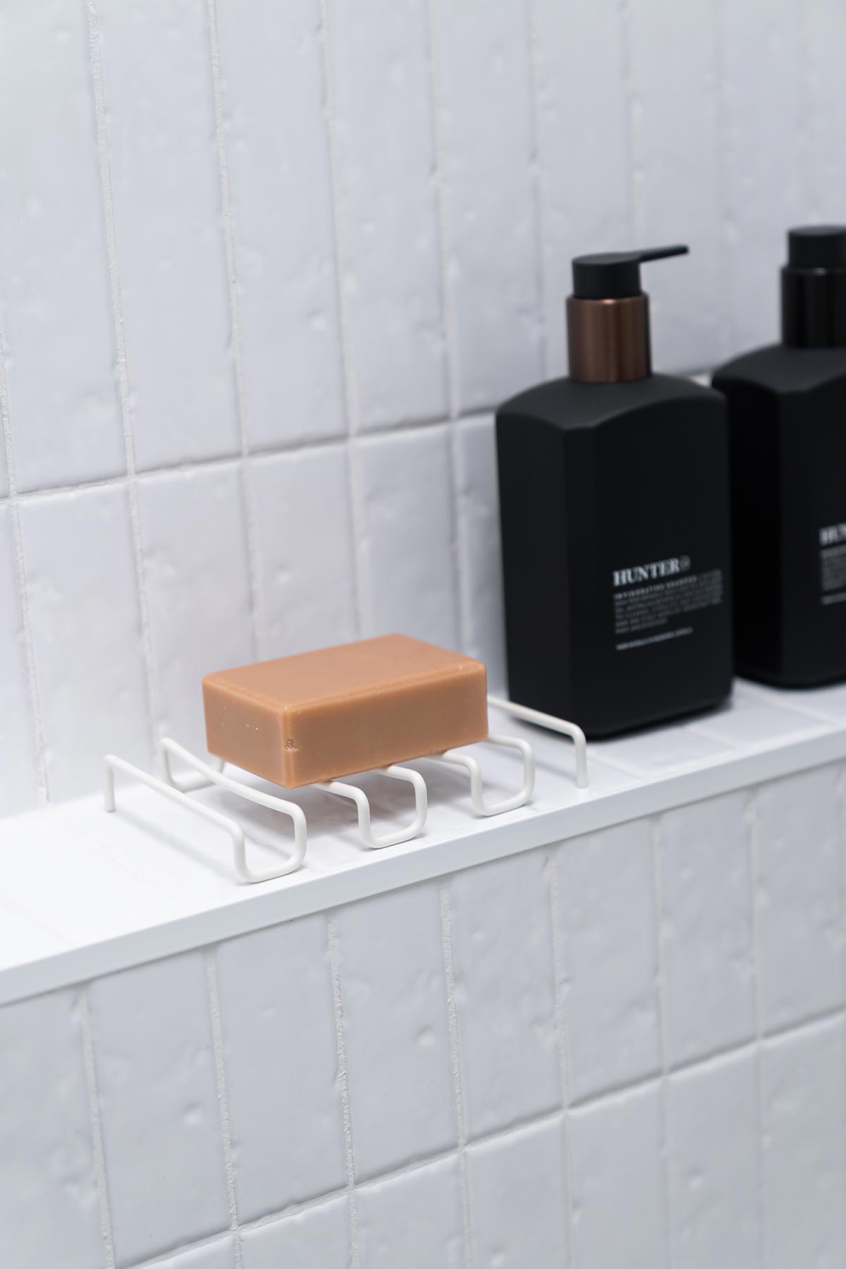
Styling was kept minimal, I brought in a few subtle pieces including Takeawei bud vase, a white amber candle, luxe soap dish from Bendo, soap bar from Made + More together with bathroom essentials.
That’s a wrap! We hope you’ve enjoyed this Ensuite Makeover. We’re so happy with our new retreat! Keep an eye out on Saturday as we reveal the ultimate styling cheat sheet for this room so you can get the look at your place! If you enjoyed the makeover video don’t forget to subscribe to our YouTube channel as we have plenty more videos coming your way.
Styling by Lucy Glade-Wright
Photography by Jonno Rodd



Hi Lucy,
I love the use of this space as a beautiful and functional bathroom. Could I ask how much this renovation cost including any building works? We’re looking to do 2 bathrooms next year and I need to start budgeting 😬🤣!
Cheers,
Cat
Wow, the fully renovated bathroom looks so great! I’m sure people would love to read and get inspired by this blog, especially people who want to have an ensuite bathroom renovation. Thank you for this wonderful article and visit Itile Bathrooms NT for any bathroom work in Darwin, Australia. Have a nice day!
This remodel turned out gorgeous! What size was the original bathroom before the remodel and what was the size after?