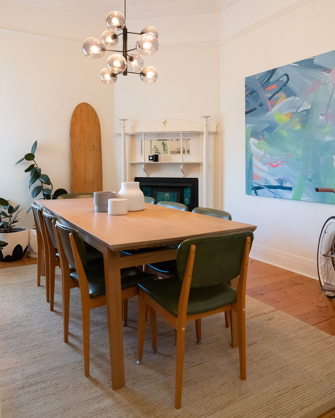
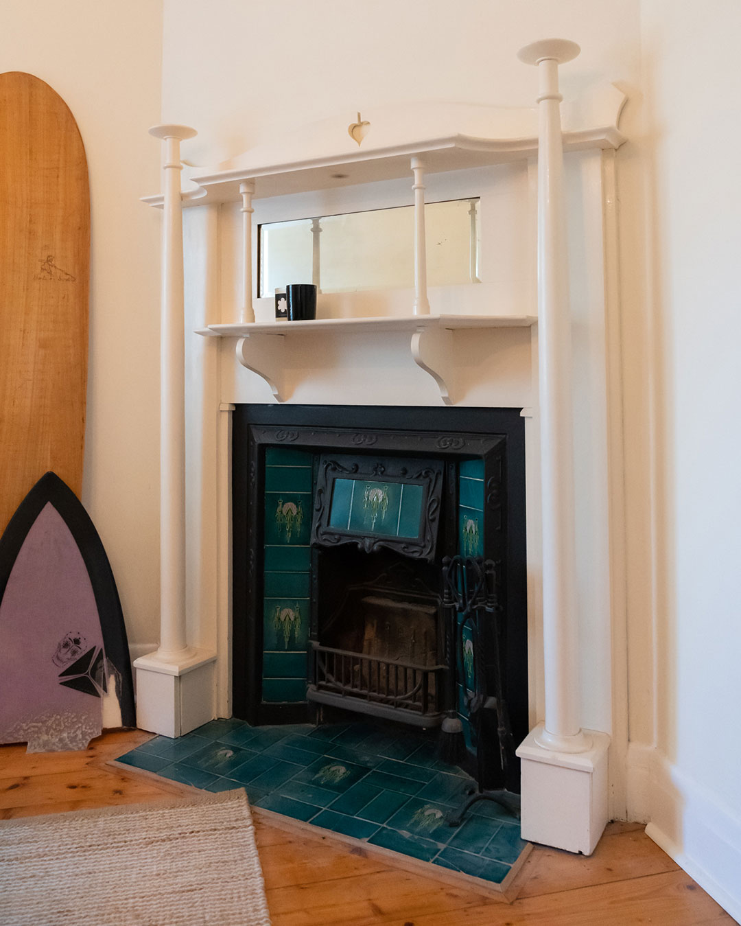
Before we embarked on the Dining Room makeover we were certain it would just be a simple cosmetic facelift… turns out we may have underestimated the extent of this makeover just a tad. This generous sized dining room boasted an old worn out fireplace that was begging to be restored to its former glory. We set out to transform drab to dapper and you will not believe what we uncovered! Get comfy and join us as we continue our DIY journey, this time in the Dining Room!
This room is the first thing you’ll see upon entering our home so we wanted it to have a very calm and inviting atmosphere. It’s actually opposite to the living room which has a very similar style but we intended to make this one much more sophisticated and peaceful in terms of its aesthetic. I took the ‘curved’ stylistic notes from the living space and incorporated this into my furniture selection to create a sense of continuity.
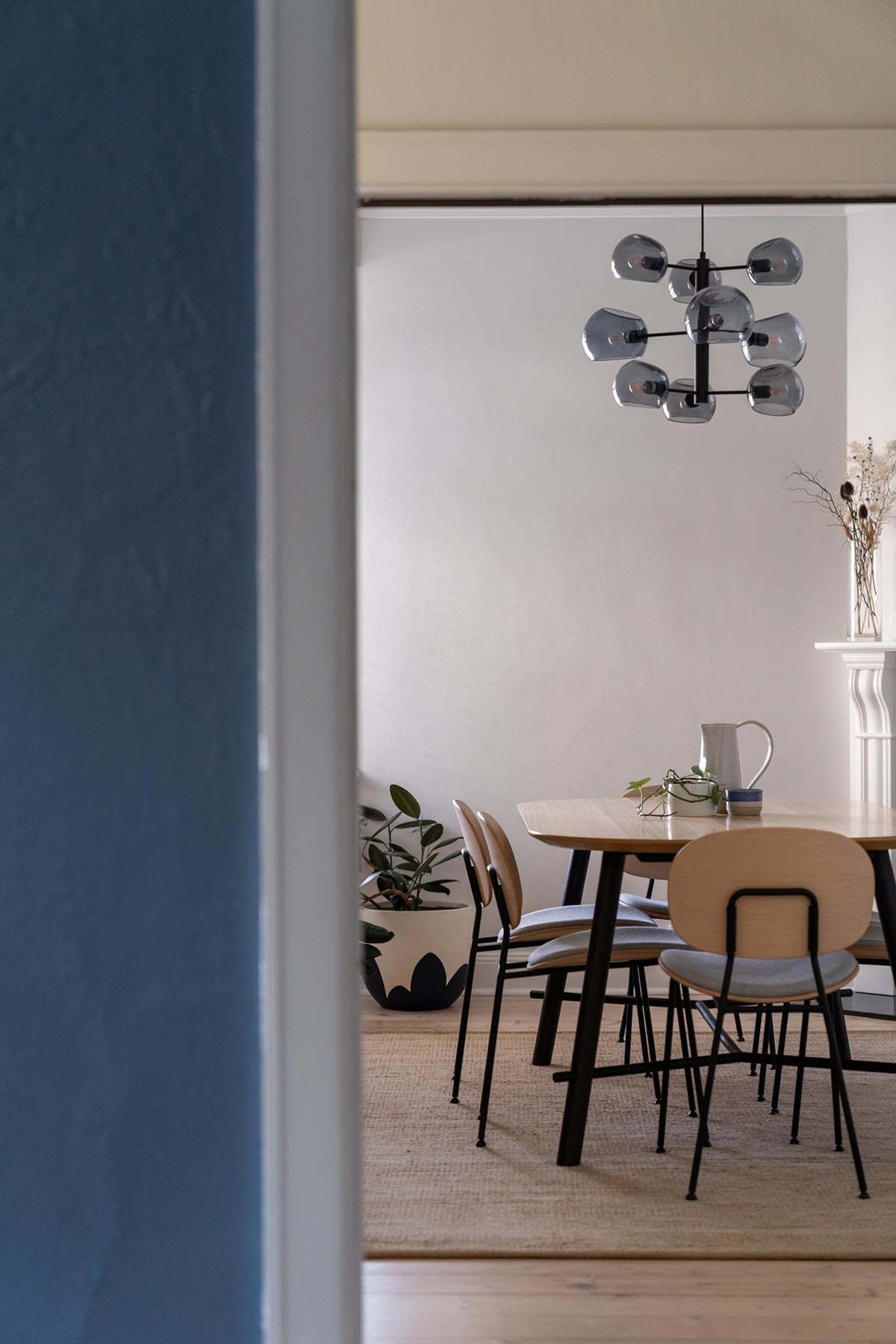
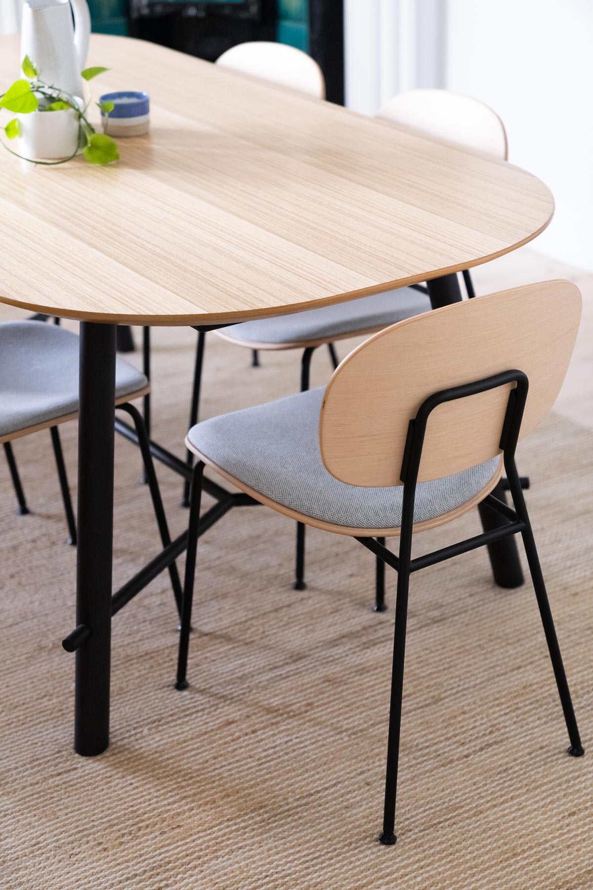
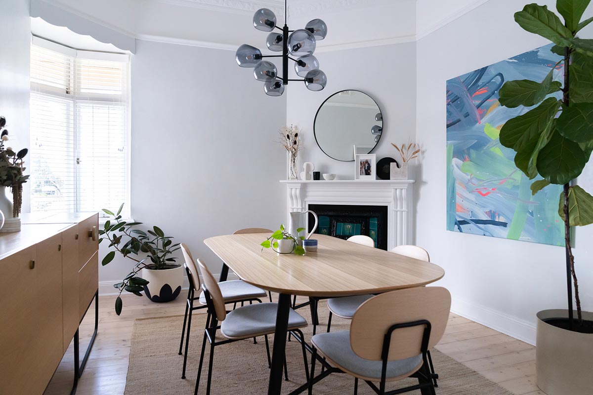
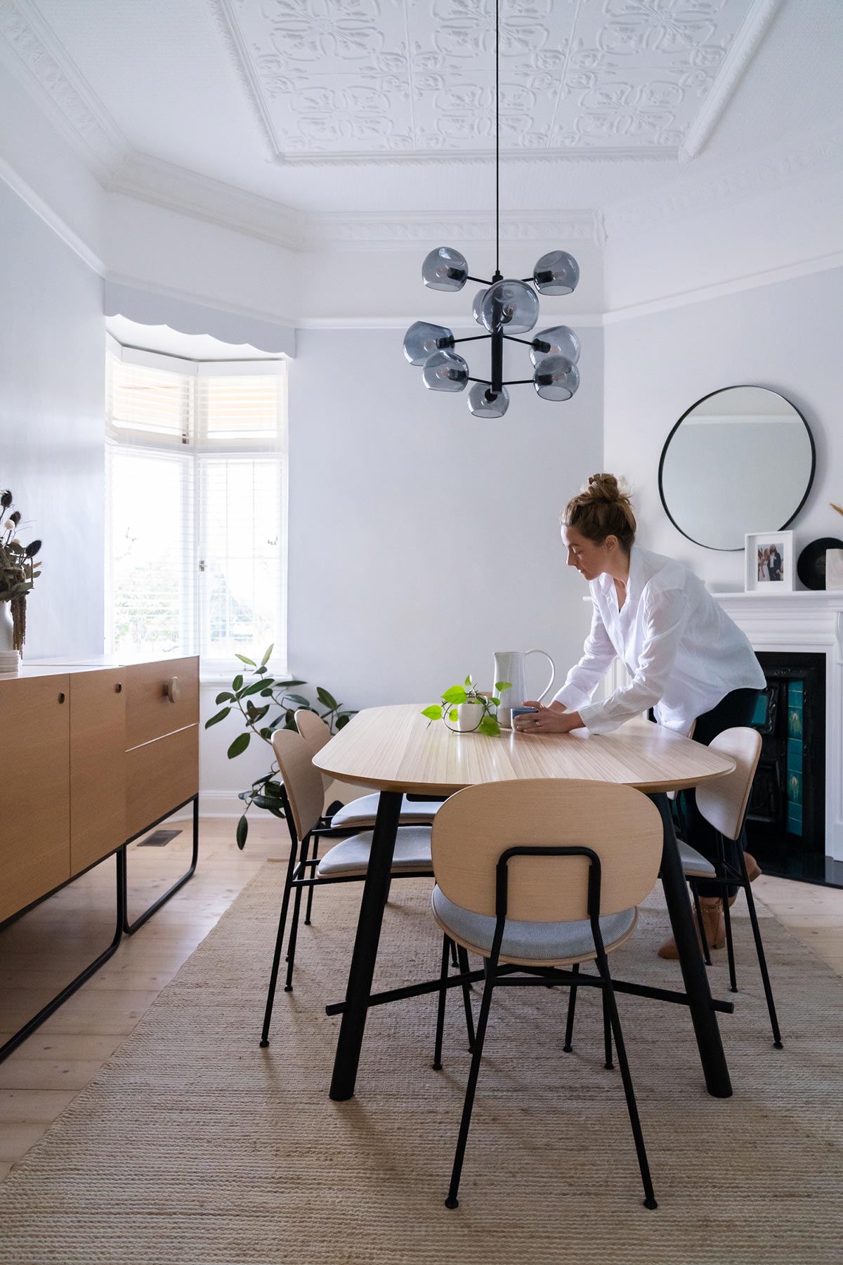
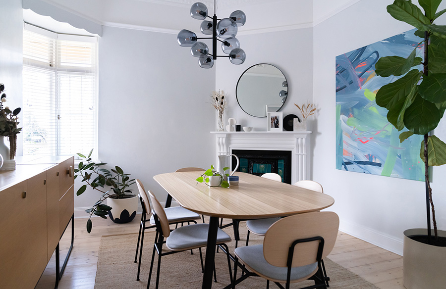
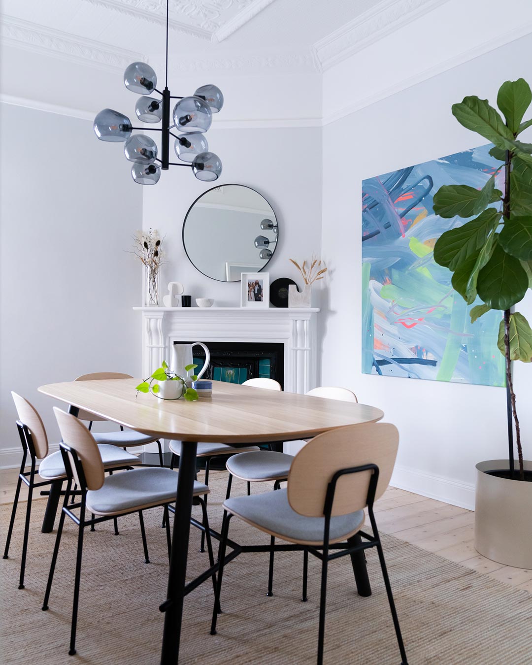
Our goal for this room apart from giving it a cosmetic makeover was of course to make it more practical and functional. That meant finding the perfect dining table setting to suit the room. Enter the Record Dining Table designed by MC.DSG together with the Tondina Chairs designed by Favaretto & Partners, all available exclusively from Baseline Commercial Furniture. I admit I’m a sucker for curves and I was drawn to the soft and friendly shape of these table and chairs. The lack of sharp lines fit within the context of my other interiors, creating an inviting and relaxed aesthetic. I was able to specify all materials with Baseline Commercial Furniture, for the Record Dining Table I opted for: Black Steel Legs with a Timber veneer top. For the Tondina Chair, I opted for: Natural Timber seat and back with Maharam Mode 002 ‘Intaguo’ seat pad and black powdercoat legs and frame.
On the walls, we painted Dulux Terrace White (½ strength) Wash & Wear from Bunnings, a very light grey with cool blue undertones. Together with Lexicon Quarter Aquanamel for the trims and Ceiling White to give our pressed metal ceilings a lift. The floors were sanded and we applied 3 coats of Feast and Watson Liming White Floor Finish from Bunnings to create a white wash effect, as per the rest of our home. 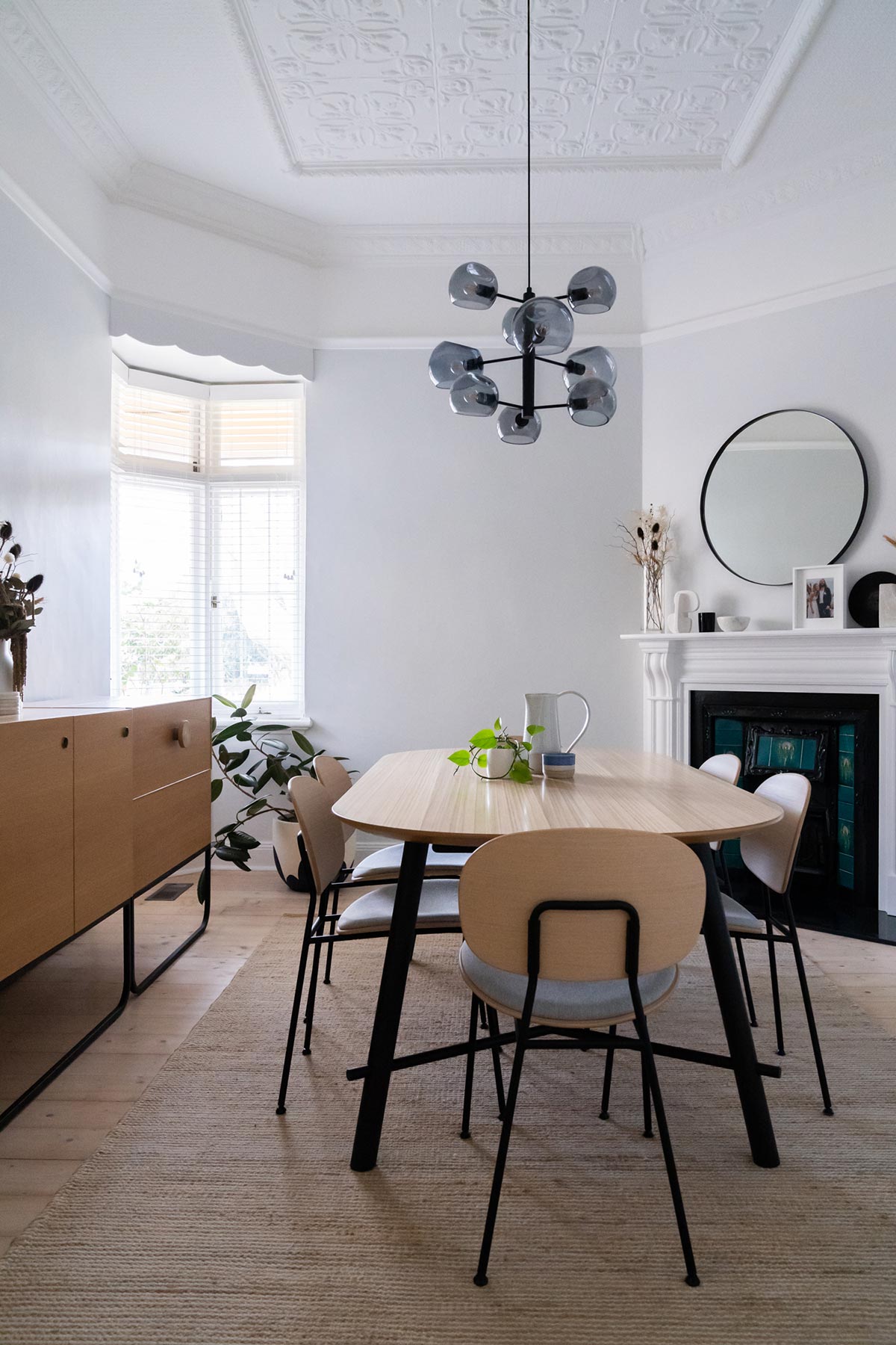
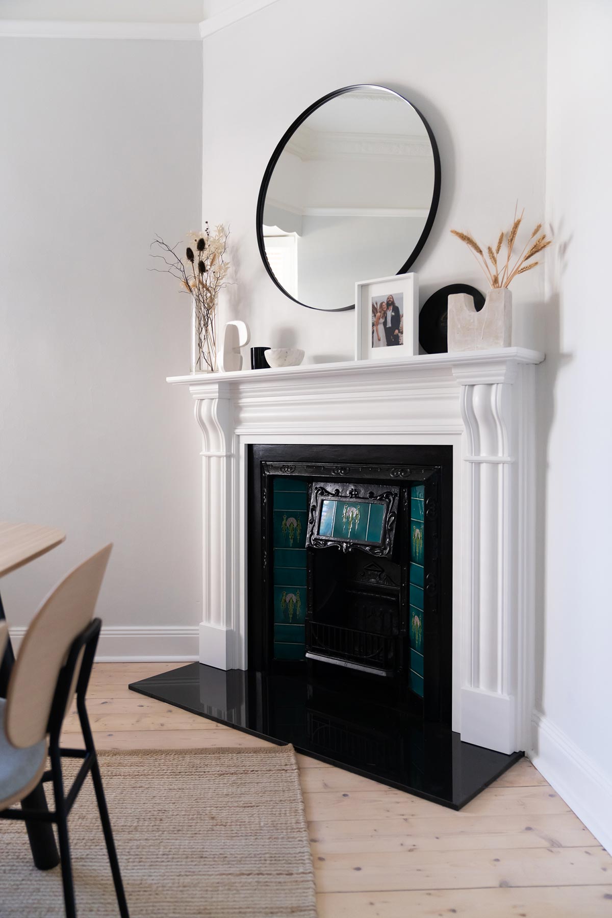
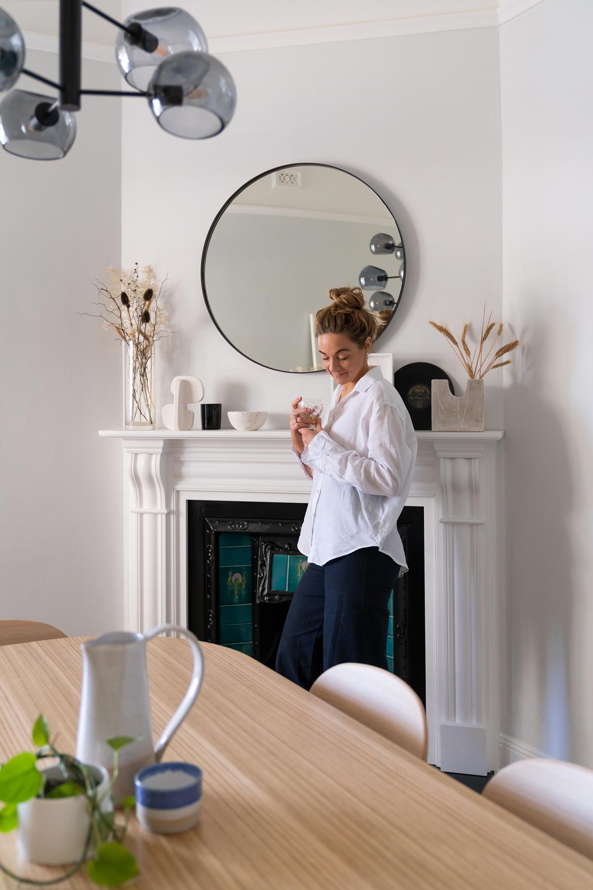
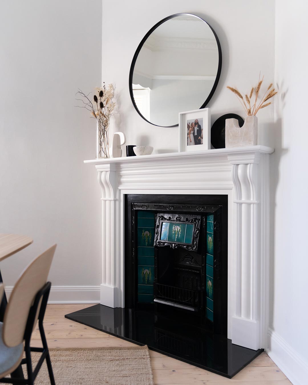
Probably the biggest change was our fireplace restoration. This was not a tiny task and was a labour of love, however we are so incredibly glad that we restored our original fireplace. We chose the Fleetwood Timber Mantel from Schots as it was the right size and aesthetic for the space. Given that the mantel is lower and slightly wider than the existing mantel, it really helped to enhance the scale of the space. Especially due to the space it opened up in order to bring in a large mirror.
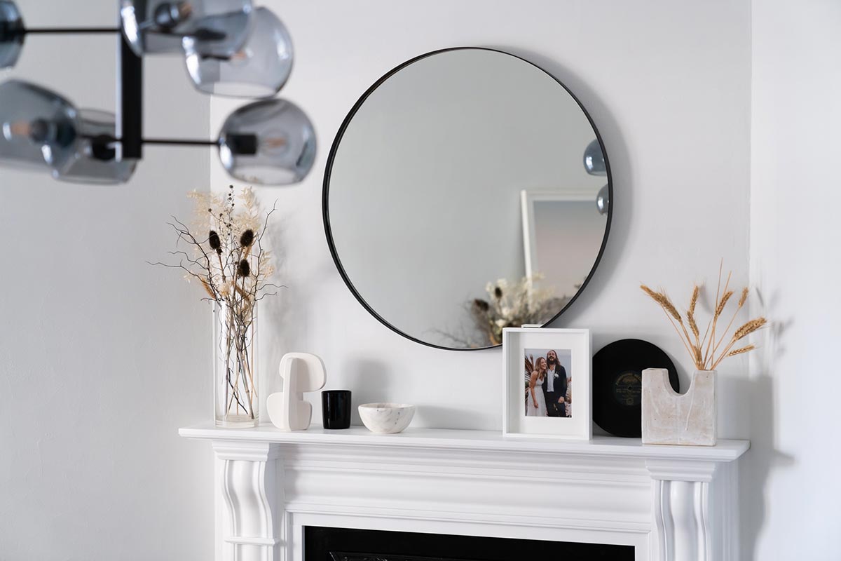
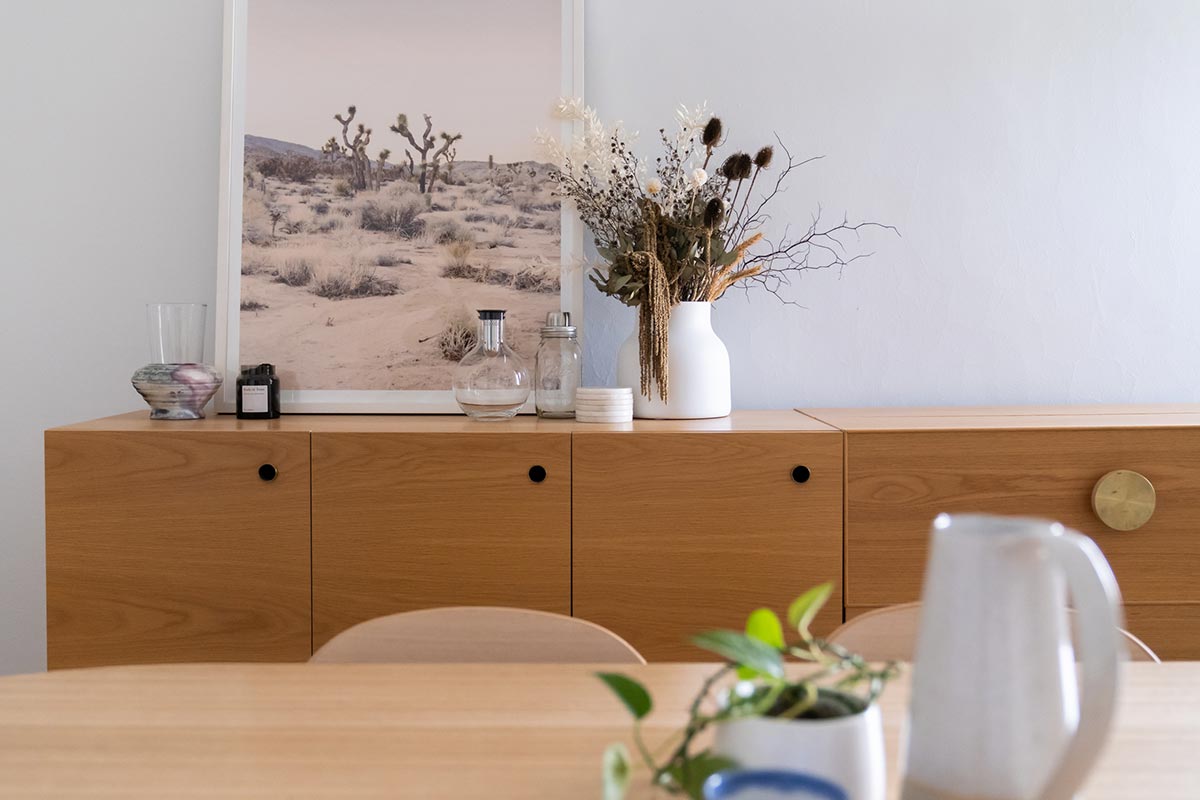
I already had a buffet unit from Grazia and Co that I was going to keep. The New York Side Board and Drinks Cabinet both in American Oak. It’s a practical and convenient place to keep all the plates, glassware and alcohol hidden. The drinks cabinet is always a cool surprise for the guests and a neat way to store your drinks. I wanted a low maintenance room so I chose to bring in dried flowers. The particular arrangement I chose was the Everlasting from Positive Parcels.
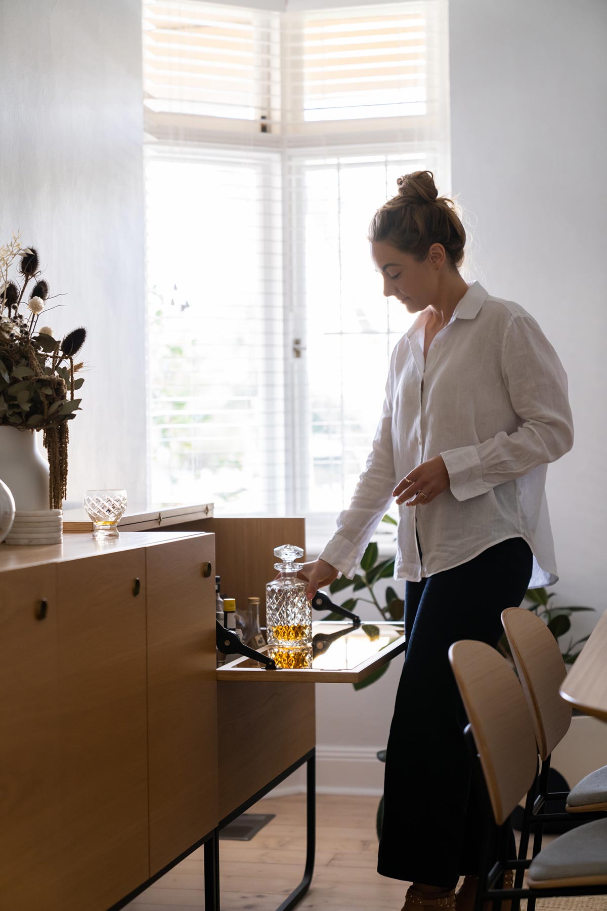
“I think what I love most about this makeover is that I actually love spending time in this room now. We make more time and place more emphasis around preparing and enjoying good meals and conversation at the table.”
Lucy Glade-Wright
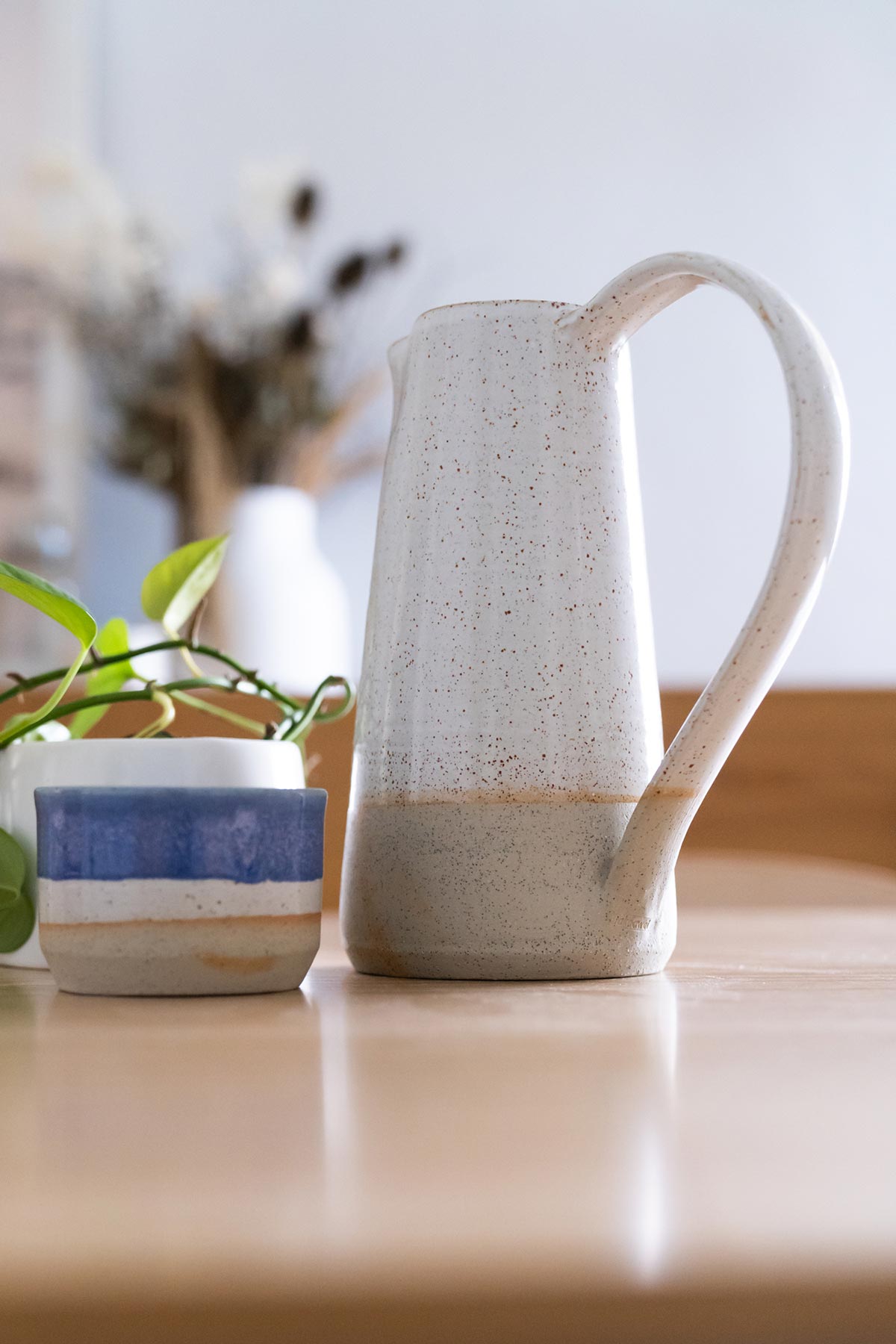
In keeping with the low maintenance idea, I wanted to style the dining table in a way that required little attention. So I chose to style ‘practical’ items that added a decorative element and for a pop of green I simply put a devil’s ivy clipping in some water, as it will happily continue to stay green and healthy with the occasional top up of water. The ceramics I featured are from Takeawai Ceramics and feature the Classic Pitcher in Shino White and Small Bowl in Nightfall.
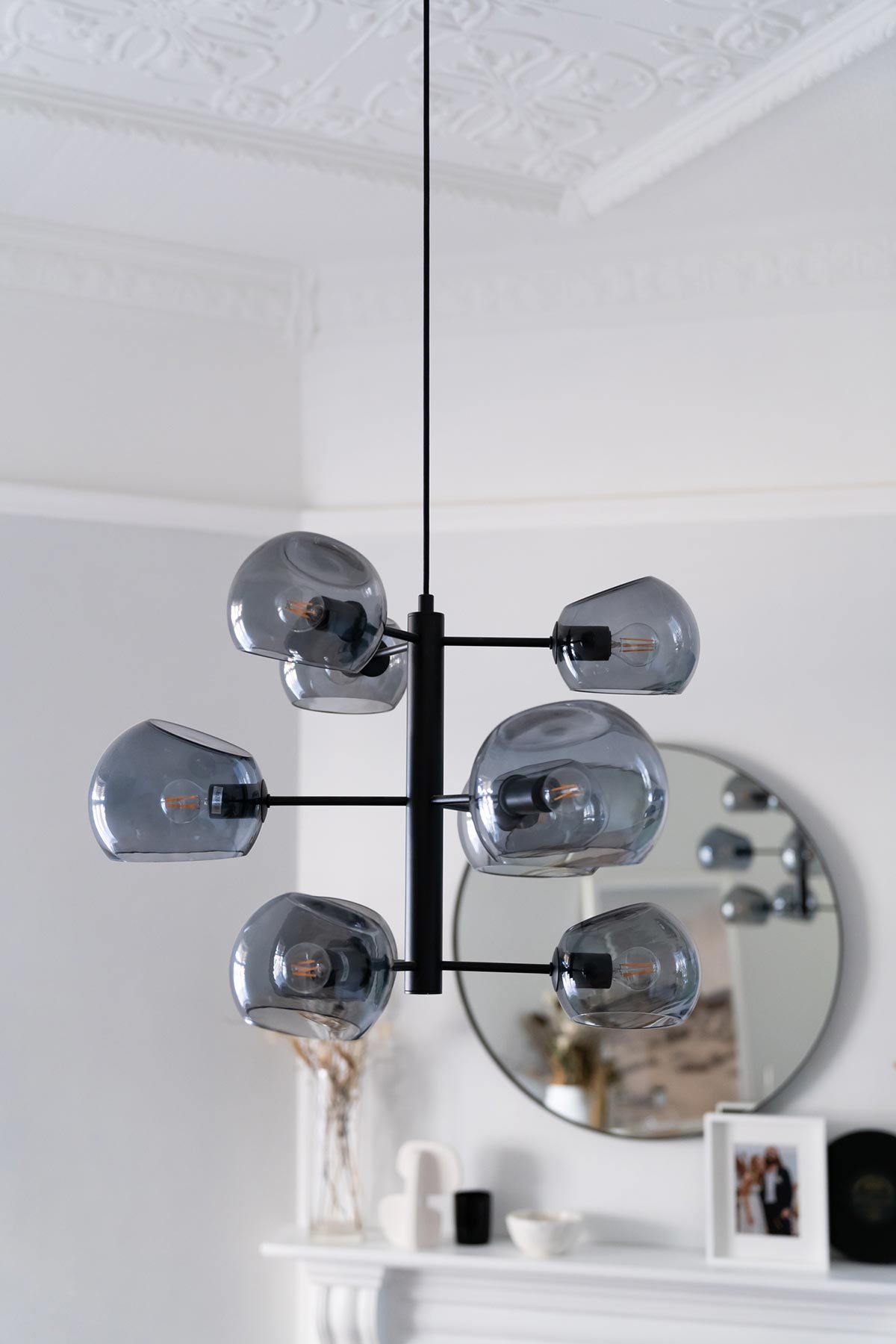
For the windows, we installed timber venetians in pure white from DIY Blinds. These blinds create a very subtle, ambient light and they also provide privacy if needed. For the lighting, we hung the Mila 9 Light Pendant from Lights Lights Lights they have a smoky blue undertone that helps to complement the other blue tones in the room.
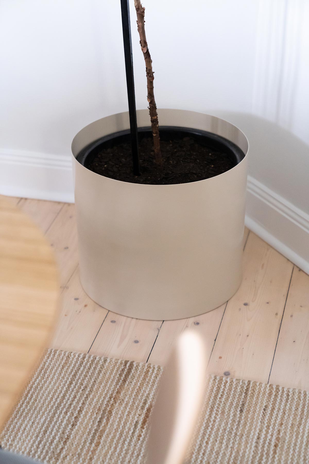
Fred, our tall Fiddle-Leaf Fig got some new pants from Ivy Muse. We opted for the Chubby Spun Metal Pot Senior in Stone. His height complemented the scale of large original artwork on the wall, ‘Buoyant’ by Rowena Martinich.
Each new room makeover brings us more enjoyment in our home. As soon as we finished our Kitchen Makeover I loved cooking more, namely thanks to my new Electrolux best friend… and now we loving dining more, sitting up at the table and enjoying meals together.
We hope you enjoyed this makeover as much as we did! This Saturday, we’ll be sharing our ultimate cheat sheet for this room so you can shop the look! While you wait, head over to our home renovation section and take a closer look behind the scenes of our recent Guest Bedroom makeover.
What’s next? We’re busy working on our Master Bedroom. Make sure you subscribe to our Youtube channel to be notified when it’s live!
Art Direction & Styling by Lucy Glade-Wright
Photography by Jonno Rodd




That absolutely a commendable makeover!!! Totally loved the transformation…..thanks for sharing.