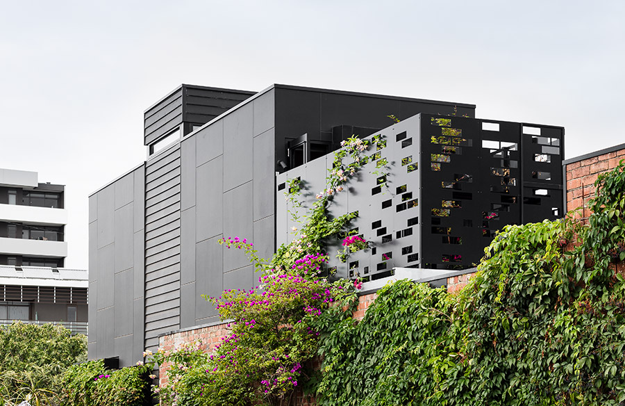
Situated at the end of a dog-leg corner in a typical Brunswick street, the Corner Store by Maison Co & Amanda Lynn Interior Design is a renovation of a former milk depot that is confronted with multiple design and site challenges including inadequate natural lighting and ventilation, overlooking of a neighbouring bedroom, a shared laneway, and having a heritage listed shed on neighbour’s fence line which prevented access to boundary. Phew. We think this is a case of ‘challenge accepted’. Let’s have a look at how these issues were addressed with new insertions while at the same time being respectful of the modest nature of surrounding residential buildings.
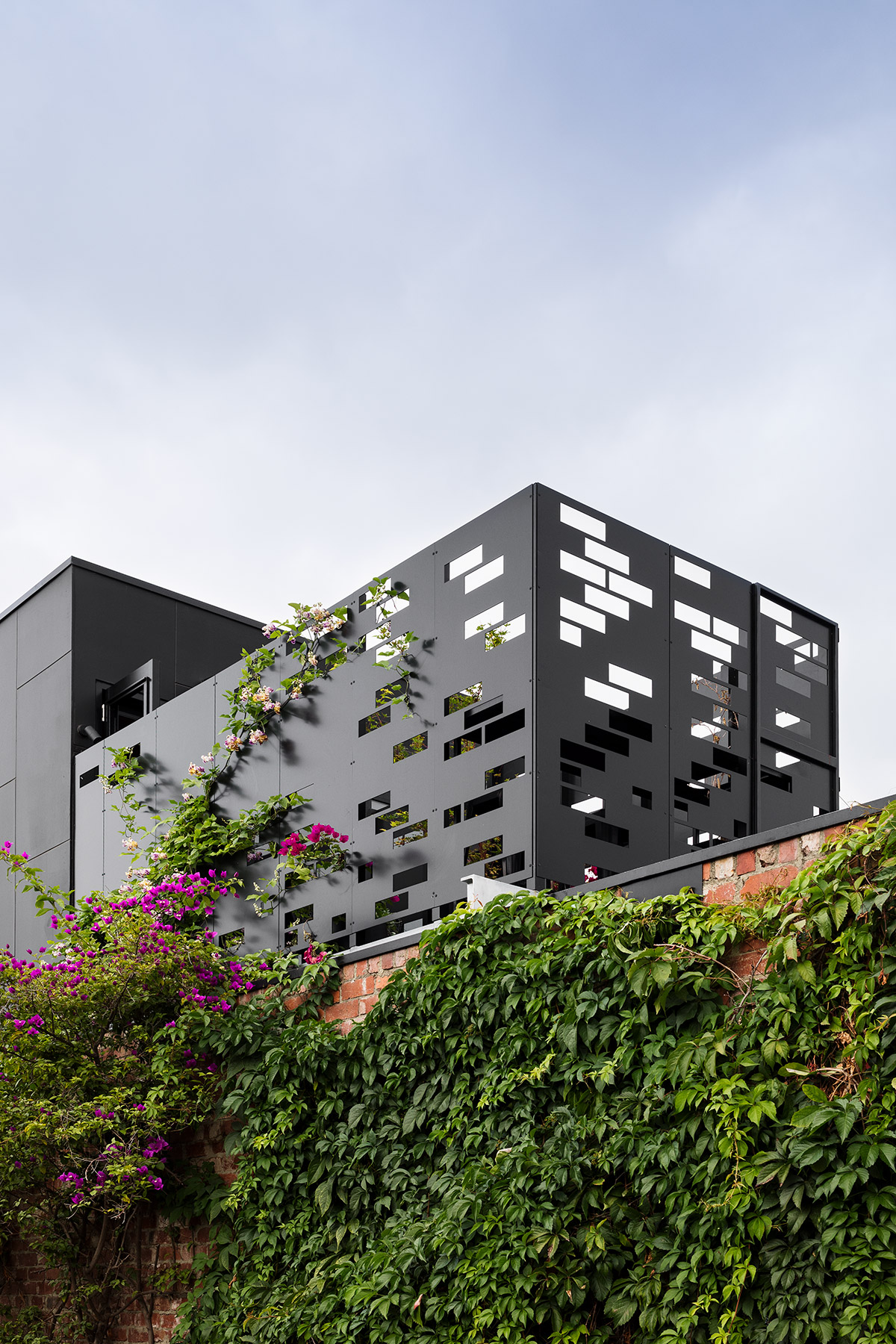
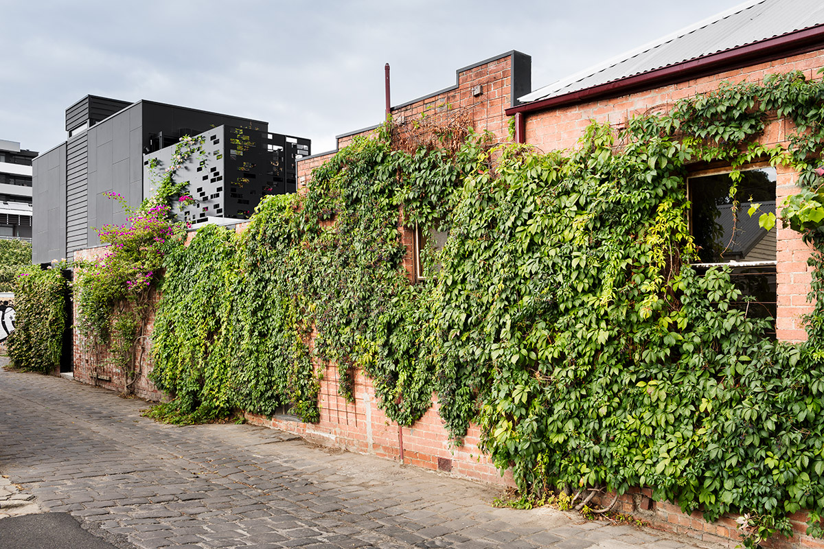
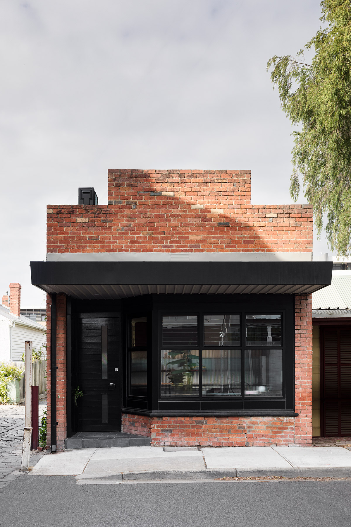
The owners were determined to retain the history and the original façade of the building which had been built with local bricks. This was to give respect to the nature of the neighbouring structures comprised mostly of a series of worker’s cottages and small factories. Directly opposite is a 1950’s paint factory which has been converted into townhouses, saving the original brick and ground level and using lightweight black cladding for the first floor additions, a response mimicked by the owners.
The structure next door had a heritage listed shed right on the boundary so scaffolding assembly for the purposes of building the first floor was a challenge. The appropriate response was to employ an ingenious cantilever scaffolding system fixed to the first floor to guarantee tradesmen access and no damage to the neighbouring shed.
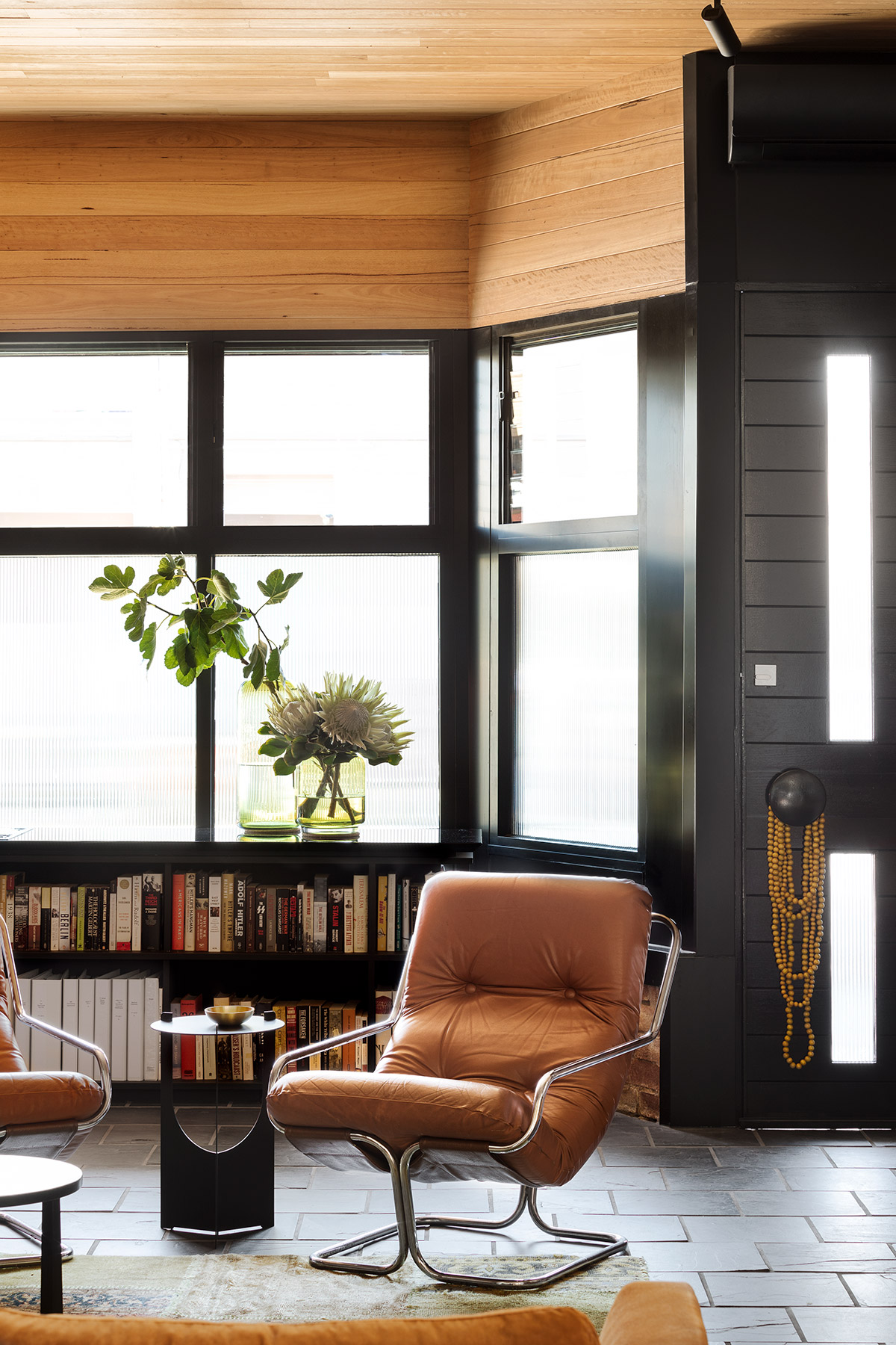
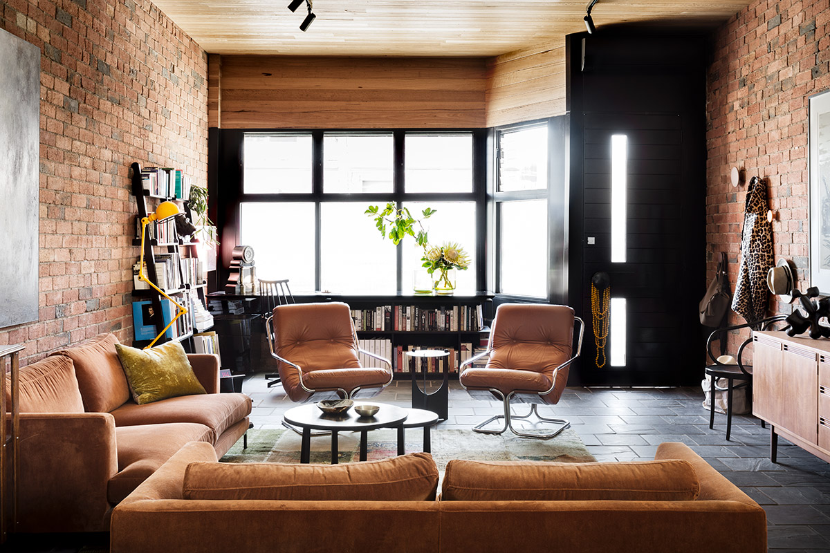
Internally, more refurbishment and remodelling were done structurally to overcome the issues faced by the house, specifically with regards to the lack of ventilation and natural light.
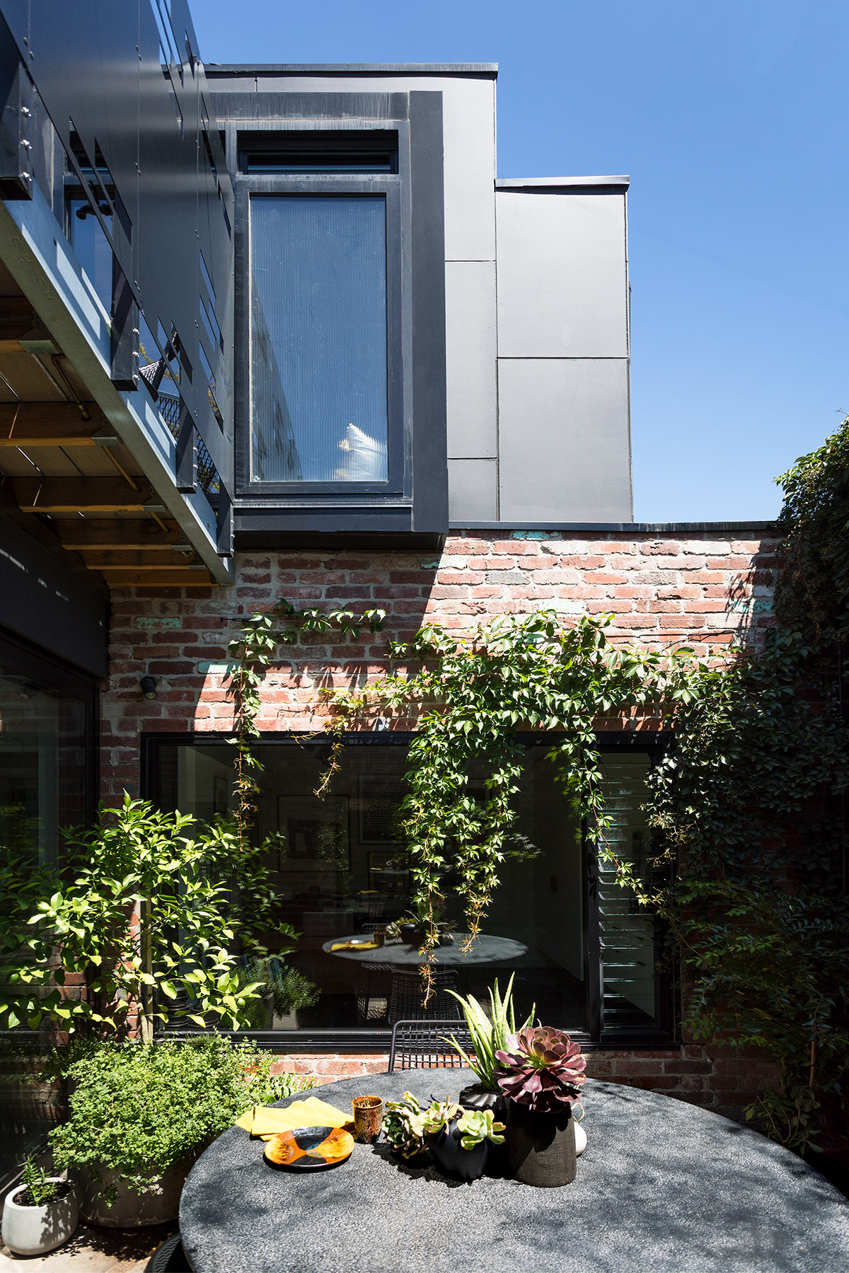
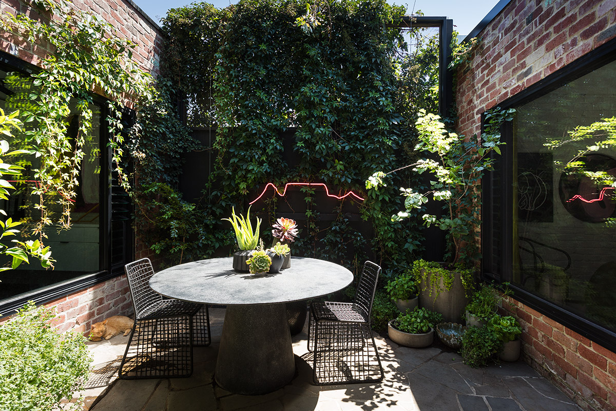
“An internal storage space, the middle of three rooms, had its roof removed creating a central courtyard in order to bring much-needed light and ventilation to the building, and allowing the adjacent two rooms which had previously had no windows, to have window penetrations to the courtyard. A staircase was added leading to the master suite and north facing morning coffee deck.” – Maison Co
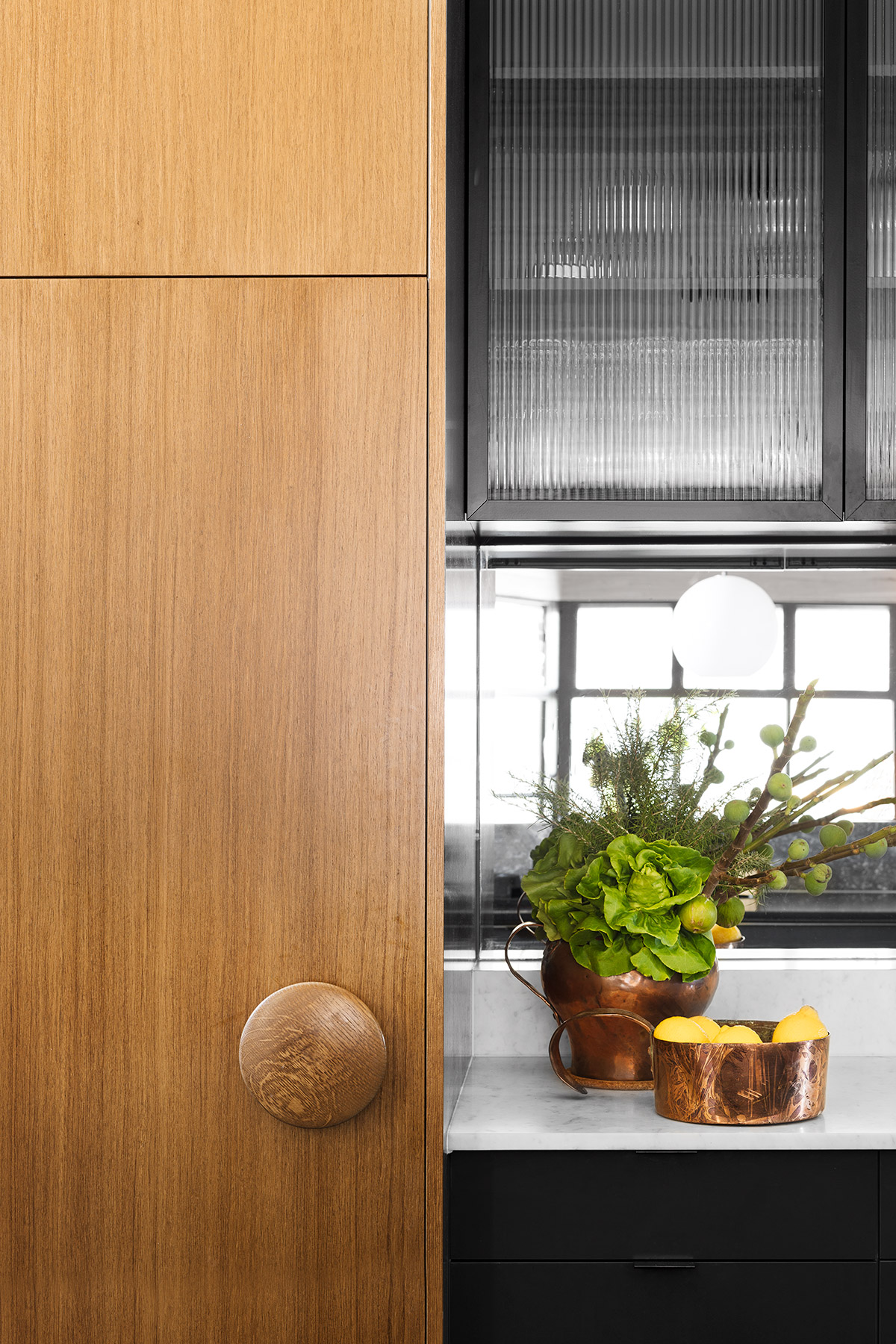
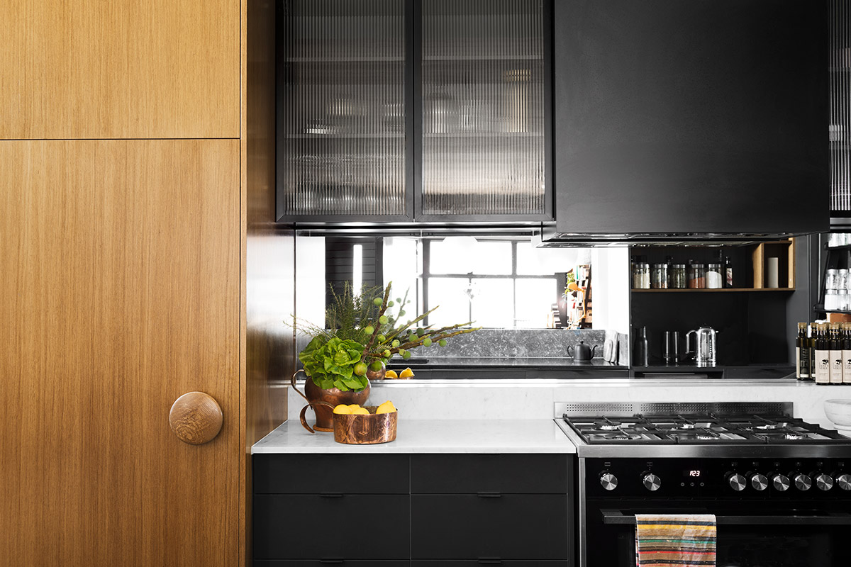
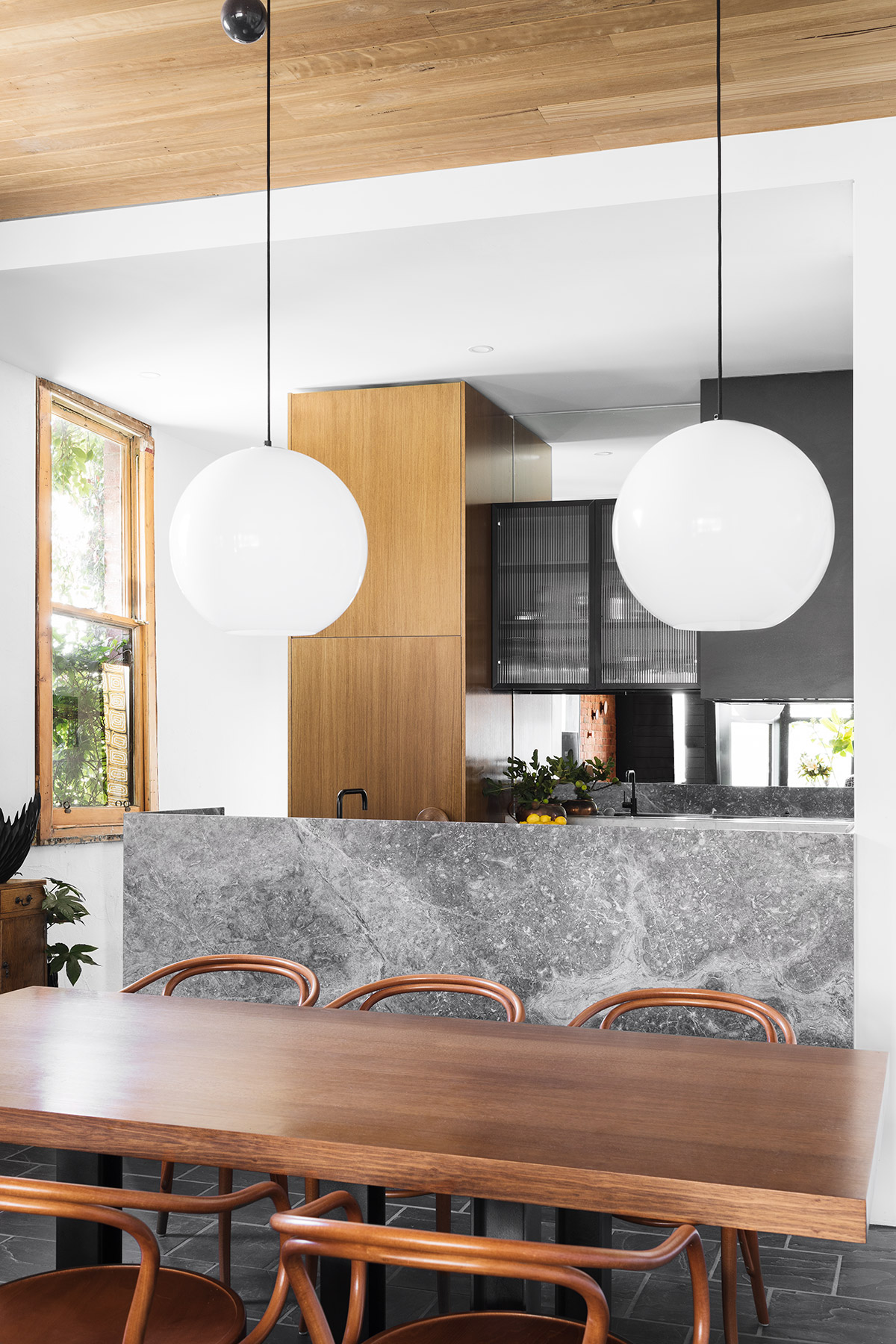
The predominantly black and brown palette of kitchen and dining area forms a great contrast with the combination of natural light piercing through the windows and artificial light fixtures.
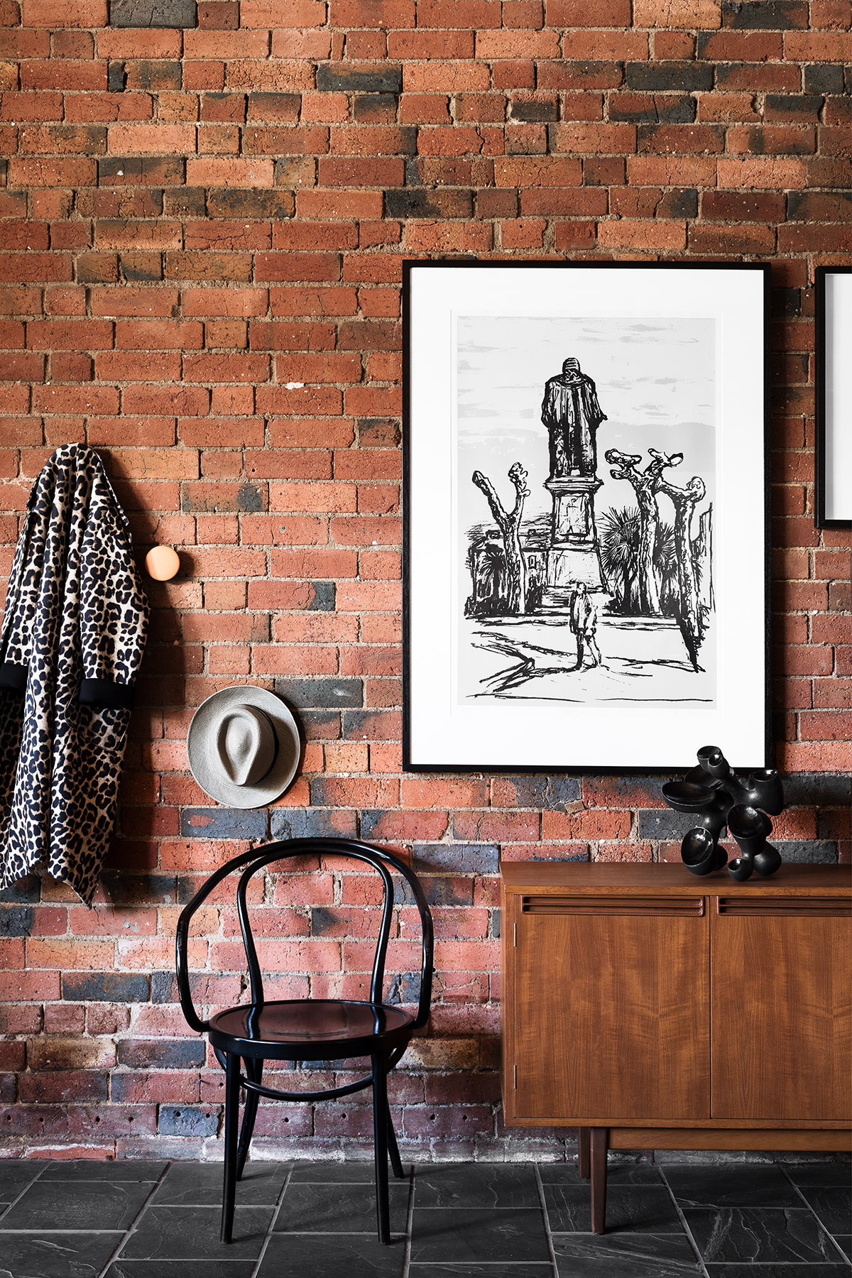
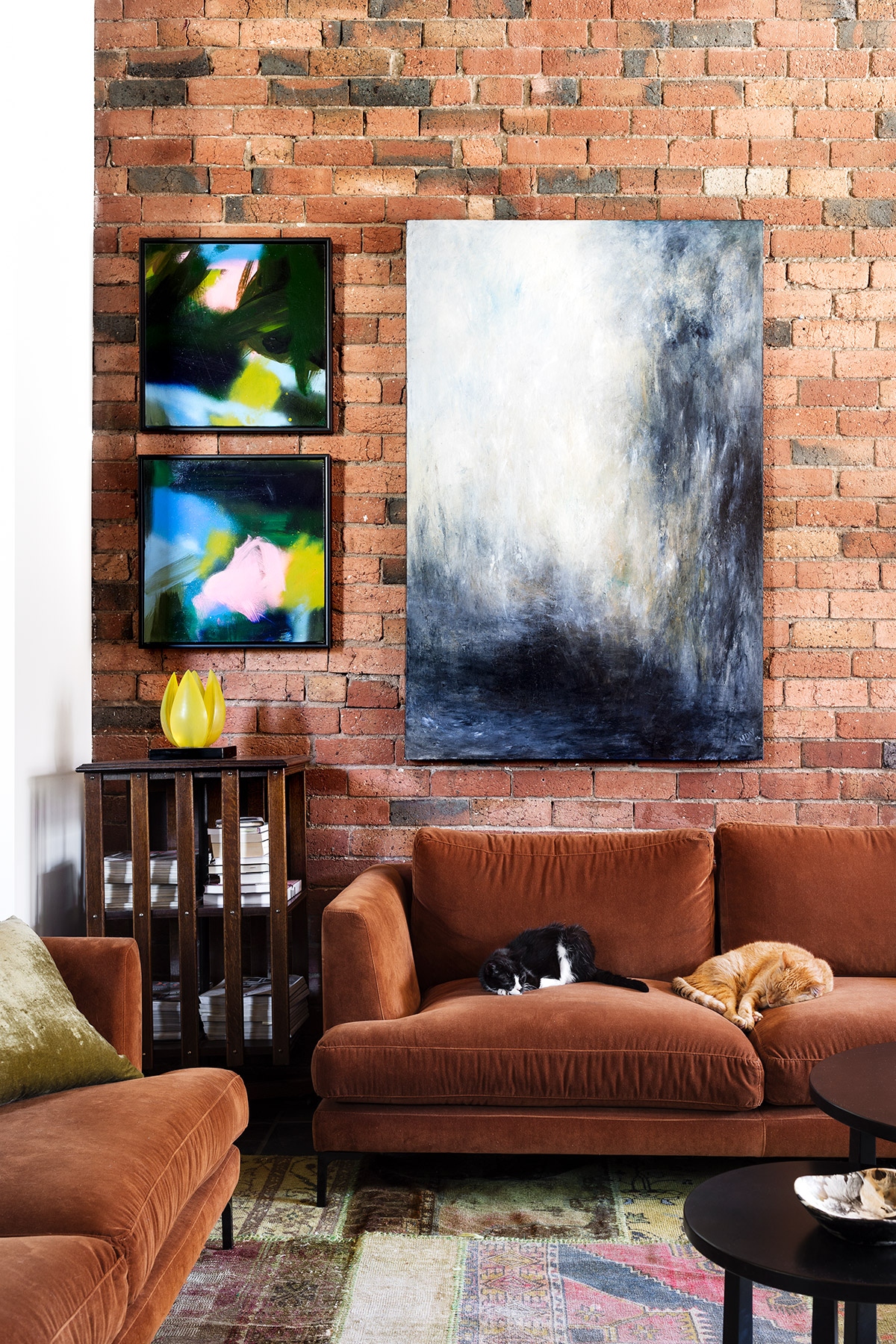
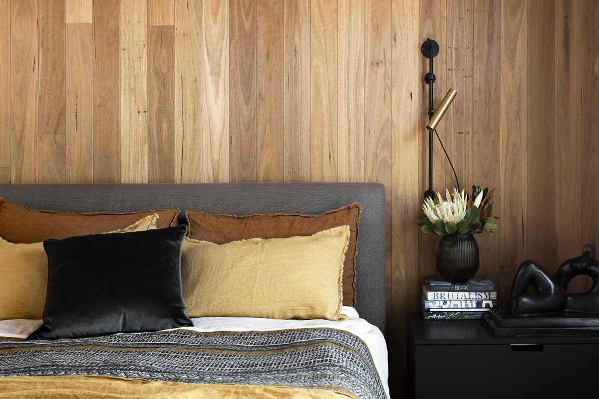
An unassuming way to deal with materiality suitable for the building’s rudimentary history prevailed, restricting the palette to a basic, raw and white brick, teak wood, and natural slate throughout.
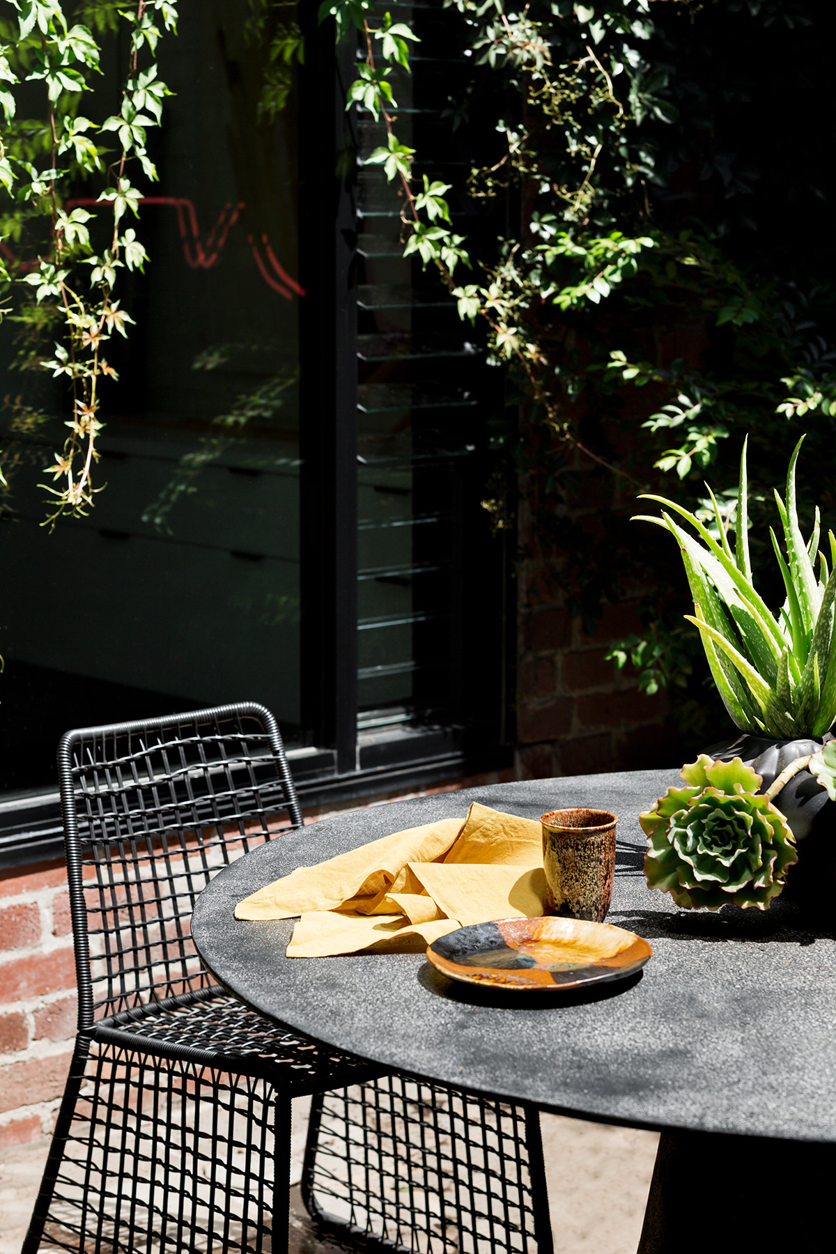
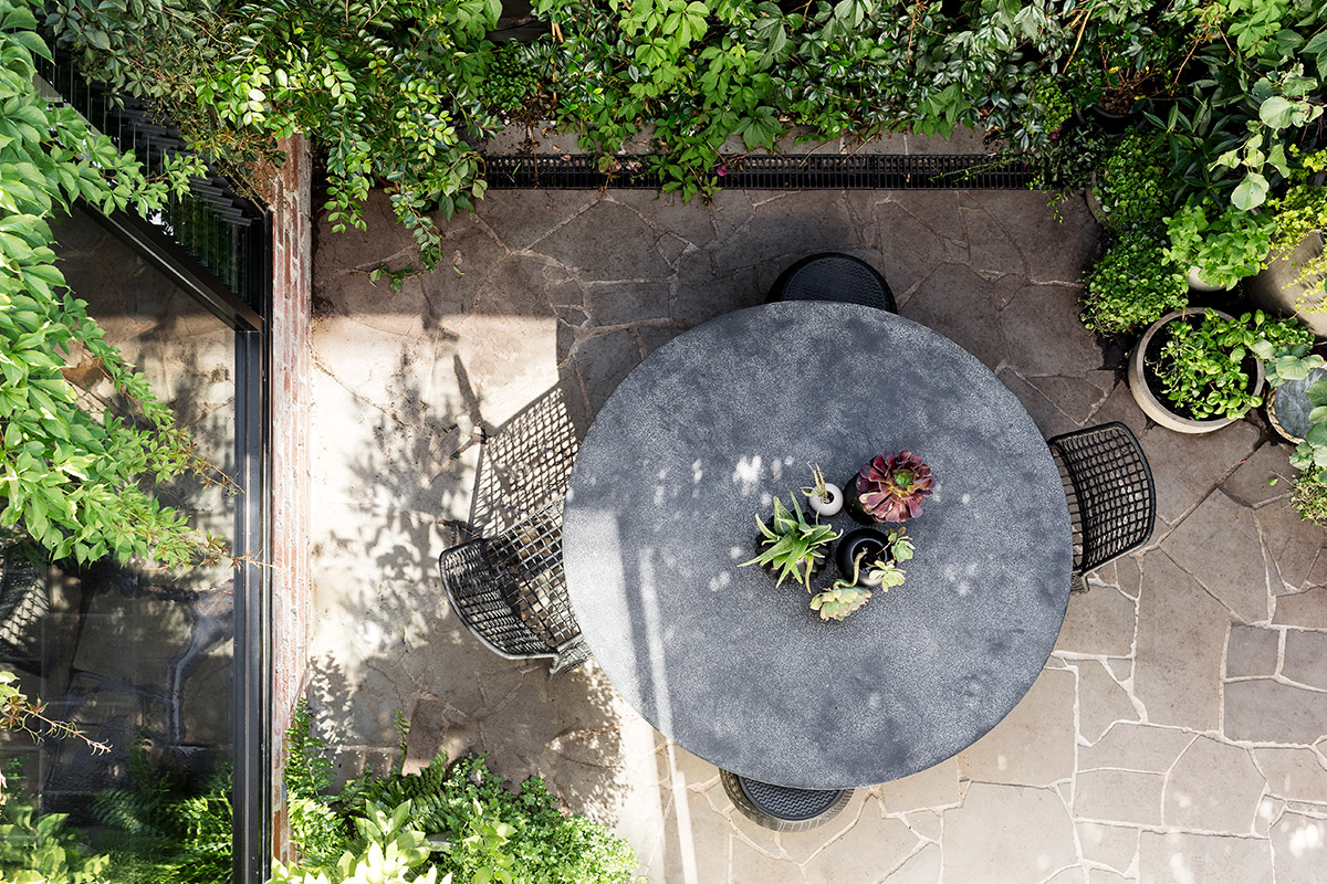
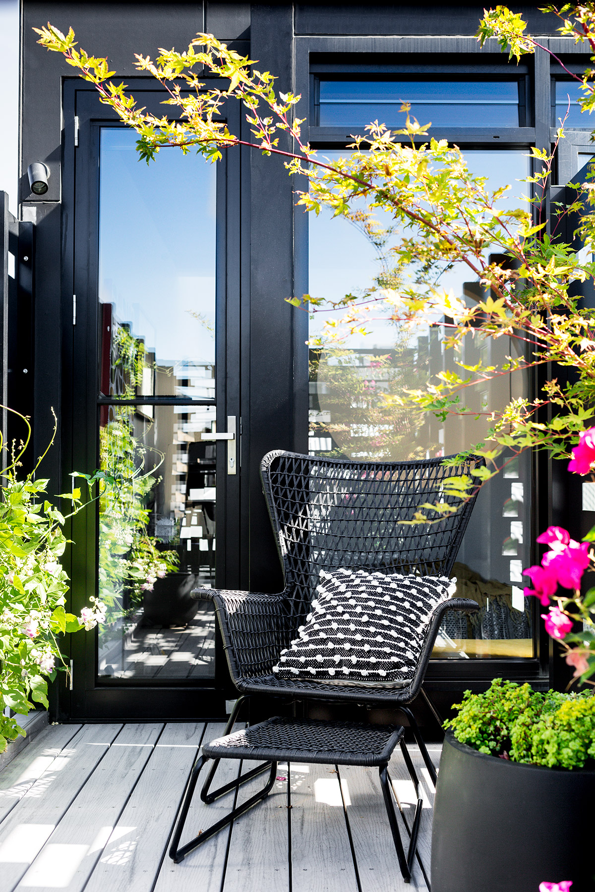
The new central courtyard has provided the owners with a private outdoor space which is usable throughout the day. Its natural ventilation and lighting serve as a sunny oasis for dining and reading, creating a second living area for the property. In addition fruit trees and herbs have thrived in the sheltered environment, creating a bountiful urban pantry.
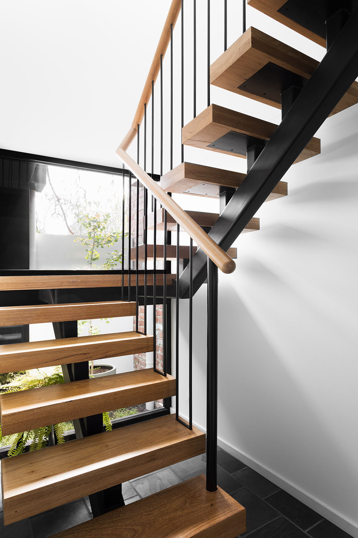
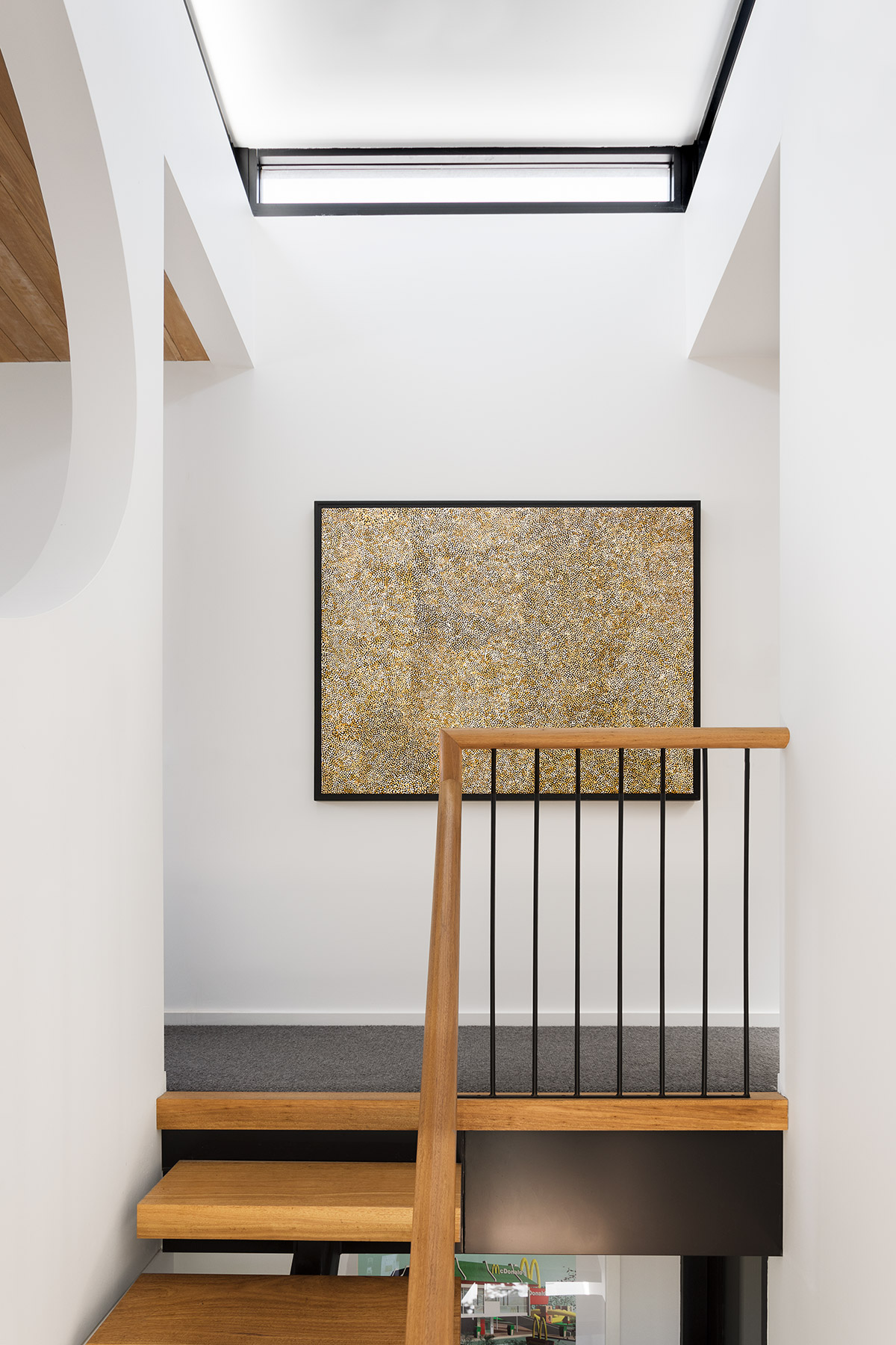
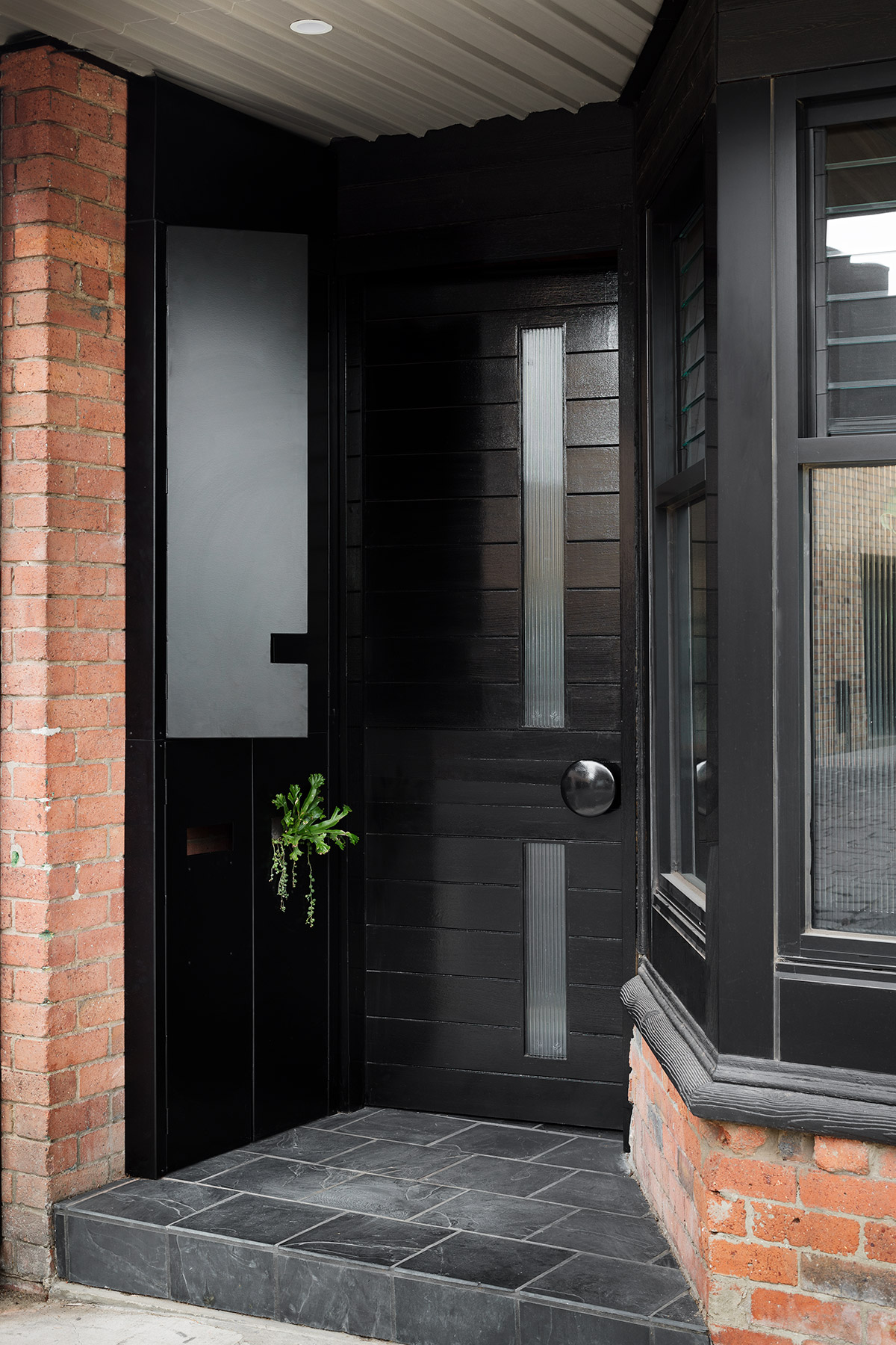
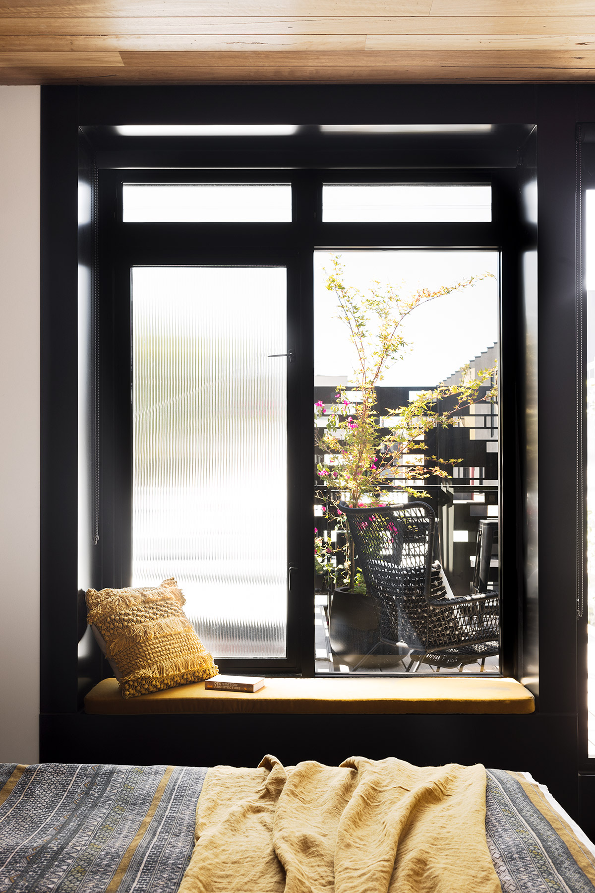
Encasing the new staircase in a light tower, with a large picture window at the landing facing west allowed natural light to flood the stairwell and created an extended vista of neighbouring gardens as one traverses the stairs. To ensure privacy at street level reeded glass was used in the lower living room windows.
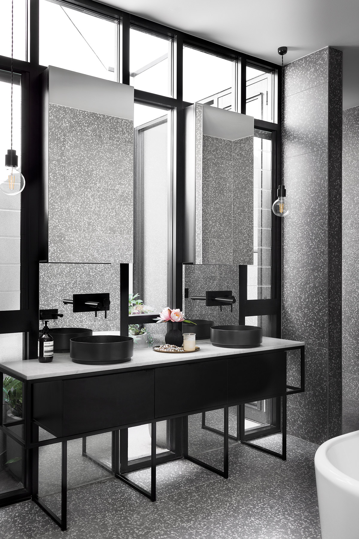
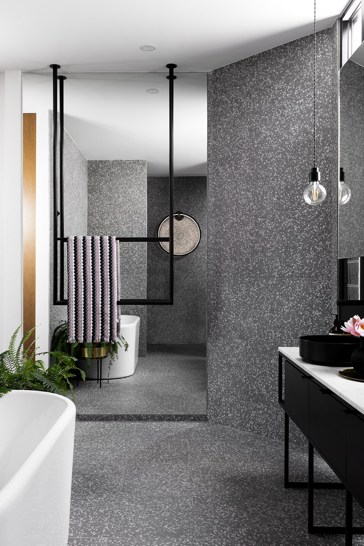
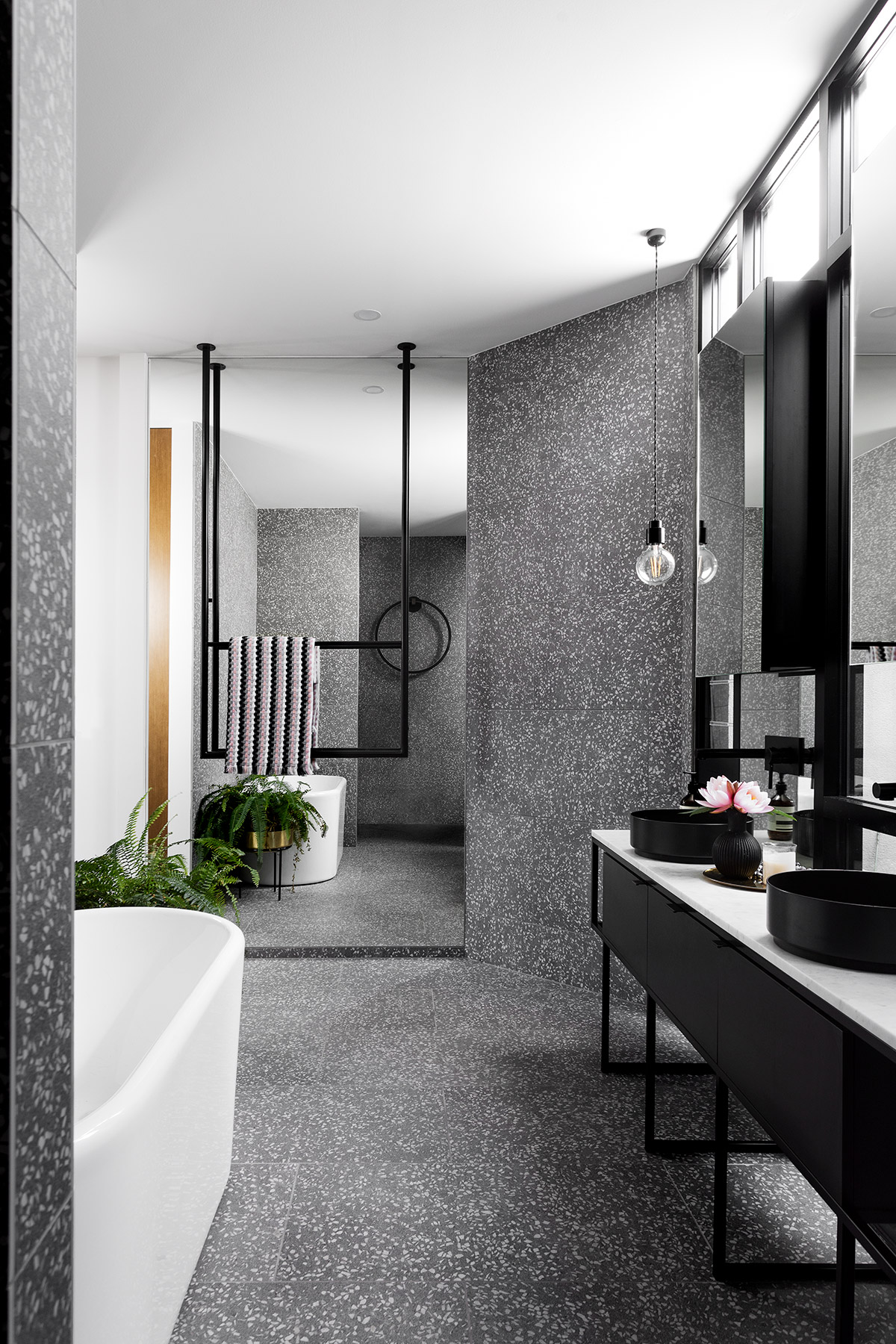
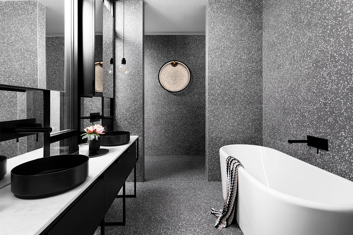
Large skylights in the internal guest bathroom and laundry alleviate the need for daytime lighting.
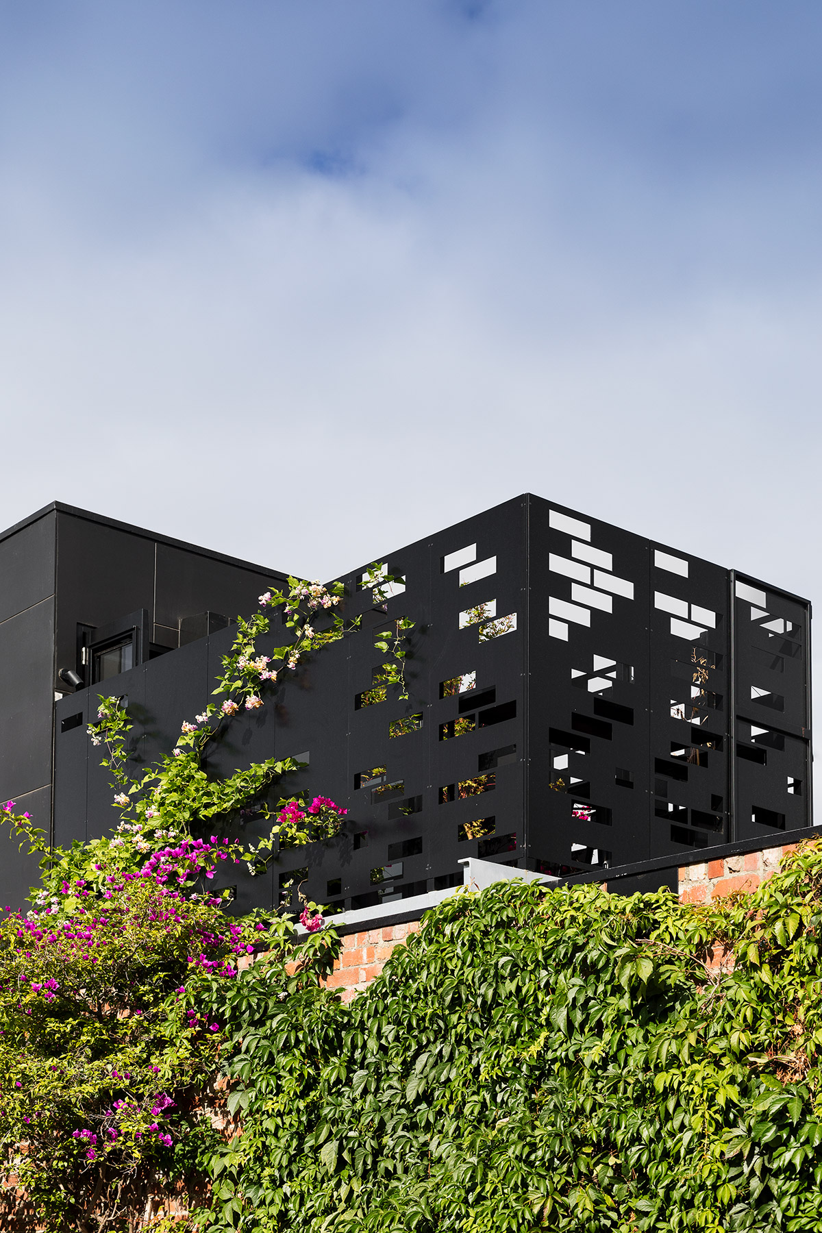
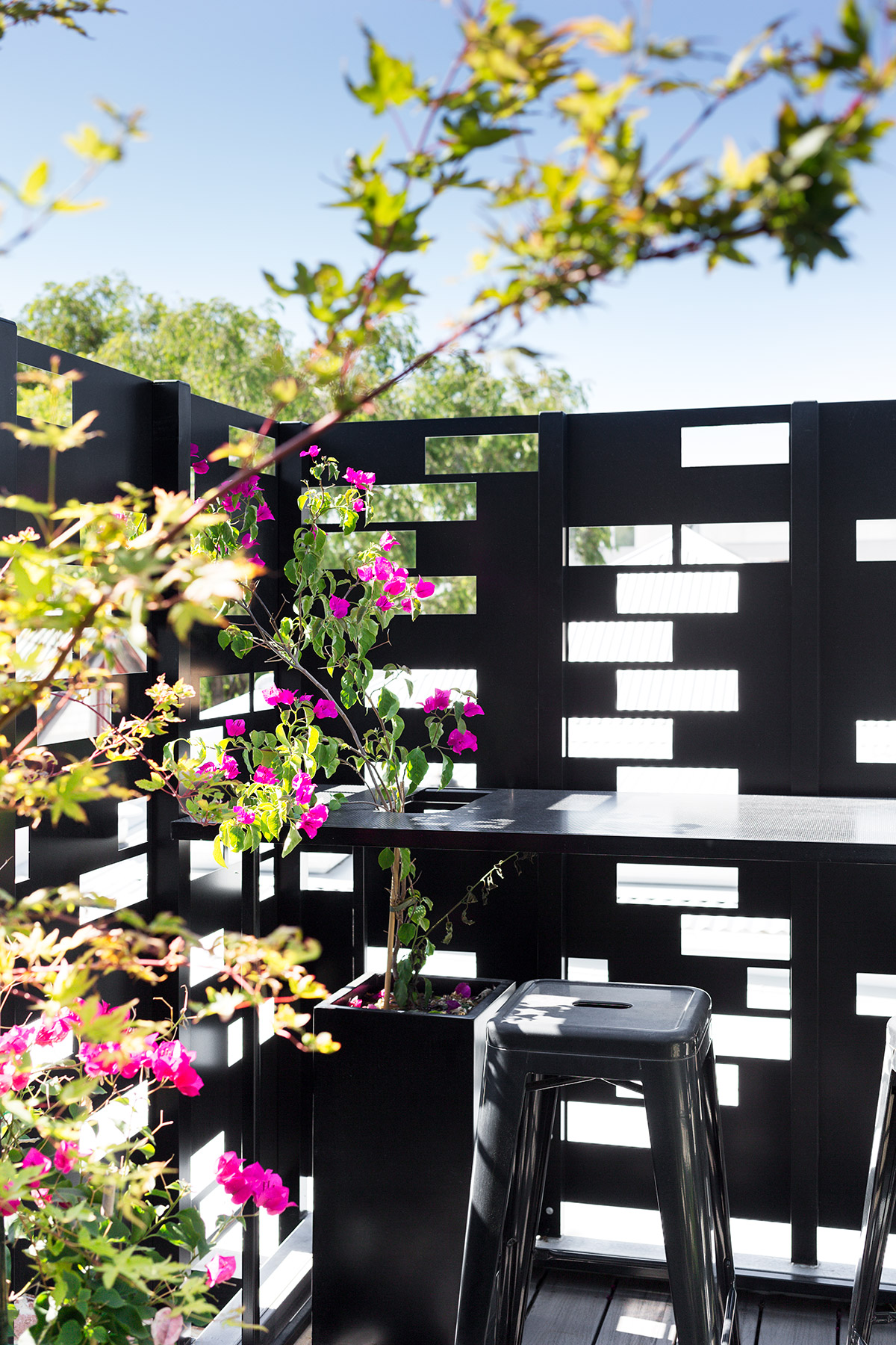
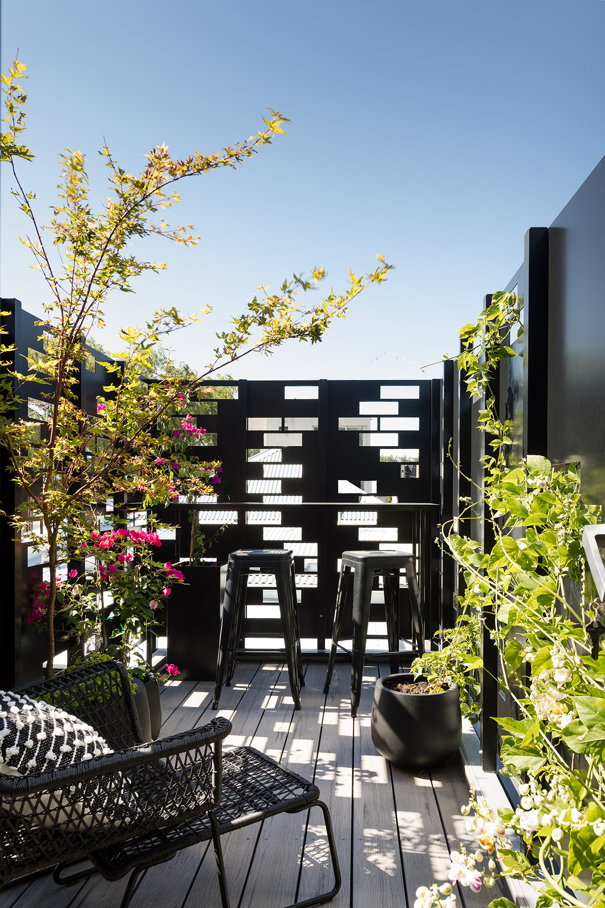
The aforementioned overlooking issues to a bedroom directly across the eastern laneway and from the street into the proposed living area was addressed by the intricate placement of brick-shaped penetrations in the upstairs deck balustrading which ensured no eye line to the neighbour’s bedroom window.
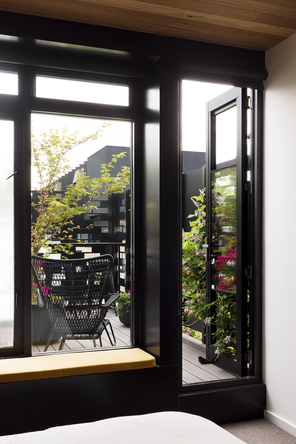
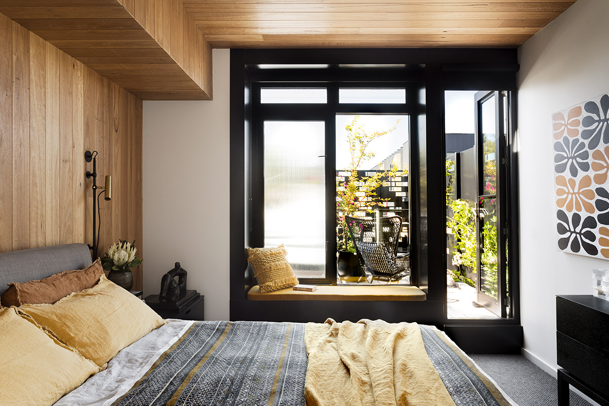
The project is a genuine example of a home plagued with plenty of challenges but was beautifully transformed into an amazing heritage masterpiece. It’s been completed with all necessary amenities within a modest footprint, using basic materials whilst creating richness through the layering of history, texture, and space.
House Project: Corner Store
Design by: Maison Co
Interior Designer: Amanda Lynn Interior Design
Location: Brunswick East
Type: Renovation
Photography: Martina Gemmola


