It’s an absolute pleasure to take you through this delicious family home and I do mean delicious. From its facade it appears much like any other weather-board cottage, quaint and at home in its picture perfect setting. Once you walk through the door however all that ‘same same’ nature gets thrown out the window and the unique personality of its owners shines through immediately. The first words that came to mind when I entered this home were ‘cool’ actually they were ‘damn cool’. An inviting family home that is next level bold and unashamedly so. The interiors are loaded with confident choices of colour, pattern and texture that layer perfectly. And around every corner there is an artwork or object busting to tell a story, proof to a very full and happy life well lived. But hey, that’s just what I think. Why don’t you take a look for yourself…
It’s not every day that you find a double-fronted weather-board home located at the end of a cul-de-sac with a little bridge and playground as your neighbour. However that is what this home-owner stumbled across a decade ago. Home to co-founder of homewares brand Kip & Co, Alex McCabe and her family. Alex immediately fell in love with the postcard setting of this home and huge gum tree that occupied the back garden. After six years of saving, Alex underwent a renovation with Mike McManus to transform the outdated interior into a bright, light and warm home for her family.
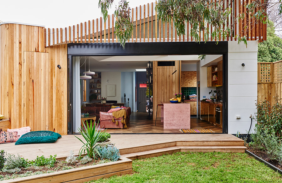
Before the renovation the garden took up half the block, so the home was extended to increase its footprint. The sliding double glazed doors at the rear of the home open completely, resulting in further extension of the home entertaining areas. Whilst the garden became smaller, the gum tree that the owner fell in love with when she bought the property remained in place. As for the rest of the home, apart from a dodgy 90s renovation it still had good bones. So any unique character was left with the rest modernise to enhance the scale and functionality of the home.
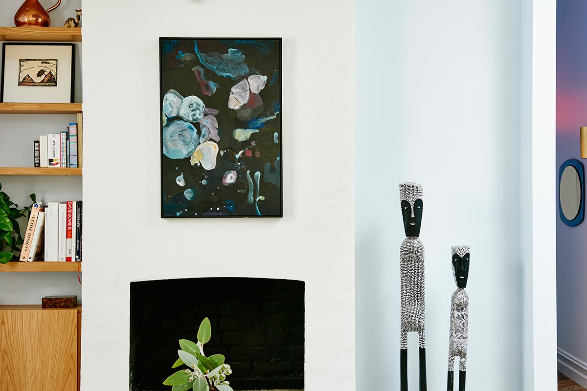
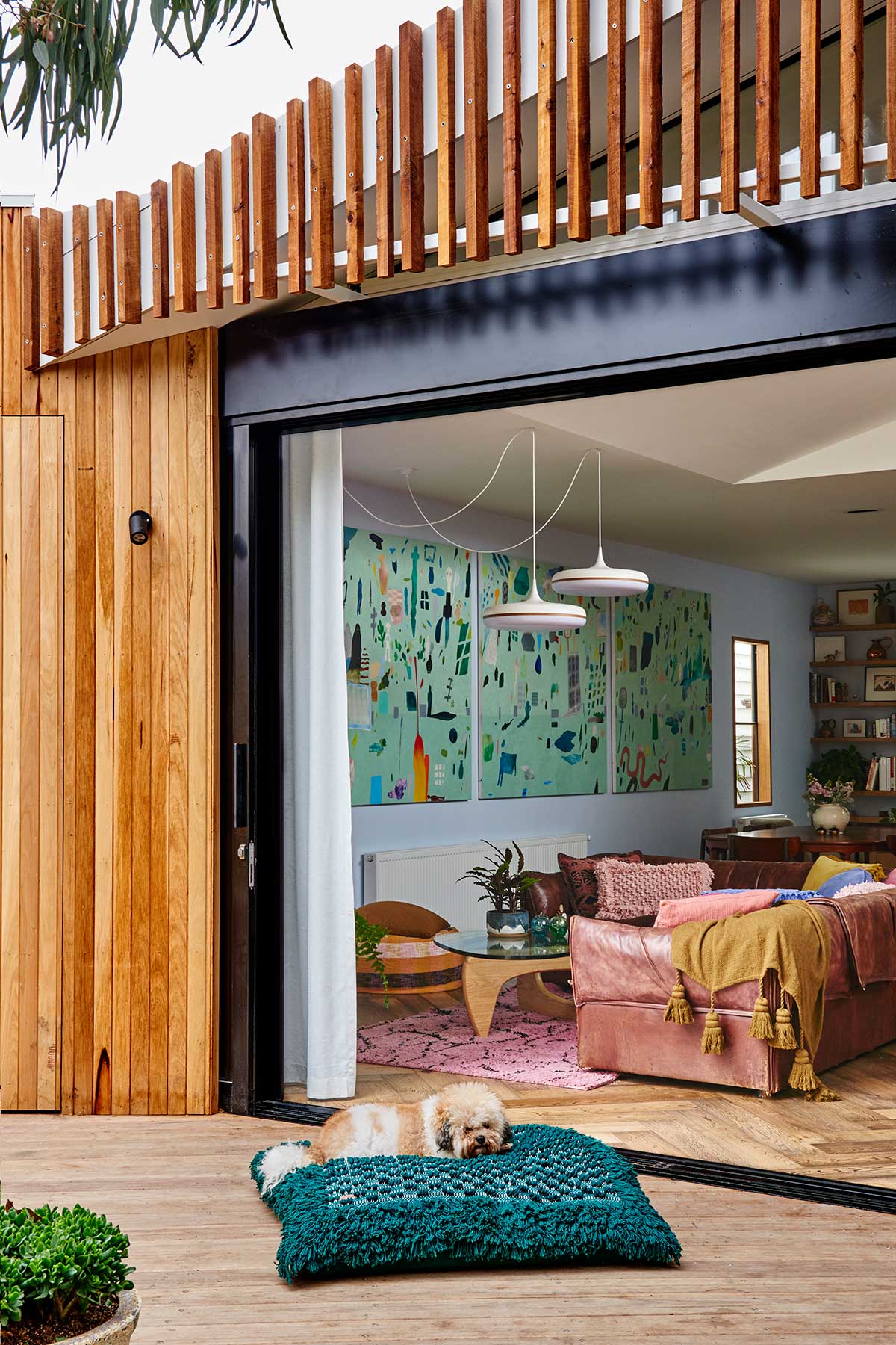
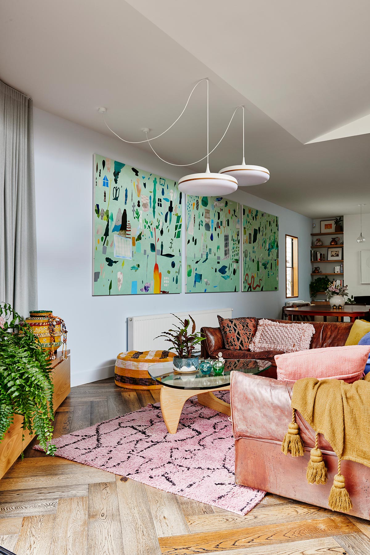
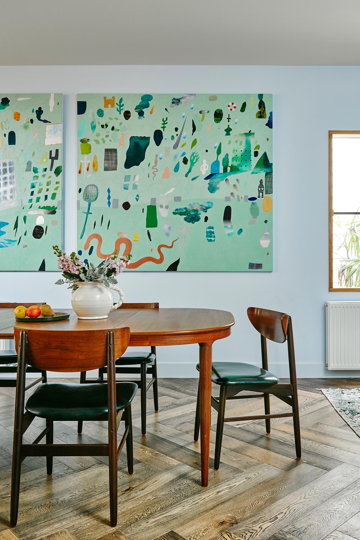
There is a lot of love about this home but I think it’s the interior styling that sets it apart. The artwork is truly spectacular and is not limited to just canvas, but sculptures and objects are throughout. It’s hard not to be enamored with the huge triptych that overlooks the living, dining and kitchen. This piece by Fred Fowler was commissioned for the space and completely sets the tone of the home.
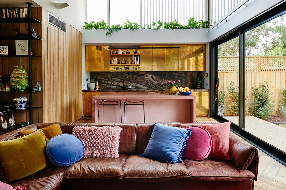
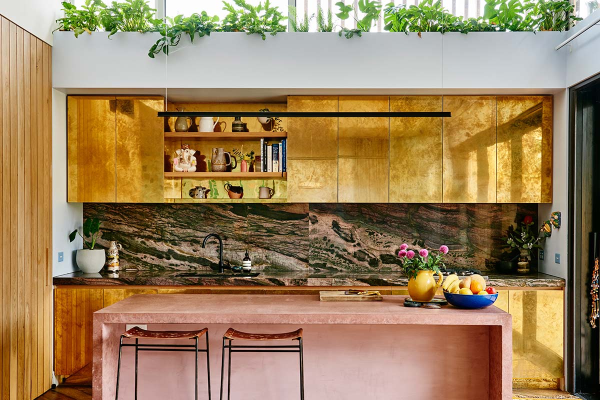
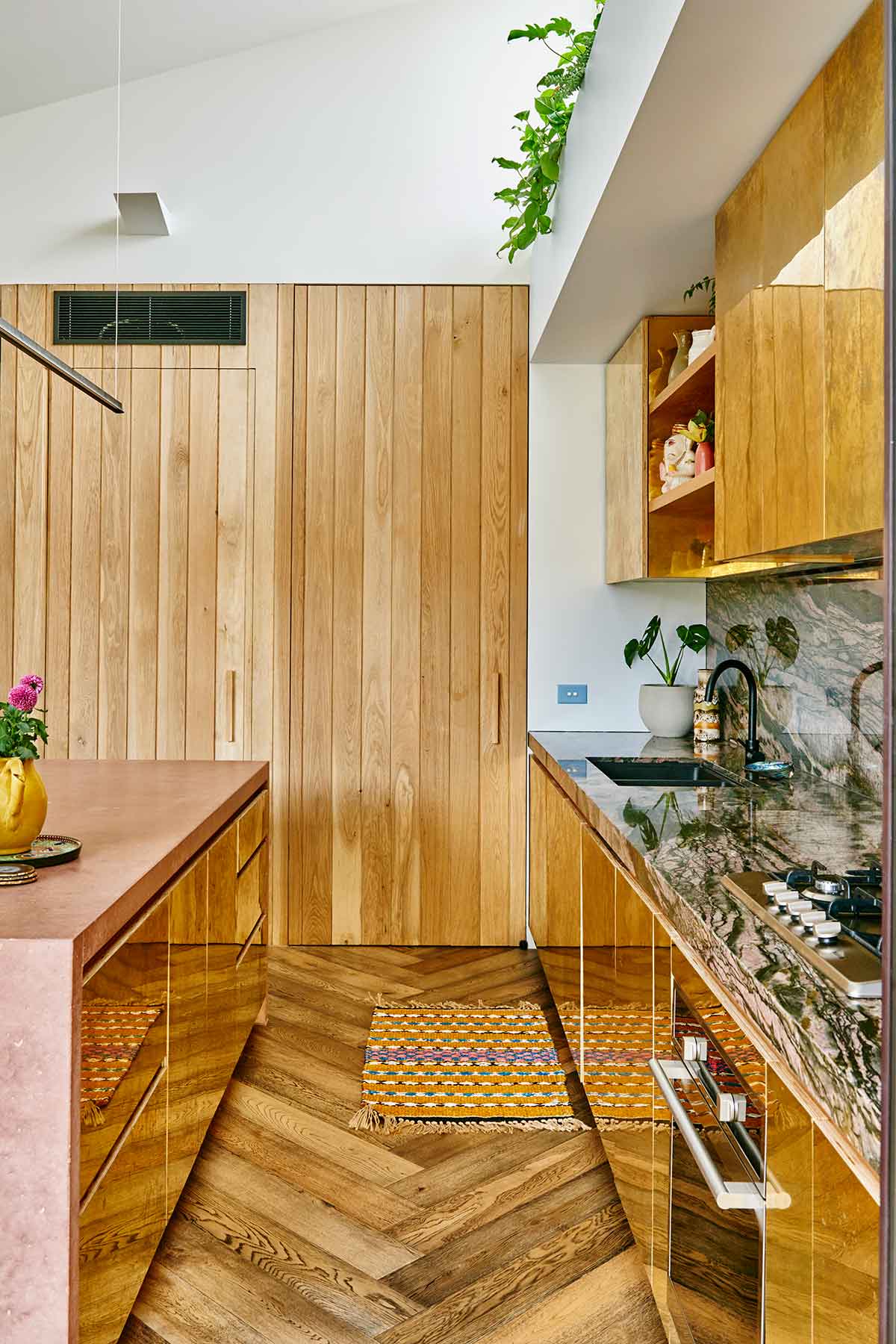
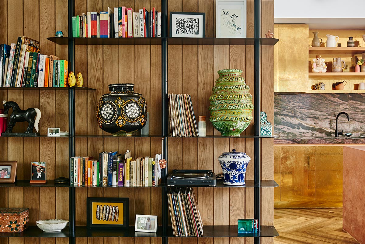
The textures themselves were also somewhat artwork. The material selection in the kitchen is insanely brilliant! It features: a pink concrete island bench (yes pink concrete – I didn’t know that was a thing but now I’m all for it), bamboo crocodile quartz splashback and brass cupboards that the owners aged themselves with apple cider vinegar over a few glasses of vino… see I told you this home was damn cool.
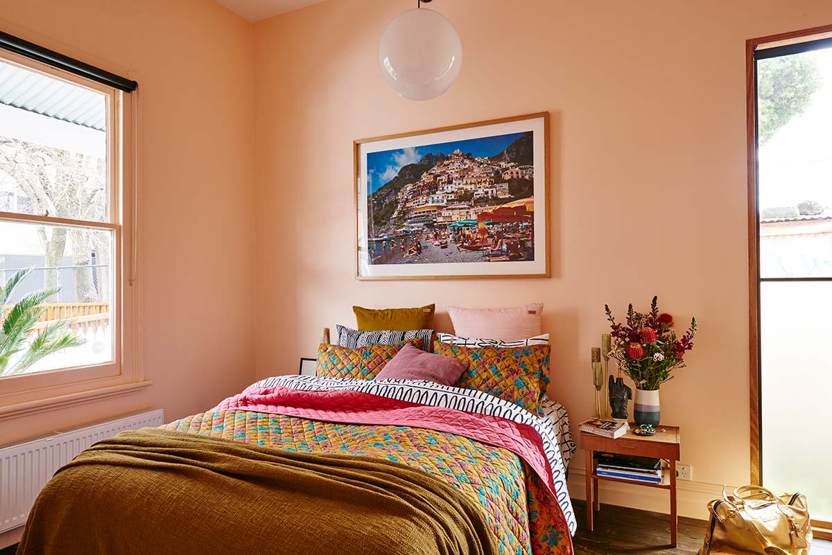
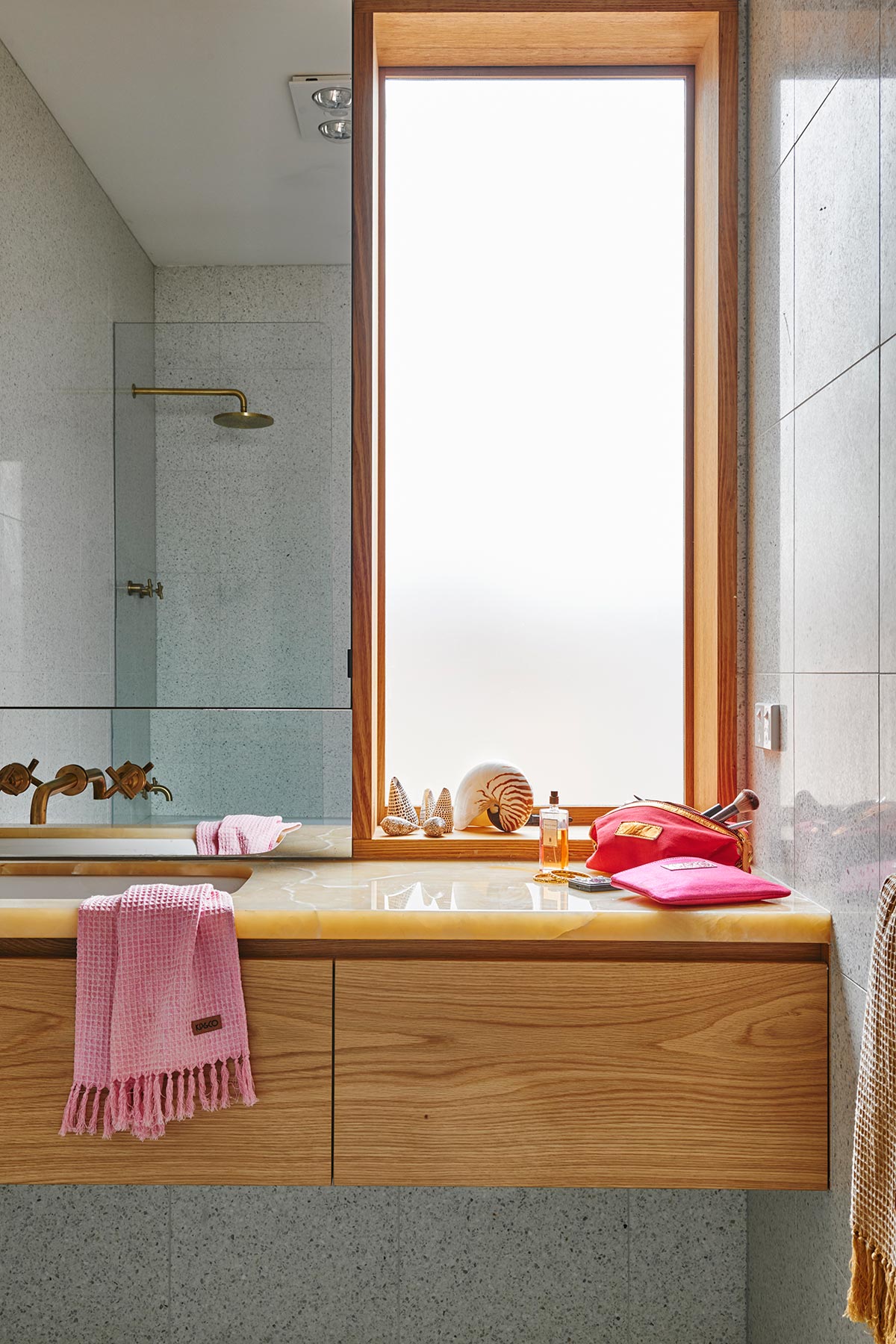
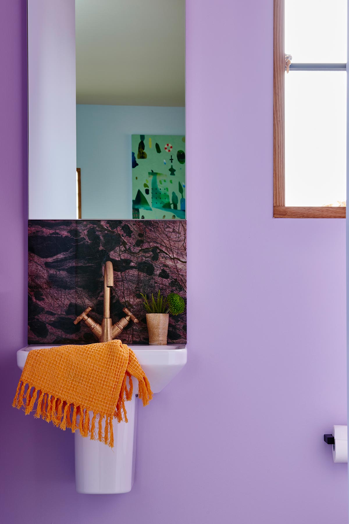
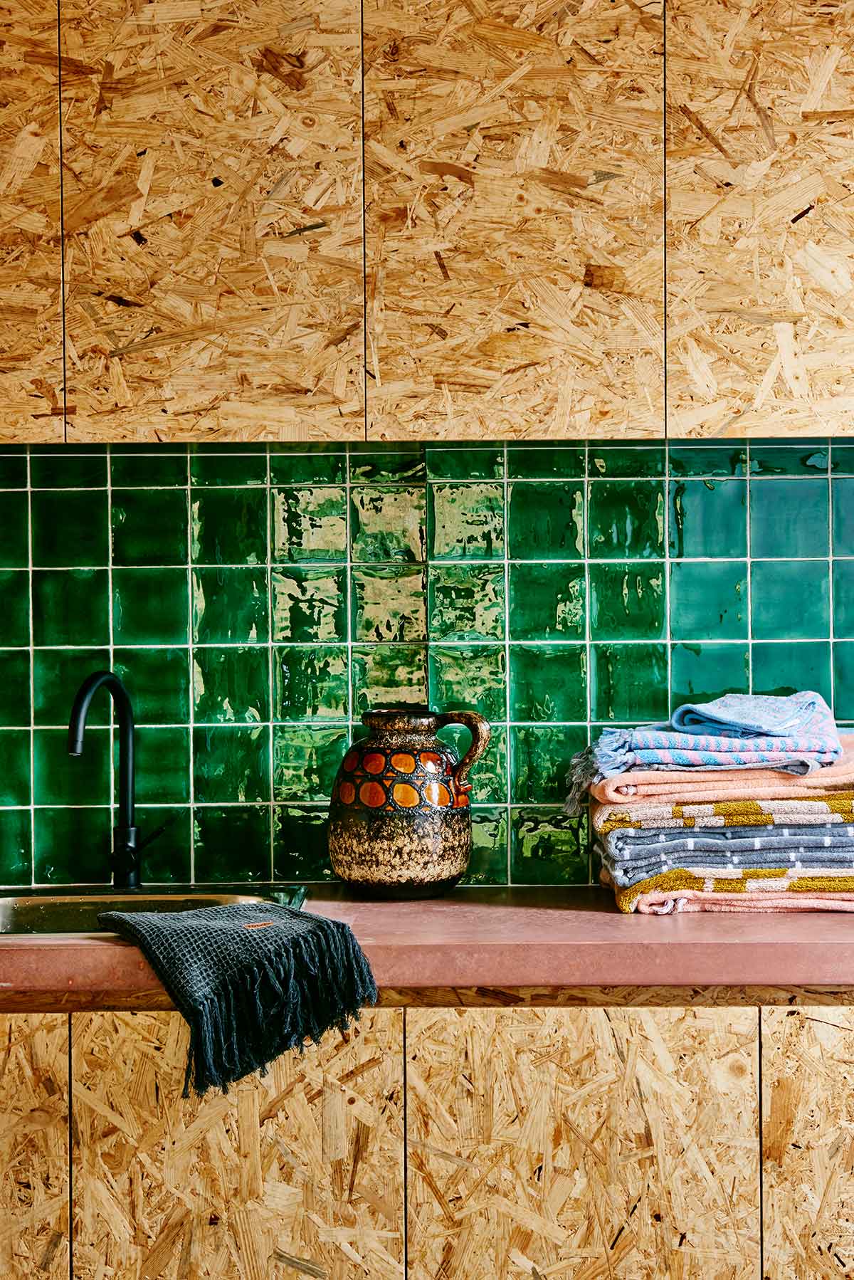
Decor wise the colour, pattern and texture continues with the owners passion for textiles clearly evident. Bold combinations of Kip & Co bedlinen, cushions, rugs and accessories are throughout and you can really get a sense for the playful and confident nature that Kip & Co are known for.
Let Us In Episode 21: Colour Crush House
Type: Renovation
Location: St Kilda, Victoria, Australia
Architect: Mike McManus
Photography: Nikole Ramsay
Video Host: Lucy Glade-Wright
Video: Jonno Rodd


