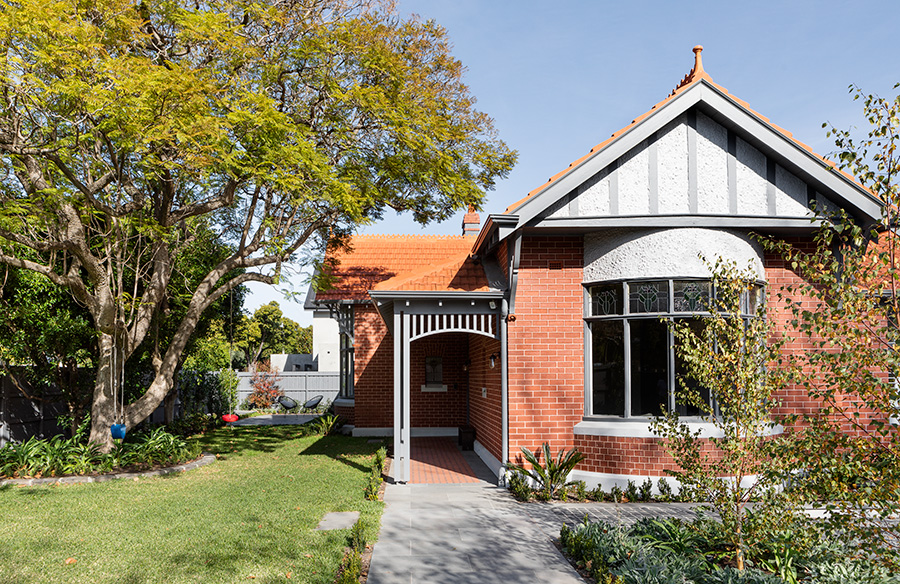
It’s been a long time coming but we’re back! We are thrilled to bring you Episode 32 in our Let Us In Home Tour series. This home features a strikingly detailed period restoration together with a contemporary addition. Designed by Page Stewart, this family home harmoniously marries the old with the new bringing a new glamour to this Edwardian brick beauty. Let’s go inside…
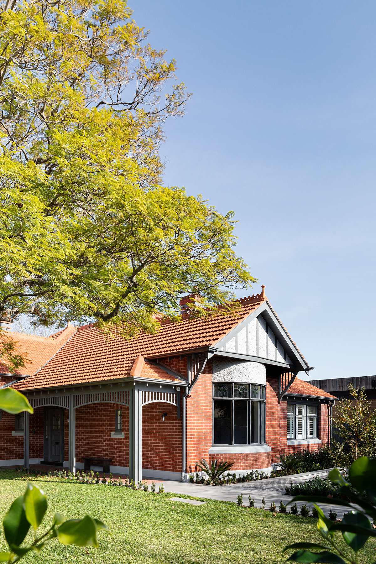
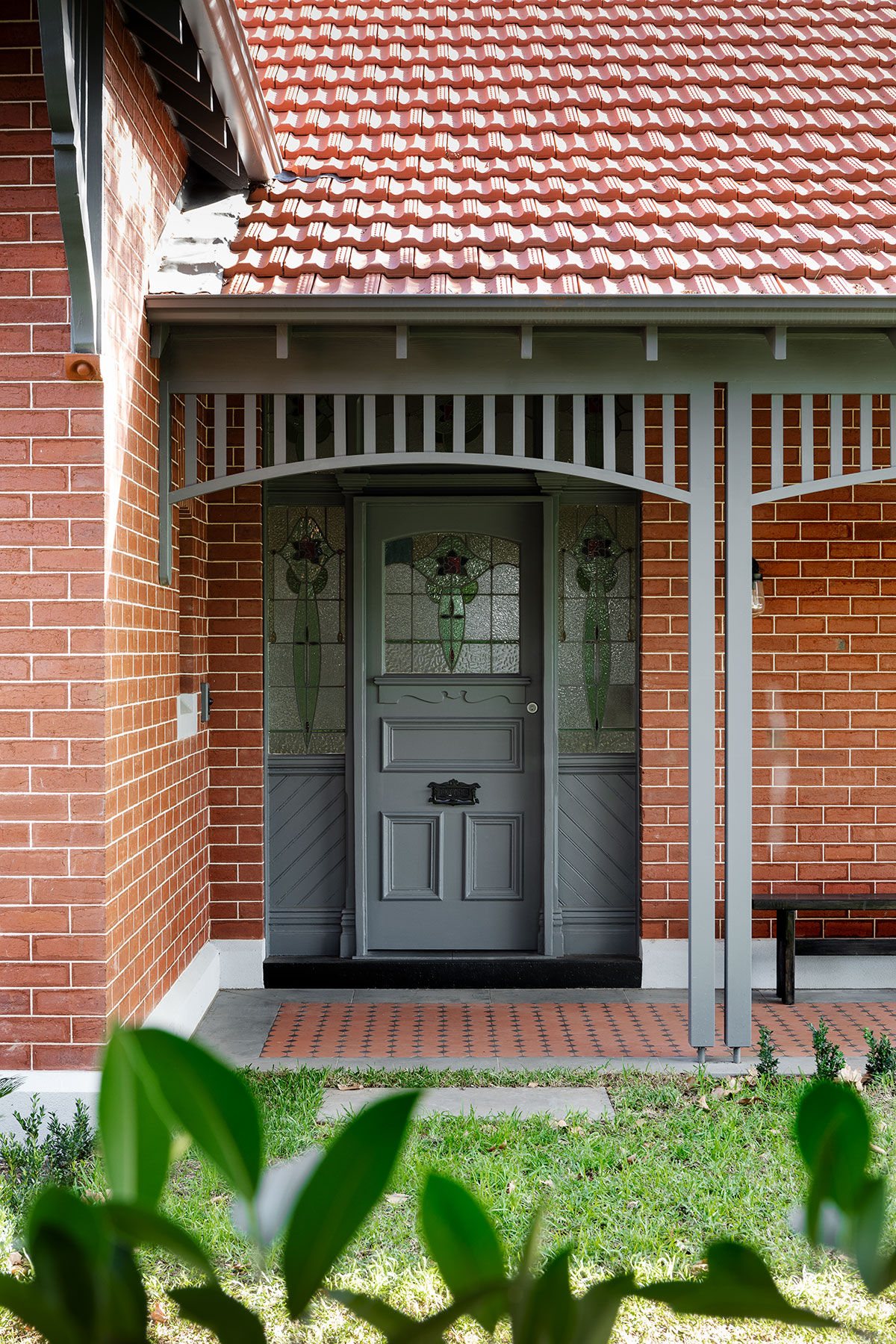
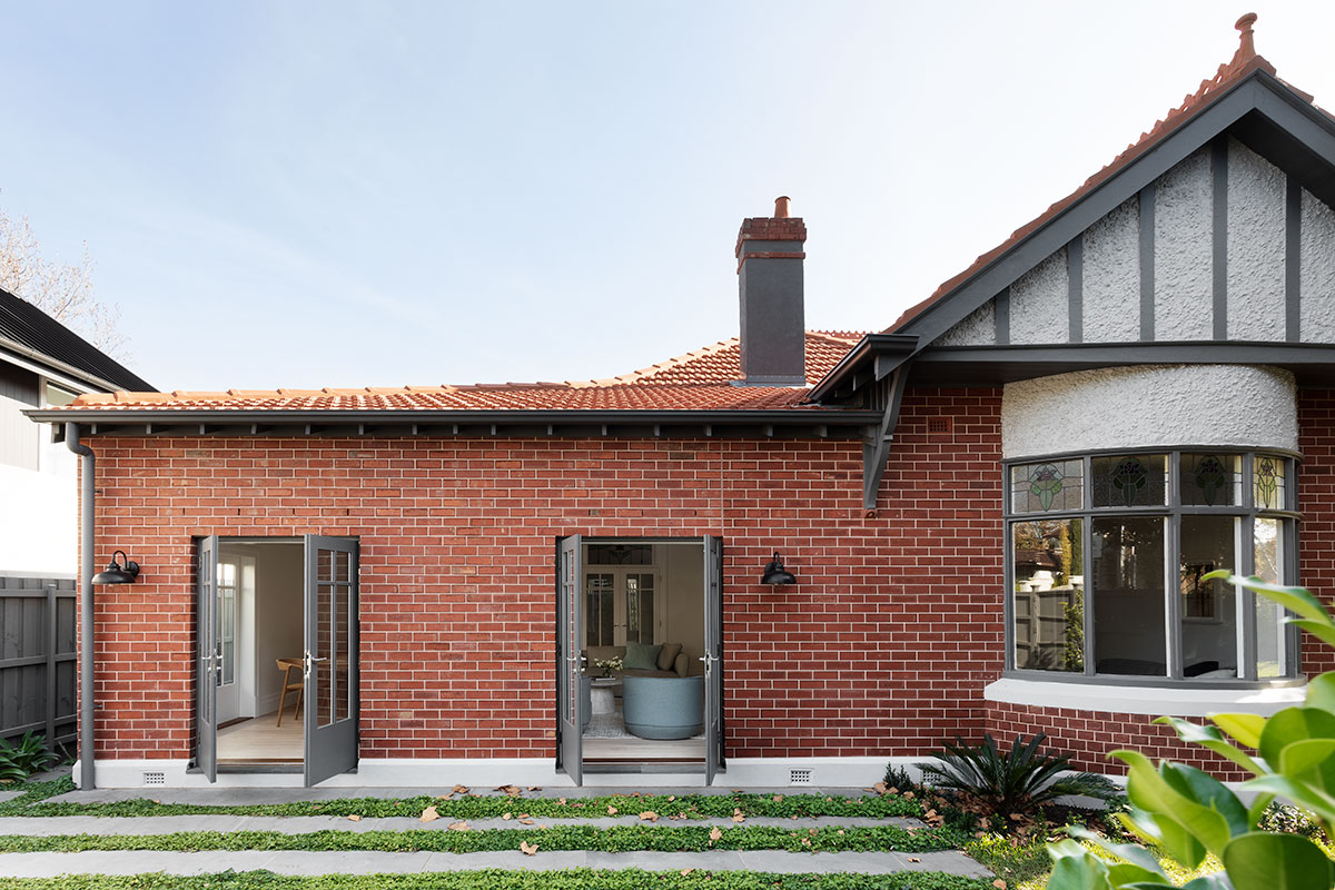
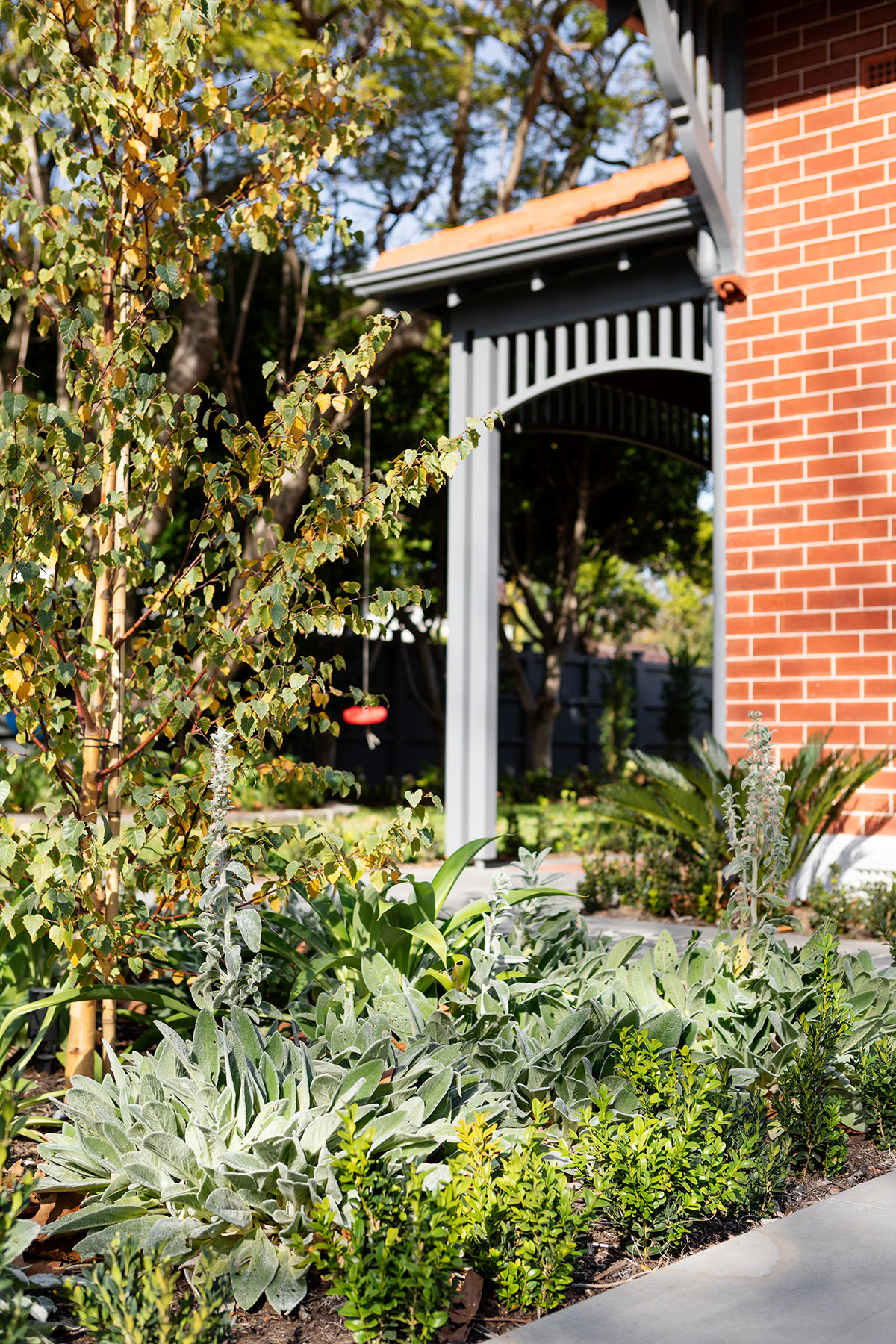
The architect is Kath Stewart from Page Stewart and this is actually her home, her family and childhood home where she grew up. It’s nestled in a huge corner block with a north facing garden just one block back from the beach in Brighton. Whilst this is a period Edwardian home, it has gone through a full renovation and the only existing part of the old structure are the external brick walls and the led lights in the front door. Everything else is completely new including the roof, rooms, windows, the reconfigured layout, new landscaping, and new fence.
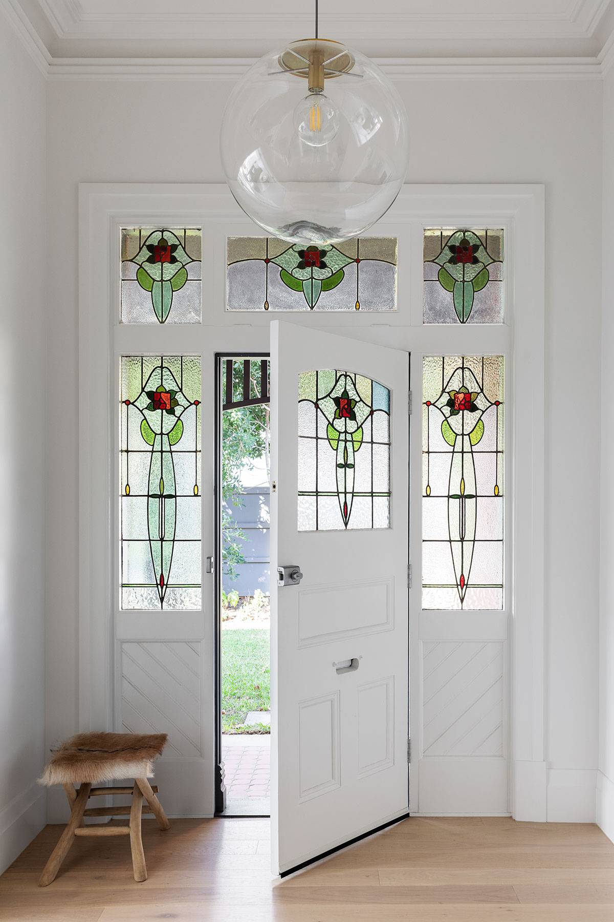
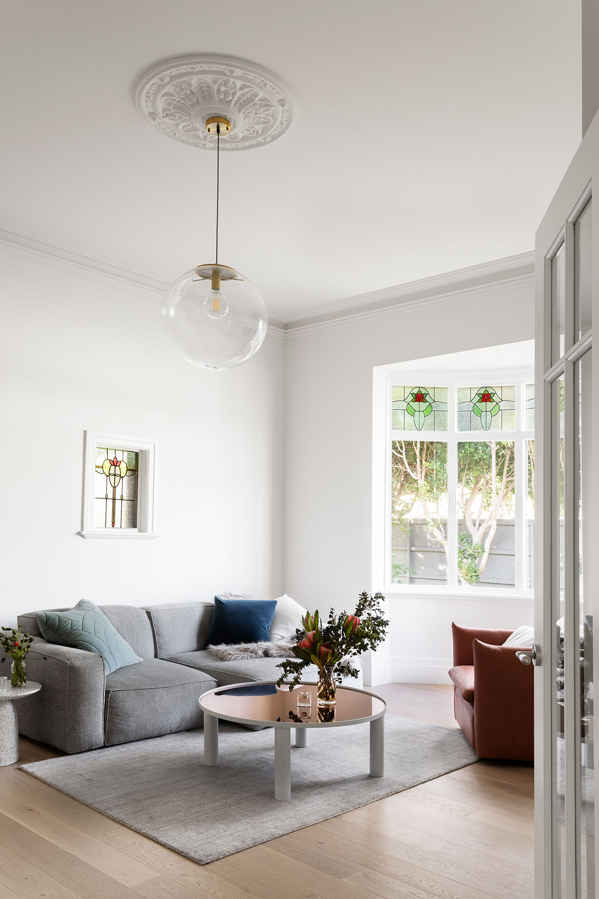
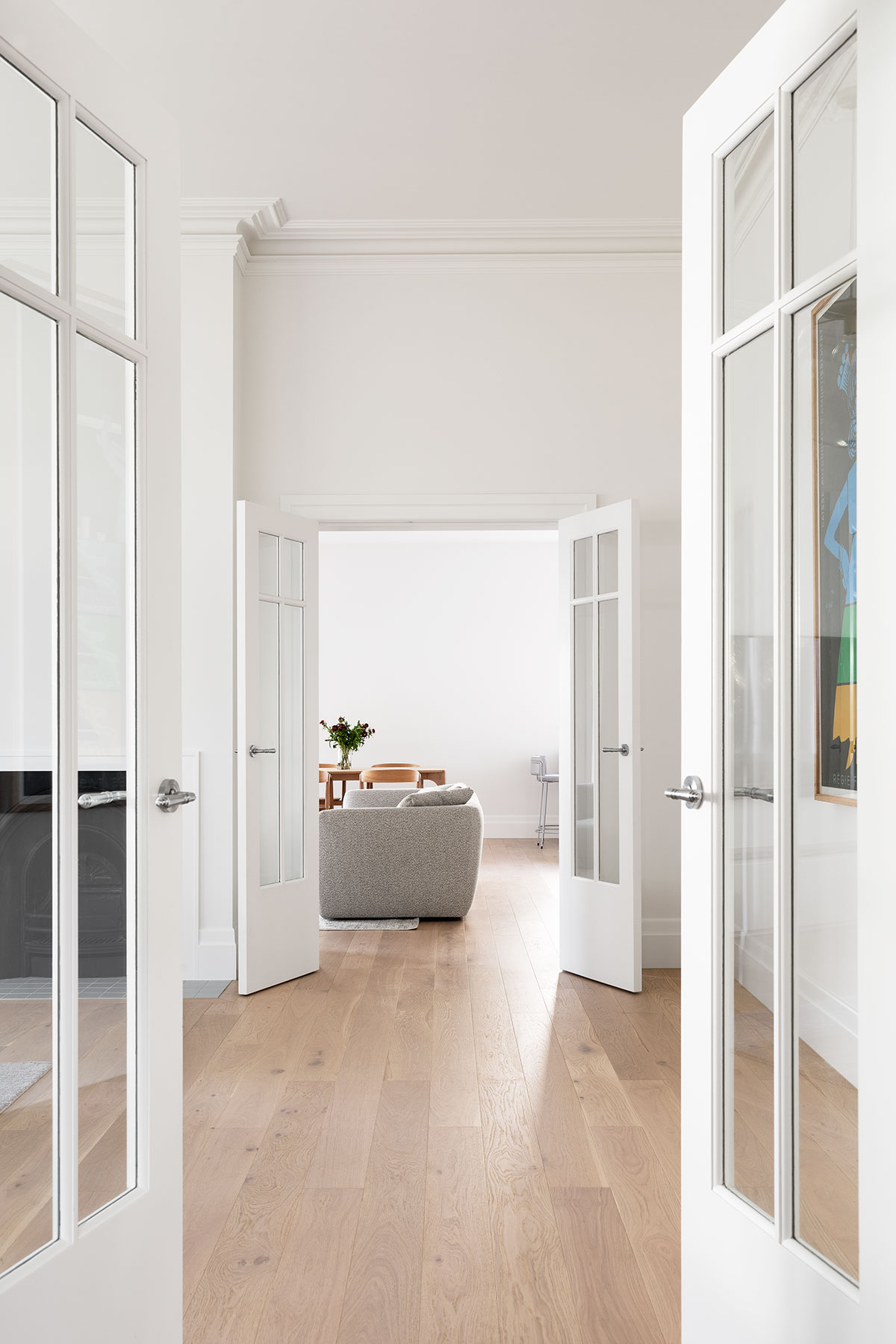
As soon as you walk into the front door, you’re instantly greeted by its very generous proportions. There are so many different living spaces in this home, all are drenched in natural light and were configured in a way where they could be interconnected while at the same time have their own defined area. You can be in one space and look through into different areas at the same time, all while maintaining a comfortable level of privacy.
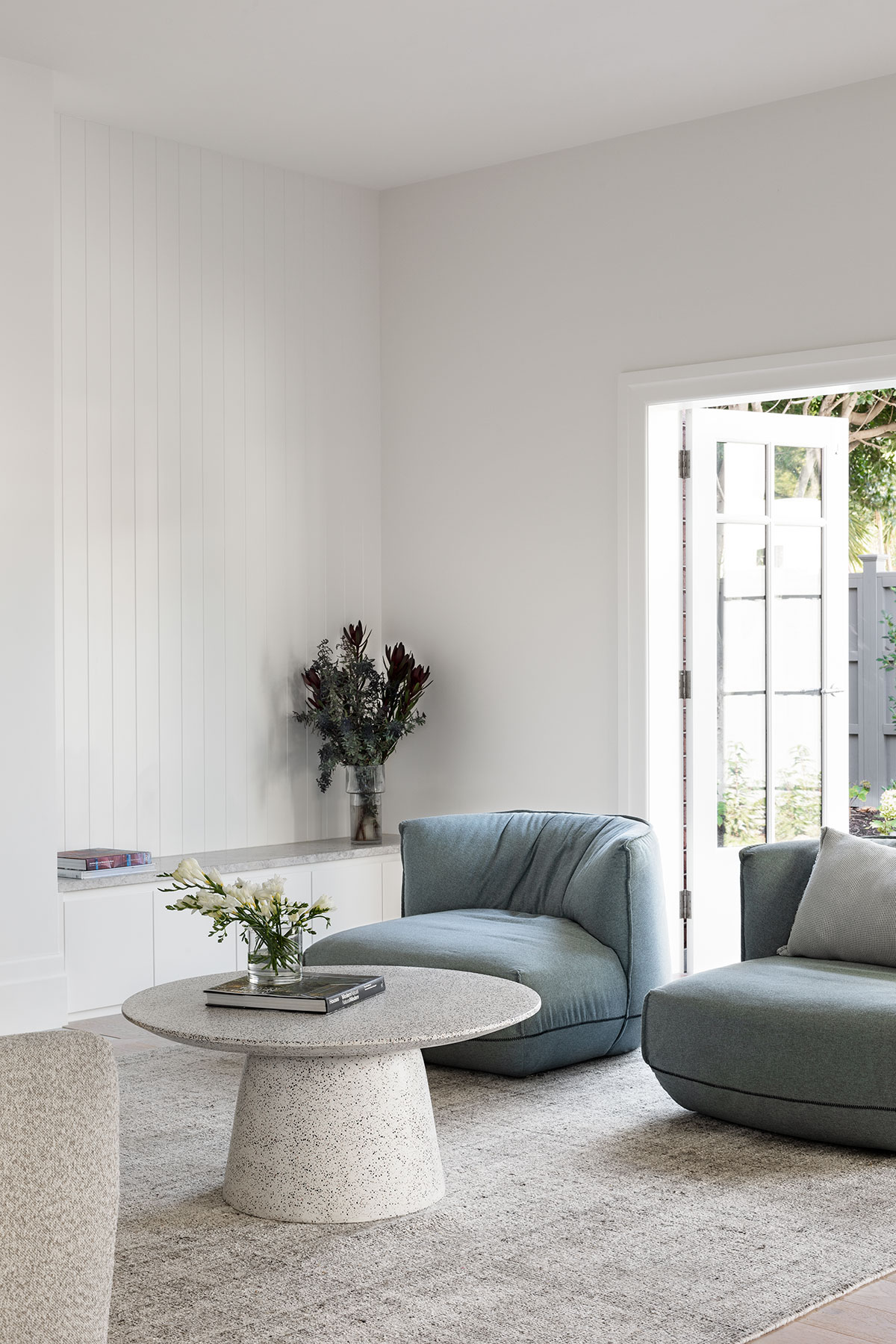
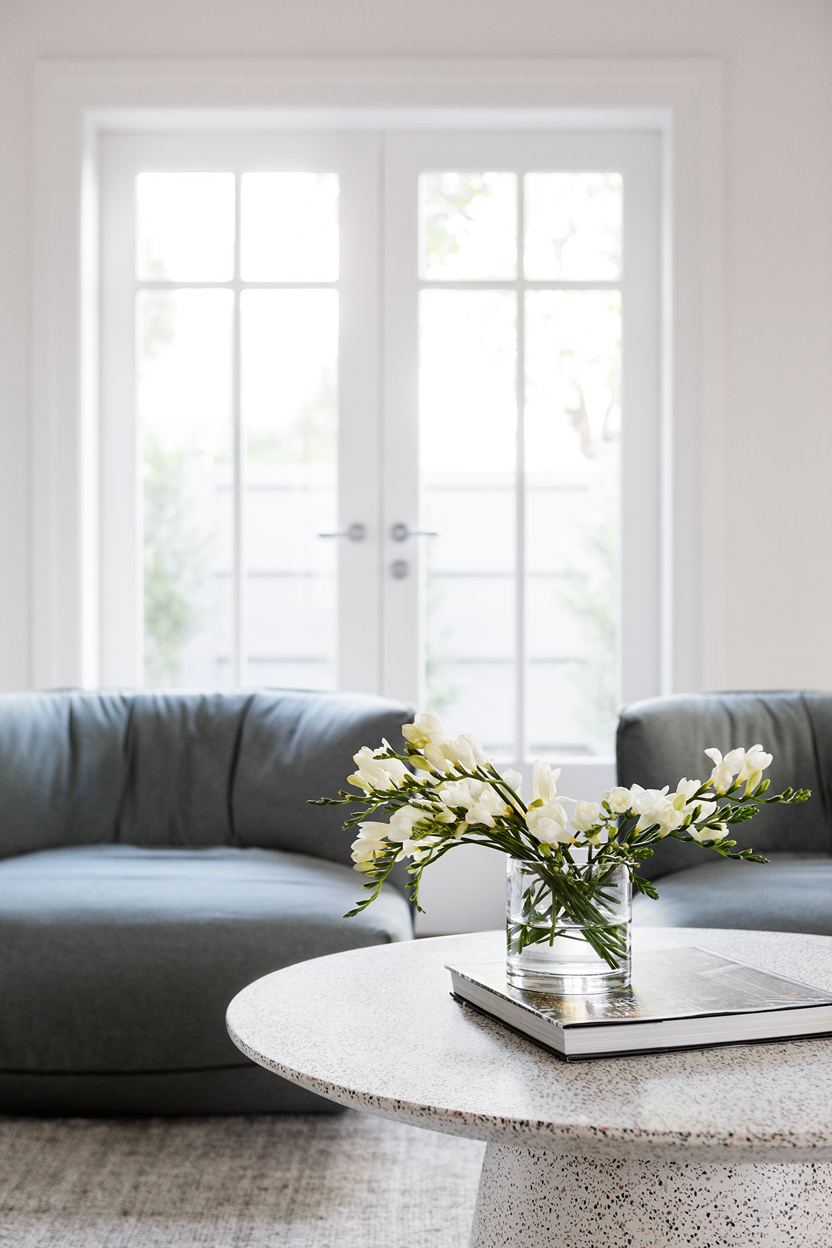
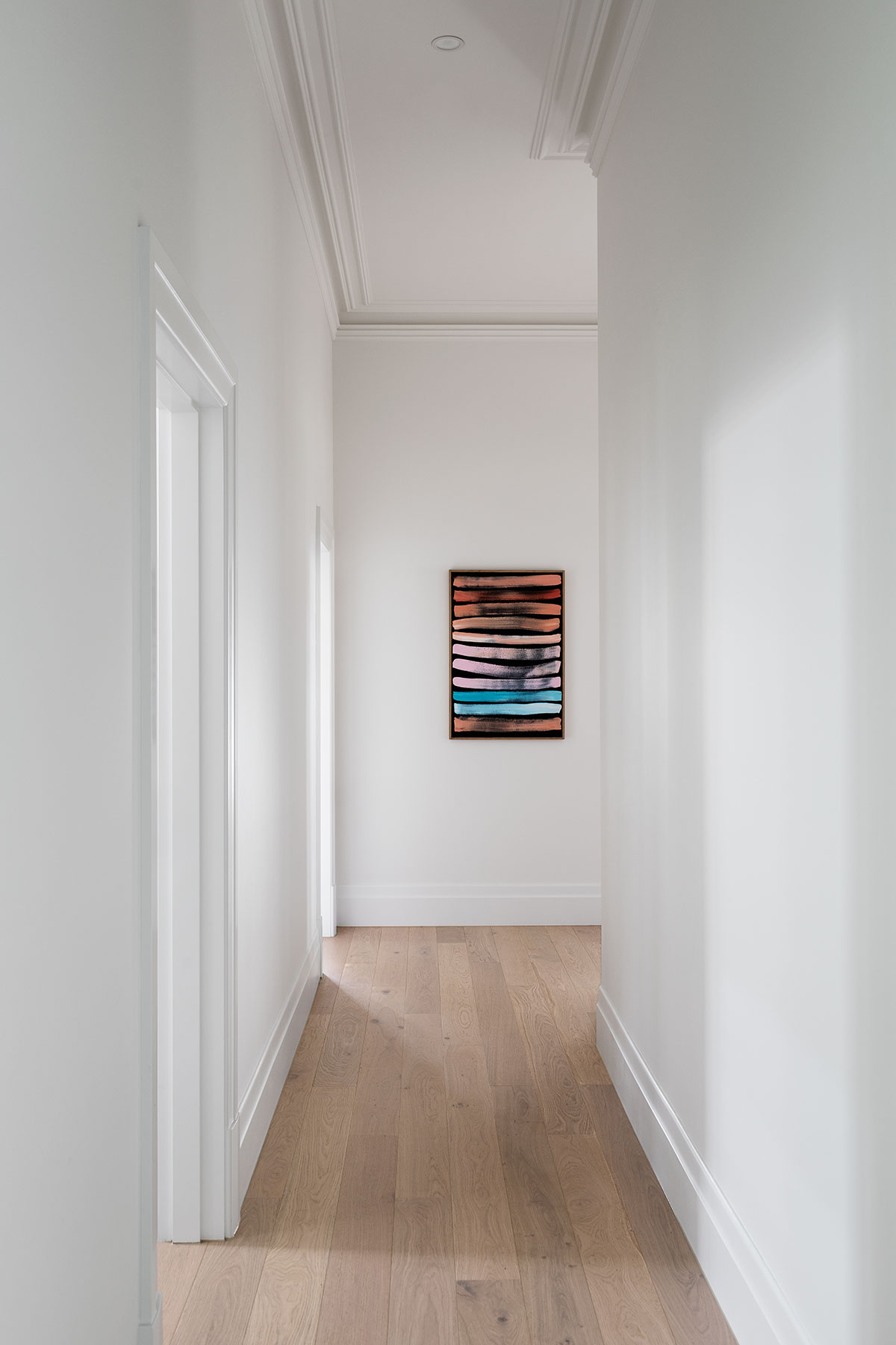
The interiors are generally pared back, there are a lot of muted colour tones, some pastels, and everything is just soft and harmonious. A lot of the personality comes from artworks and touches of greenery including those in key pieces like lighting and decor. These subtle accents can be found in the living areas, kitchen, and dining area, delivering a feeling of cohesiveness and refinement when moving through each space.
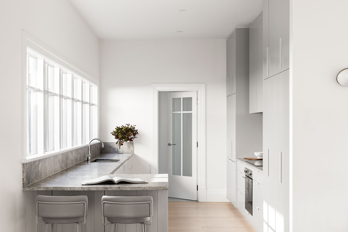
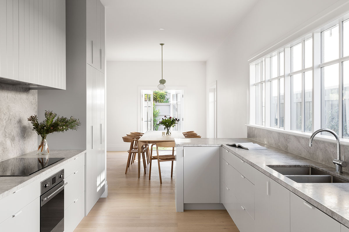
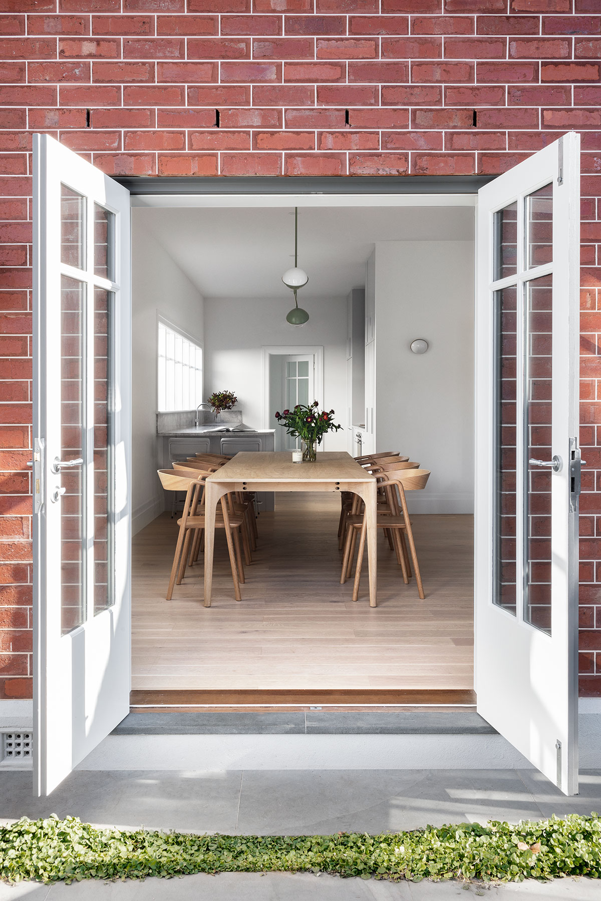
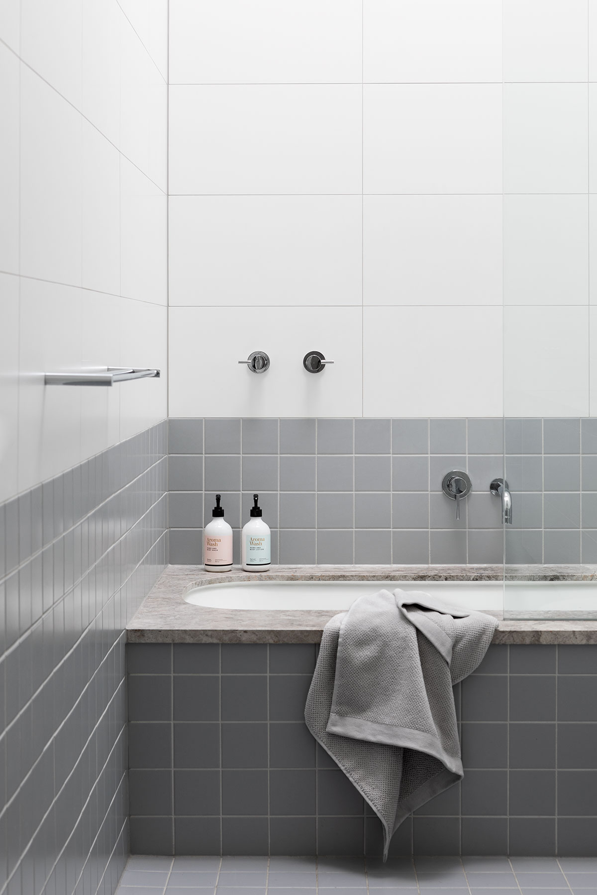
The simple and minimalistic colour palette is consistent throughout the home and is paired with some classic design elements like elegant limestone in the kitchen and main bathroom, plantation shutters, a lovely soft and bluish-grey tone of the carpet in the rooms, and a consistent tilework in different areas. All those small details really helped to create a beautiful cohesive interior and it just makes you feel like you’re in this old stately home but one of comfort in the modern age.
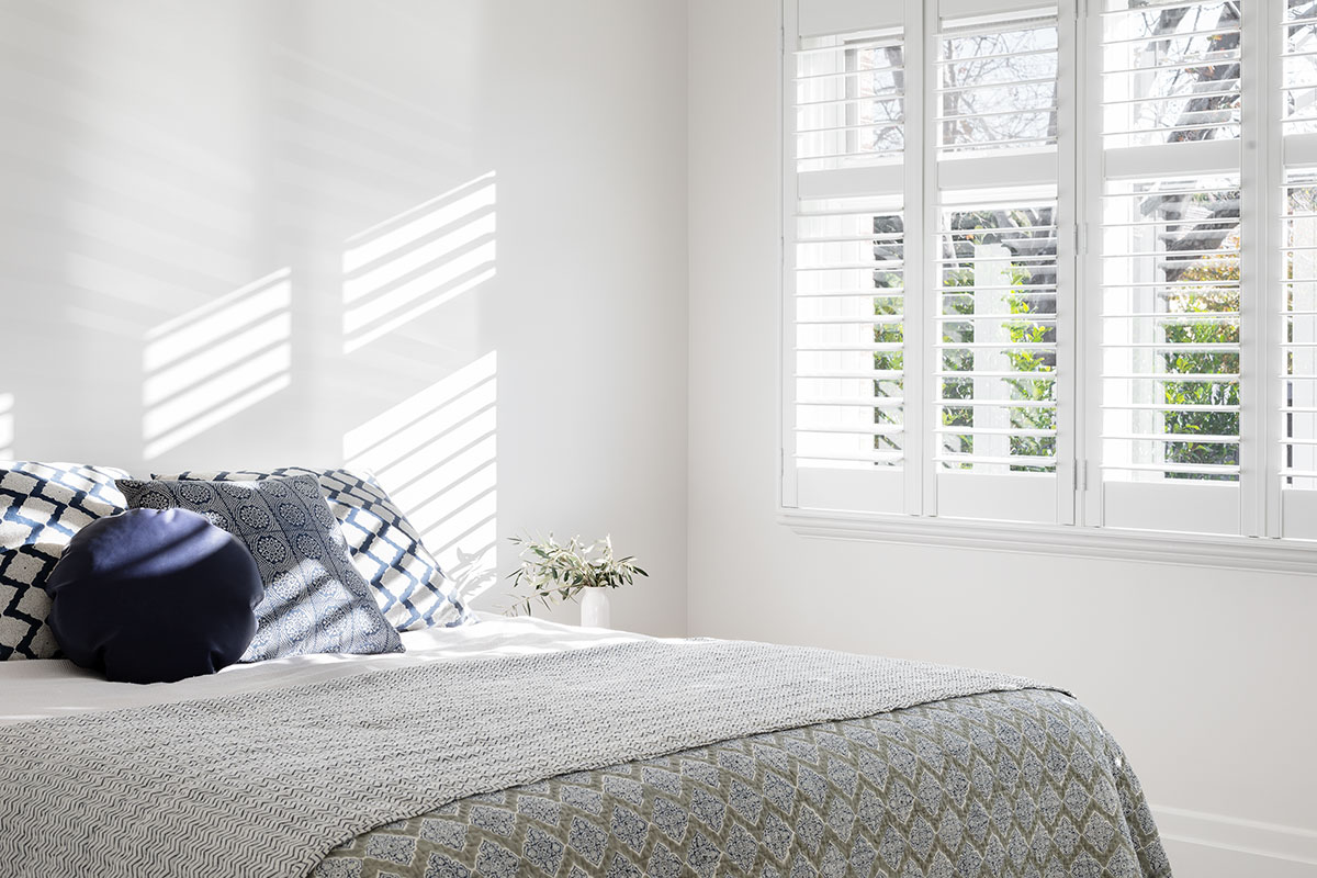
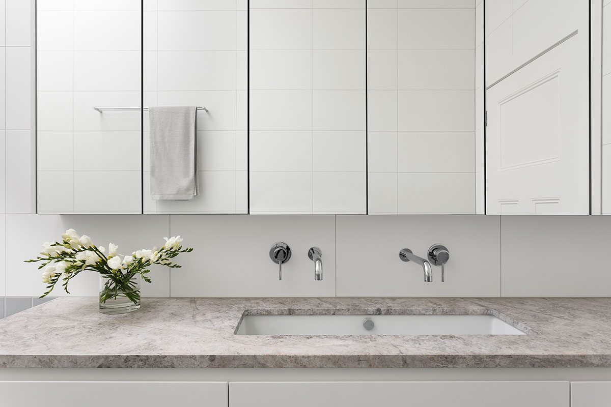
What I love most about this home is the way it has embraced its heritage in a contemporary way and honoured the history of the building. The significant interior makeover and overall transformation resulted in a beautiful evolution that brought the heritage home into a modern context.
Thanks for watching! If you enjoyed this home tour, and if you are enjoying all of our Let Us In Home Tours, do us a solid and subscribe to our YouTube channel. Plus, like our videos and comment ’cause we want to know what you think. We’ll see you next time!
House Project: Brighton House
Location: Brighton, Victoria
Photographer: Martina Gemmola
Landscape: Alto Landscapes
Video Host: Lucy Glade-Wright
Video: Jonno Rodd


