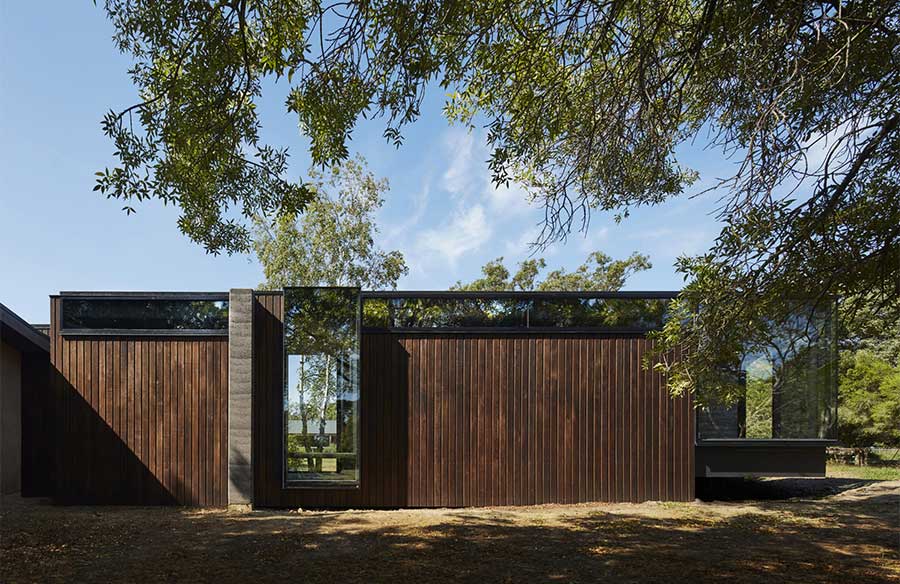
An existing 90’s dwelling in need of a master suite is the unique brief that inspired Branch Studio Architects to create ‘A Pavilion Between Trees’. In erecting the new structure, they have not only preserved the existing trees but have used them as points of interest for design interaction. This maneuver has earned them a spot on the Houses Awards 2017, the House Alteration and Addition Under 200m2.
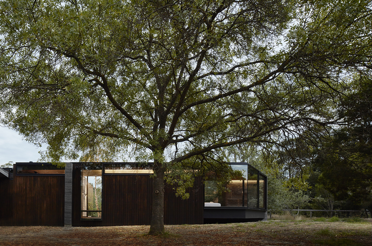
The main house is an owner-built inherited property that demonstrates a disparate architectural style. This led the architects to strategize a semi-detached pavilion and create the much-needed separation, giving the new structure its own identity.
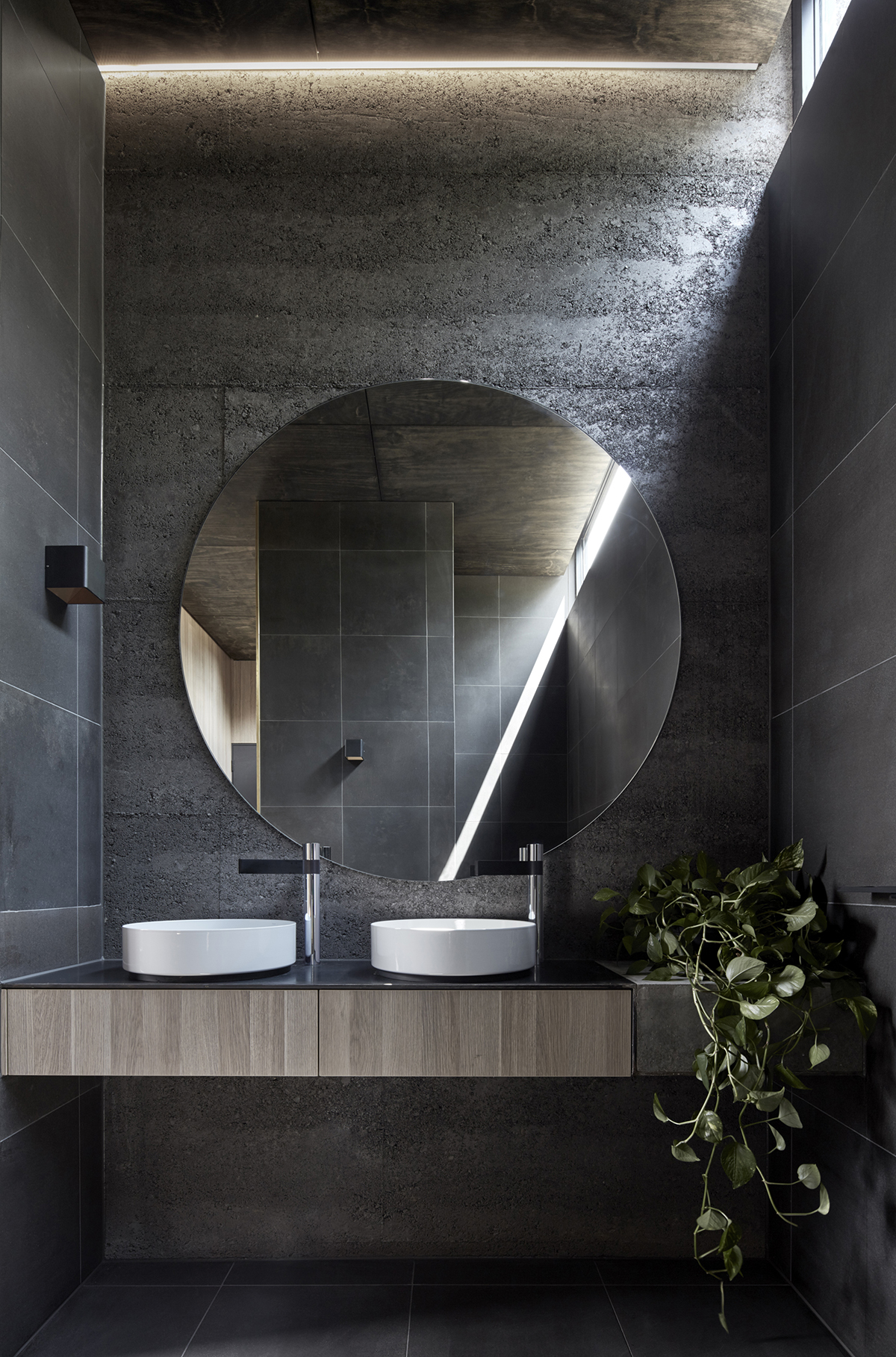
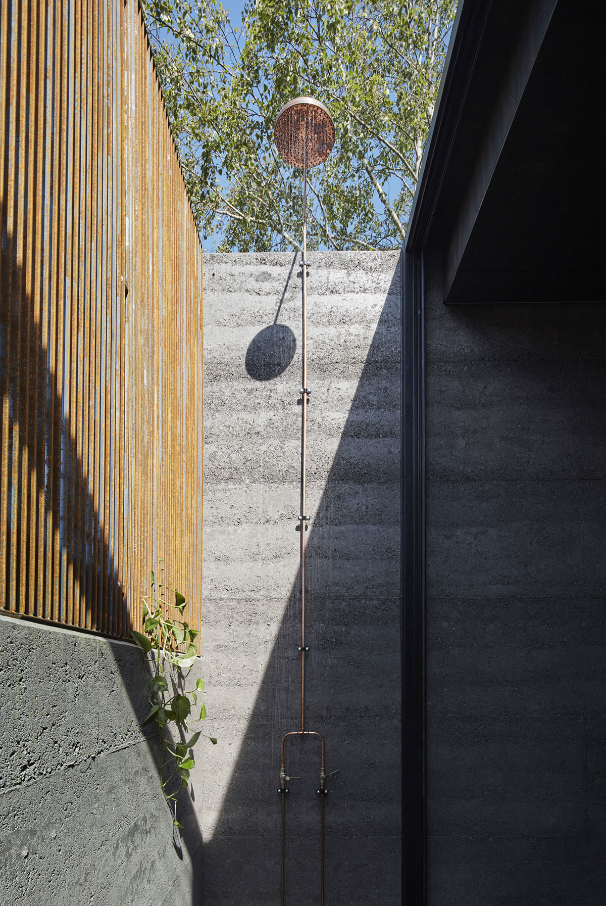
From the open plan house, a singular corridor leads to the trapezoid-like ensuite, which is divided into three sections. First, you’ll walk through the bath and vanity zones where you’ll find both an indoor and outdoor shower. The contained private spaces give off a sense of earthy calmness with the neutral choice of colors and the natural light bleeding into the walls. Supplementary lighting came through the clerestory lighting, which also seems to be a reappearing style visible in the subsequent areas.
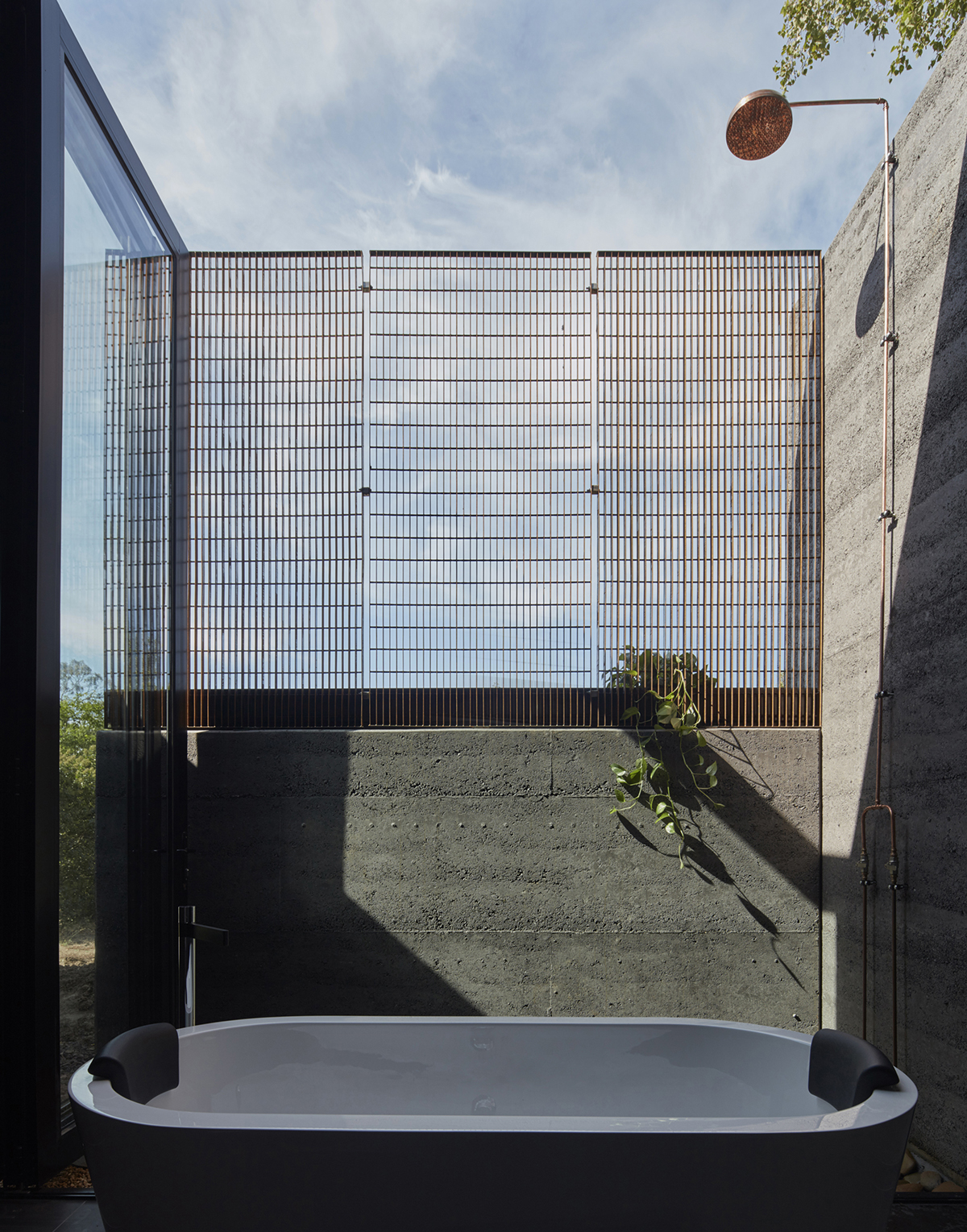
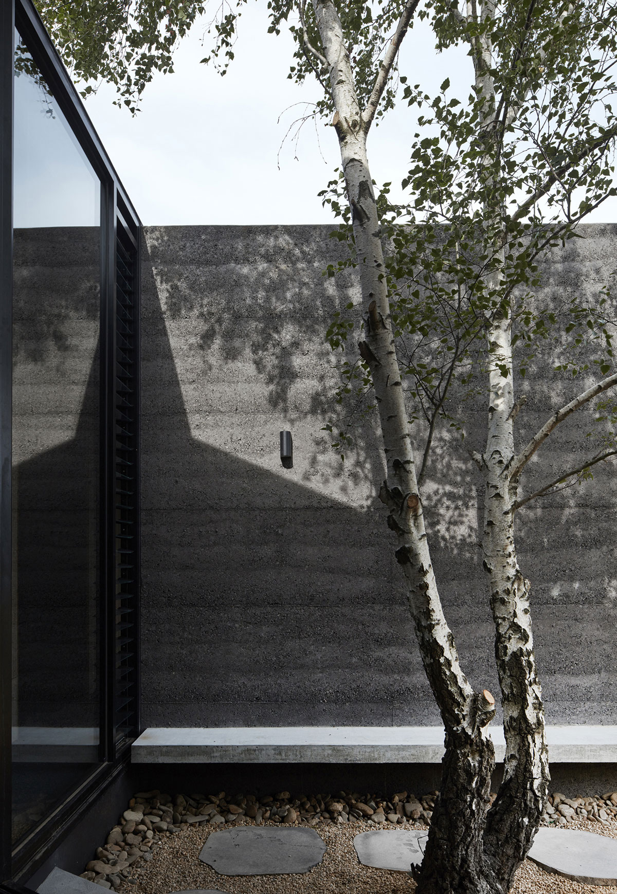
On days when the clients desire to commune with nature to attain their zen, they can slip into the bath which is positioned near the external-internal building line. A steel mesh screen installed above the half height rammed earth wall provides a private retreat without depriving the dwellers of the tranquil backdrop of treetops and blue skies. Full height folding glass doors spill you out to a narrow external courtyard.
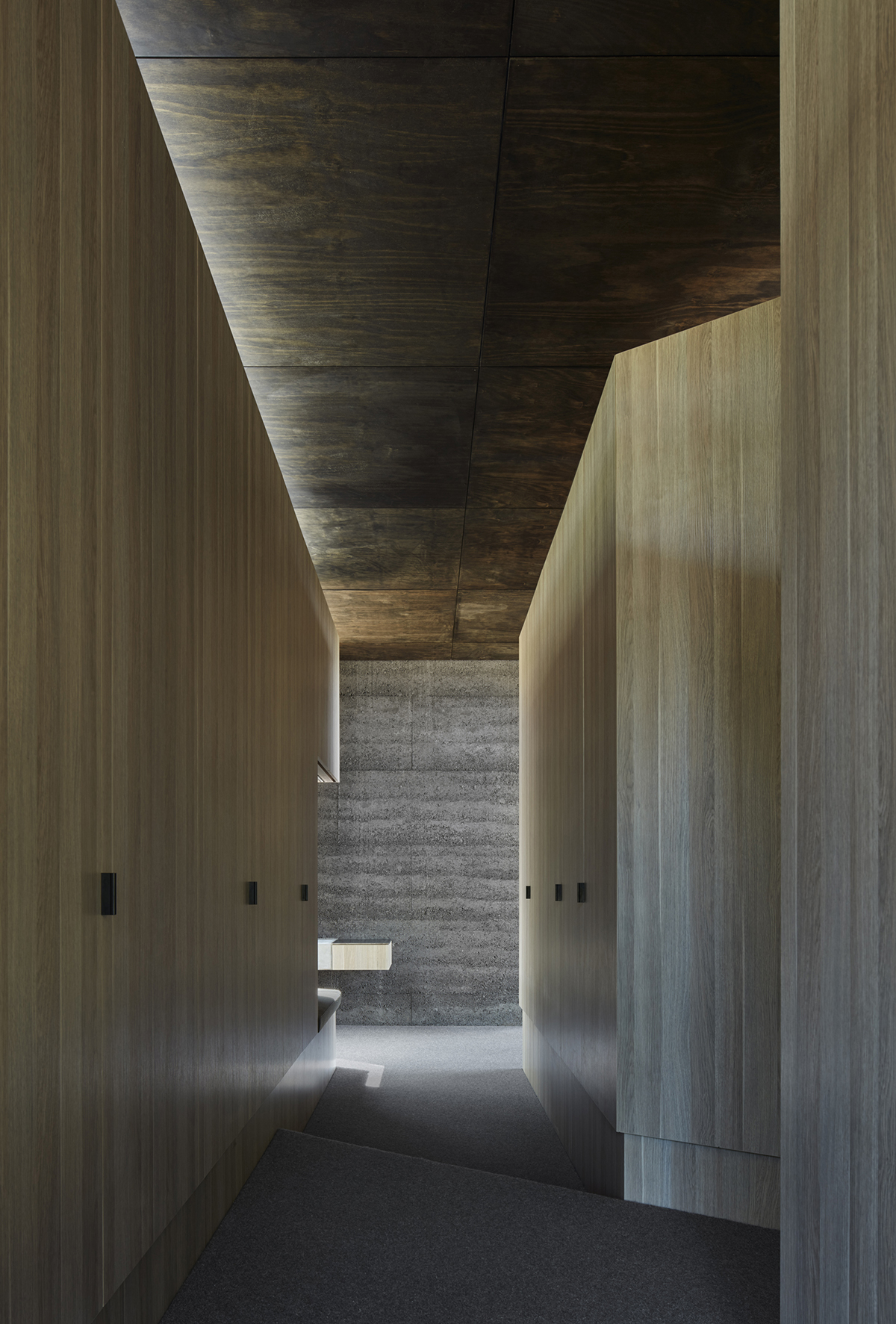
Progressing into the extension, you’ll meet with a central wall that splits the area into two distinct spaces before they will be conjoined again when the wall structure finally ends.
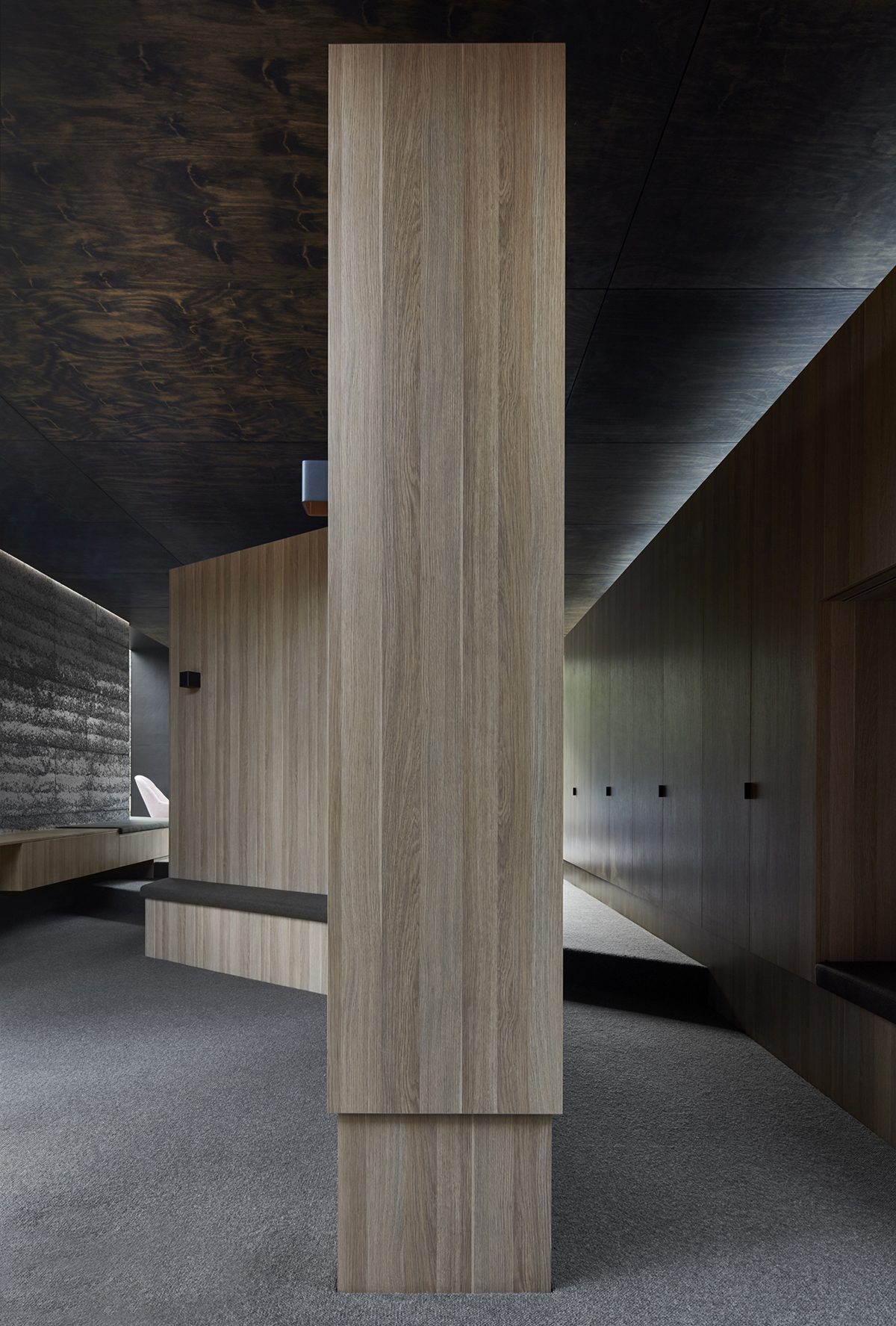
The separated zones provide for his and hers closet areas, with Georgina’s territory a tad bigger than Aidrian’s for obvious reasons — women and their wardrobe. The robe areas are elevated and both have direct admission to the outdoor scenery.
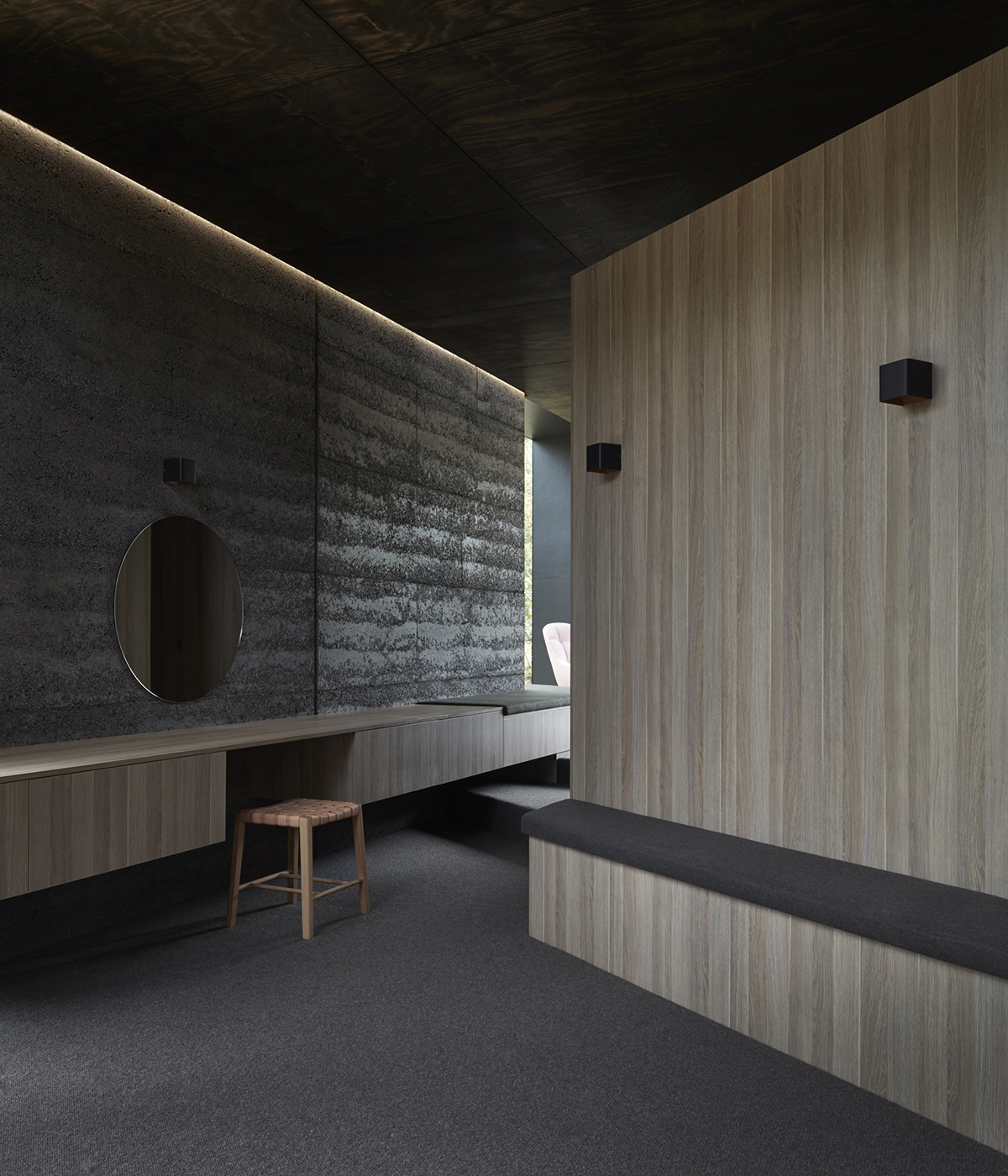
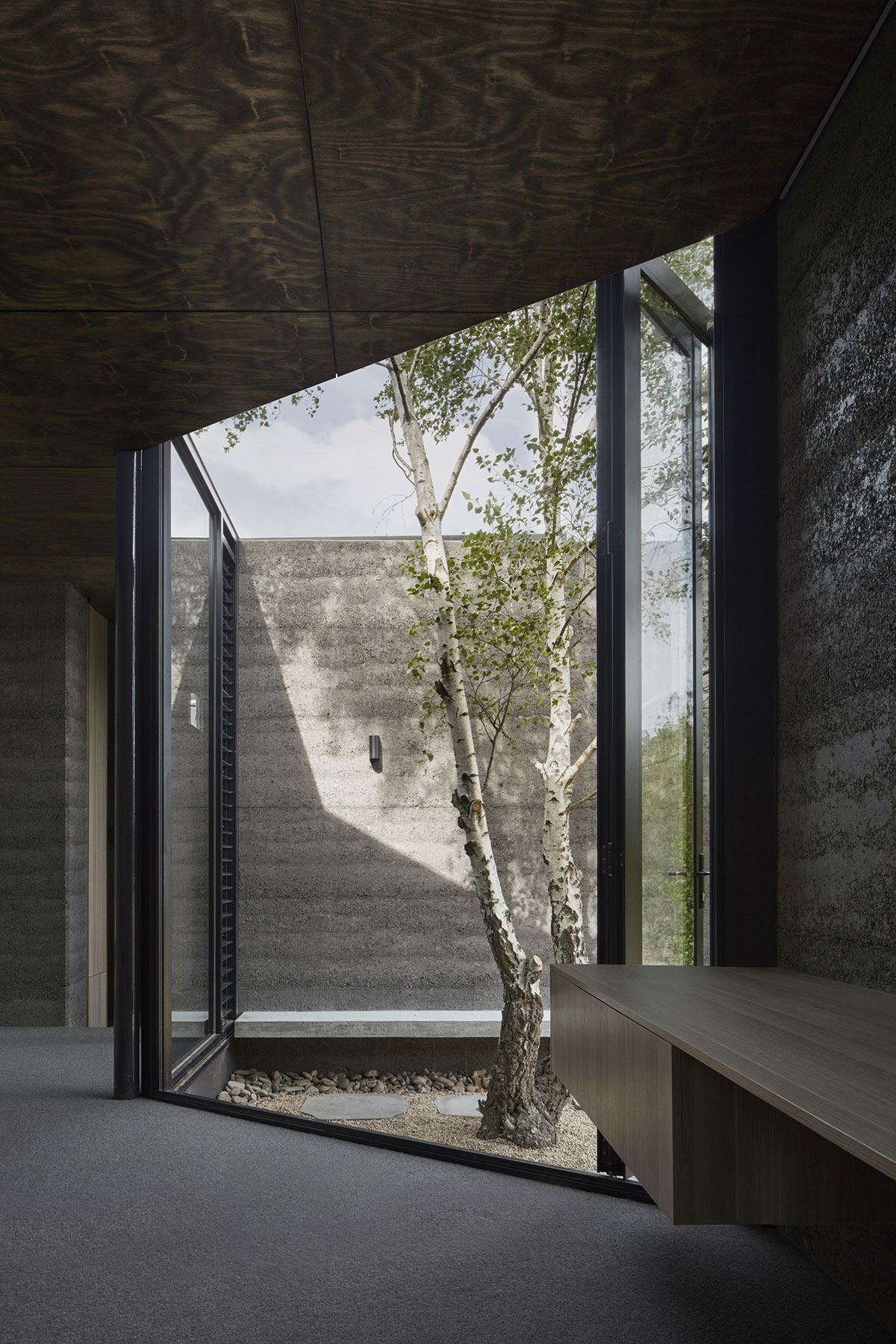
Georgina’s south side features a built-in seating and a circular vanity mirror. From the room, you can spot the view of another open space where a silver birch tree cheerily stands, unharmed. Part of the brief was that no trees would make way for the new building, safeguarding the connection between the natural landscape and the building.
What’s elegant in Adrian’s northern part is the protruding window box through which the northern sunlight creeps in. The box, which gives him an aperture of the leafy green canopy, also doubles as a seating space where he can hang out. This space right here gives him a taste of his own private locker room and it almost feels like a bachelor pad.
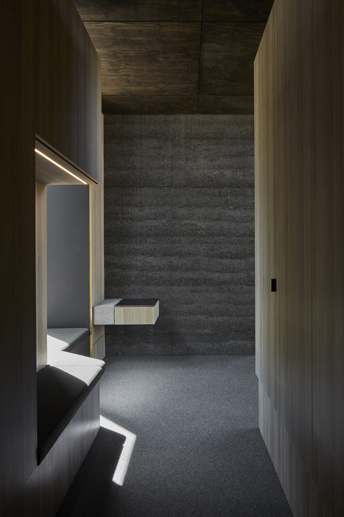
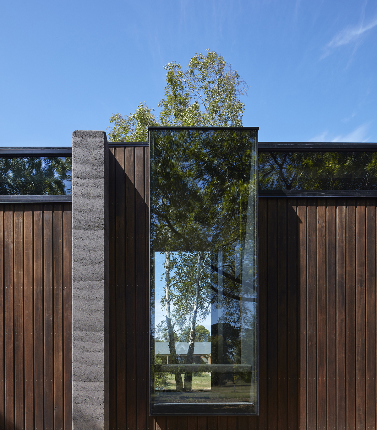
At the point where the closet ends lies the bedroom, the part of the building with maximum elevation. It’s here where the preceding divide morphs into one. Inside, you’ll see a low height bed occupying the central space and the built-in cabinets skirting the perimeter. Informal cushioned seatings line the bedroom walls, as well as the bottom portion of the suspended window box area. The latter serves as a portal where you can marvel at the fruit trees outside and the greenery that goes beyond it.
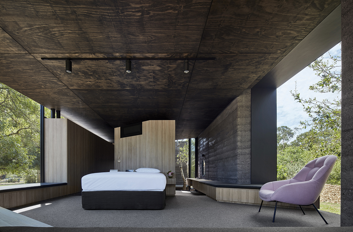
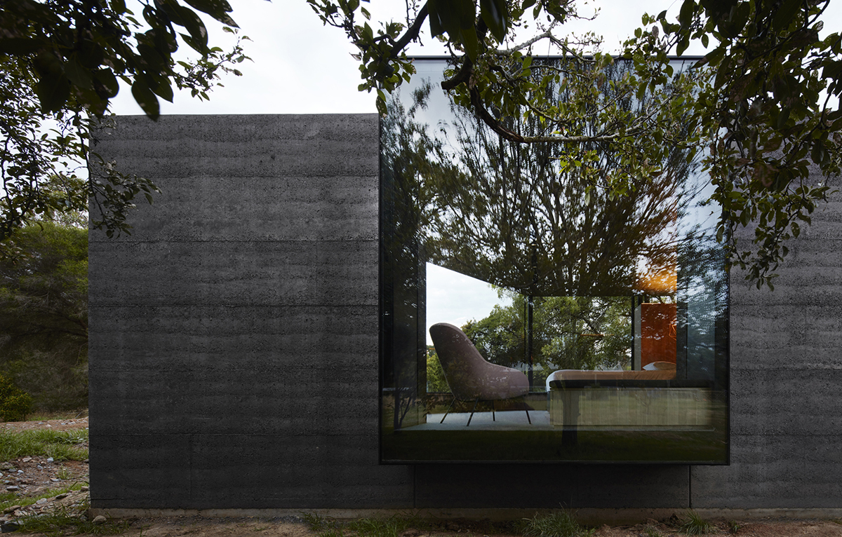
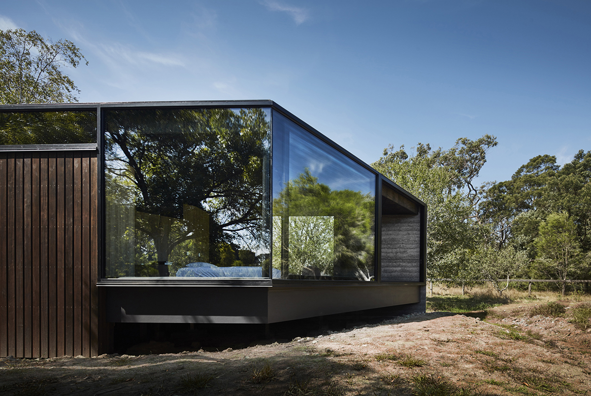
The cottage suite embeds itself gracefully into the folksy habitat with its material palette of charcoal rammed earth, steel, glass, and timber. In contrary to its contemporary take on the design and interiors, the alteration has retained the overall rawness of the residence.
To see more outstanding Australian architecture that bagged titles during the Houses Awards 2017, head to this post.
Photography by Peter Clarke Photography


