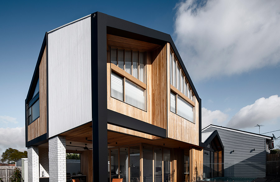
Many old homes in Melbourne that get renovated with a modern twist are sure to have a show stopping aesthetic. These include period homes that are given quirky or modern additions and extensions. The Split House by FIGR Architecture definitely falls under this category with it’s modern extension. As you arrive at the address, you’ll be greeted by an old but well-maintained home that keeps the modern extension obscured in the back. The new structure takes inspiration from the same Melbourne-based architecture firm’s Datum House featured previously on the Community Journal. Let’s have a look..
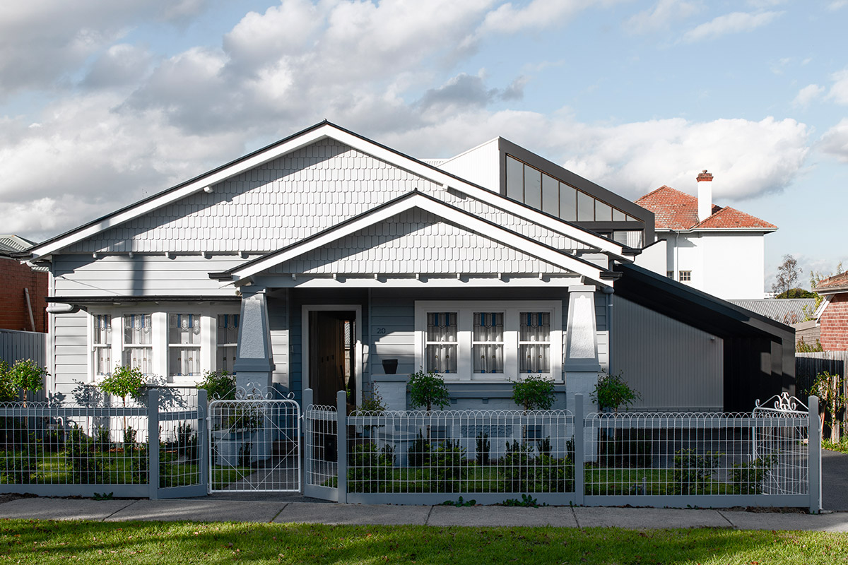
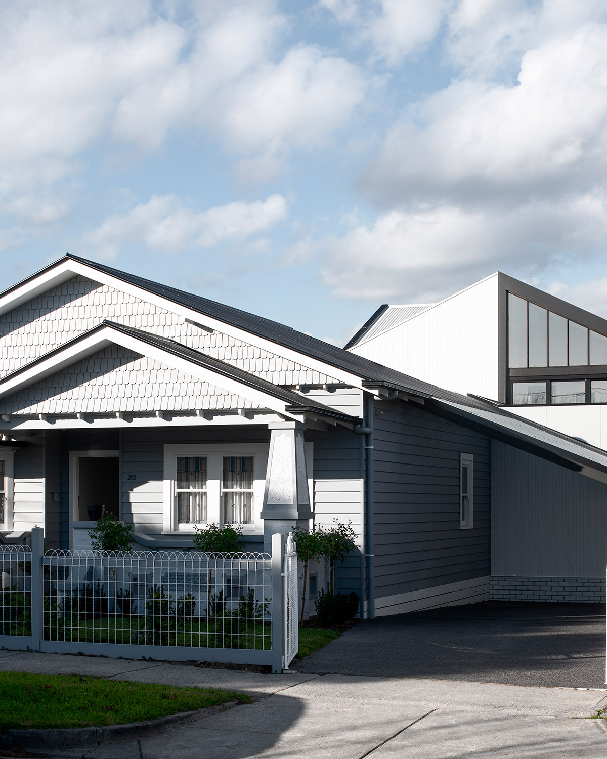
The saying ‘Reserved at the front, party at the back’ aptly describes the Split House. An old classic suburban Melbourne home serves as the facade of this project. It’s barely touched by the project team as most of the efforts were focused on what lies behind: the addition that splits the old from the new.
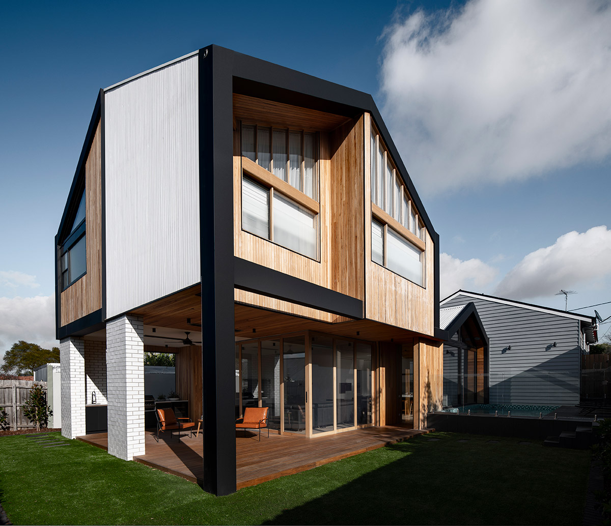
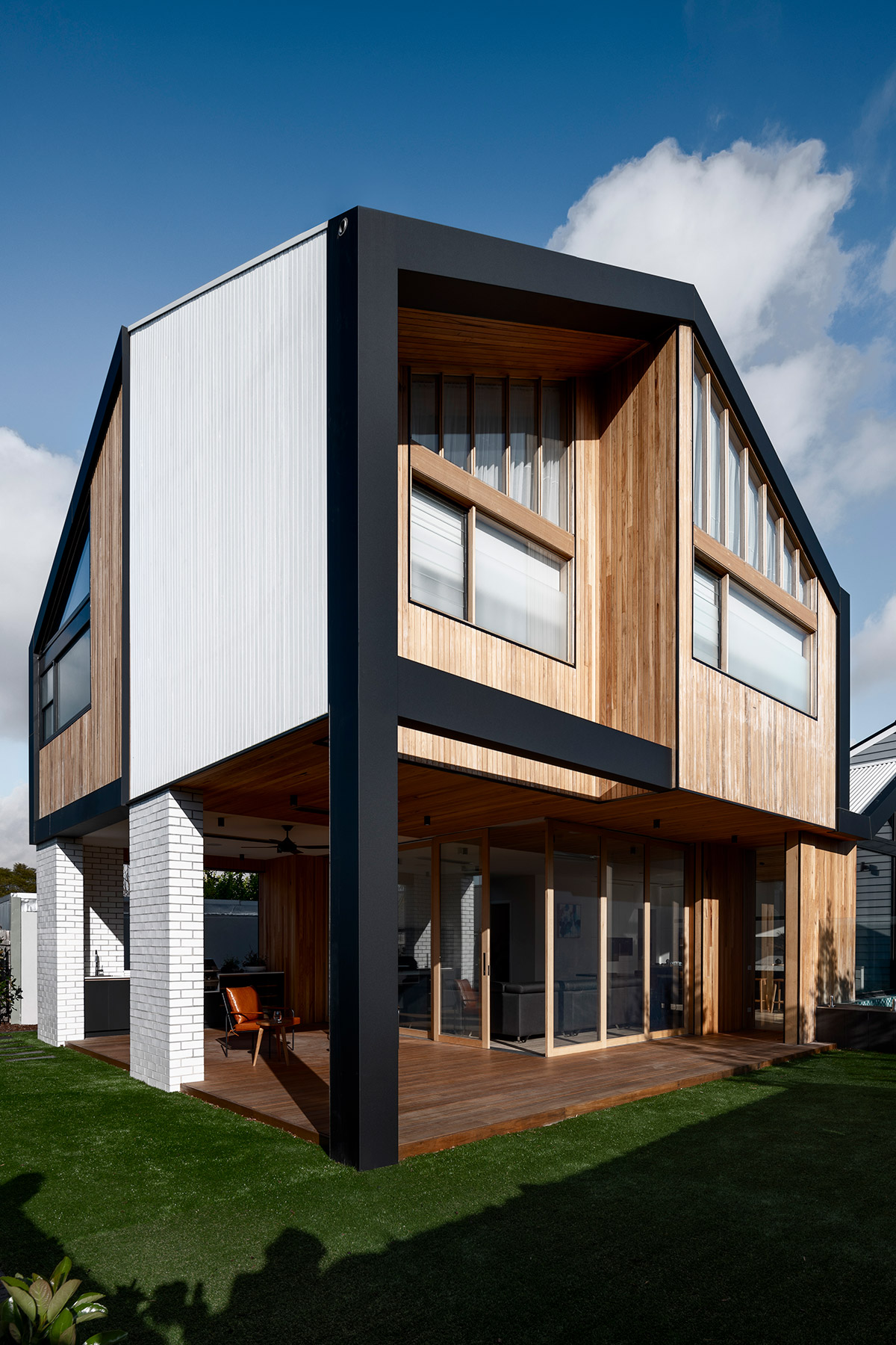
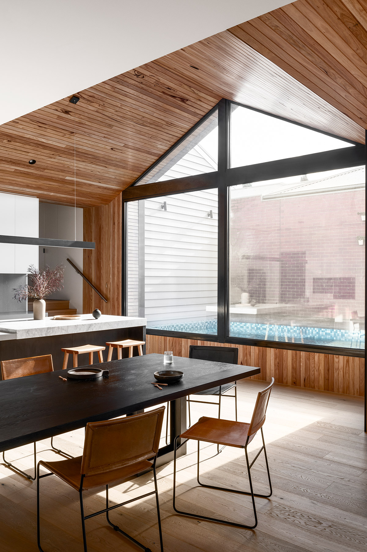
A cosy but stylish palette of white, timber and black is showcased in the geometric style exterior. The colours were applied in such a way that you can conclude no two identical walls touch each other. Its exterior is outlined by black that runs from the pillar to the gutter. A small pool with turquoise coloured tiling creates a stark contrast with the warm, serious exterior design of the home.
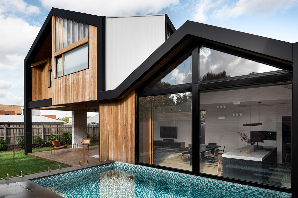
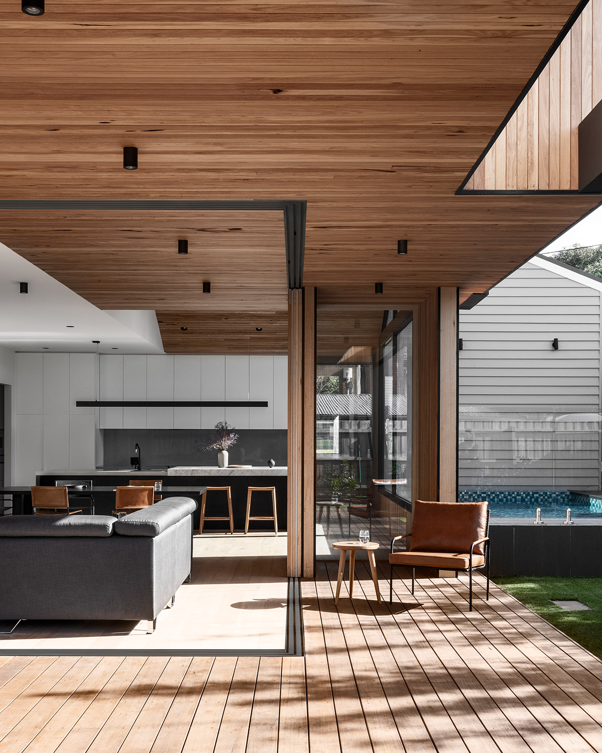
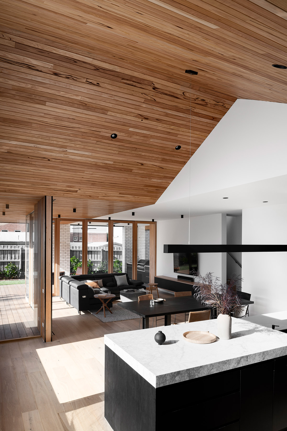
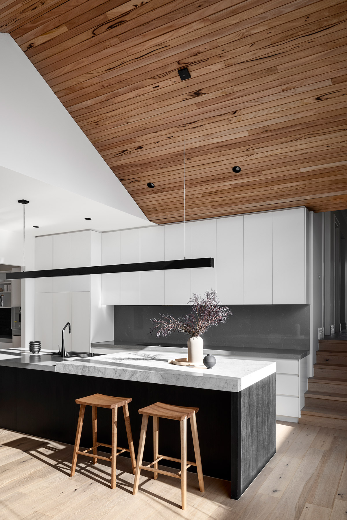
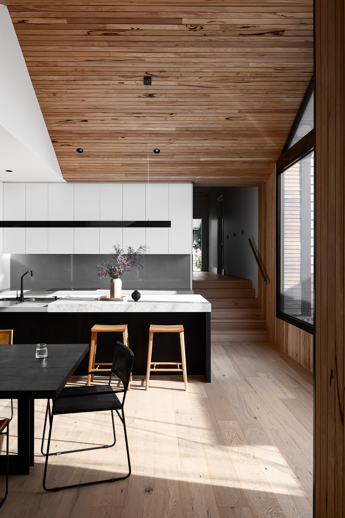
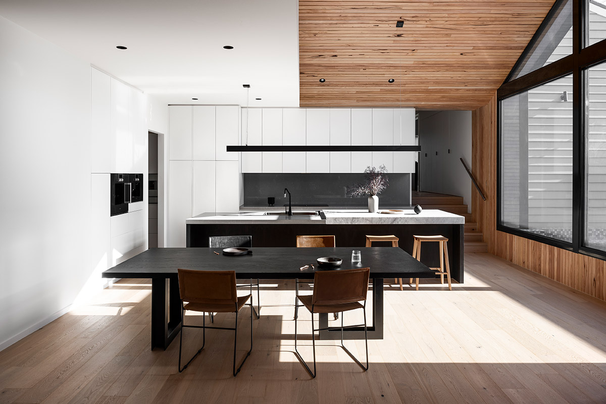
Elements from the exterior continually flow to the overall interior. Floor and ceiling are both timber clad but the latter being warmer in colour and more vivid in detail. Black and wood elements are also present in the home’s furniture and fixtures. The kitchen bathes in sunlight through the large window that sits right in front of the modest pool outside. White walls, cabinetry and a stone bench top give the kitchen and dining area a clean look as well as a break from the timber.
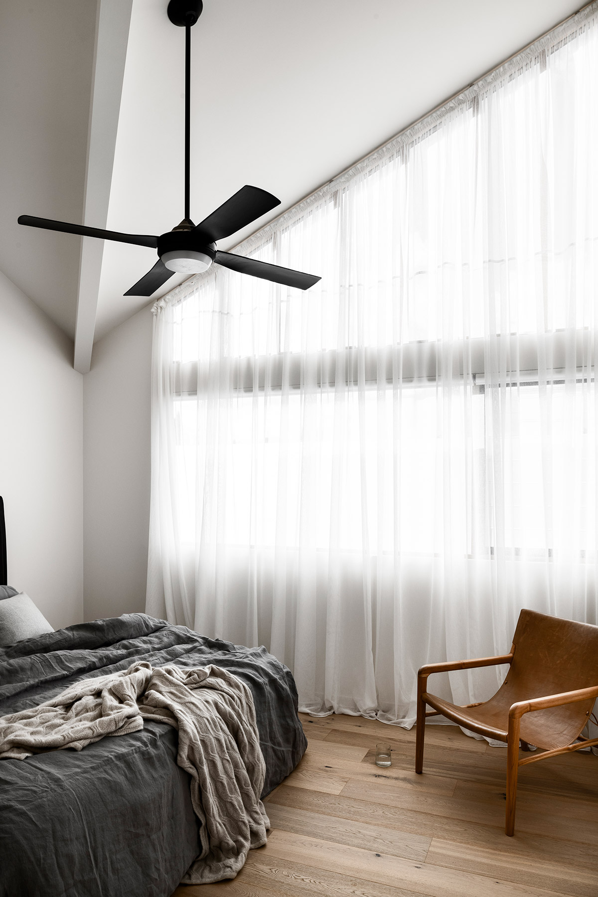
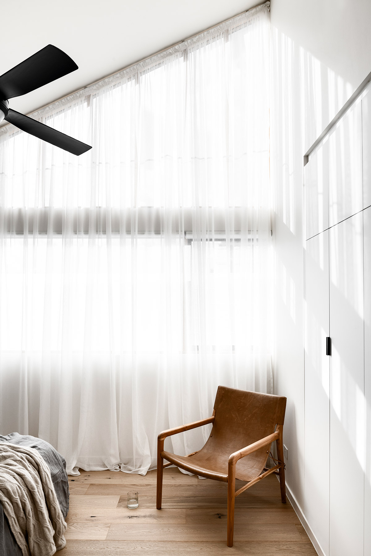
The bedroom maintains a softer colour scheme with less black and more white and pale timber. A ceiling fan with matte black finish, the only black fixture in the room, is added for accentuation.
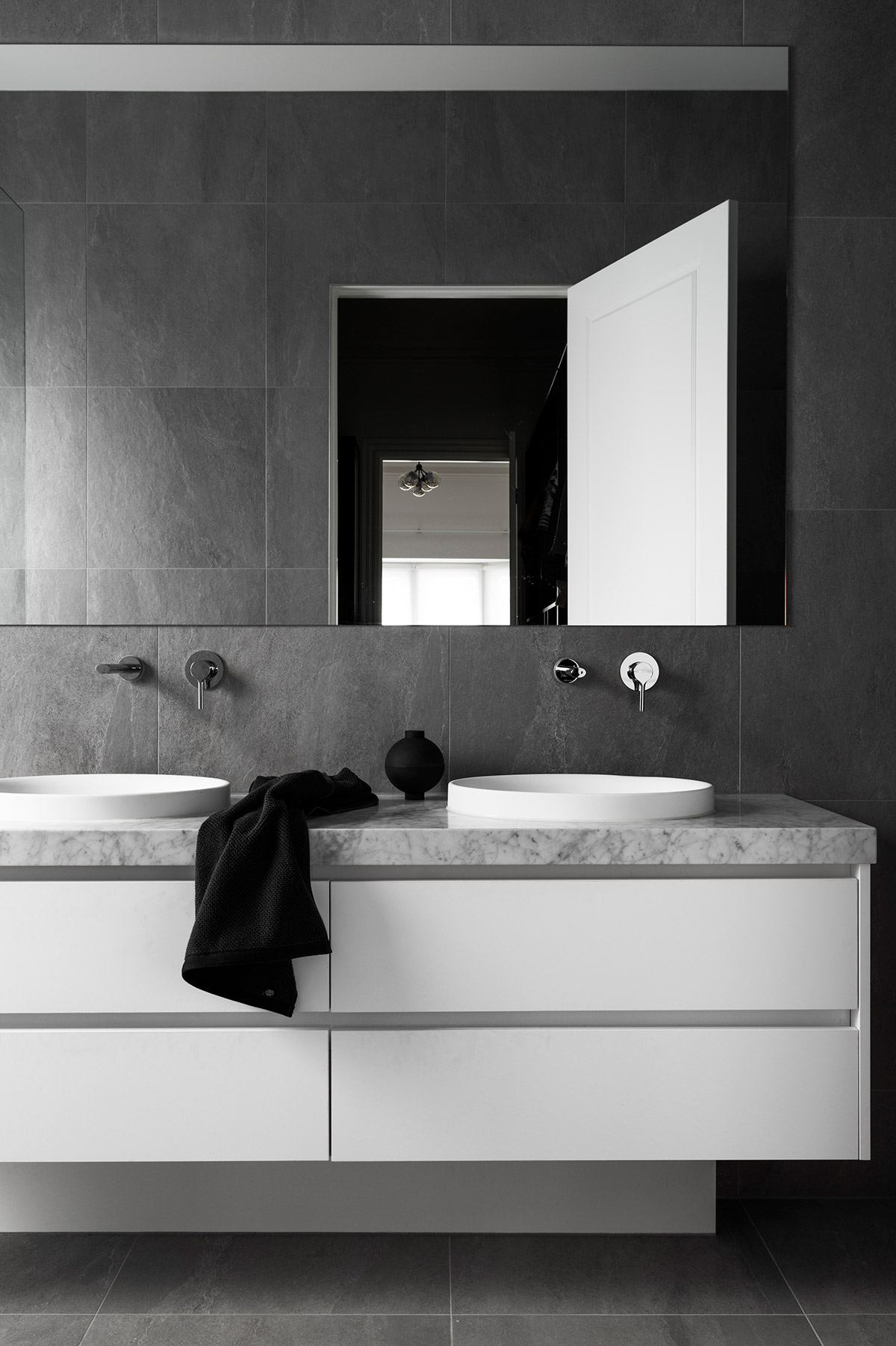
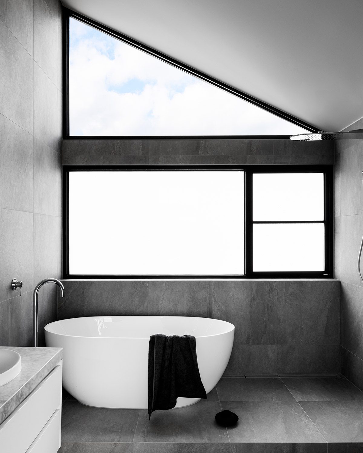
Meanwhile, the bathroom takes a break from the warm, rich timber that flows throughout the house. Instead, it’s designed with stone for the tiling and bench top. A bathtub is installed with a window view but privacy is maintained.
Overall, the Split House is a stark contrast to the dainty classic suburban home at the facade. Think of it as a home with a split personality but in a stylish and functional way.
House Project: The Split House
Architect: FIGR Architecture
Type: Renovation
Builder: RODA Developments
Stylist: Ruth Welsby
Photographer: Tom Blachford


