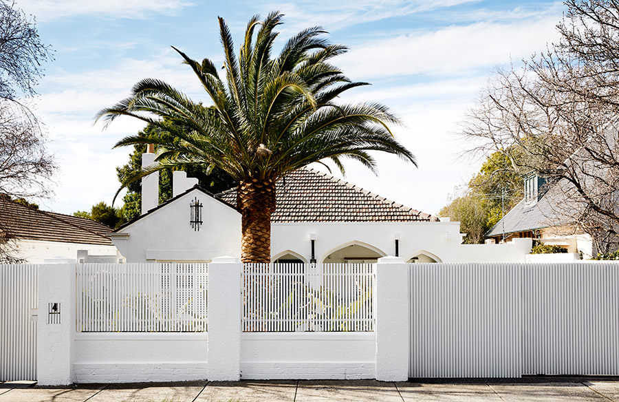
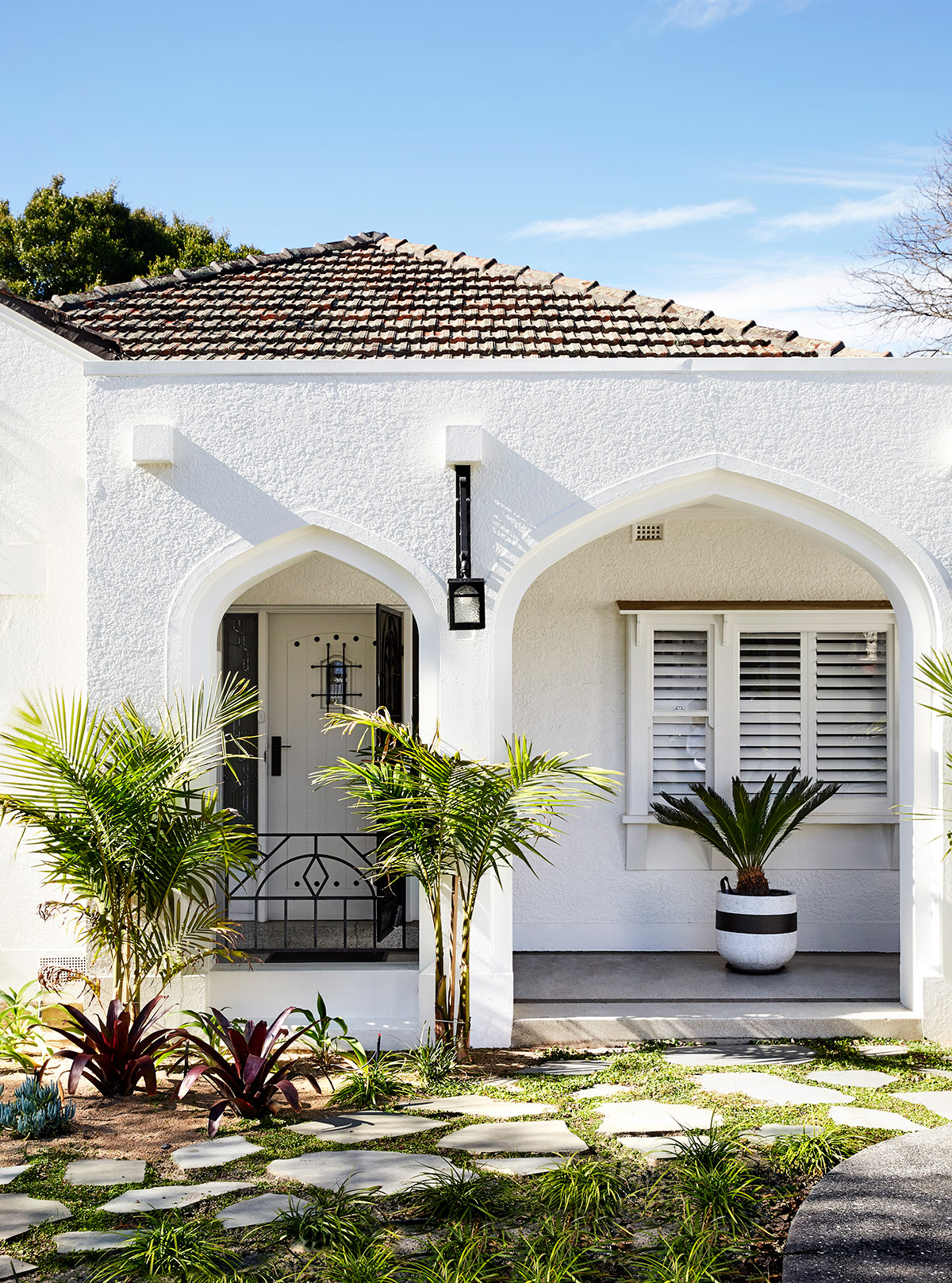
For this home renovation, a personal touch is found in the process involving the architect and the client for the two share a friendship that dates back to young adulthood. The house in question was an old 1926 Spanish Mission Style home. This architectural style was very popular in Southern California, USA and eventually made it to the neighborhoods throughout Australia; in this case, Melbourne. Let’s give you a house tour of the new Spanish Mission House, superbly designed by Pete Kennon of Kennon.Studio.
They say that it can be difficult to work with someone whose style isn’t the same as yours. But for Architect Pete Kennon of Kennon.Studio, this wasn’t the case. He and his client have known each other for about 20 years and share the same hobbies and interests, including painting and art.
For projects similar in nature to the Spanish Mission House, Kennon usually begins by getting to know the clients for a deeper understanding of themselves. This is necessary for the spaces to be reflective of the homeowner’s personality. Kennon believes that how a home looks shouldn’t only be about a client’s style and design language but it also has to feel like a part of the client. In this case, the process just got more convenient because of the clear understanding and familiarity with the client.
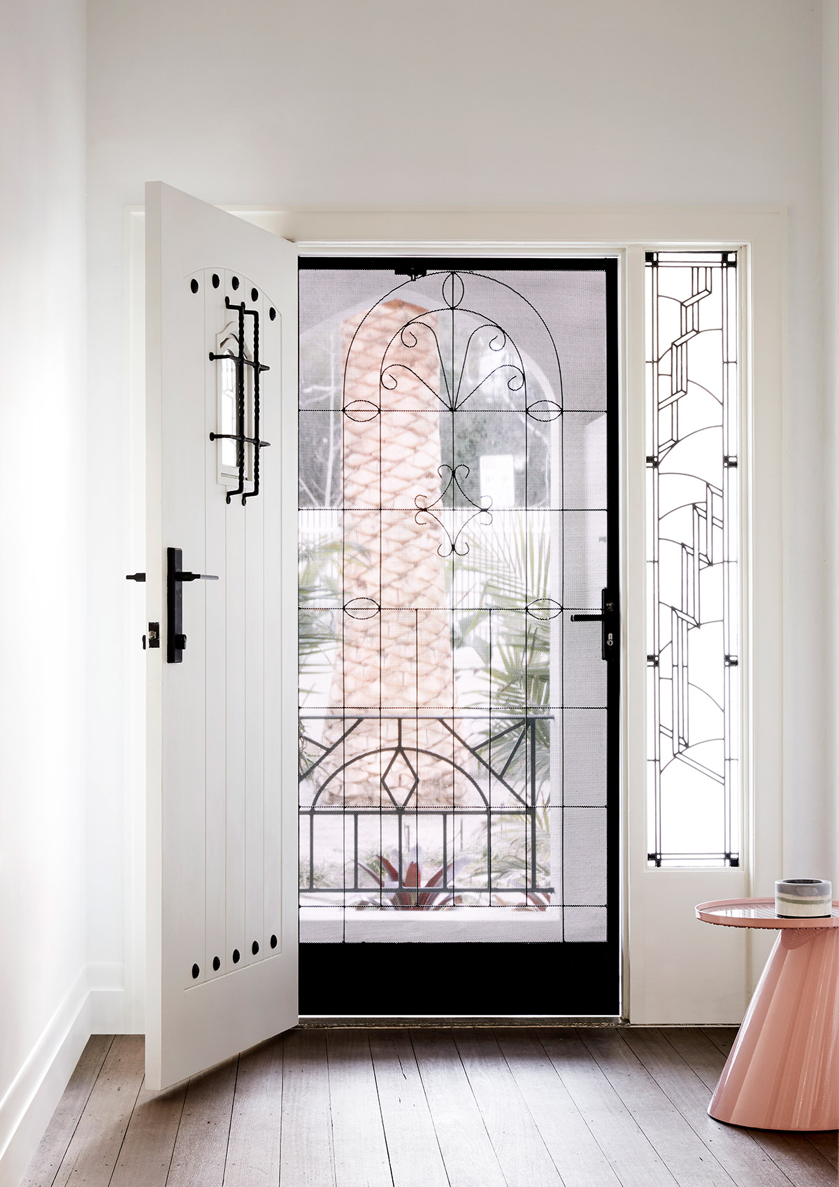
The house to be renovated is a 1926 Spanish Mission Style home. This architectural style was very popular in the United States, particularly in southern California back in the 1900s. Southern Californian neighbourhoods in Los Angeles, San Diego and Palm Springs can be seen with these homes and it’s largely because of the close proximity to Spanish communities with the Mexican border a little down south. This style of home also eventually became popular throughout Australia.
Given that the house is almost a century old, extra care and hard work was put into altering the floor plan. This was especially important during the demolition of its interior walls on the north side to make open up the living spaces.
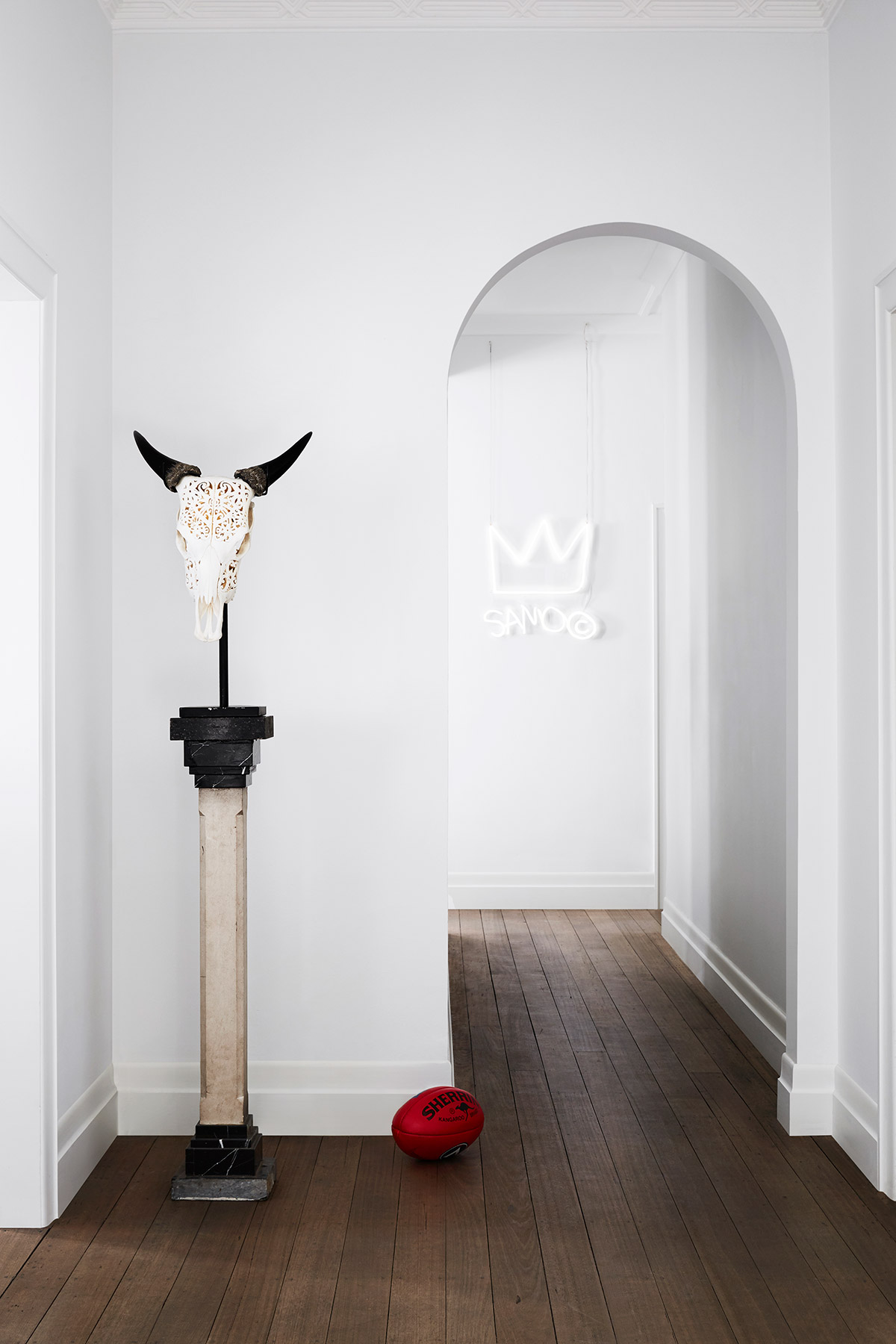
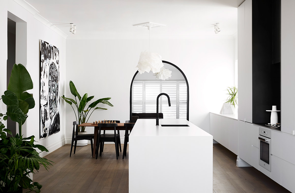
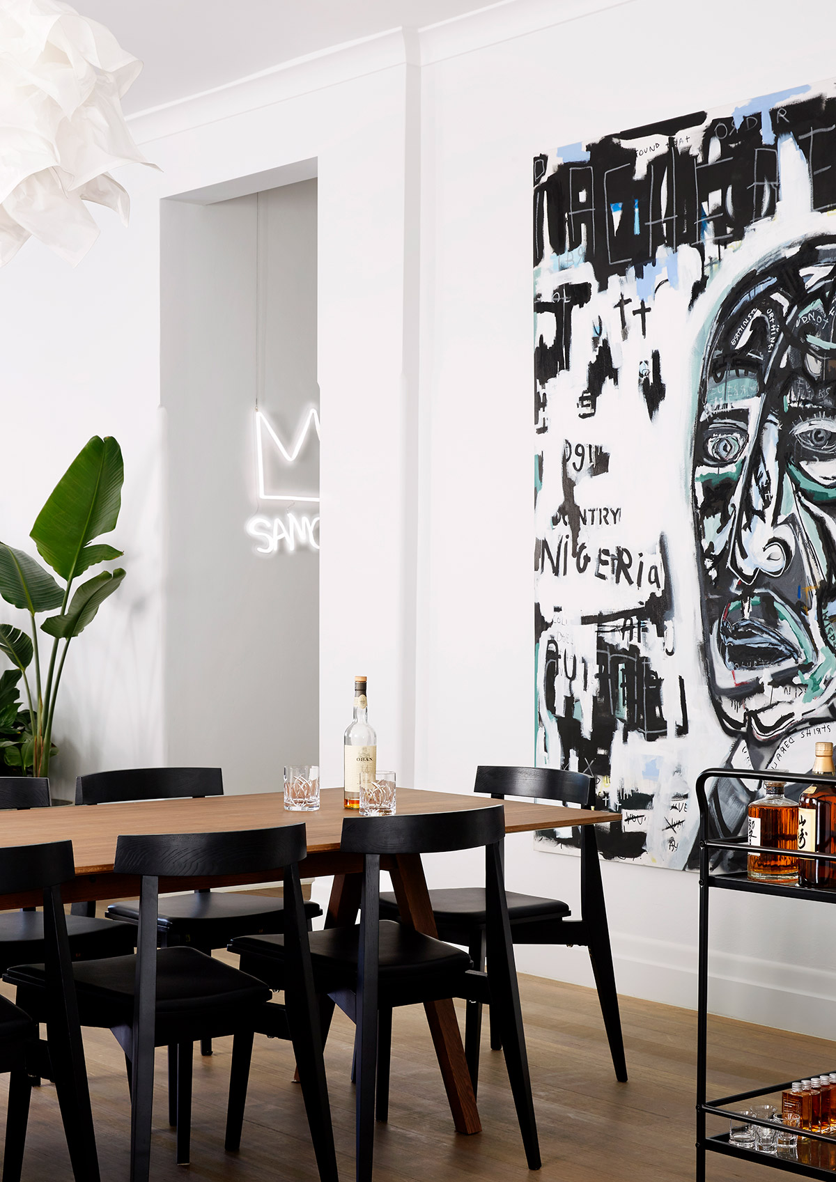
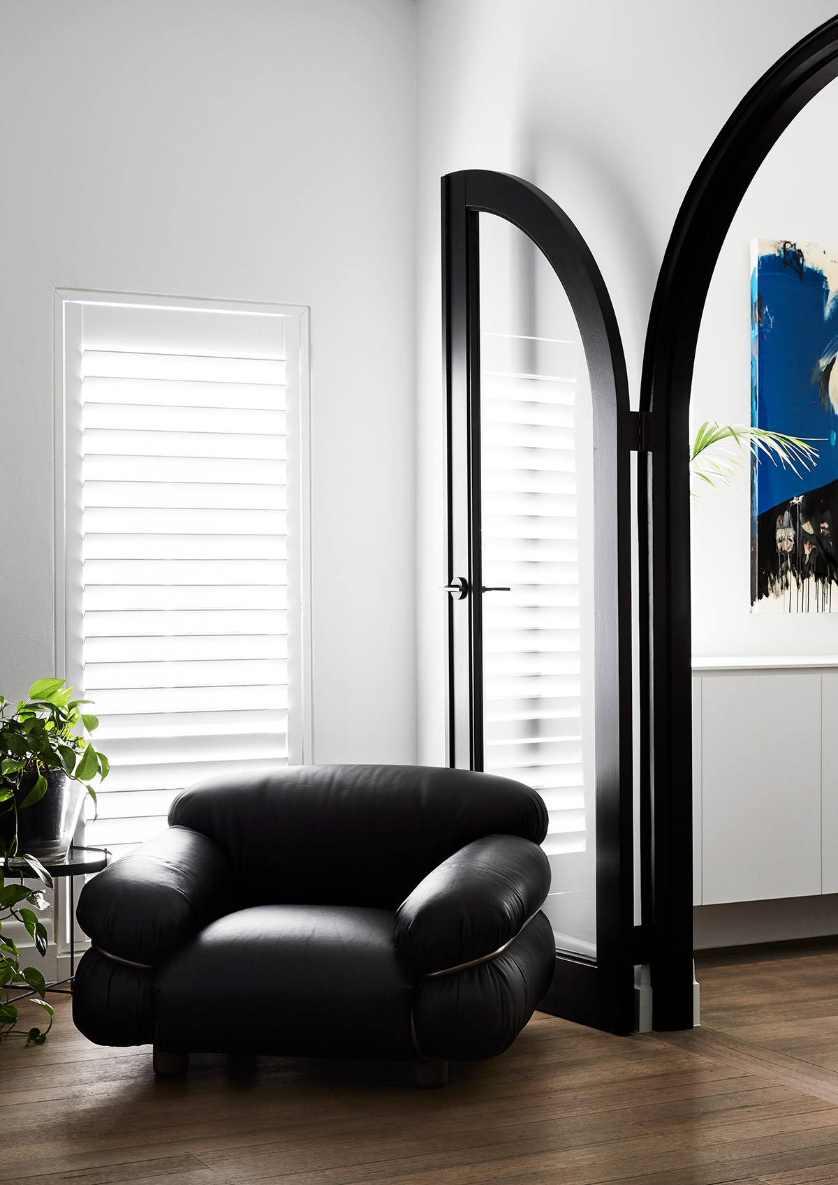
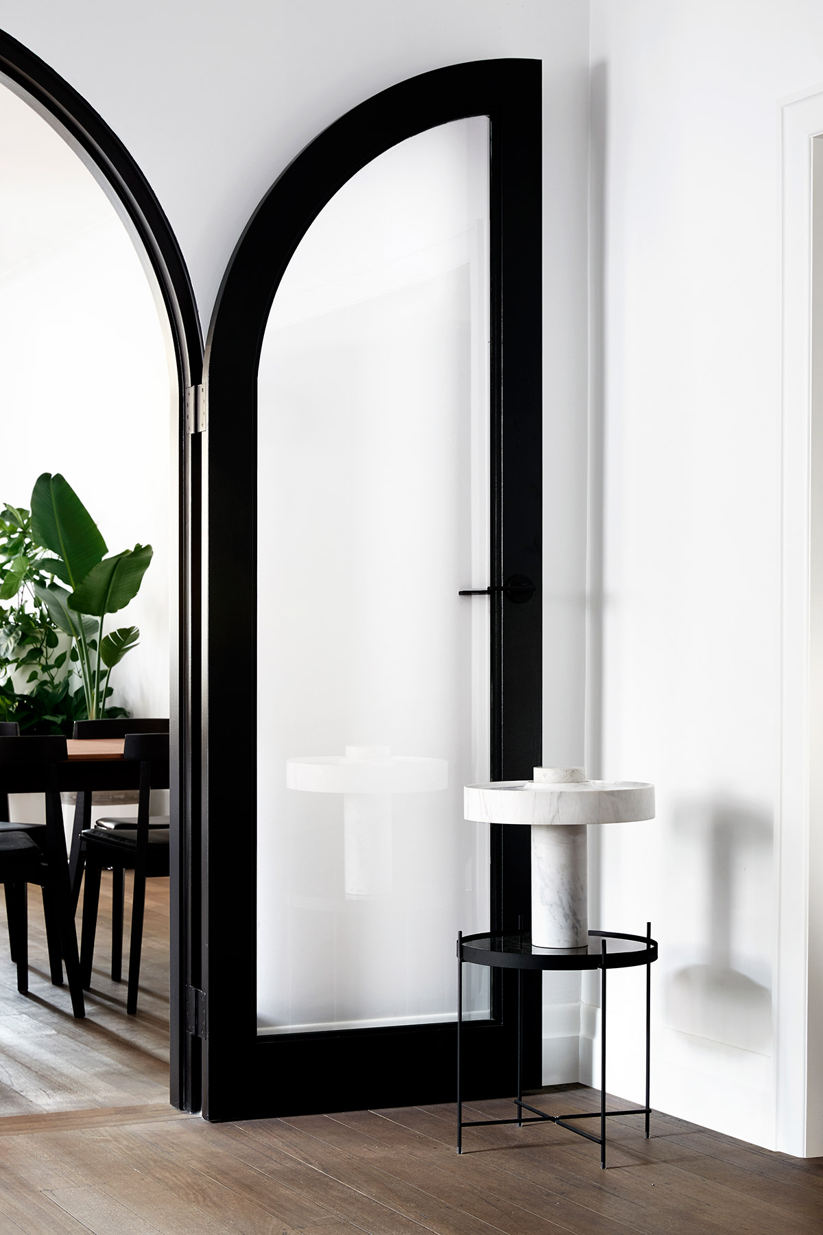
The client is a talented artist and had paintings they wanted to showcase throughout the home. This was taken into consideration when designing the new dwelling. Colours in the materials were reduced so the paintings would become the most eye-catching part of the wall. Throughout the home, the palette of white, black, timber and other neutral colours are consistent.
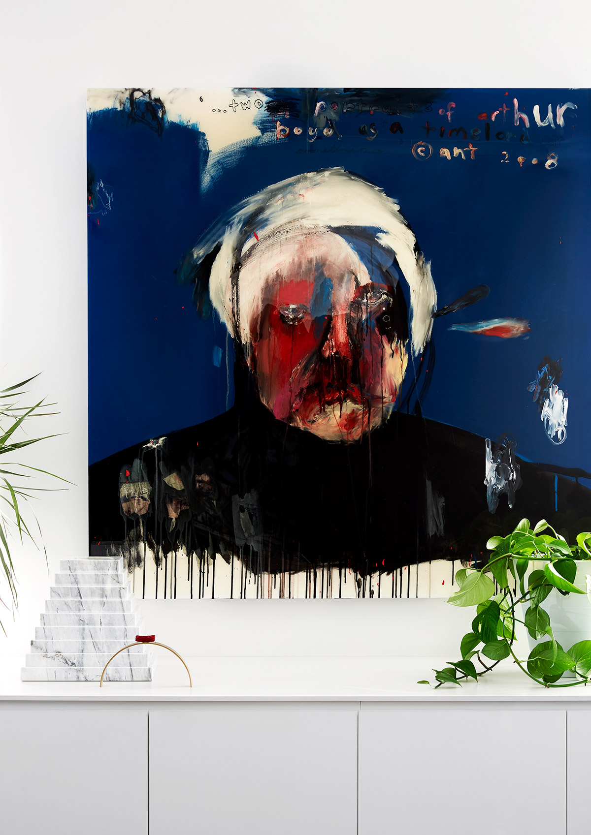
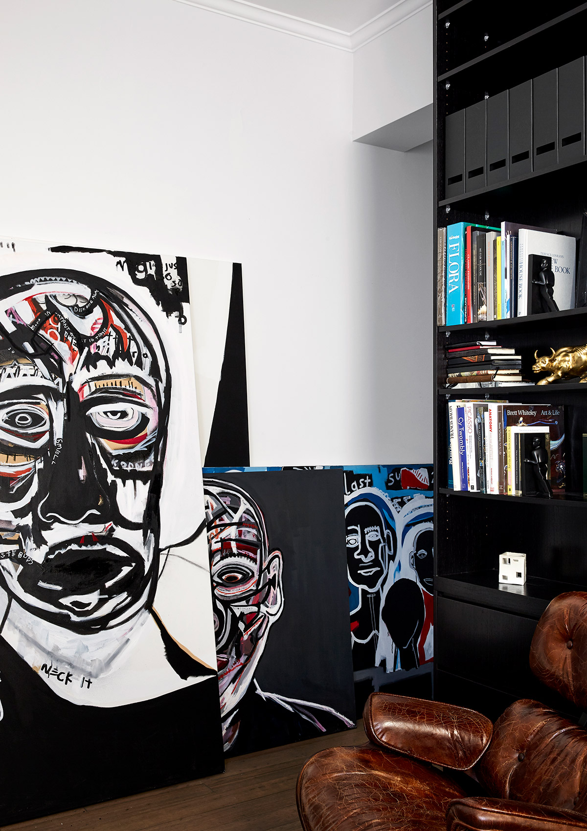
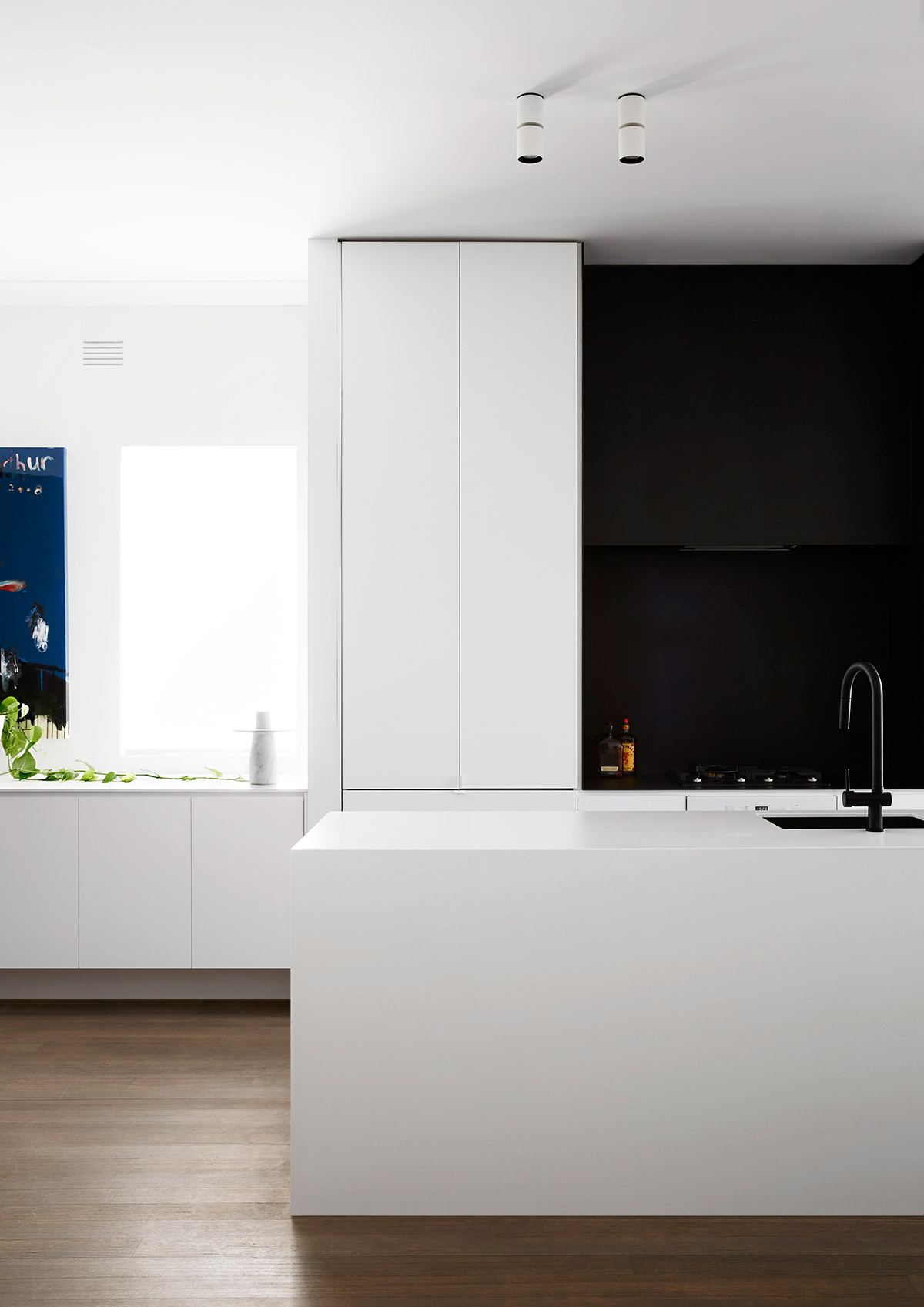
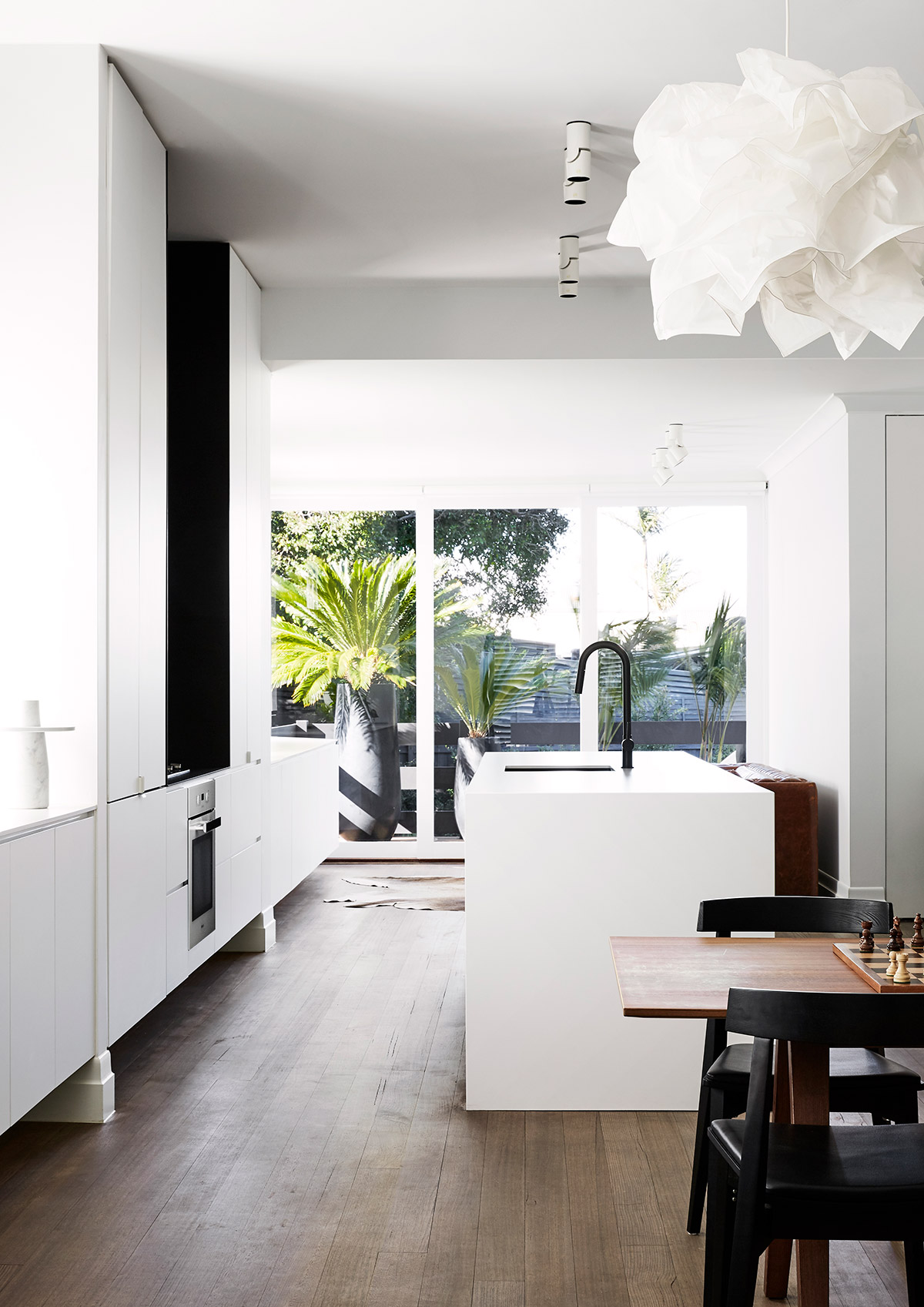
The kitchen is a multi-purpose part of the renovated home. Not only is the dining table a mere piece of furniture but also an adaptable item depending on what’s up at home. It can either be dressed up for formal occasions and dressed down for a casual time with friends and family.
The bathroom is far from the ‘Mission Style’ aesthetic because of the modern design implemented. Gorgeous gray tiling creep all over the walls and the floor with all black fixtures including the showerhead and faucet. The glass shower door further adds a modern feel to the bathroom.
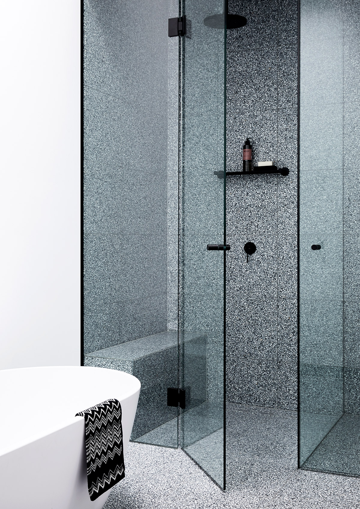
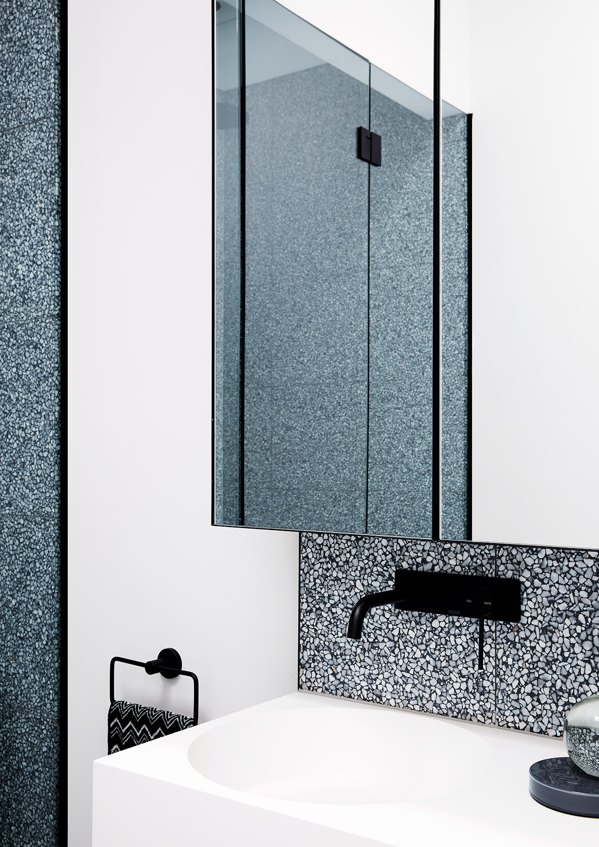
After tearing down walls and a fresh lick of paint, Spanish Mission House is a proof that old details can co-exist with modern design. The home’s bathroom didn’t retain much of its Mission Style aesthetic because of the lack of wooden furniture but nonetheless, you can feel in the space’s layout that a similar high-traffic space has a history. The renovation success of this house all boils down to planning and its beautiful execution.
House Project: Spanish Mission House
Architect: Kennon.Studio
Location: Melbourne, VIC
Type: Renovation
Styling and Art Direction: Manuela Millan of Meanwhile In Melbourne
Photographer: Caitlin Mills


