Zuzana & Nicholas‘ Monash Road House is the perfect reflection of modern functionality meets classic aesthetics. Set in a post-war cottage restoration, this humble dwelling stands firmly with innovative features that modern homeowners are looking for.
Such timeless craftsmanship has captured the attention of the judges that secured a nomination spot in the 2018 Houses Awards for House Alteration and Addition under 200 m2. What makes this delightful home a classic tale of old meets new, we’re yet to find out. Let’s take a look around…
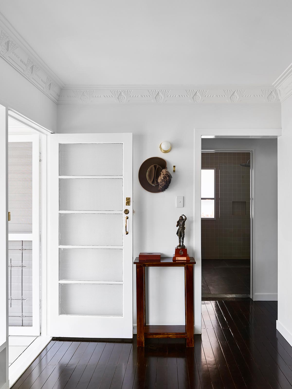
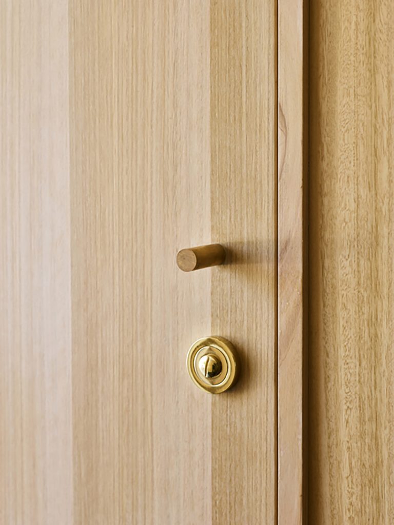
The airy and open design of the space is from the glass walls, windows, and doors, matching the white paint for the walls and other features of the house. Zuzana & Nicholas maintained some of the bucolic elements of the cottage such as the copper lock and door features. Welcoming guests is the minimal hallway leading to other areas of the house. There is no superfluous stuff inside the house to ensure spaciousness and more floor space.
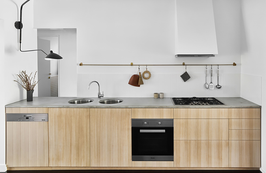
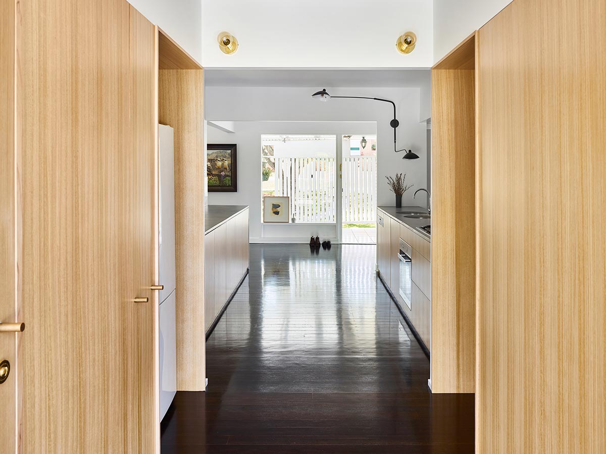
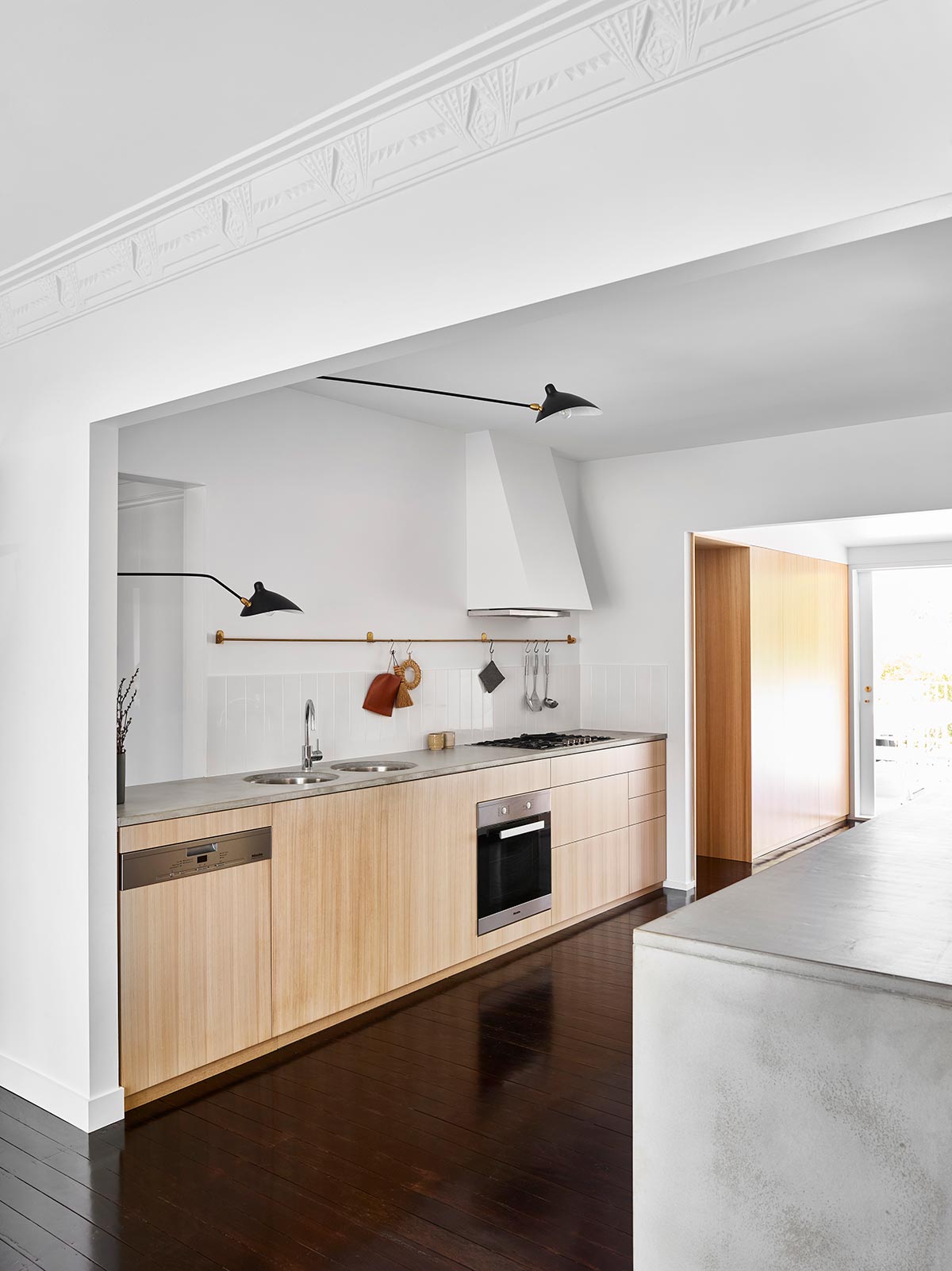
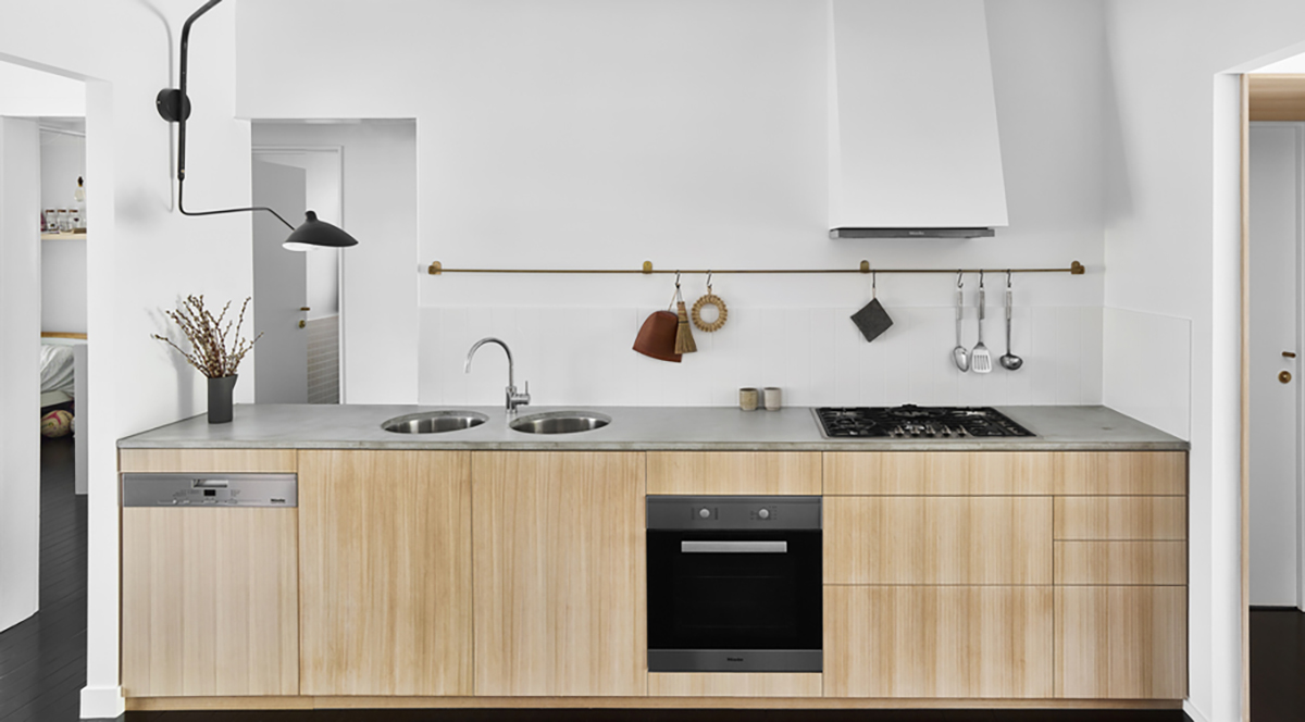
The hardwood floor delivers a classic overall look while ensuring high-quality structural integrity from the ground up. There is something timeless and captivating as to how the dark-colored floors complement the clean white walls. The cottage feel is maintained in most of the features of the house including the accessories made of natural materials hanging on the kitchen sink.
Staying true to the functional design of the home, the designer provided built-in cupboards that cross from side to side to the wall. This allows you to put your kitchenware and potholders inside to save more sink space as well as organize your stuff. A wall-mounted exhaust fan painted white should add more to the functionality with an aesthetic kick.
Creating a country-like finish is the wood effect of the sink in pale shade combined with the gray marble surface. Ease and convenience in food preparation and other kitchen chores is possible with the strategically designed faucet and double sink with an adjacent burner and the oven underneath.
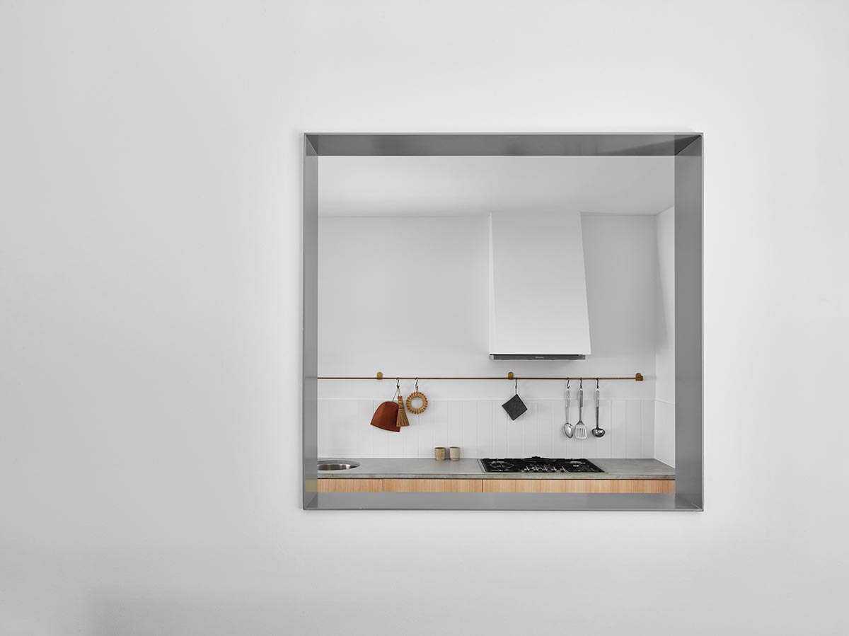
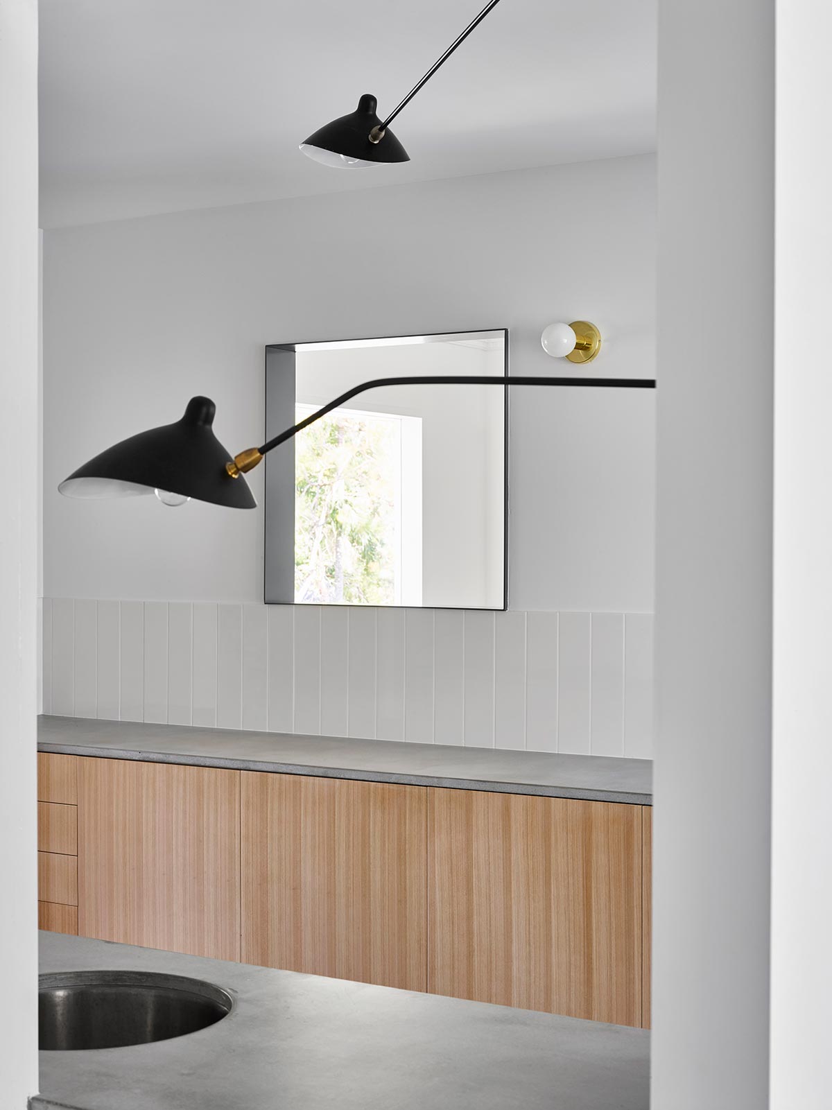
Adding to the dainty and charming design of the kitchen is the huge mirror that faces the kitchen area. The sole position of the classic accessory makes it a highlight in the wall with the gray stainless steel edges for more effect.
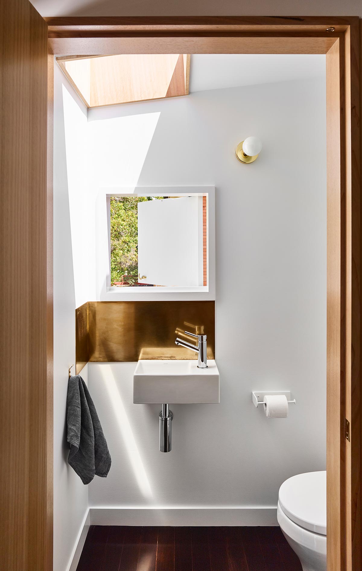
The blend of classic and modern features is evident when you enter the bathroom with a clean and minimalistic approach. The dark wooden floors and white walls continue in the bathroom zone while the modern bathroom features add to the innovative and functional design. The beautiful window with a conventional opening allows natural air and light in. You can simply open the window wide for a unique and panoramic backdrop from your bathroom.
There is something remarkable and relaxing when you pass the spacious hallway from the kitchen door to the kitchen zone and other areas of the house. It is fully equipped with modern amenities without giving up the traditional post-war cottage features from the simple wooden doorknob to the rustic ornaments and accessories.


