When it comes to renovating, we can often get really excited about creating our dream home. We might wanna knock down walls, plan massive extensions, but, unfortunately, our budget doesn’t always stretch as far as our grand designs. However, you don’t need to spend a fortune in order to transform your home and the house we’re about to take a look at today is proof of that, with an ambitious budget of only $35,000, to transform an entire three bedroom home plus its gardens, is that even possible? Don’t know, we’re about to find out.
Before this home was renovated, it was just very dated. It just hadn’t had a lot of love. The home was built in around the 90’s and it probably hadn’t been given much of an update since then. There were lots of dodgy colours. There were lots of dated tiles and flooring, poor choices of fixtures. Basically, it was just a little bit sad and it was time for a revamp.
So enter fresh, young, modern makeover and here we are today in a brand new home and without spending a fortune. Also, there’s one thing I haven’t told you guys yet. This renovation wasn’t just done by one person, not two people, but in fact, 13 very trendy influencers and one very large, one stop DIY shop. Yep, Bunnings actually had the confidence to bring 13 influencers together in one home and let them loose to create their dream home. If that ain’t ballsy, I don’t know what is.
The problem that I thought I might see in this home is that it wouldn’t be a cohesive style internally. However, I’ve gotta say, with all these different people designing rooms, it actually does feel like a really considered home. Everything works and the styling is carried really well throughout.
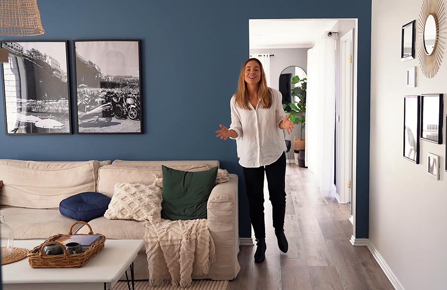
The hallway into the living area is a really lovely way to enter this home. It’s just got a really fresh feeling and you are hit with a lot of colour, but there’s also a lot of white as well, and the timber panel flooring has got kind of a really nice light, whitewashed effect. So that actually helps to brighten it all up. It has a bit of a coastal feel, but it’s not kind of a provincial coastal, it’s more of a modern, coastal vibe. It’s very young, it’s very fresh, it’s very contemporary. It’s got a lot of energy and I like that energy, it just kind of makes you feel happy as soon as you walk through the door.
I spoke a little bit about this when I was walking through this space, but this living area, it is a smaller living area, but they’ve done really well in terms of scale. So I say this all the time, if you are dealing with a small space, you want to maximise the scale of the pieces that you have in that room. Go a big rug, go as big as you can. Go a big couch, as big as you can. And because every time you kind of choose larger feature pieces, they just make everything else around you just feel inherently bigger and more generous and then, therefore, makes your smaller space look big.
Leading into the kitchen, that’s got a really good feel. Again, we’re dealing with smaller spaces here, but every space feels incredibly generous and in terms of saving money, what they’ve actually done is they haven’t changed the layout, but they have just improved the look and the feel of what was currently there. I really like the neutral colour palette. There’s a lot of grey going on, but, again, it’s got lots of flushes of white and timber, which is really important to kind of keep it fresh, keep it light and, you know, not get it too weighed down by too much dark grey.
The pantry! I need whoever did that pantry to come into my home and sort me out, because that pantry is like the best piece of organisation I have ever seen, it speaks to my OCD nature and I just love it. That organisation that we saw in the pantry also folds into the laundry, as well, and also the bathroom has good use of storage and the bedrooms, as well. I mean, they’re small bedrooms, they have great room, but they’ve really maximised every single piece of space with those awesome storage solutions.
Speaking of bedrooms, that master bedroom. That was just a very dreamy, lovely, wistful place to be. It just felt beautifully calm. I loved the green on the wall. I loved the texture on the wall with that panelling and that was, quite, you know a pretty good size en suite, I’ve gotta say. I mean, it wasn’t massive, but relative to the other bathroom. The ensuite is actually a really great size and the styling of that en suite matches what’s going on in the other bathroom, which, I really liked the bathroom styling. I loved the colour, it was very regal, I loved that blue, and it was just modern. They managed to turn what was a very small room into a very fun and functional space.
The kid’s room was just so cute! It just made me want to be a kid again, basically. I loved it. It was just so much imagination in there and I loved that. I think that’s what kids rooms need to be. I loved the murals on the wall, I loved the teepee. I loved the fairy lights, I loved the bed. I loved all of it and I just think, I’m just kind of really jealous I didn’t grow up with a bedroom like that.
This is actually a three bedroom home, but the third bedroom, which leads off from the kitchen area, has actually been sort of transformed into a multi purpose space. Kind of home office come lounge come just chill out area. I really like the fact that that room I guess now serves a different purpose. You might want to kind of roll out your yoga mat and do some down dog, or you might just wanna take your book in there or the newspaper, or you might just wanna get some bills paid. I don’t know. It’s just kind of a nice space that you can have to yourself and you can shut the door and hide away.
We’ve gotta talk about that outdoor entertaining area, which has a really good, functional feel to it. That was a complete transformation from what was there before. I liked the raised decking. I liked the fact that that created a zone for which you set up to the table, and also the table was cool cause it had a couple of chairs but I liked that sort of DIY, outdoor bench situation, which was just made out of cinder blocks and a gate. I mean, that’s genius.
The front has been given a transformation as well and I must admit, this house does stick out from its neighbours a little bit because it has new landscape, gardens, and there’s also just a fresh coat of paint, and you know what, updating is a bit of a pain, but I love the fact that paint and colour can fix everything. It just makes everything look better and that bright pop of green, as soon as you walk through the door, it automatically sets the tone for what you’re gonna find inside. They’ve even painted the driveway. That has made a huge difference. A driveway is kind of like an afterthought but the fact that they’ve painted that, it just lifts and elevates everything.
Okay, budget. They set a budget for $35,000. Did they hit it? Almost, they went over by just $3,000, coming in at $38,000 in total and I’m talking total here. We’re talking everything that you see in this home. We’re talking appliances, traits, you know, the things that you can’t do yourself like electrician and plumbing, plus all of the plants in the garden. Everything in the home and garden for $38,000, that’s pretty damn good if you ask me.
Where they saved their money was definitely furniture, they upcycled a lot of pieces, there was a lot of DIY happening here and also those big ticket rooms, the kitchen, the bathroom, they saved money there by just changing out the fixtures and fittings but not messing with the overall layout because as soon as you start to move things around and you want to change the plumbing and knock things over, start to re-tile surfaces, that’s where the cost can creep up. So instead of re-tiling, they’ve just painted over old tiles. Instead of getting a new, beautiful, concrete bench top, they’ve just painted over the existing one. So it’s being smart, being clever, and thinking about ways to transform the space that you already have to give it a modern makeover. I’ve gotta say I’m really impressed by what this home has been able to achieve on a very modest budget.
Thanks for watching, guys. I’d love to know what you thought of this home and its ambitious budget at $35,000. If you want to know more about this home and other helpful DIY tips, head to the Bunnings YouTube. And if you have not already, please subscribe to our YouTube channel, because we’ve got way more Let Us In home tours coming your way. Cheers!
Check out our previous Let Us In Episode 22 where we take a Tiny Cabin Tour at Sweeney’s Hut, Kimo Estate.


