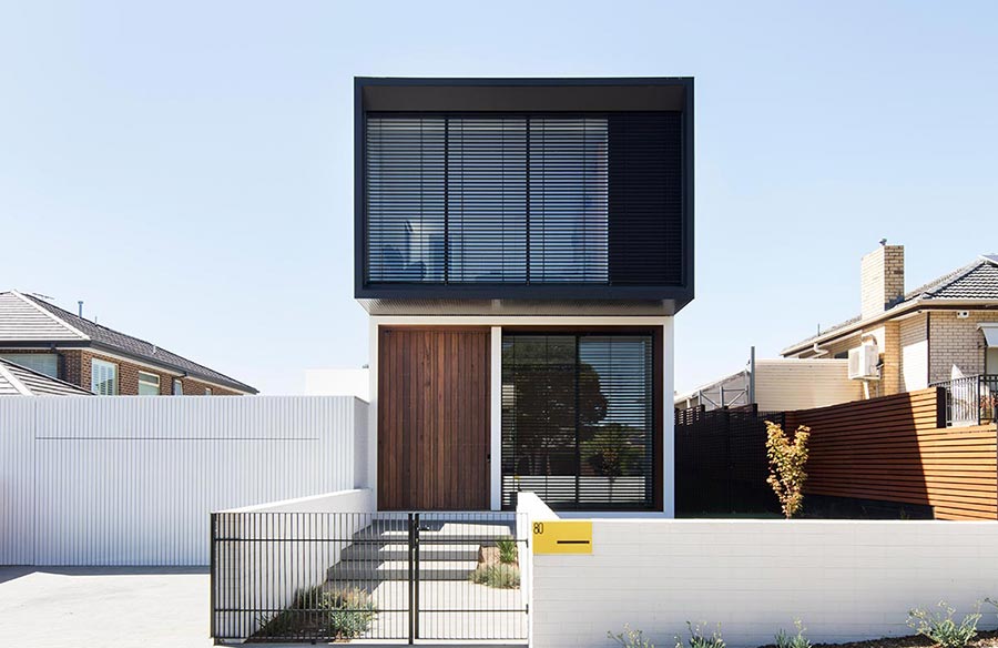
Right around a neighborhood of beige houses aisled by brick veneers stands an interesting new build that boasts nothing of boldness, yet stands out perfectly to meet the gazing eyes with utmost confidence.
The clients wanted an open space living without a nagging feeling of emptiness around the inhabited corners. Michael Ong of MODO responded fluently with volumes, levels, and clever use of materials to create the Bulleen House, a one of a kind residential masterpiece set to redefine a 1960s neighborhood in Melbourne. Let’s take a closer look…
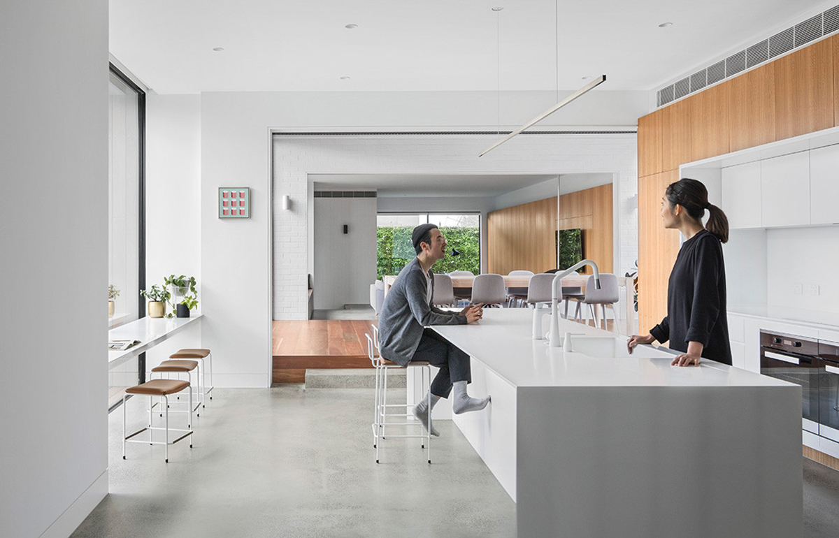
“The clients explained their vision of an open floor plan with all living areas connected, however they felt it was important that spaces didn’t feel empty and vast,” Michael explains. “The question then became how we create spaces that feel open, yet defined and welcoming.” Transitioning between spaces become a hallmark of an experience in this lovely dwelling as walls and screens were replaced by volumes, levels and materials, allowing a distinct shift of environment within an open plan setting.
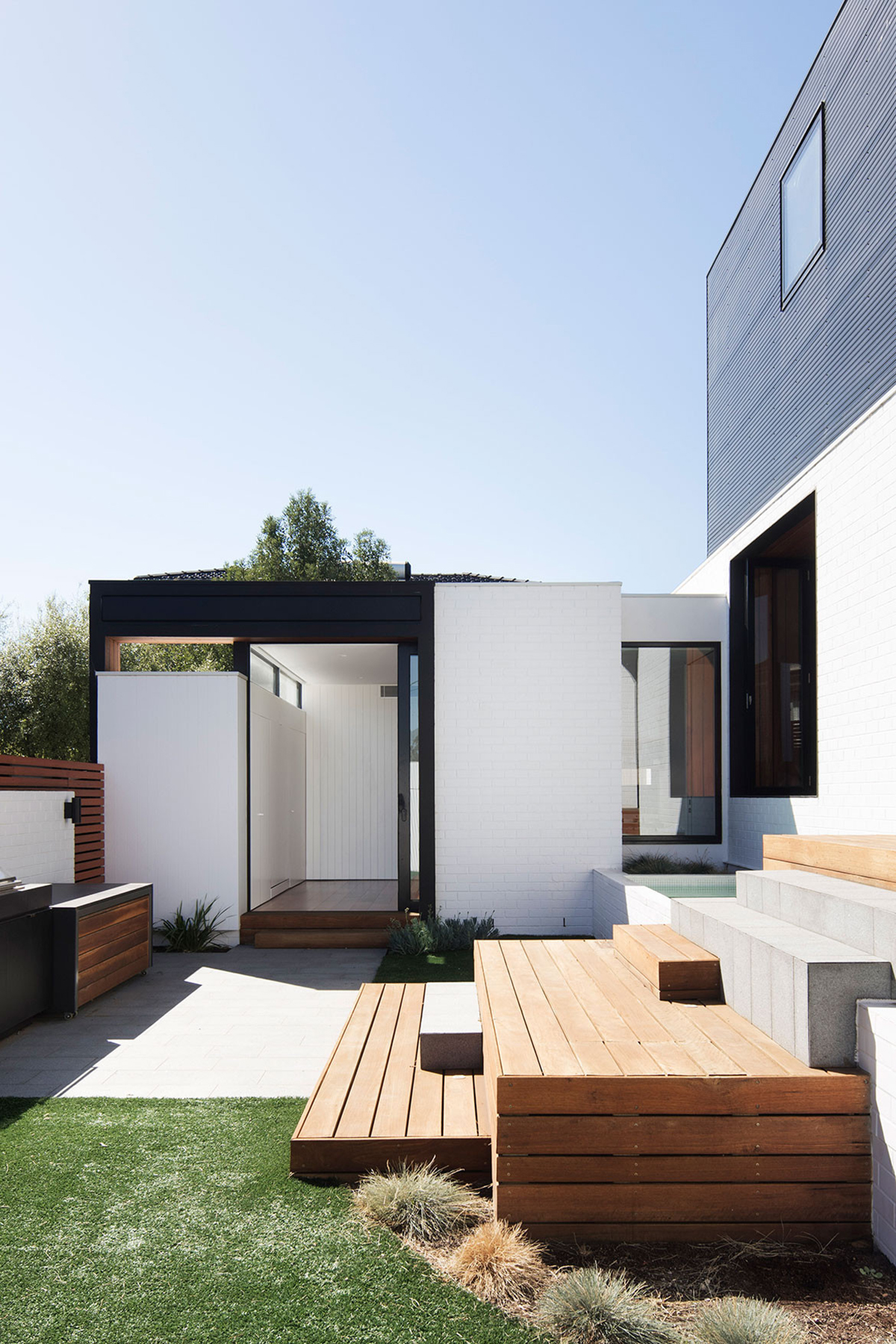
Bulleen House’s frontage is narrow to give due proportion to the streetscape and reduce the daylight impact of the western sun. However, to capture much of the natural light and thermal efficiency from the nothern sun, the main house is situated along the southern and eastern sides, right within the courtyard where the view floods throughout the interior halls.
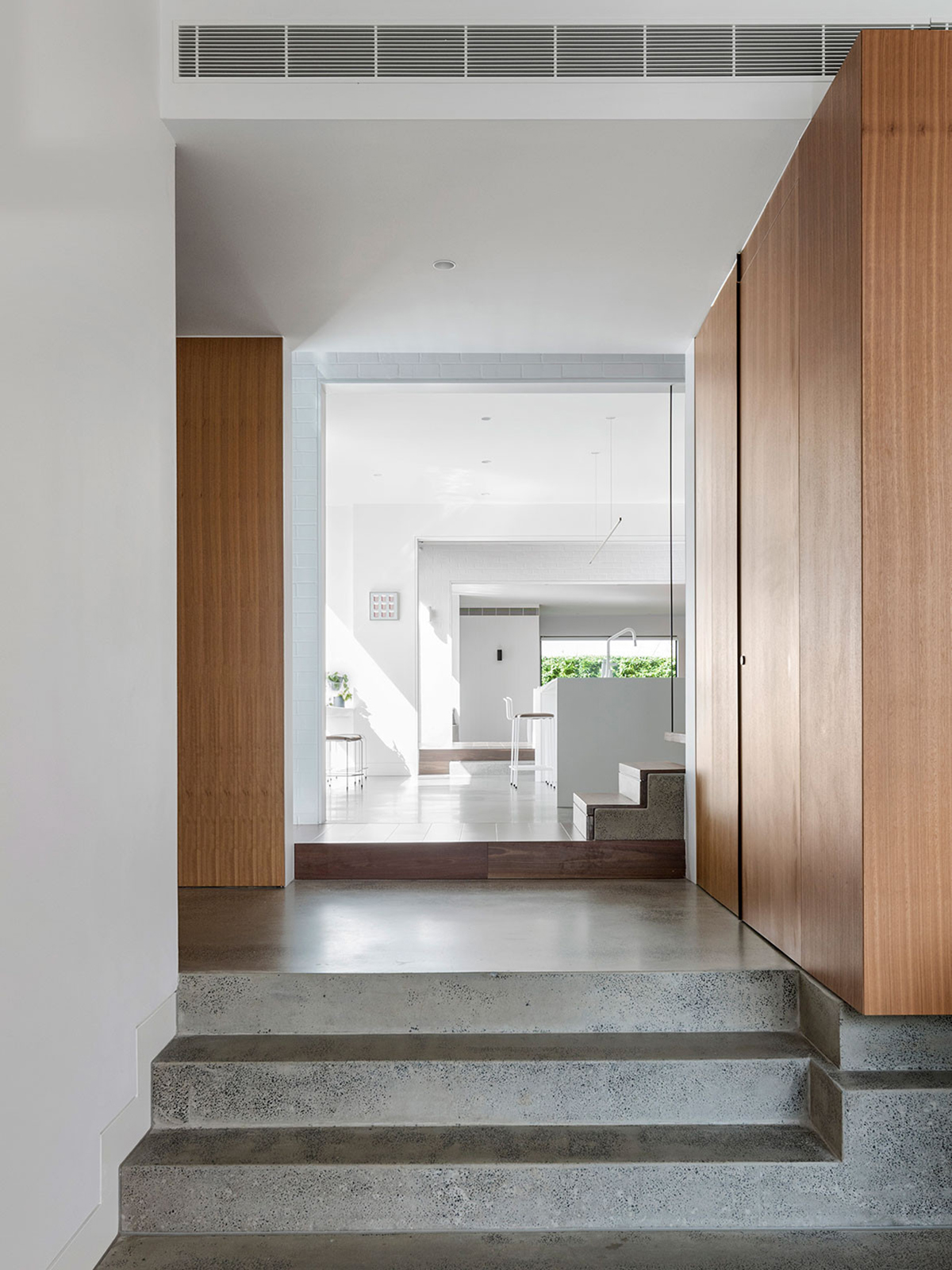
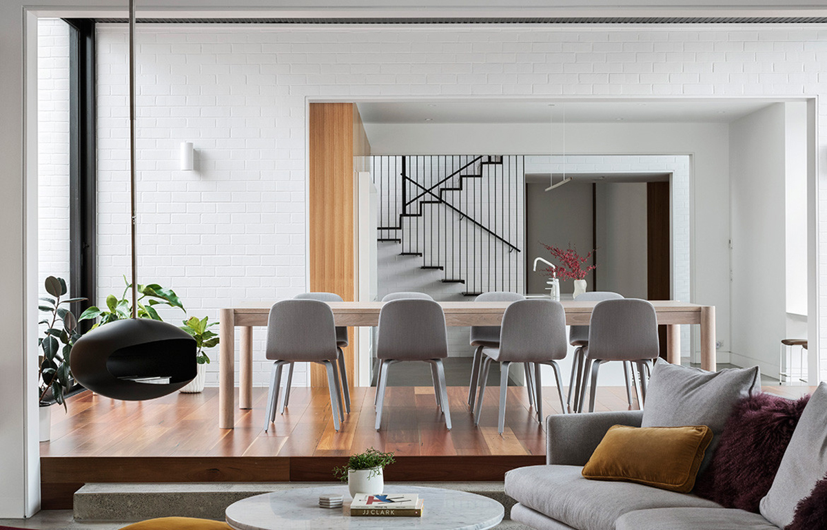
The interior livingscape boasts of its unique approach to an open plan space. Substituting traditional divisions to incorporation of levels and materials to shift from one functional space to another. “You step into the ‘next’ space, [and] the walls are slightly lower or higher, and the floor, walls and ceiling materials change,” Michael explains.
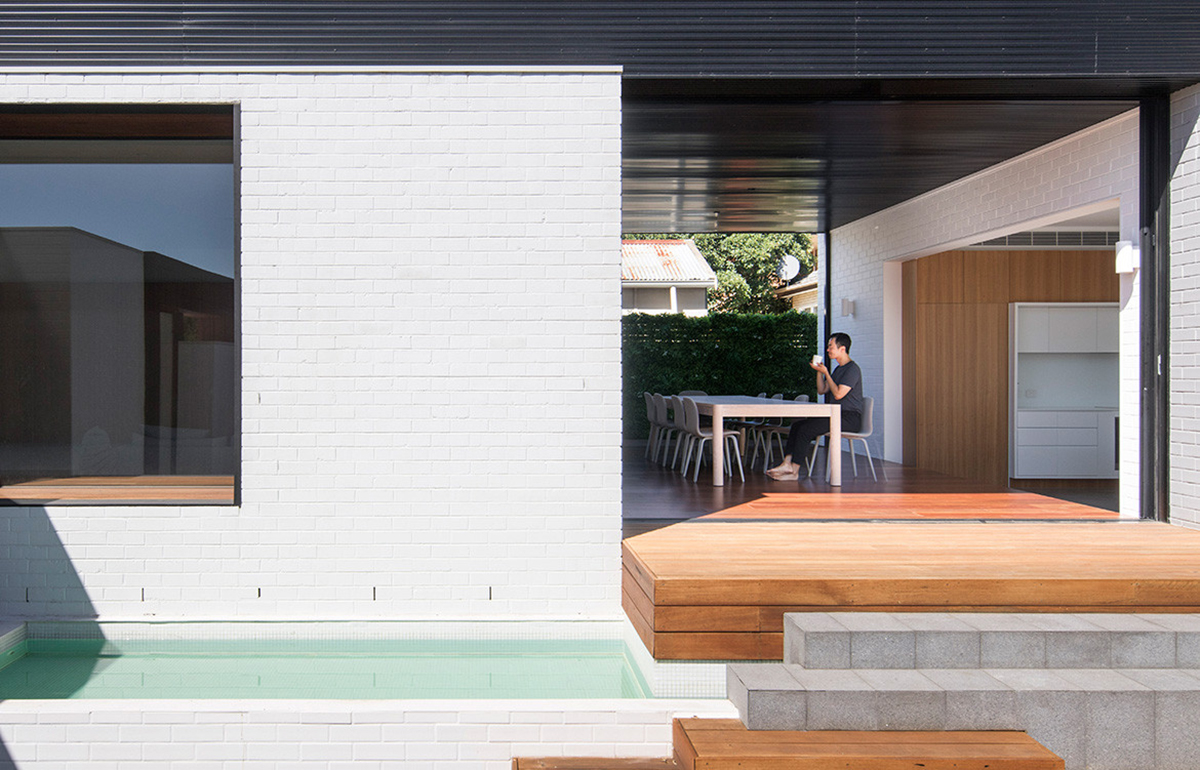
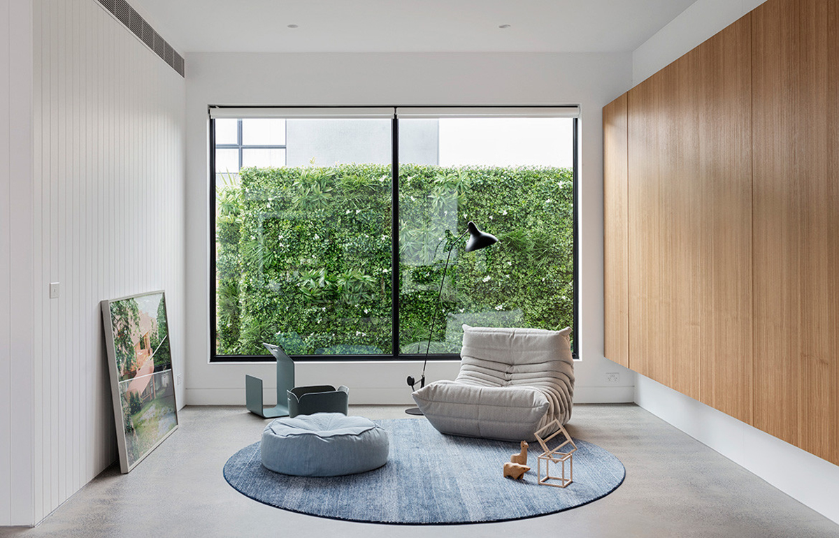
Concrete steps guide you through the entry point that slowly takes you to the garage and a few more steps to the kitchen and right around the staircase. The shifting use of materials is visible in every detailed aspect of the house. Timber flooring indicates a texture threshold of the stairs, creating distinction from the polished-concrete kitchen flooring. Right around the dining room presents a whole new ambiance with brick walls and timber floors on the step up with the living space bearing polished concrete and timber-joinery wall on the step down. Sliding doors make a subtle appearance, opening the dining area to the gardens on both the north and south sides with timber and concrete stairs cascade downwards right into the courtyard.
“As you move through the house, your body starts to develop an understanding of these multiple volumes and shifts in levels and materials,” Michael says. “It’s amazing how clearly and quickly you start to read and respond to these seemingly minor design details.”
 Build by Seventy7 Projects, Furniture and Styling by Nina Provan,
Photography by Ben Hosking.


