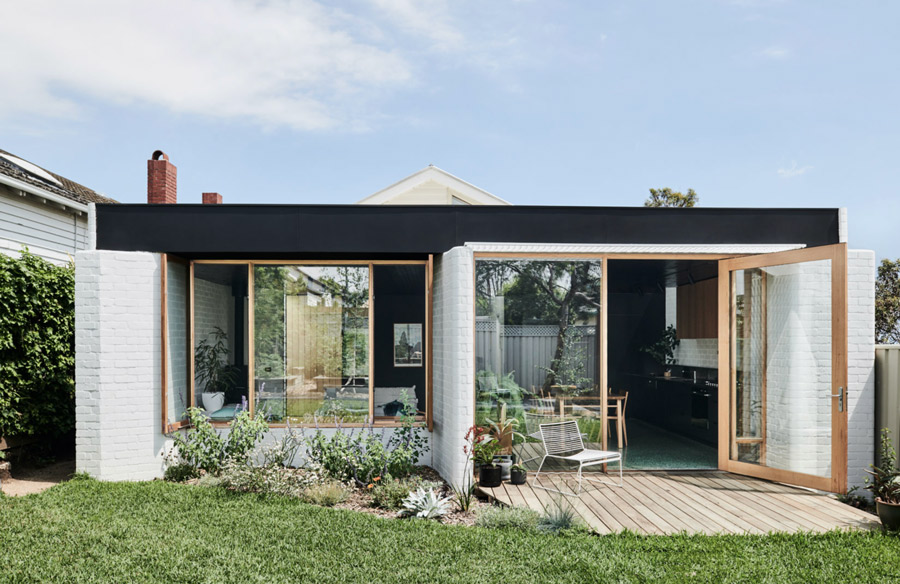
Californian bungalows or “Cal bungs”, as they’re affectionately known, are ripe for renovating. Whether it’s restoring to its former glory or adding an extension out back, it’s a lot easier than you think. Take Brunswick West House by Taylor Knights for example, which has a bit of column A and a bit of column B.
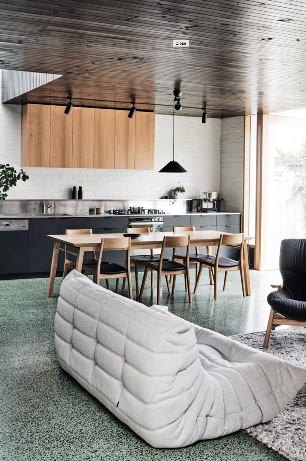
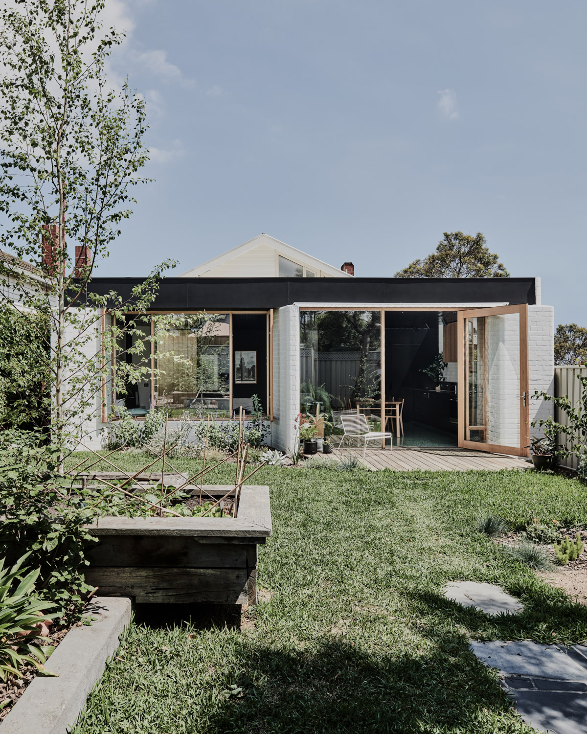
Keeping the original bones of the home, a minor reconfiguration to the existing floor plan made a grand impact, whilst the rear extension accommodates open plan living, dining and kitchen area, spilling into the backyard.
This addition was from the outset an exercise in ‘quality over quantity’. For the clients, a creative couple with a teenager, achieving ‘more space and lots of it’ was never the goal, rather, opting for considered, flexible spaces that would adapt with them as a family.
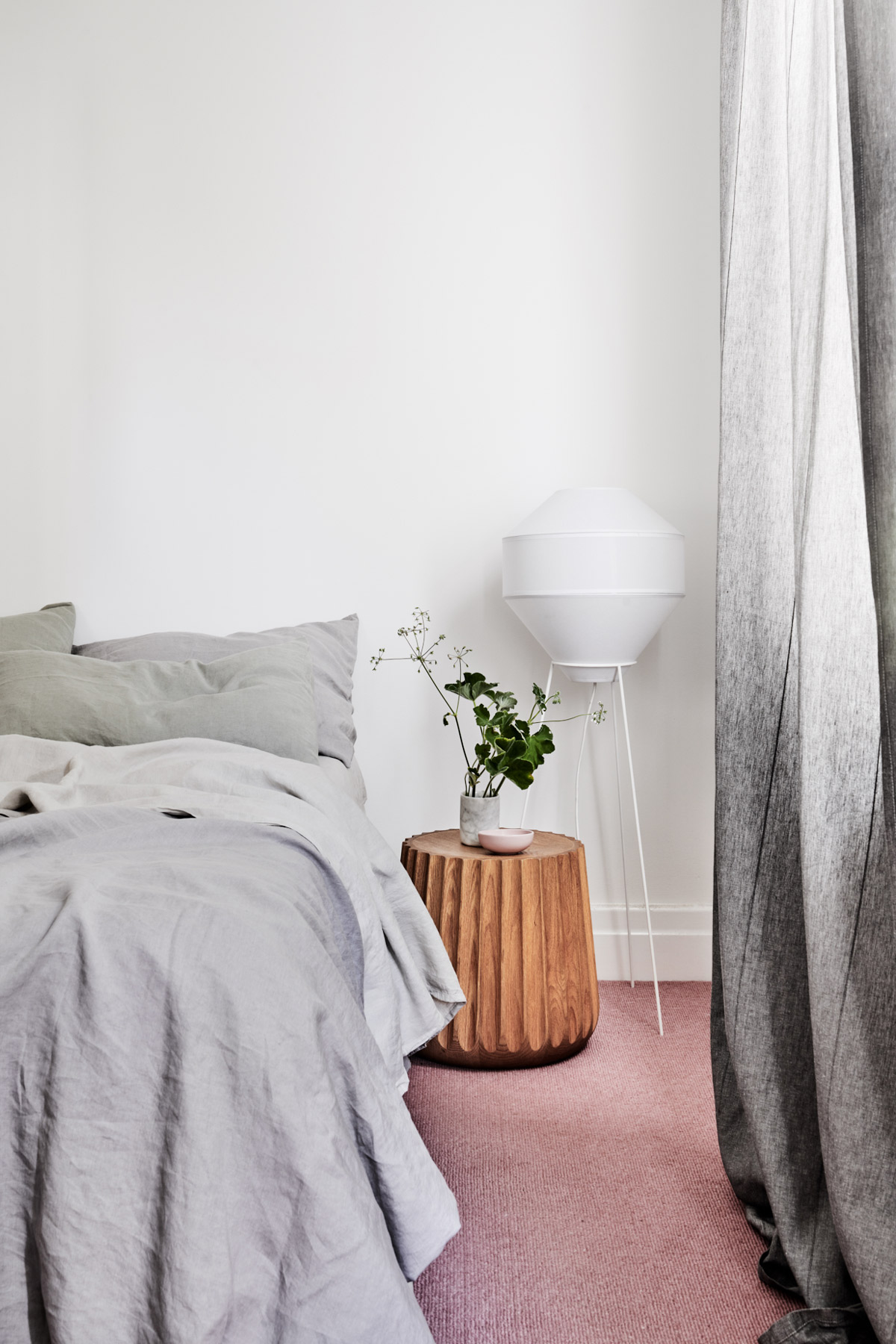
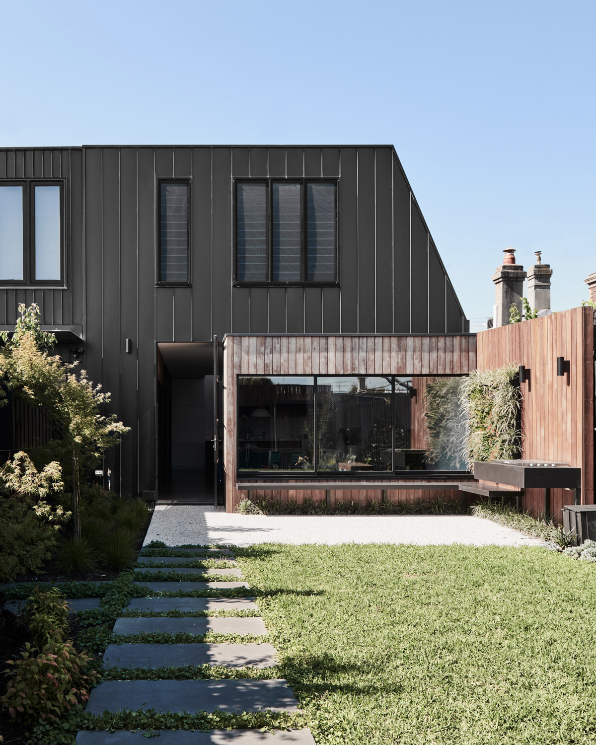
Often, the very nature of alterations within heritage homes can call for fiddly solutions in negotiating the traditional corridor and room arrangements. In response, Taylor Knights’ strategy looked to avoid significant reconfiguration of the existing internal spaces by repurposing the generous ivy-lined side access, creating a lush and unassuming new entry point at the centre of the home. This approach enables the home to operate quite cleanly and disparately in two parts of a whole: the existing rooms now accommodate bedrooms, while the addition forms the new social heart of the home.
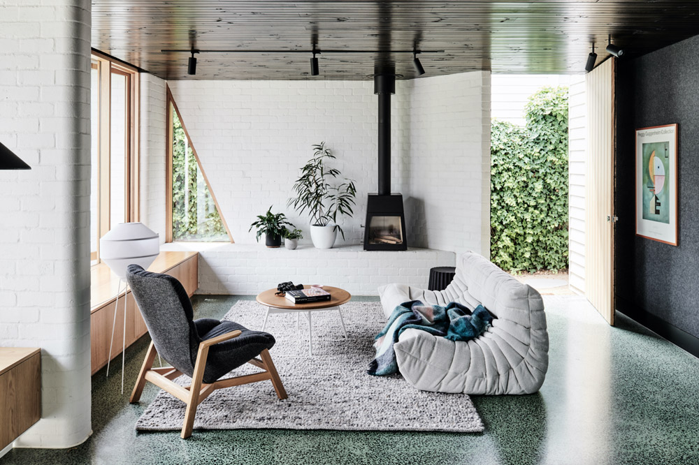
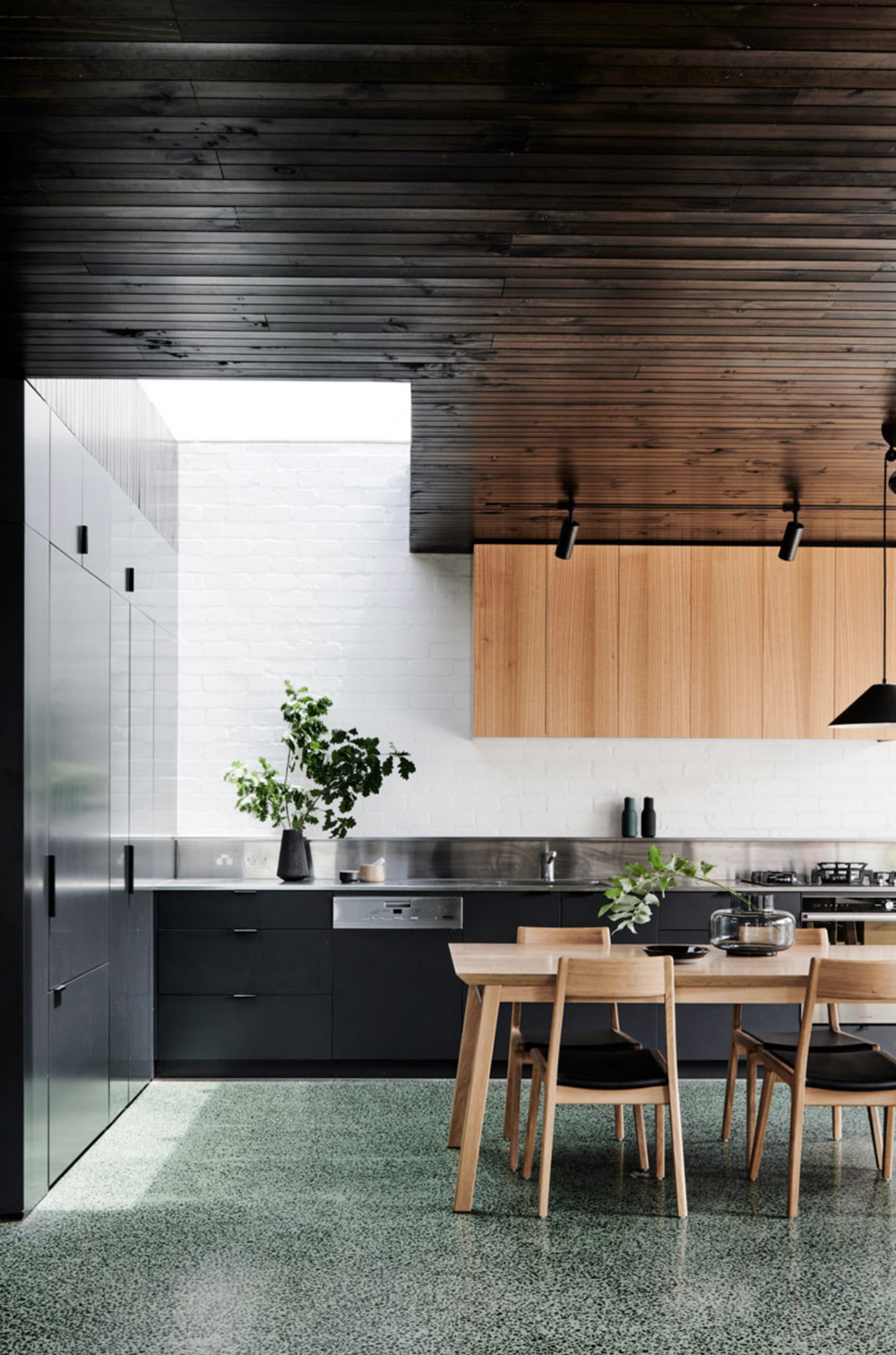
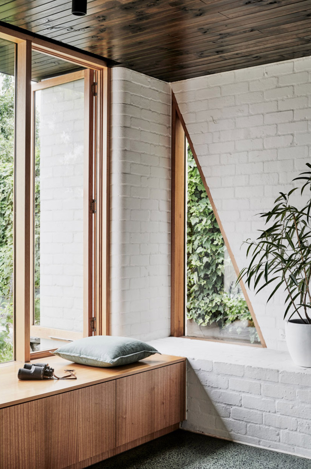
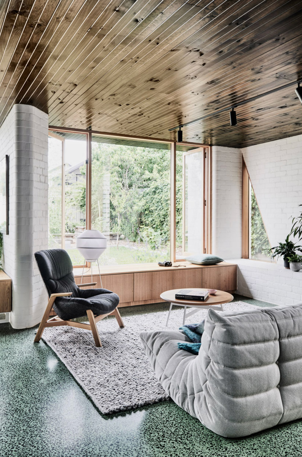
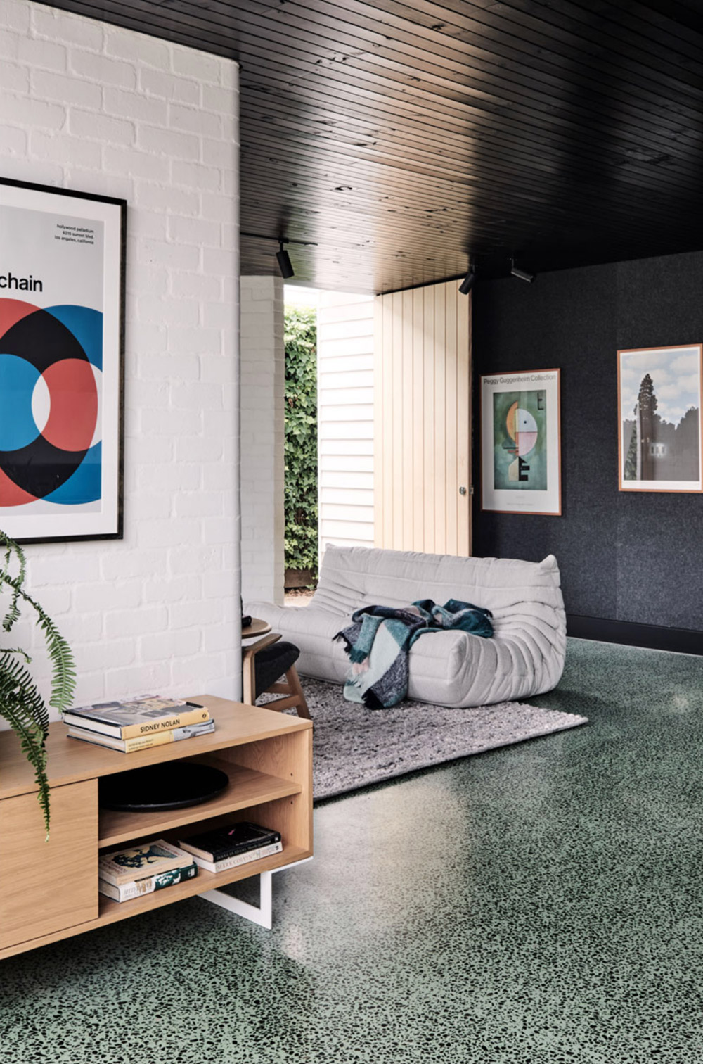
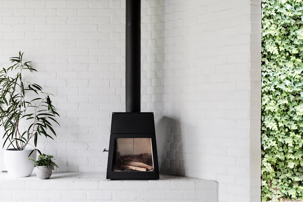
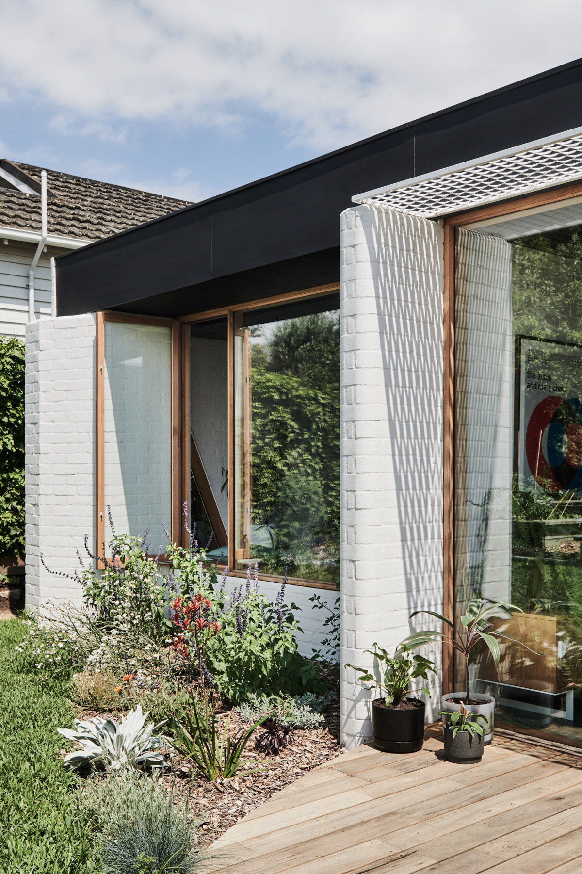
These new primary living spaces are arranged in and around three sculptural masonry walls, creating nooks and reveals within the open plan of the new addition – spaces that could offer a place to sit and share with family, or to retreat within at other times. Tall windows and a skylight tucked away in the kitchen draw in oodles of natural light, as well as offering a pretty spectacular view of the greenery in the backyard. Ledges/steps, lounges, and benches are all purposefully located to facilitate and promote conversation and activity between occupants in the open living space.
Get the look…
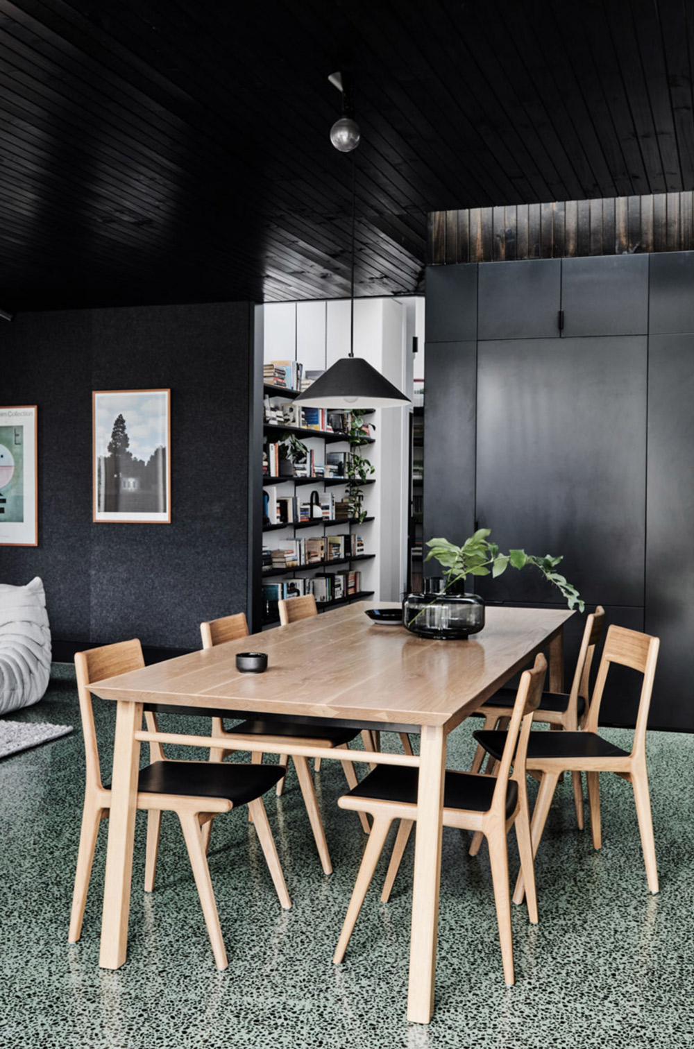
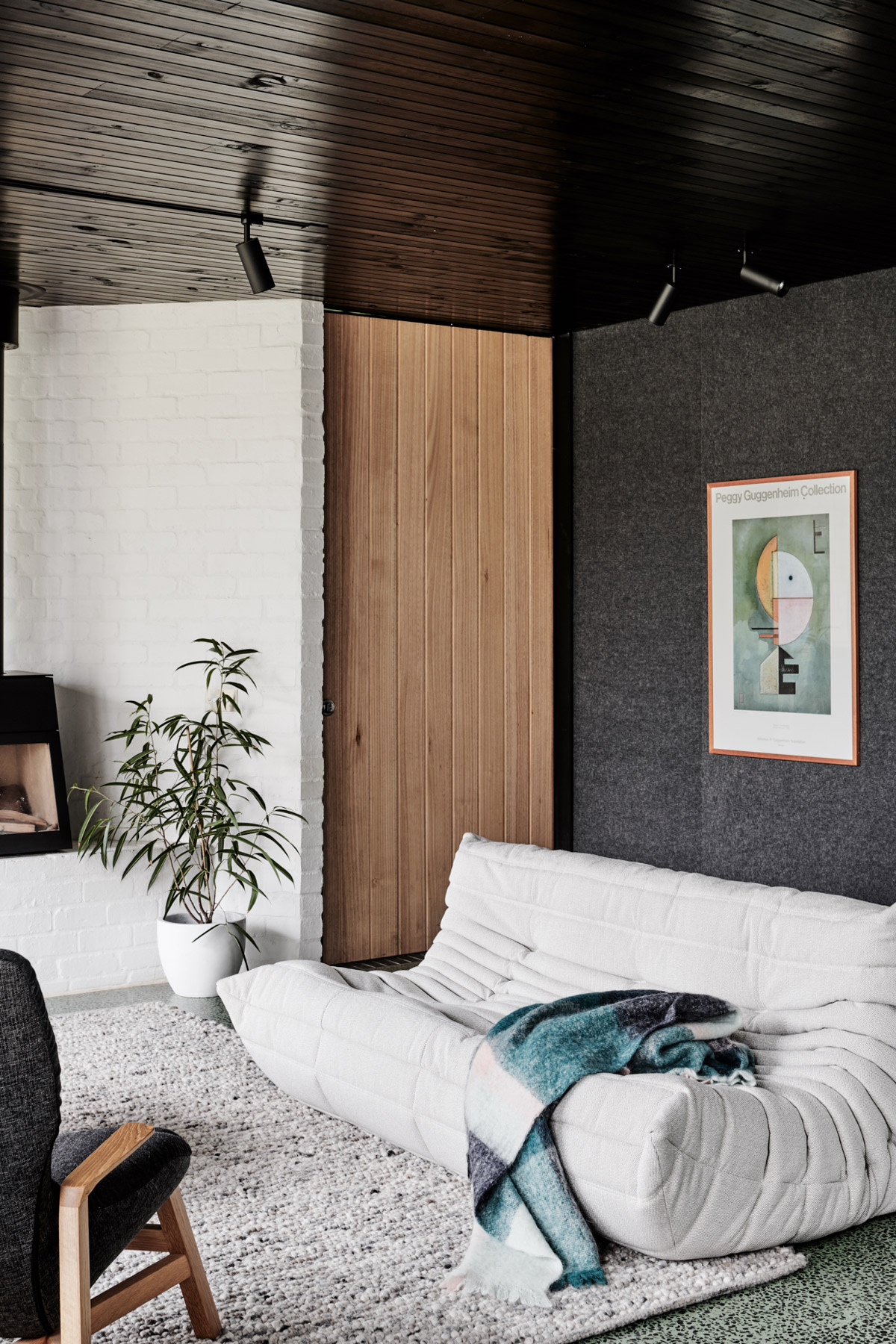
For the client, creating a space that would also accommodate their diverse collection of artwork and literature was also an essential part of their brief – a family favourite being the much-loved print of Kandinsky’s Upward (Empor). This offered the architects an opportunity to draw upon some of the artwork’s beautiful geometric and tonal elements, which in turn formed a reference for the interior palette within the new pavilion space. The result is the interplay between the white walls and light-reflecting timber lined black ceiling, and perhaps most noticeably, the striking sage green concrete floor flecked with dark local bluestone.
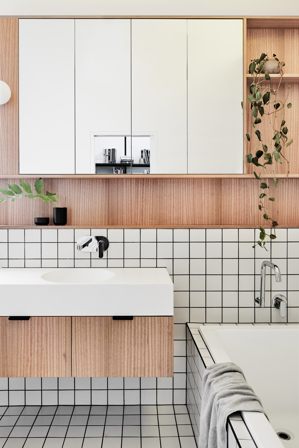
Mixing old-world charm with a modern edge, Brunswick West is a unique space that seamlessly combines aesthetics and function.
Photography by Tom Blachford. Styling by Ruth Welsby. Build by Gareth Cannon.


