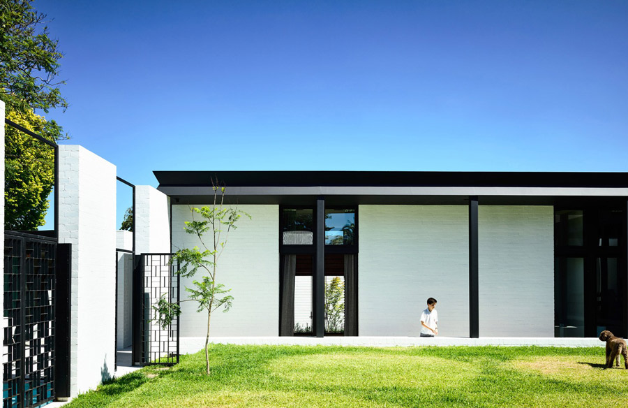
Question, how do you go about designing a family home that works for you now and always? You know the one… the home that grows old with you, that caters to your toddlers who become teenagers in a blink of an eye. Therein lies the challenge architects face when designing a family home that will change and adapt through the family life cycle. Informed by the memories of the original house, this alteration and addition by Kennedy Nolan is what we call ‘future-proofed’. Located on a leafy street in Melbourne’s Kew, Belmont House sets the stage for family life, providing secluded areas and open-plan spaces for both the kids and grown-ups alike.
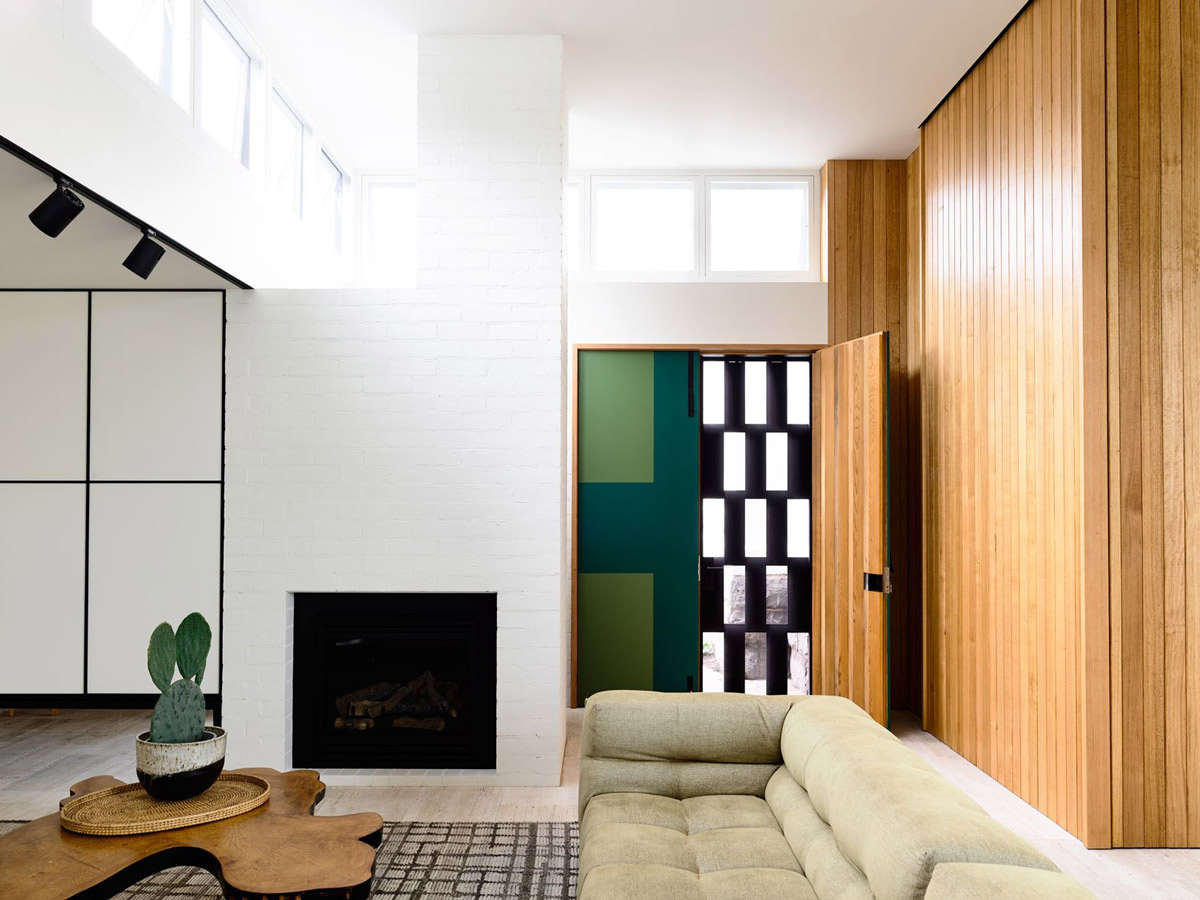
The old Victorian home was purchased off an elderly couple who had clearly imprinted the home with warm memories. The couple had lived in the house first with their growing family and then by themselves, a journey Kennedy Nolan wanted to recreate for their client’s family.
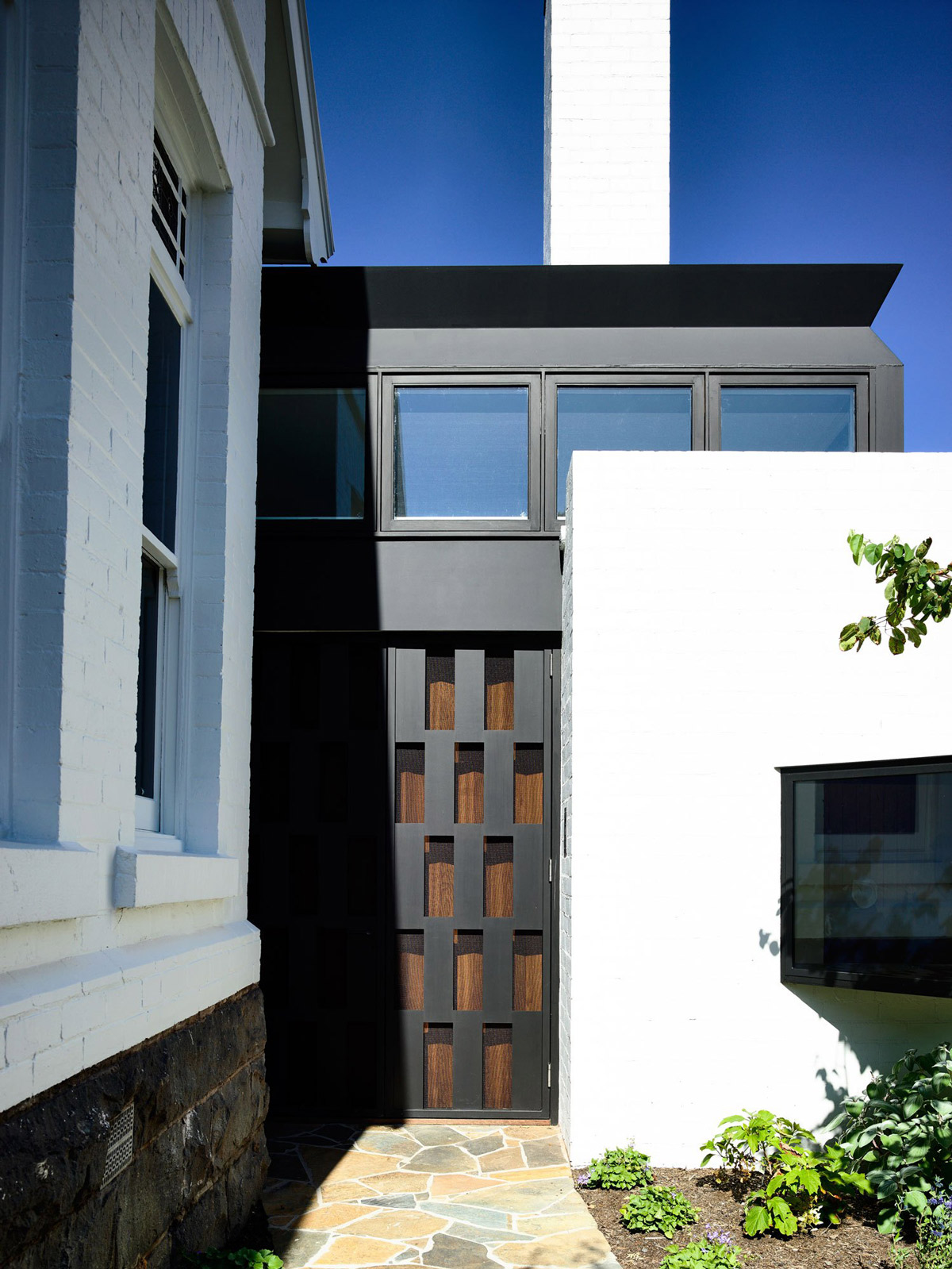
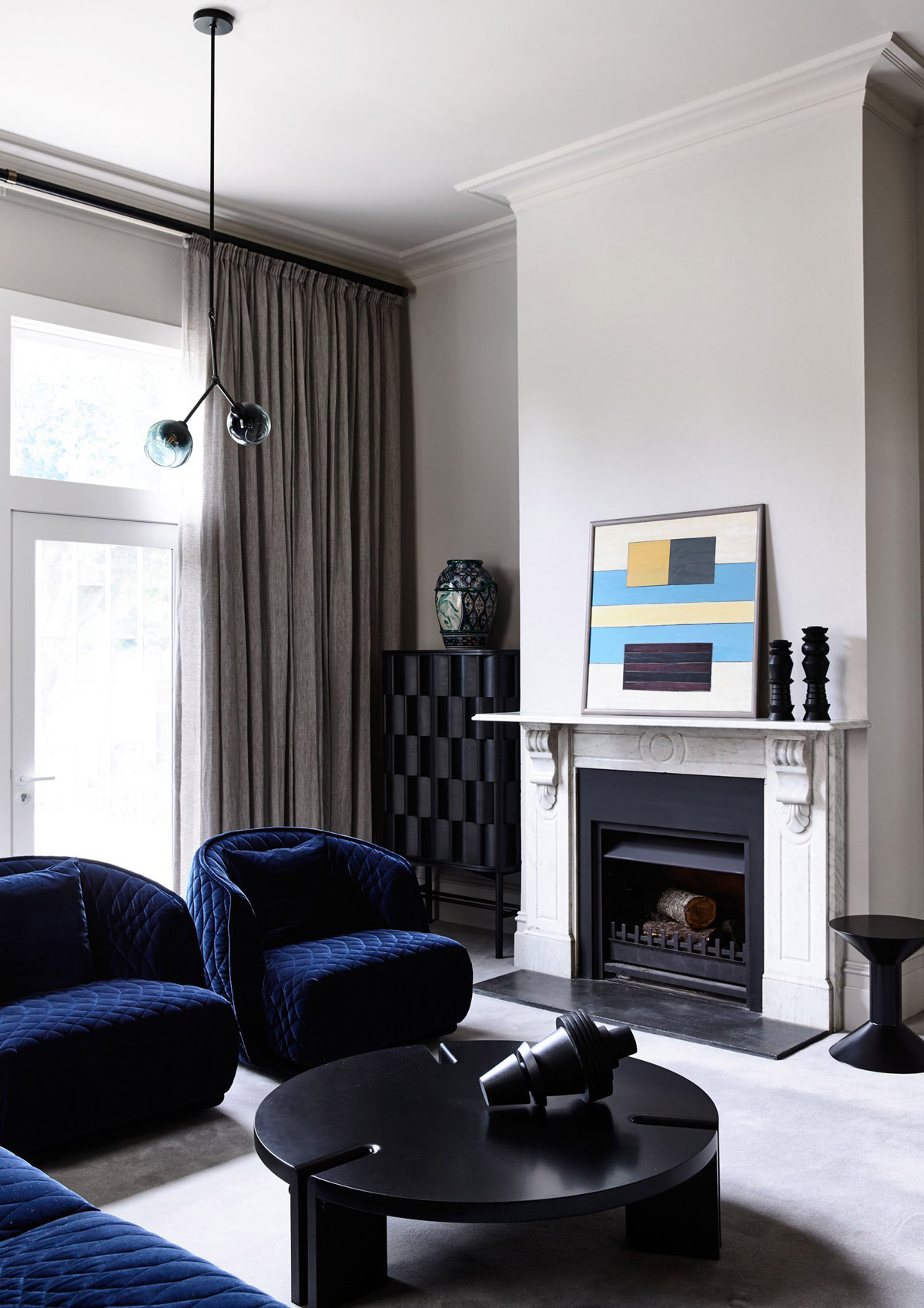
By in large Kennedy Nolan have achieved this by zoning the house into three sections; an adult’s zone in the older part of the house at the front, a communal living space in the middle to maximise socialising and the kid’s domain at the rear. Each zone feels quite distinct, yet they flow into each other in a way that encourages exploration and interaction.
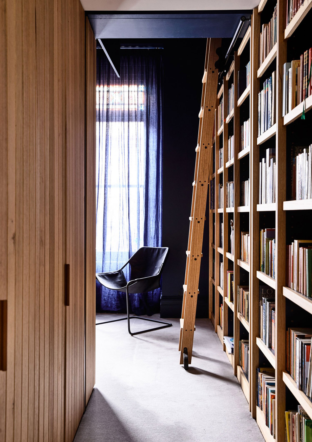
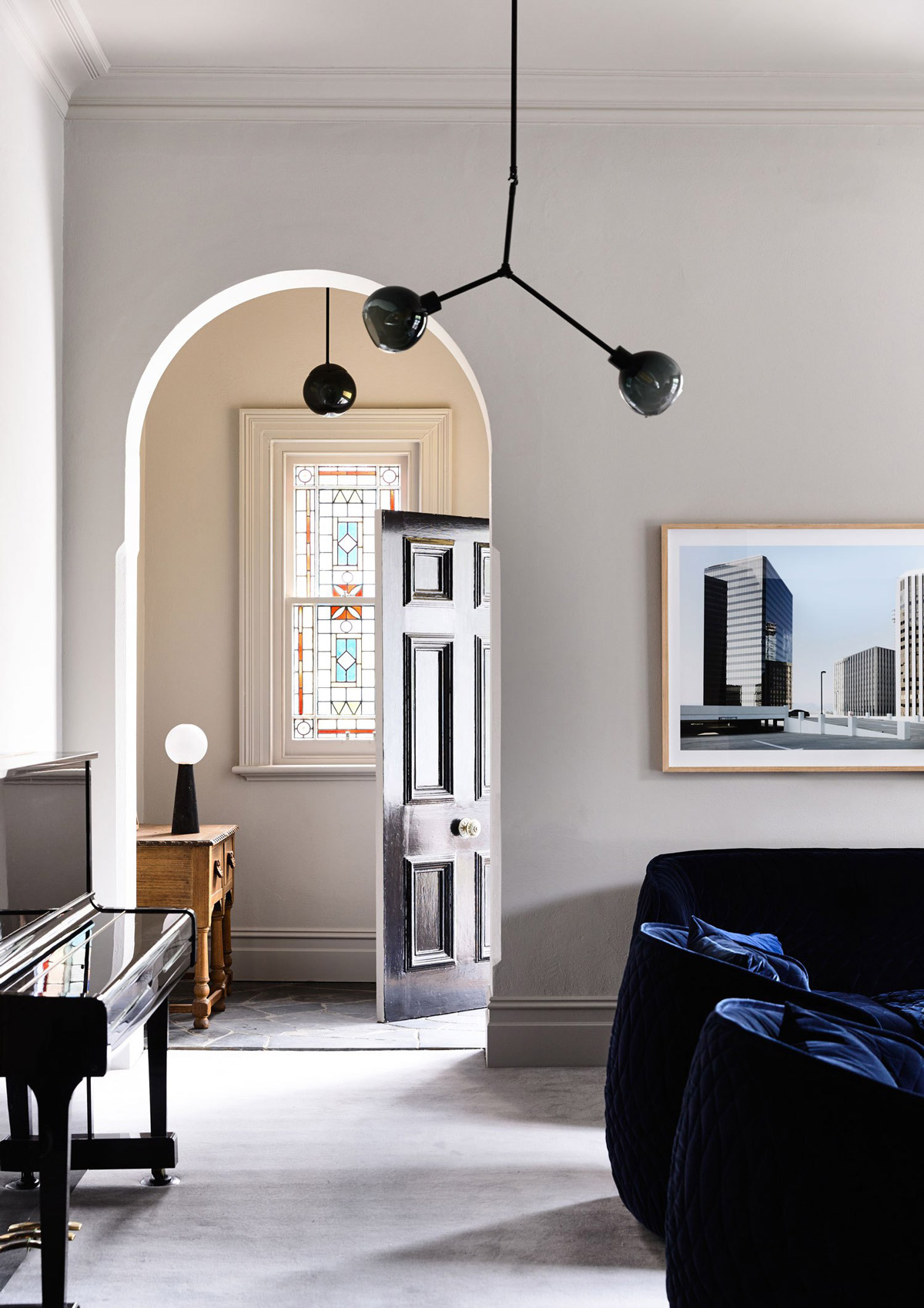
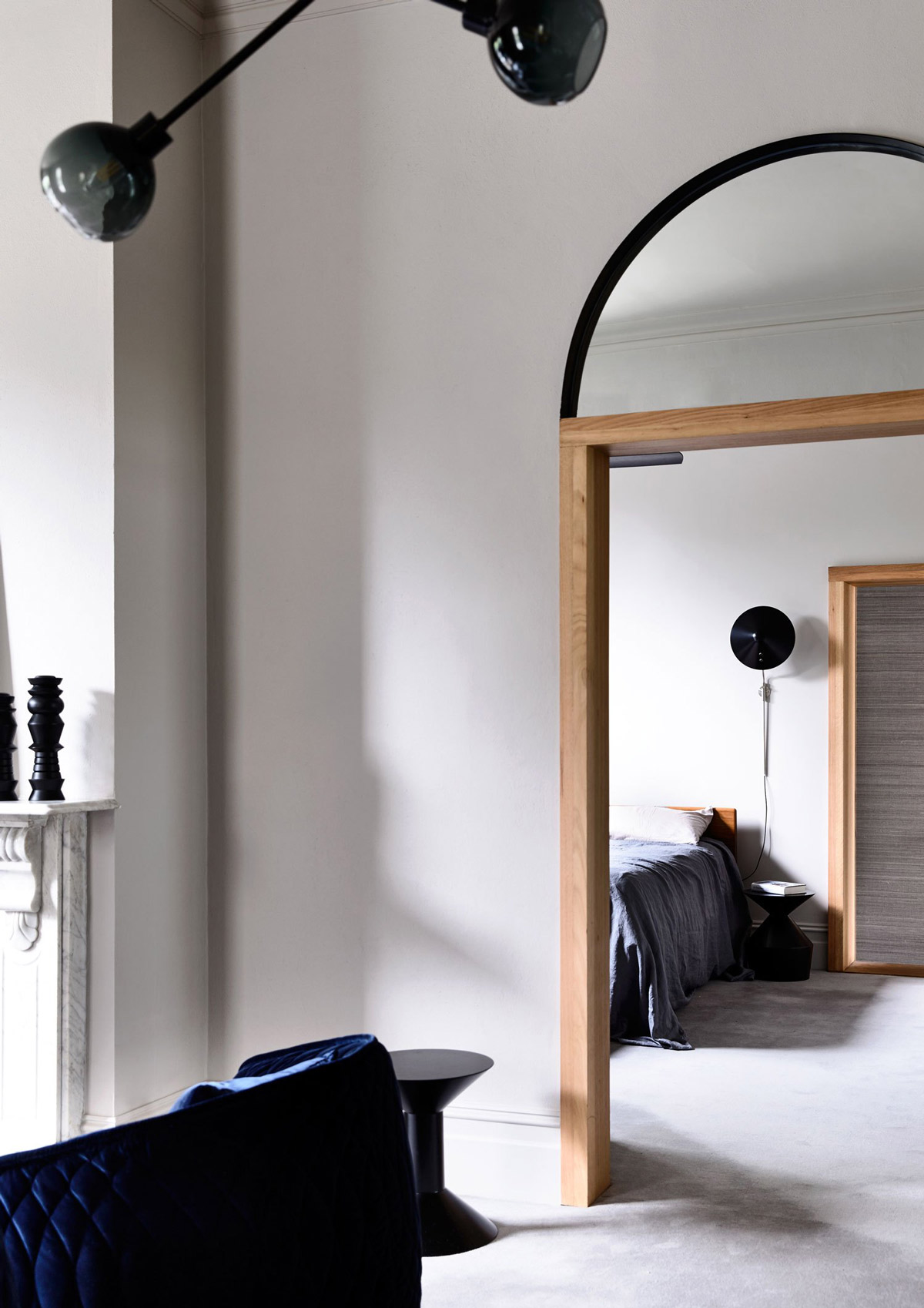
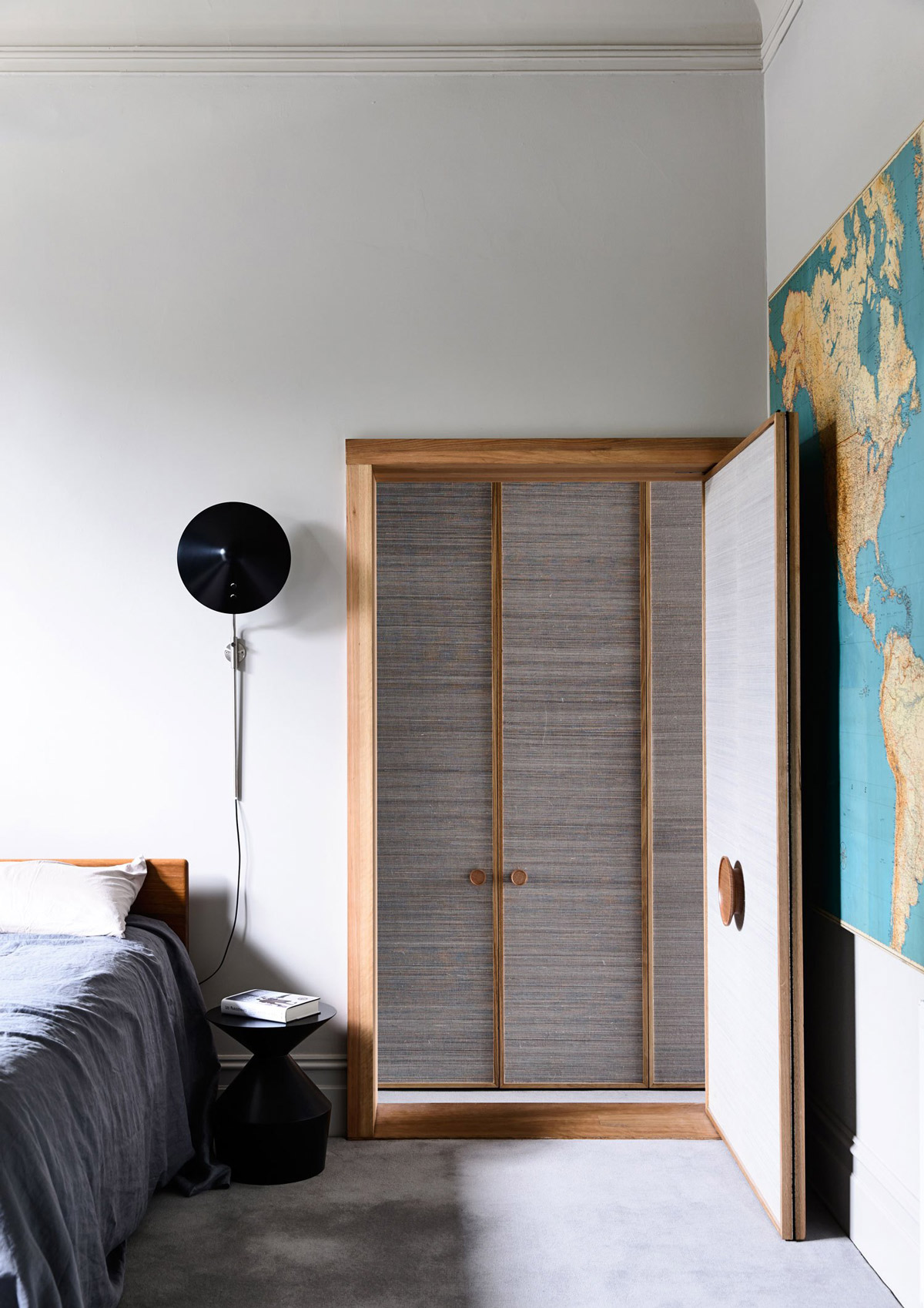
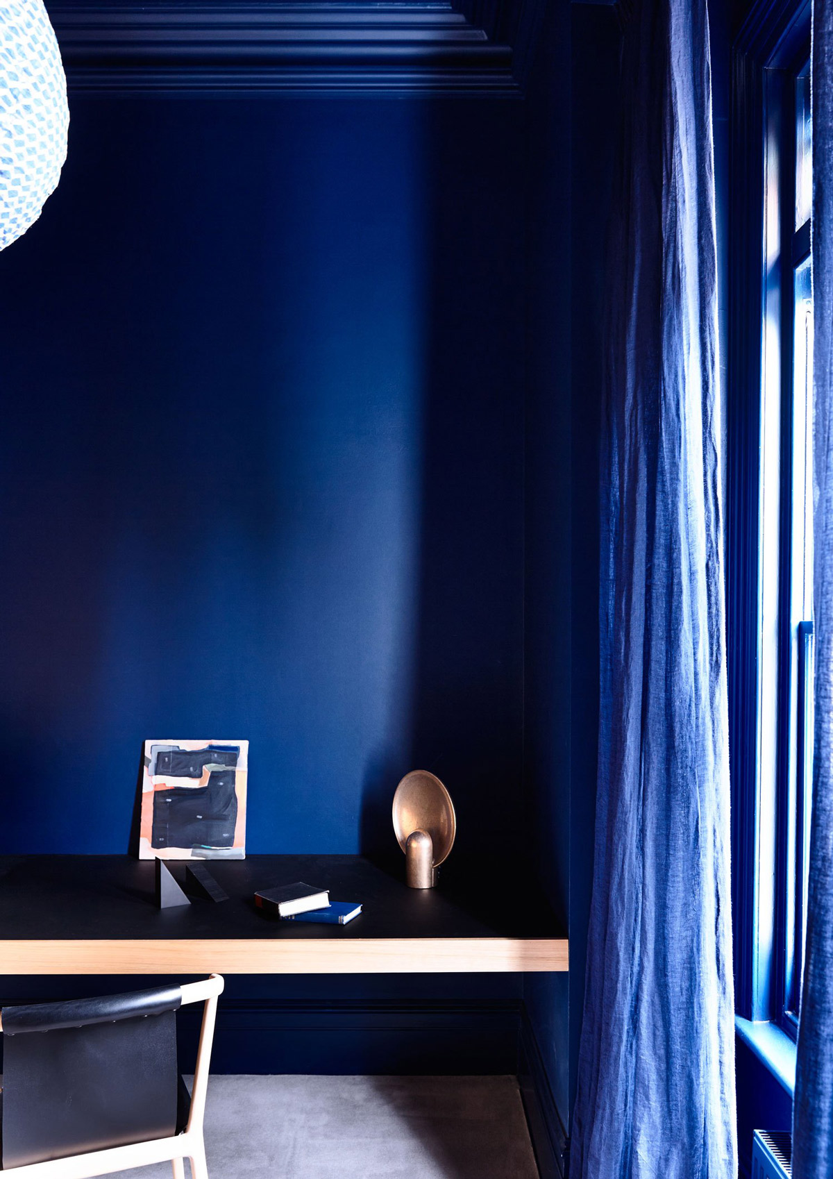
Let’s start with the adult’s section. A tranquil sitting room, leading off the front door and through to the master bedroom, has an air of serenity. Probably the most lust-worthy section of the parenting zone is the study, a pure heaven of respite. Accessed through a corridor lined with timber bookshelves and painted a deep relaxing blue, it is the perfect dual-cave. A man cave for both of the sexes! Big tick.
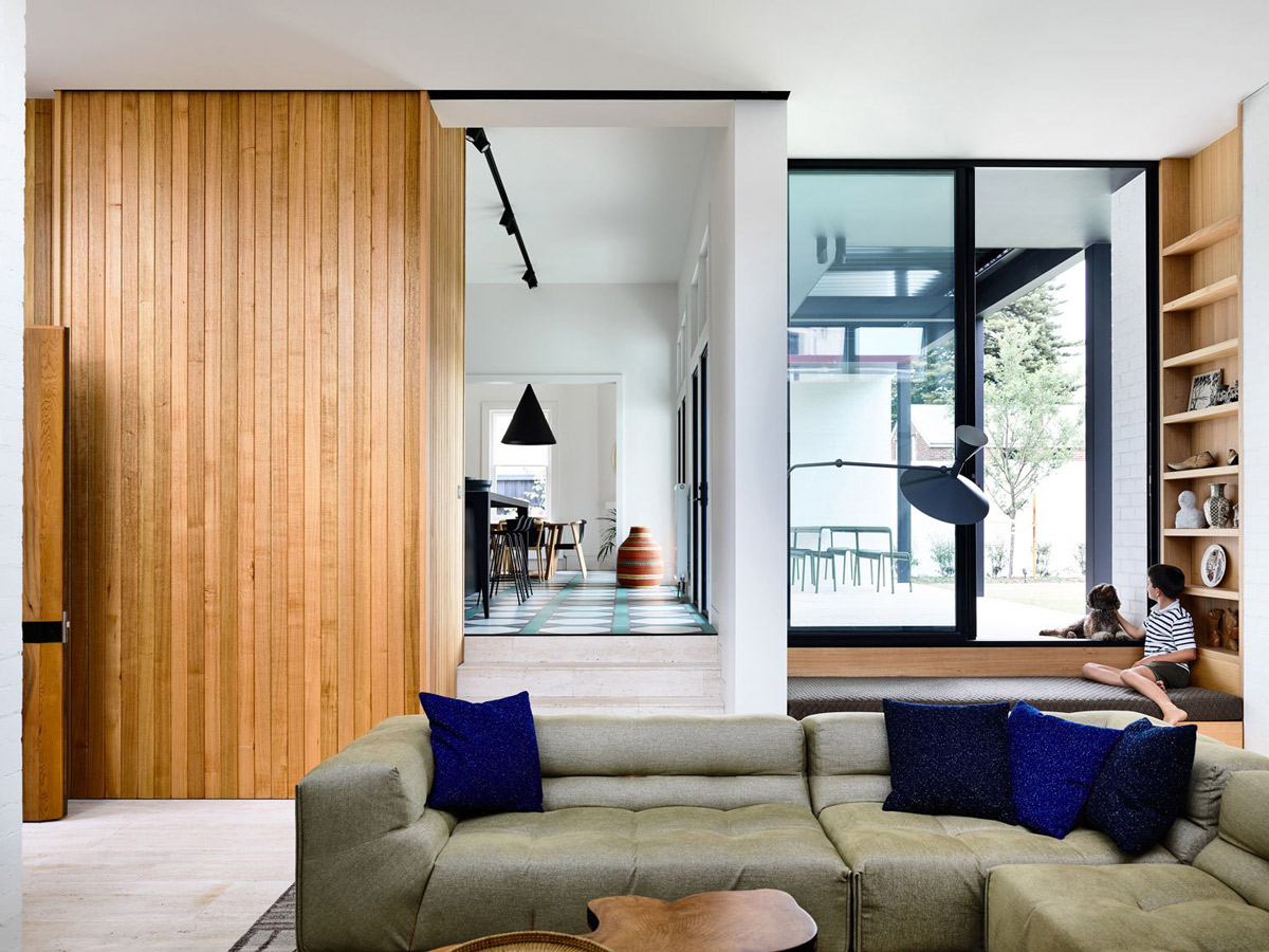
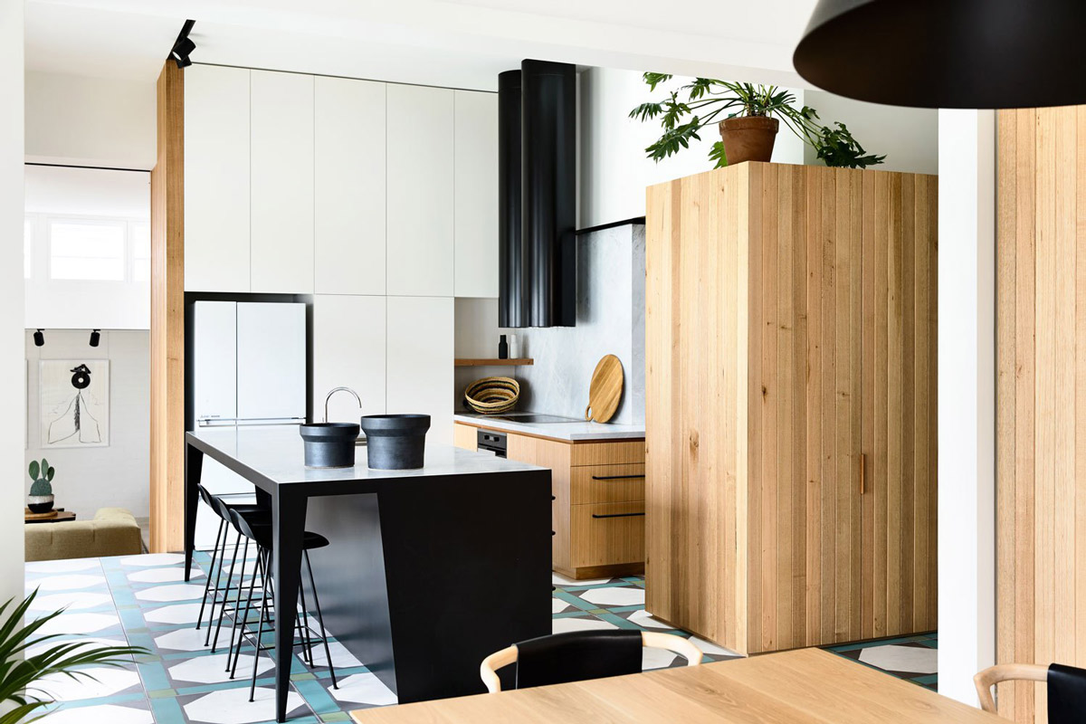
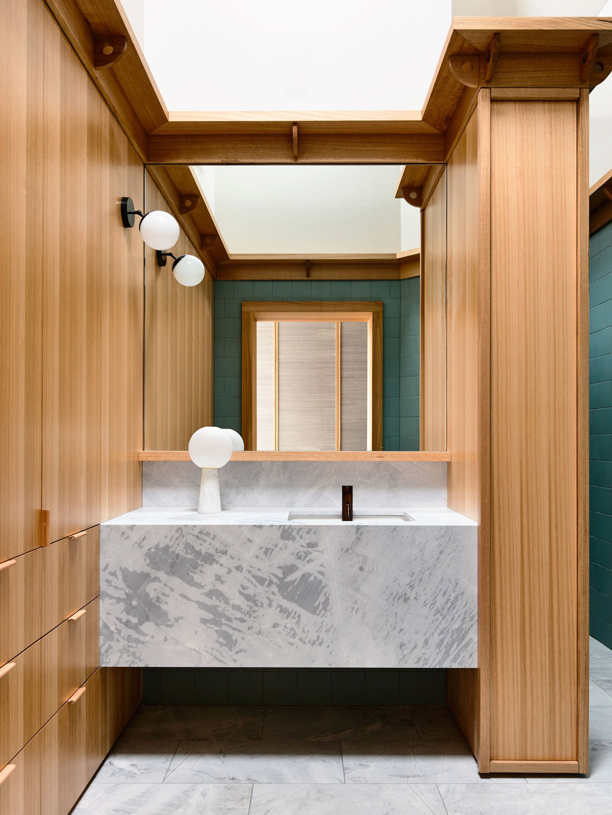
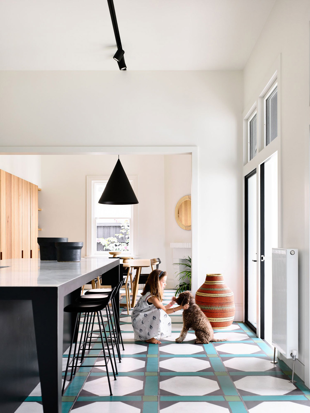
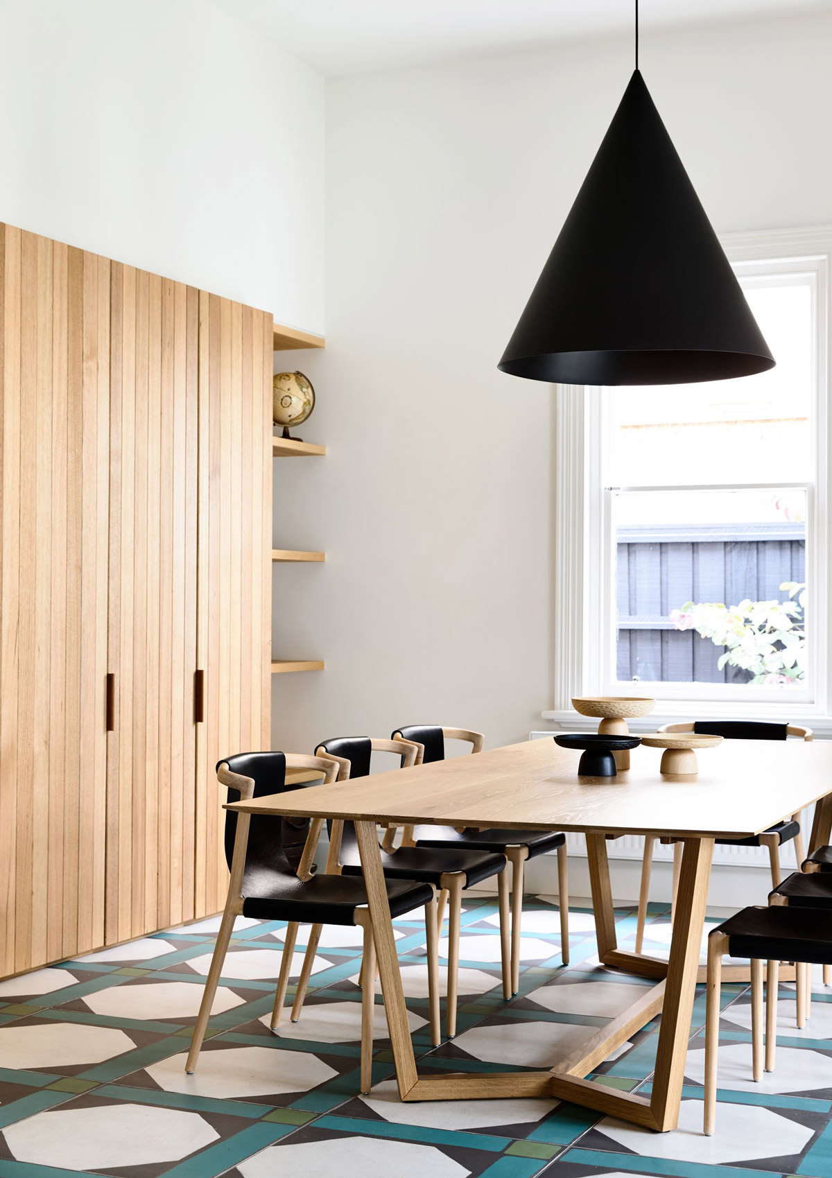
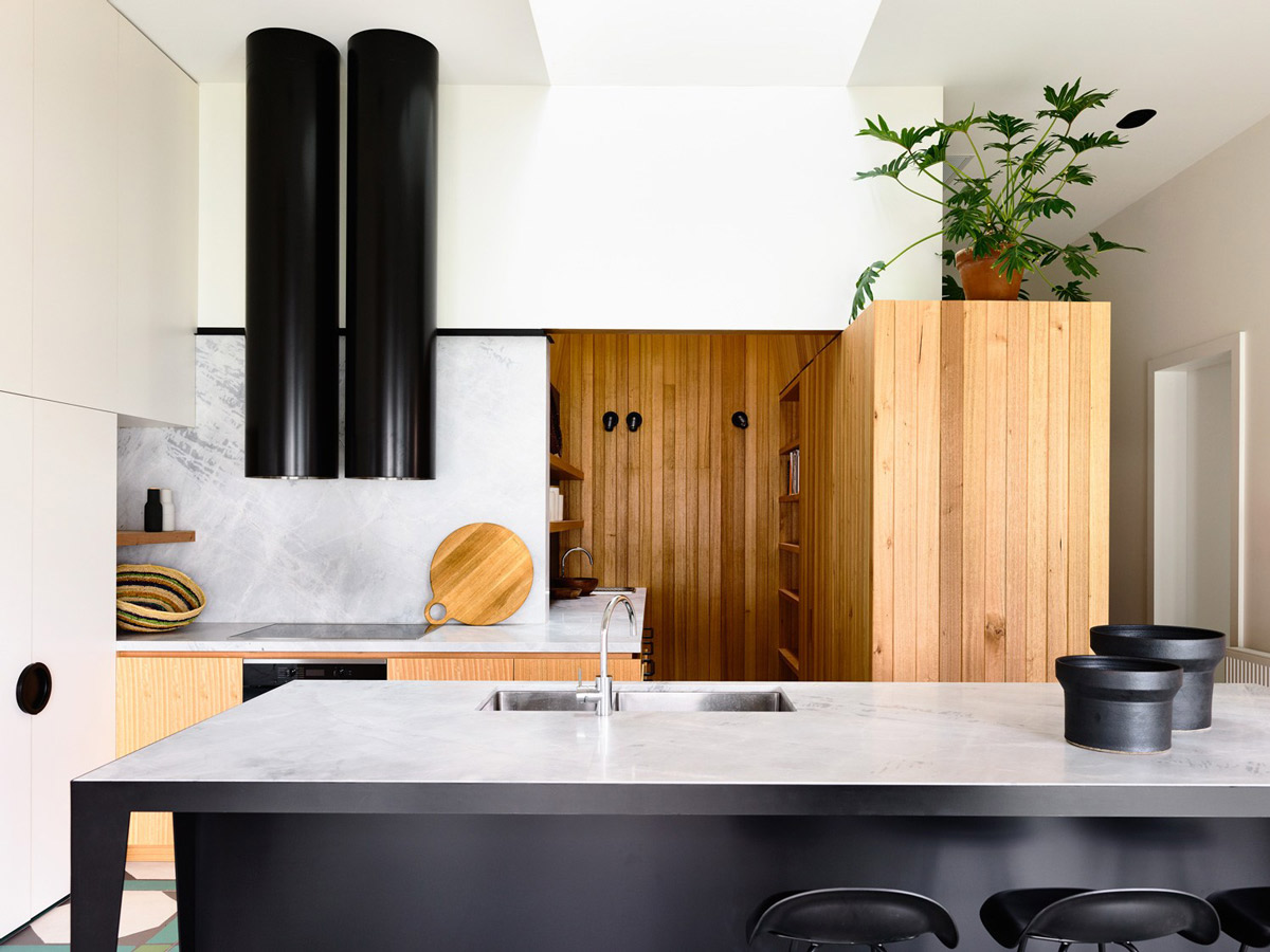
Moving into the central space; the kitchen, dining and separate sunken lounge, act as a transitional area between the adults’ zone and the kid’s zone. What is delightful about this space is the swap from the warmth of the parents’ zone with its comforting pale grey carpet to the flood of light and energy, greeted by a bold hexagonal tiled floor in the kitchen and dining. There’s a strong geometric feel to this interior. From the archways to the light fittings to the way sections of the house interlope on each other. Natural light washes in from east- and north-facing windows, amplifying the sense of contrast to, and transition from, the older part of the home. The geometric theme of the tiles is echoed in the neat composition of the kitchen, a carefully arranged presentation of white cabinet doors, Victorian ash veneer joinery, timber lining boards, an angular black steel island bench topped with white natural stone, twin black cylindrical range hoods and natural stone splashbacks.
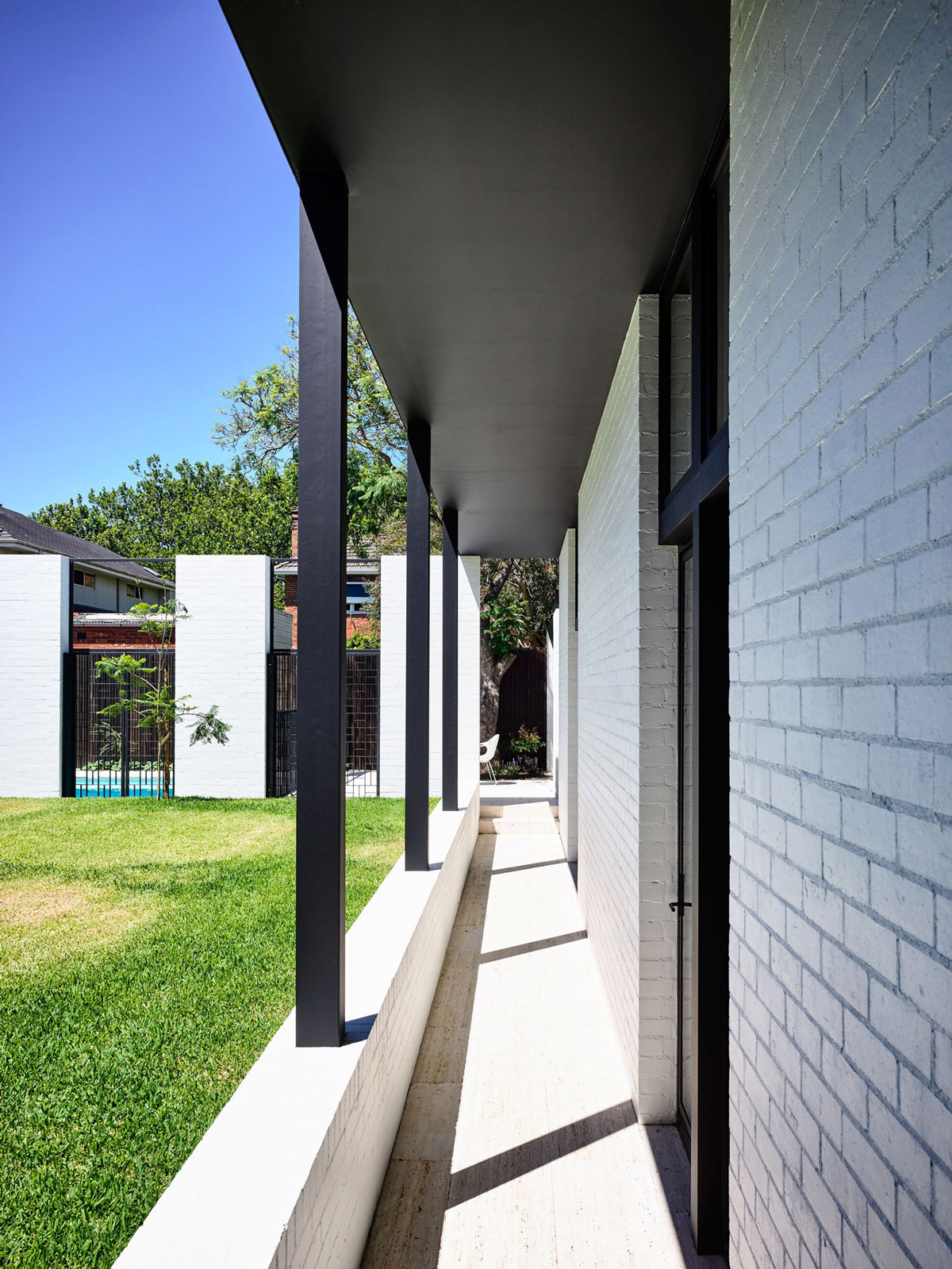
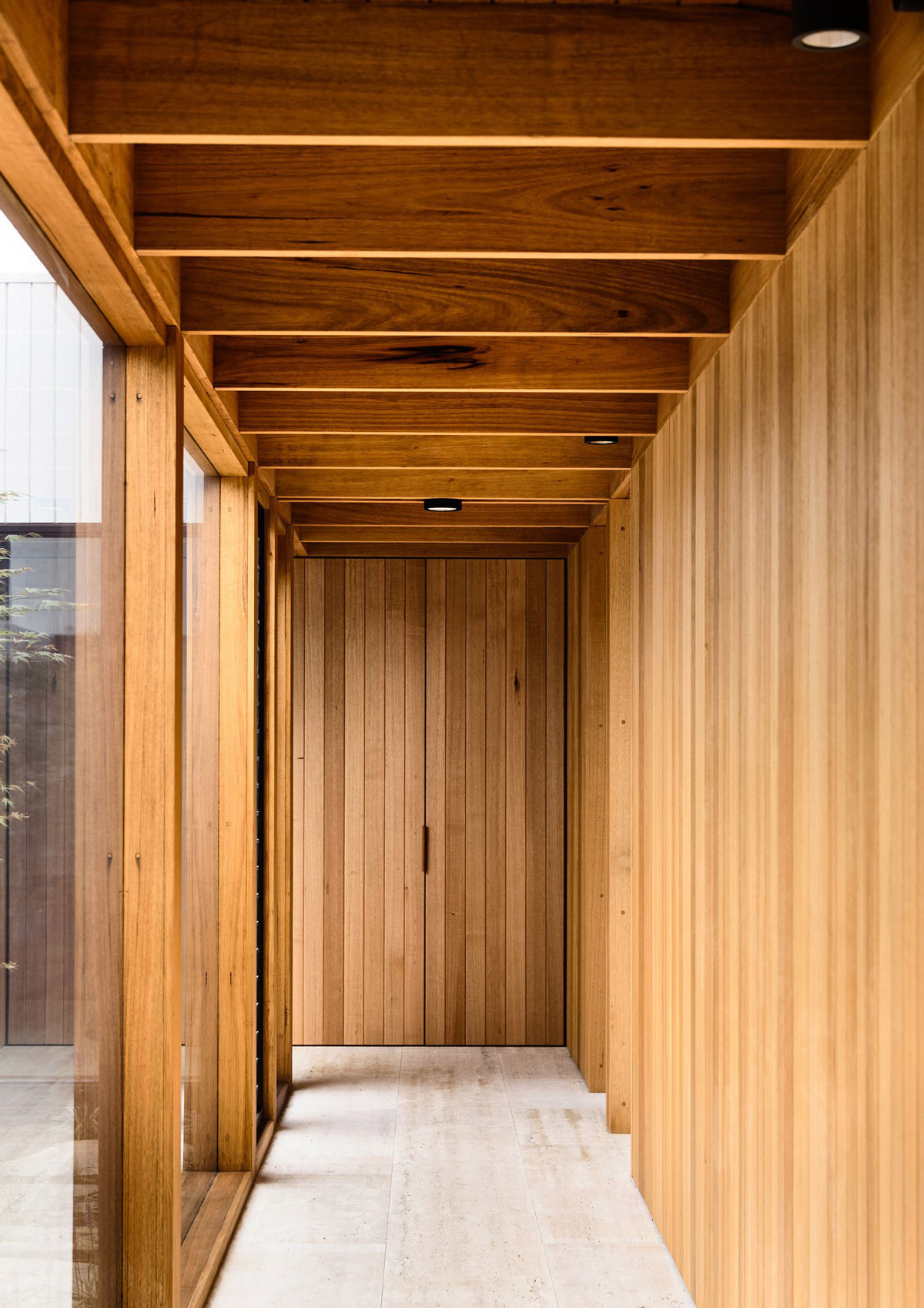
The kids’ zone perhaps has the strongest geometry to the design. A long corridor of bedrooms (notably a mile away from the parent’s bedroom – pure genius) have doors that lead out to an external corridor. It gives the rectilinear form of the rooms an almost Balinese feel, an indoor/outdoor experience. Freedom for the young ones to rush straight from their bedrooms to the grass outside and adaption for older offspring to navigate their own needs.
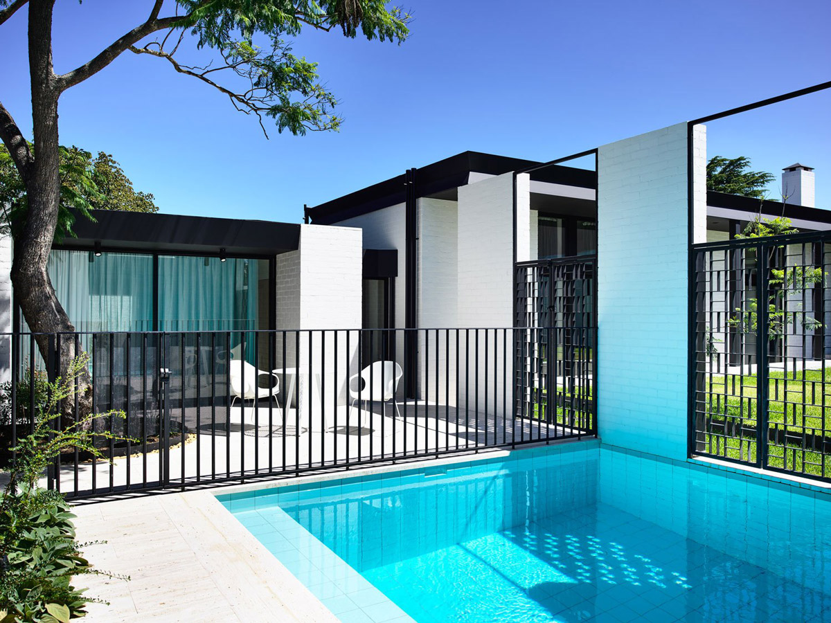
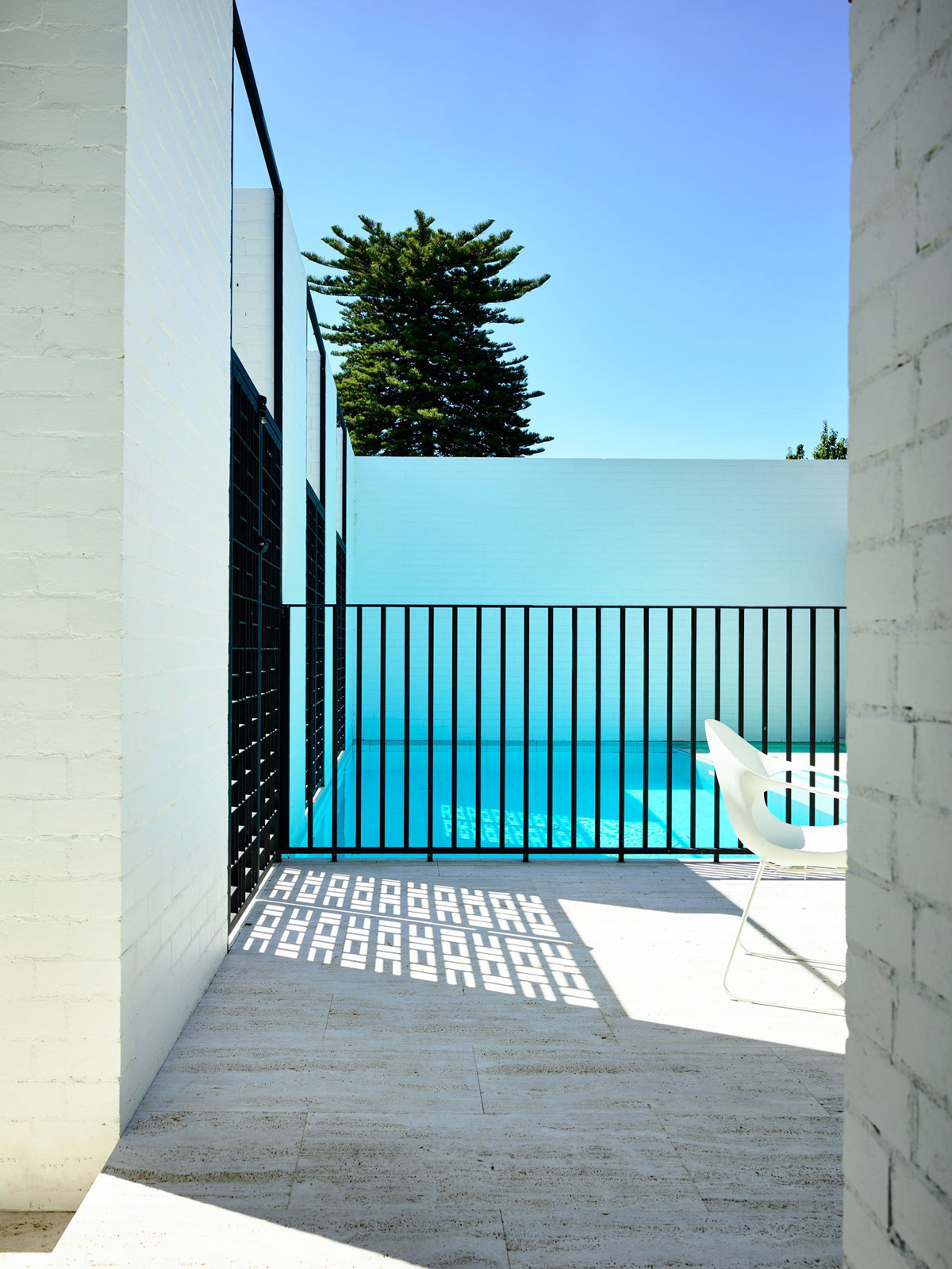
And if you weren’t already gobsmacked, step into the guest bedroom at the rear of the house, which looks out onto the most spectacular ice blue swimming pool. Let’s just say if I’m the guest of honour, they’re going to have a hard time making me leave!
Photography by Derek Swalwell.




Hi All im rookie here. Good art! Thx! Love your stories!
This is just beautiful!!! Can you tell me where the pool fence was sourced/made?